Welcome to Dear Data Two
This project was inspired by Dear-Data.com, a wonderful collaboration between Giorgia Lupi and Stefanie Posavec. We (Jeffrey Shaffer and Andy Kriebel) decided to follow in their footsteps and coincidentally, Andy moved from California to London, England.
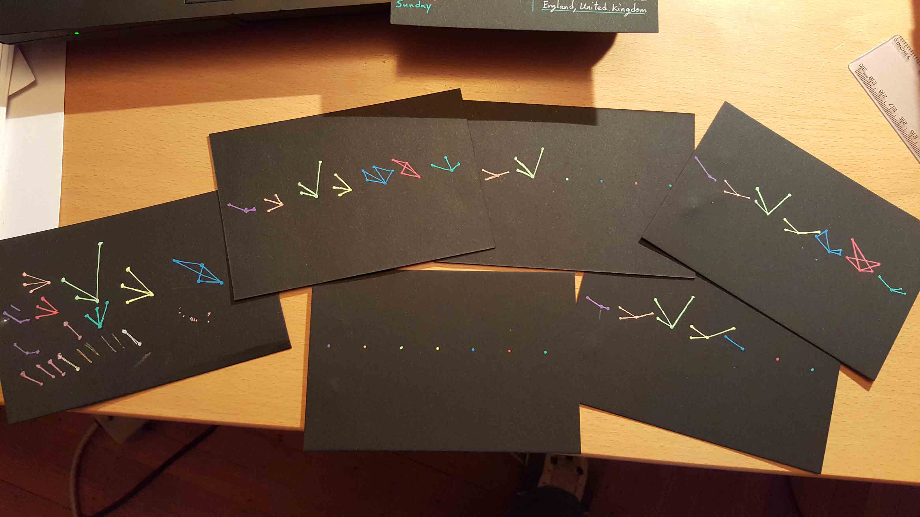
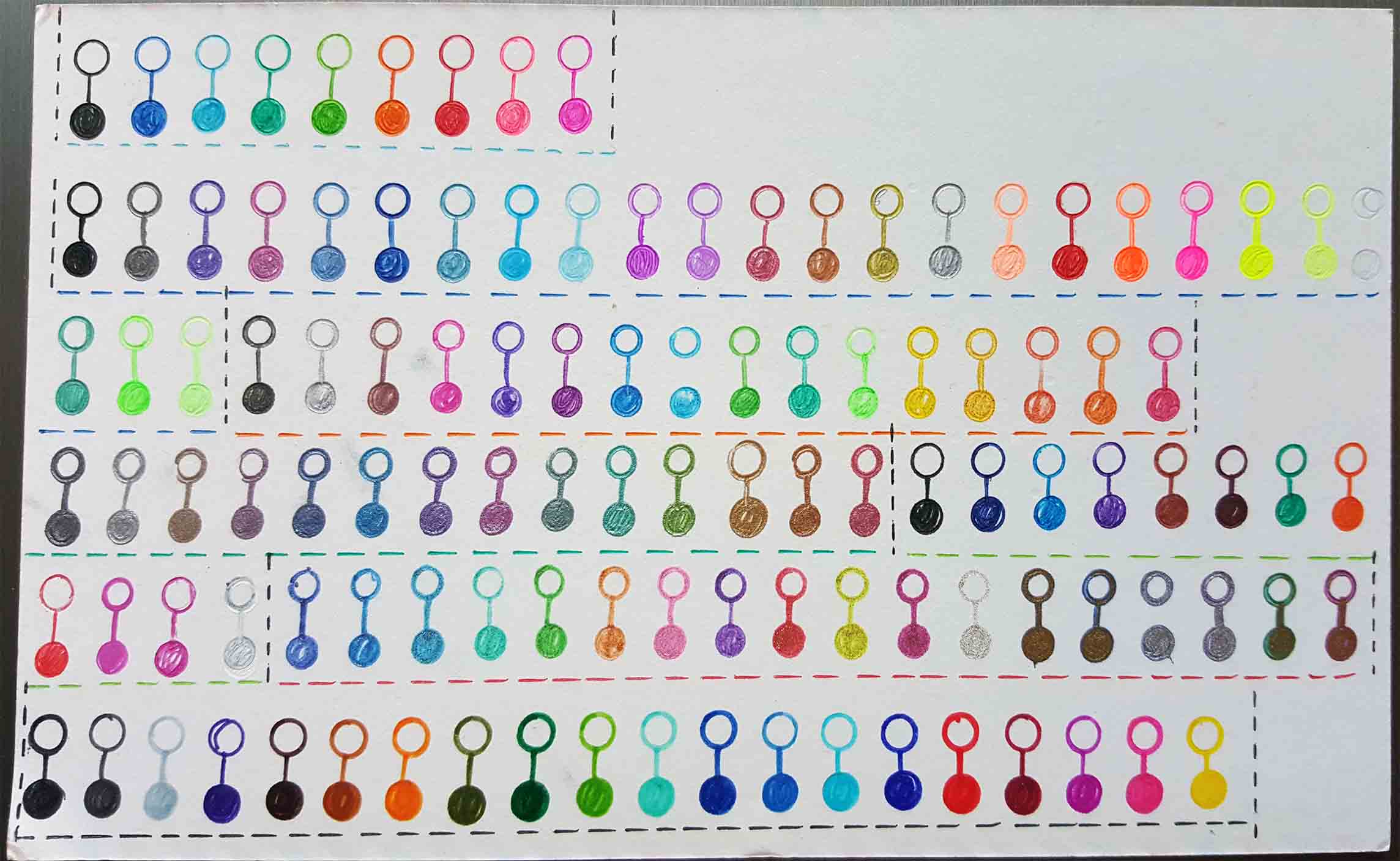
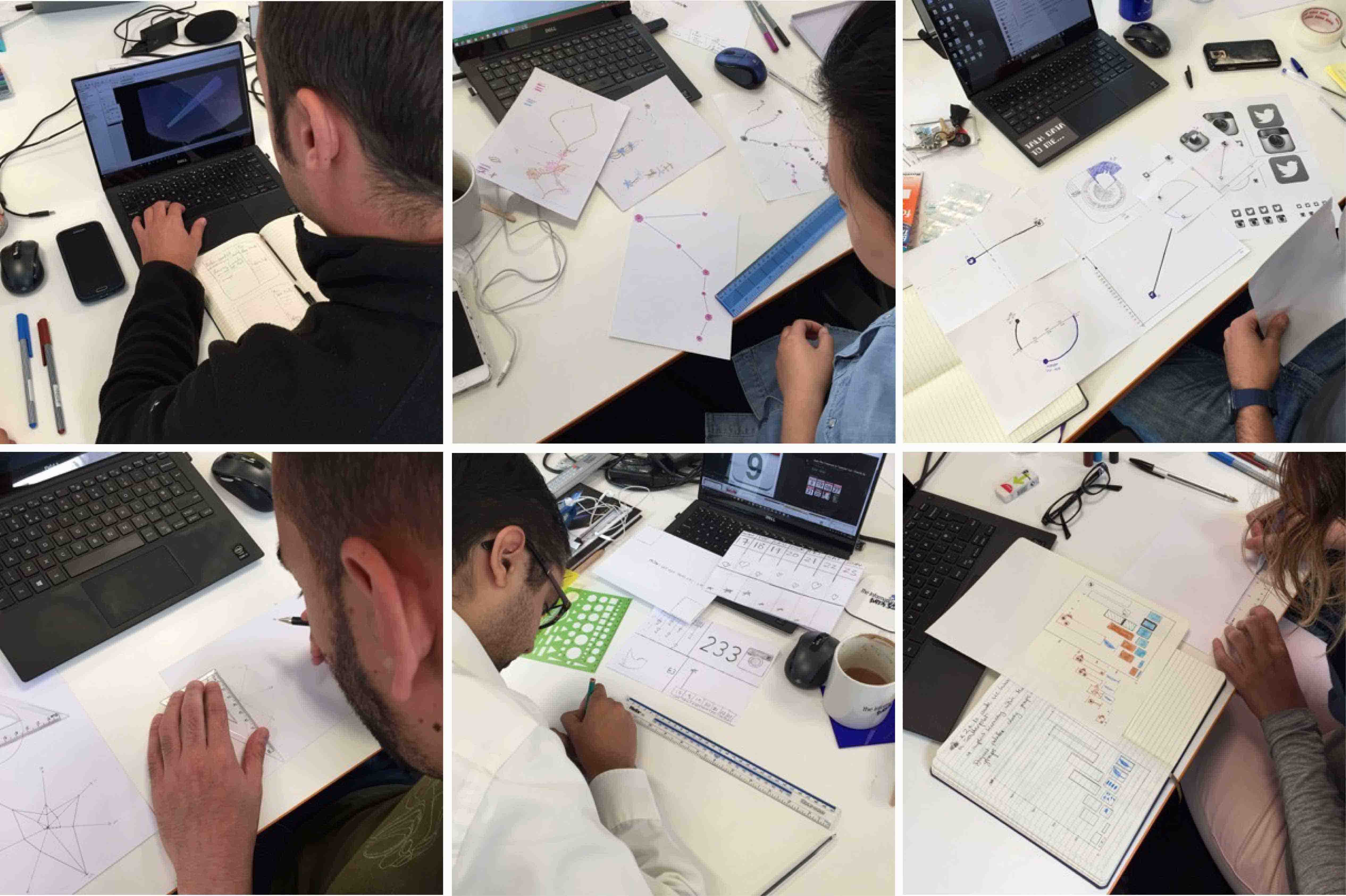
It is our intention to follow the original authors, week by week, creating our own visualizations on postcards, and mailing them to each other. We have decided to keep with the same topics as the original project, but in a very broad sense. In the same manner as the original project, everything will be drawn by hand (although we both opted in week 1 to use a straight edge along with our gel ink pens).
We are both data visualization practitioners, teachers and regular speakers on the topic and we are big proponents of data visualization best practice. Giorgia and Stefanie are amazing artists, which is evident in their work. We are technology guys, using tools like Tableau and R to create data visualizations. We thought it would be fun and interesting to see the differences in the approach and design of the data and contribute to this amazing project. We encourage others to do the same.
Thank you for joining us as we explore this project.
Jeff and Andy
Weeks :
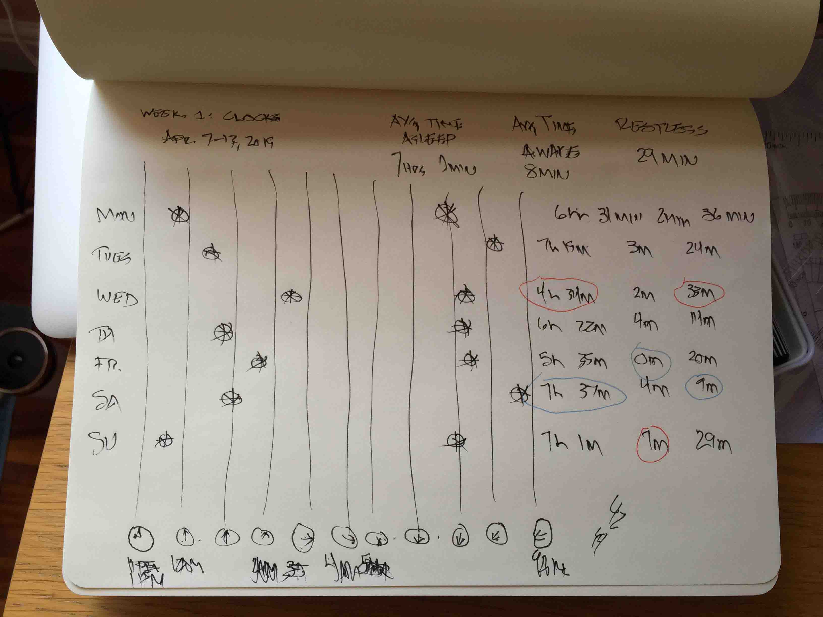
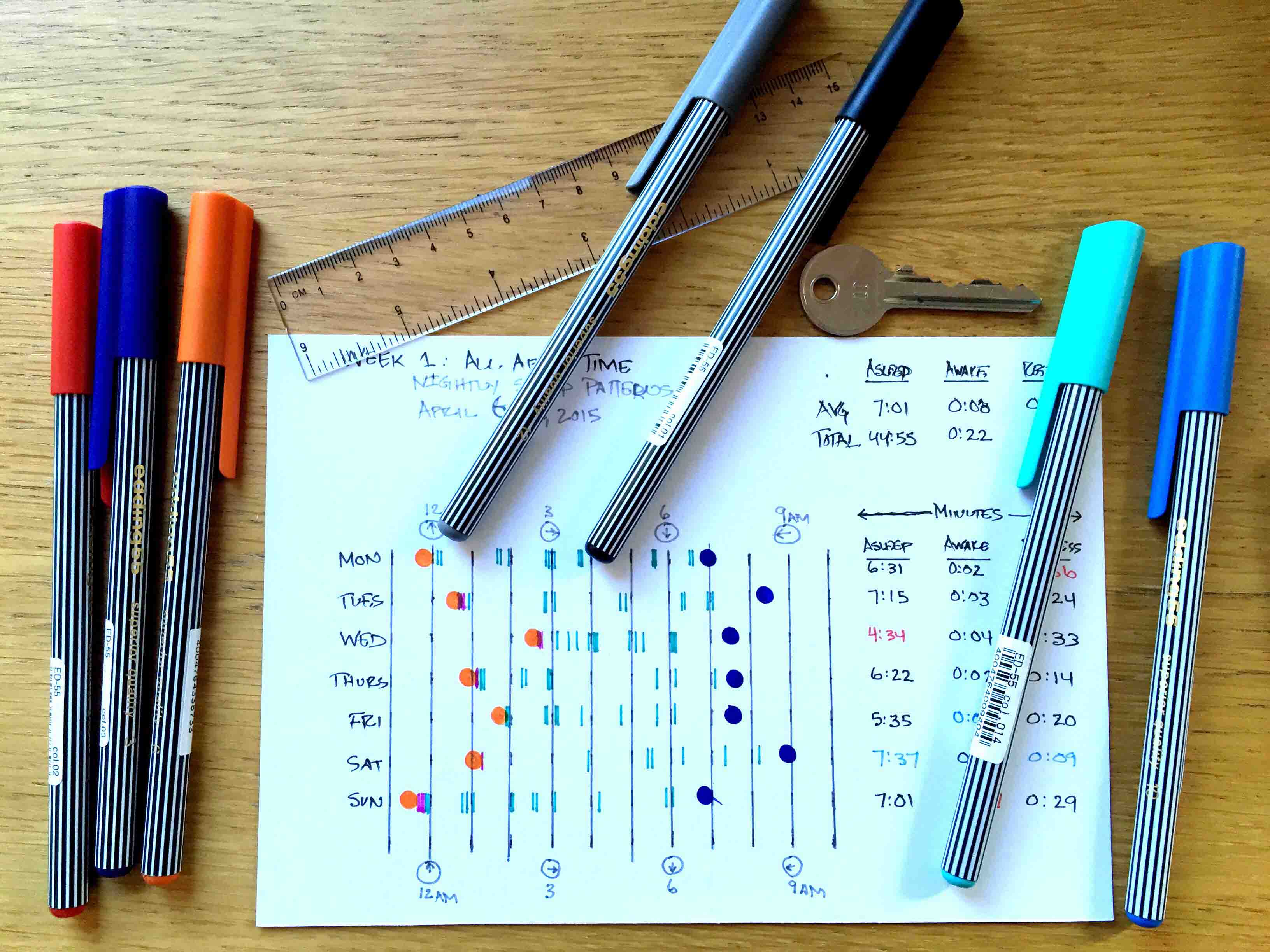
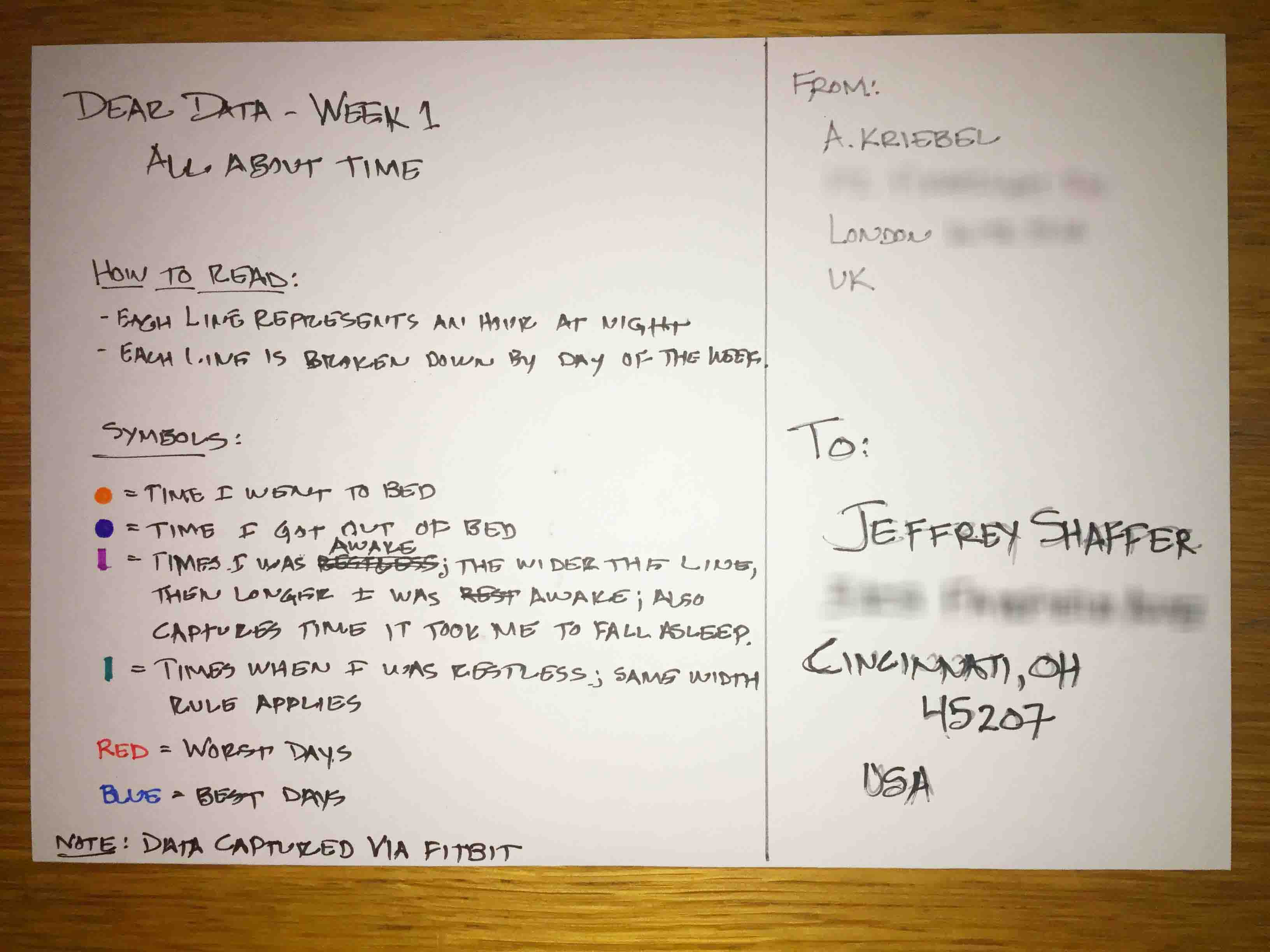
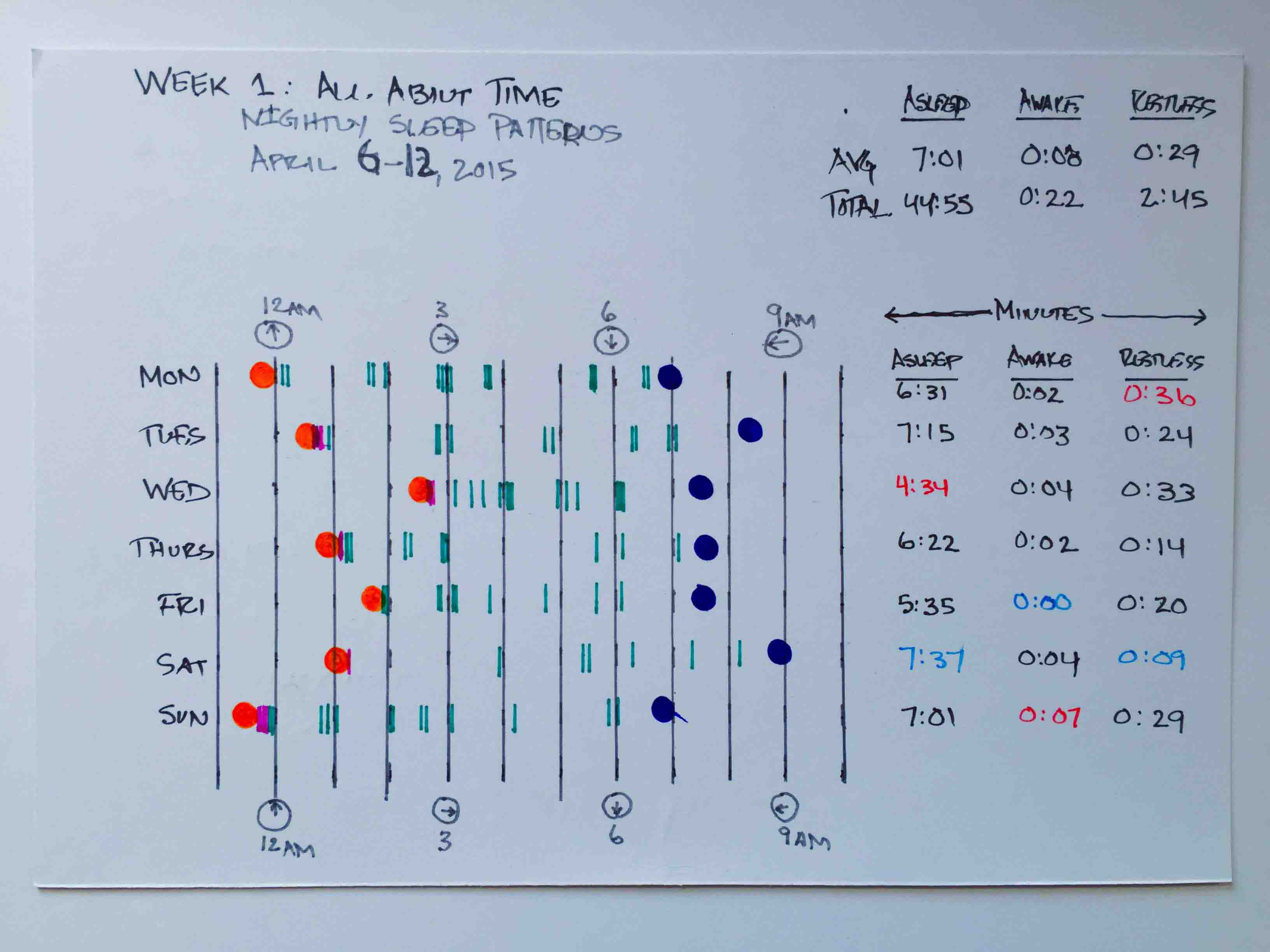
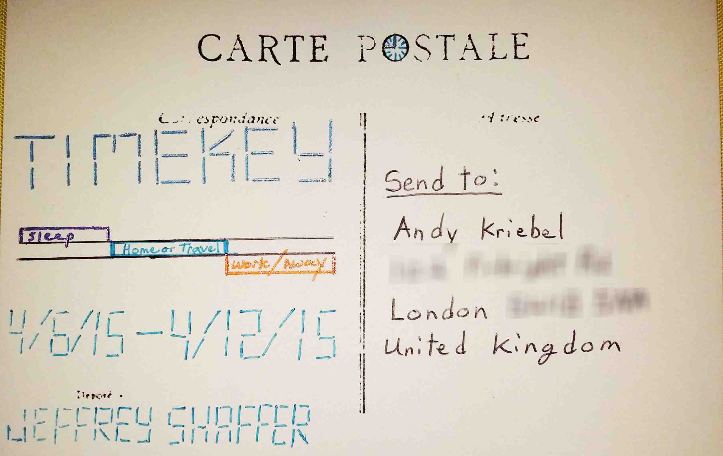
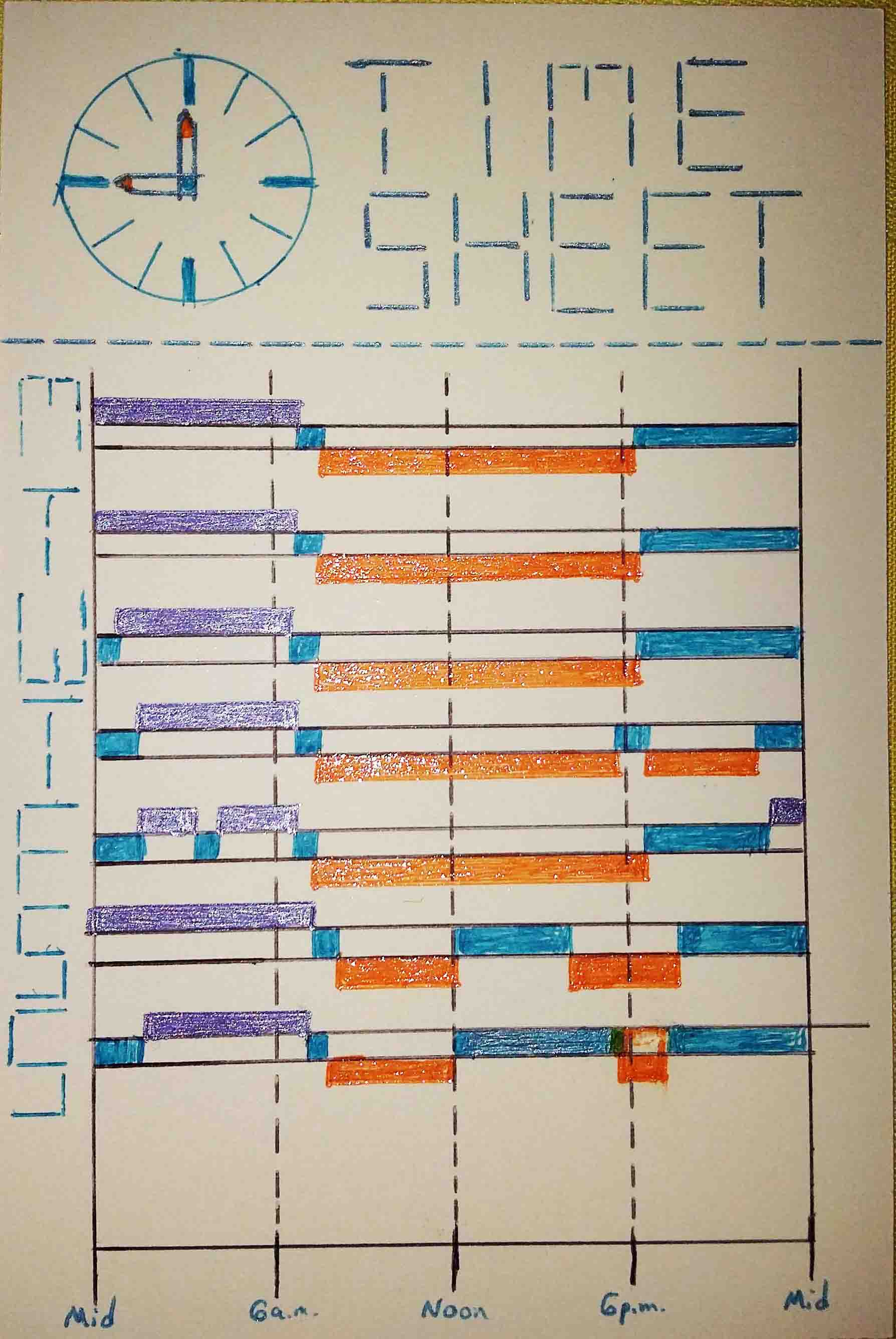
- 1 - Time
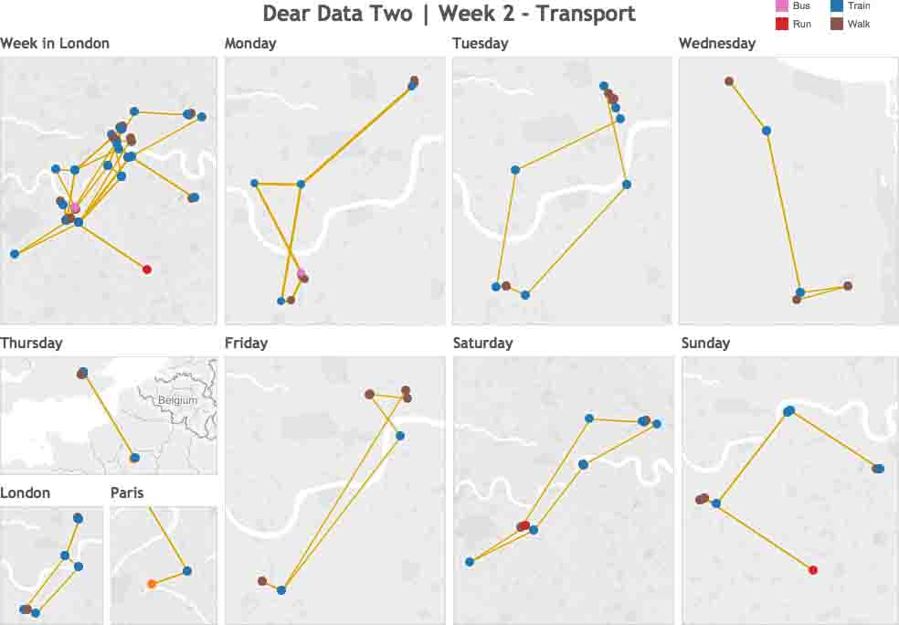
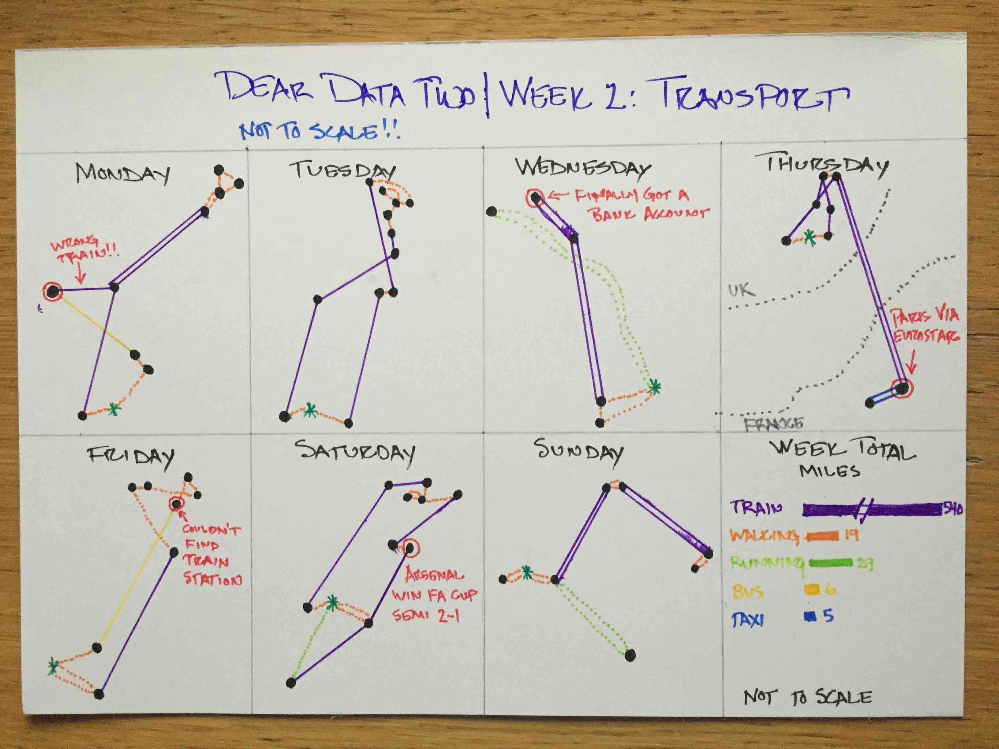
- 2 - Transportation
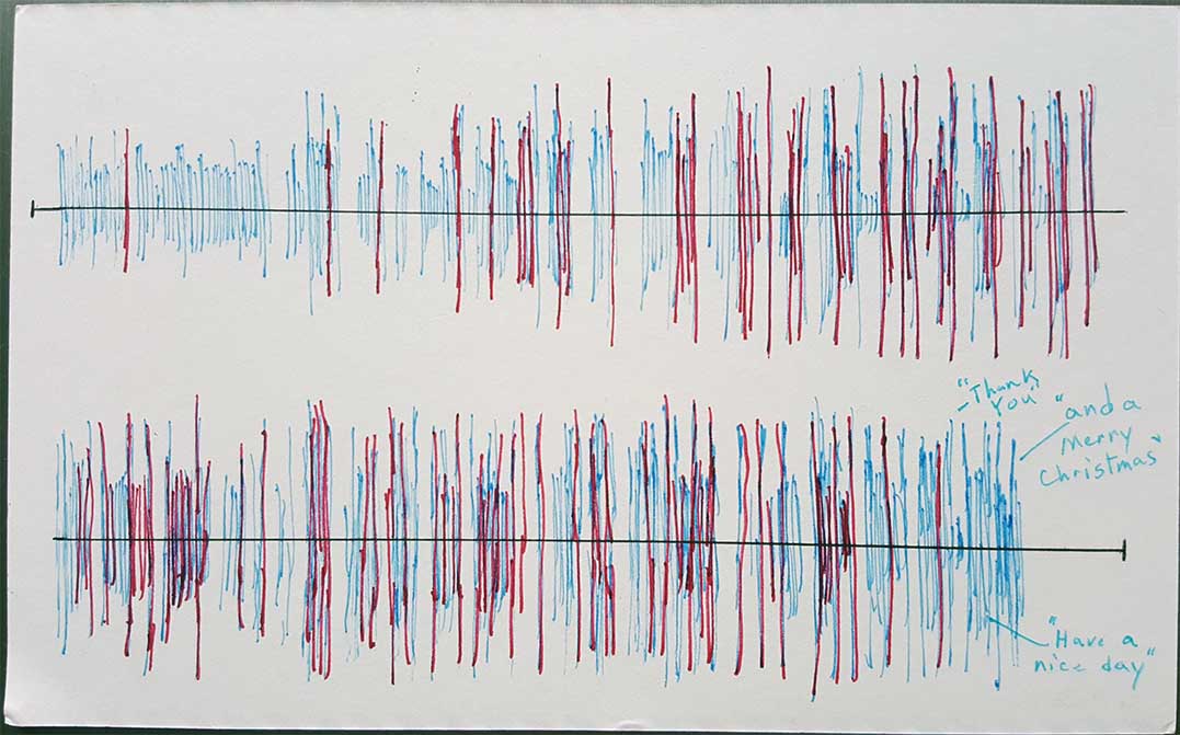
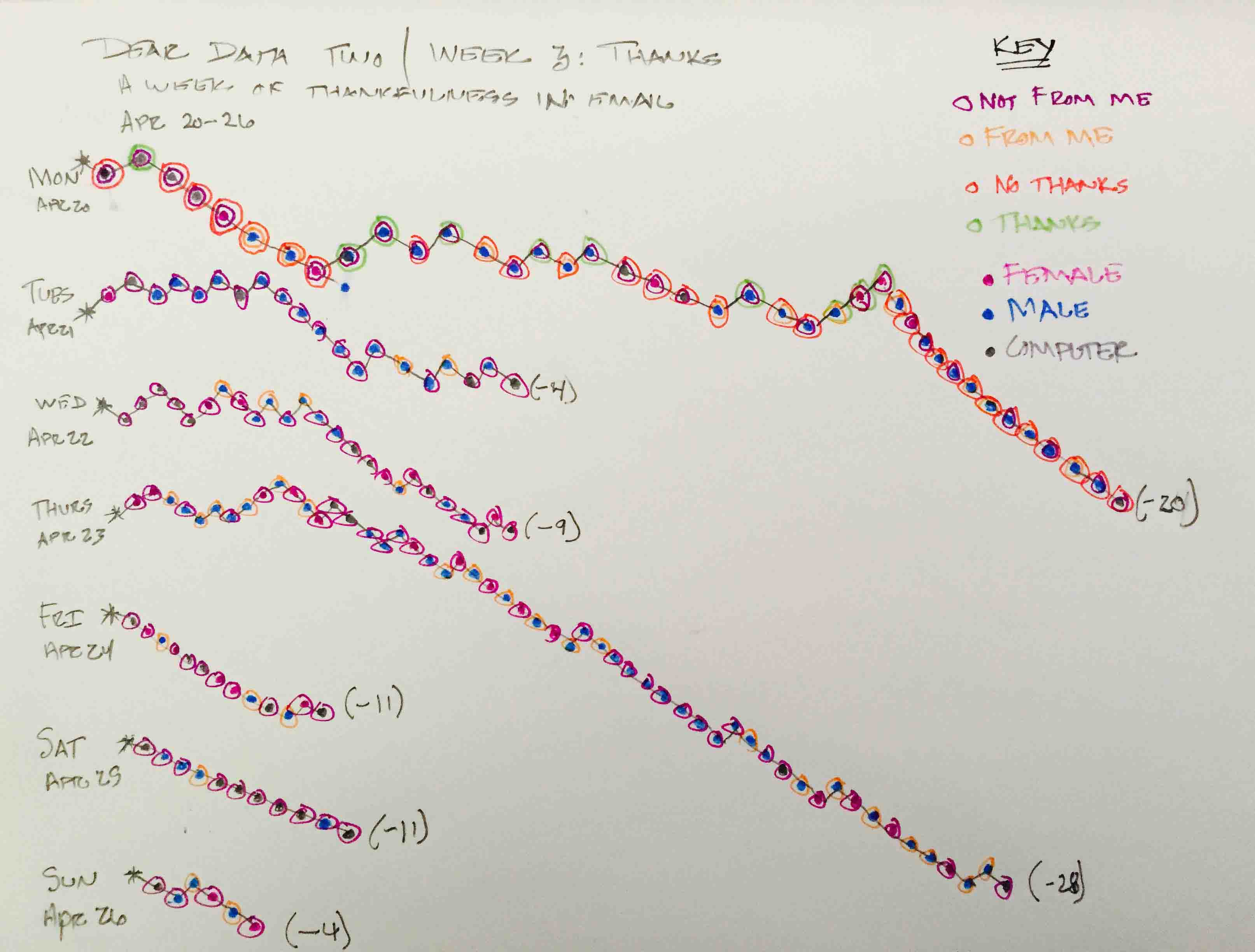
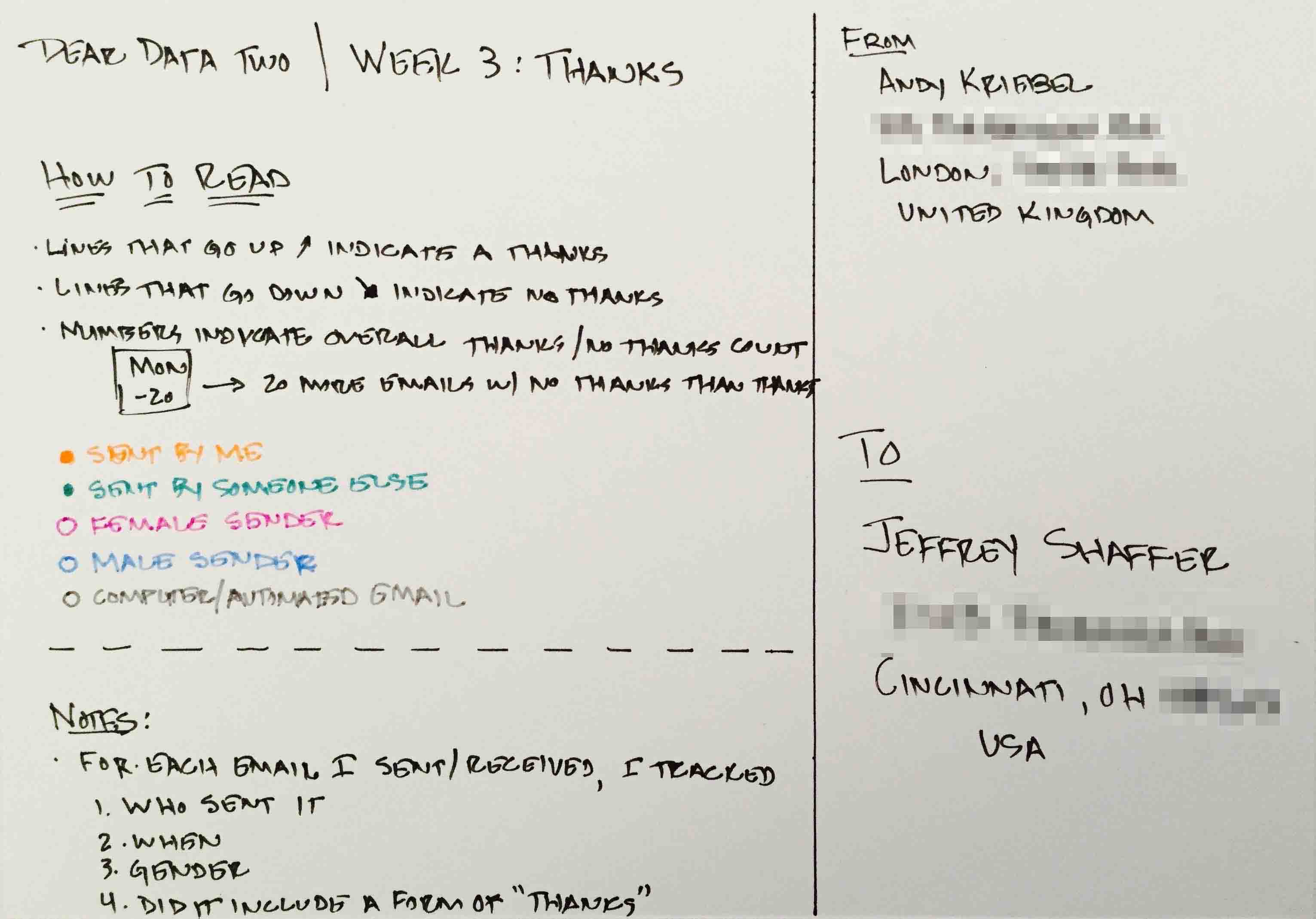
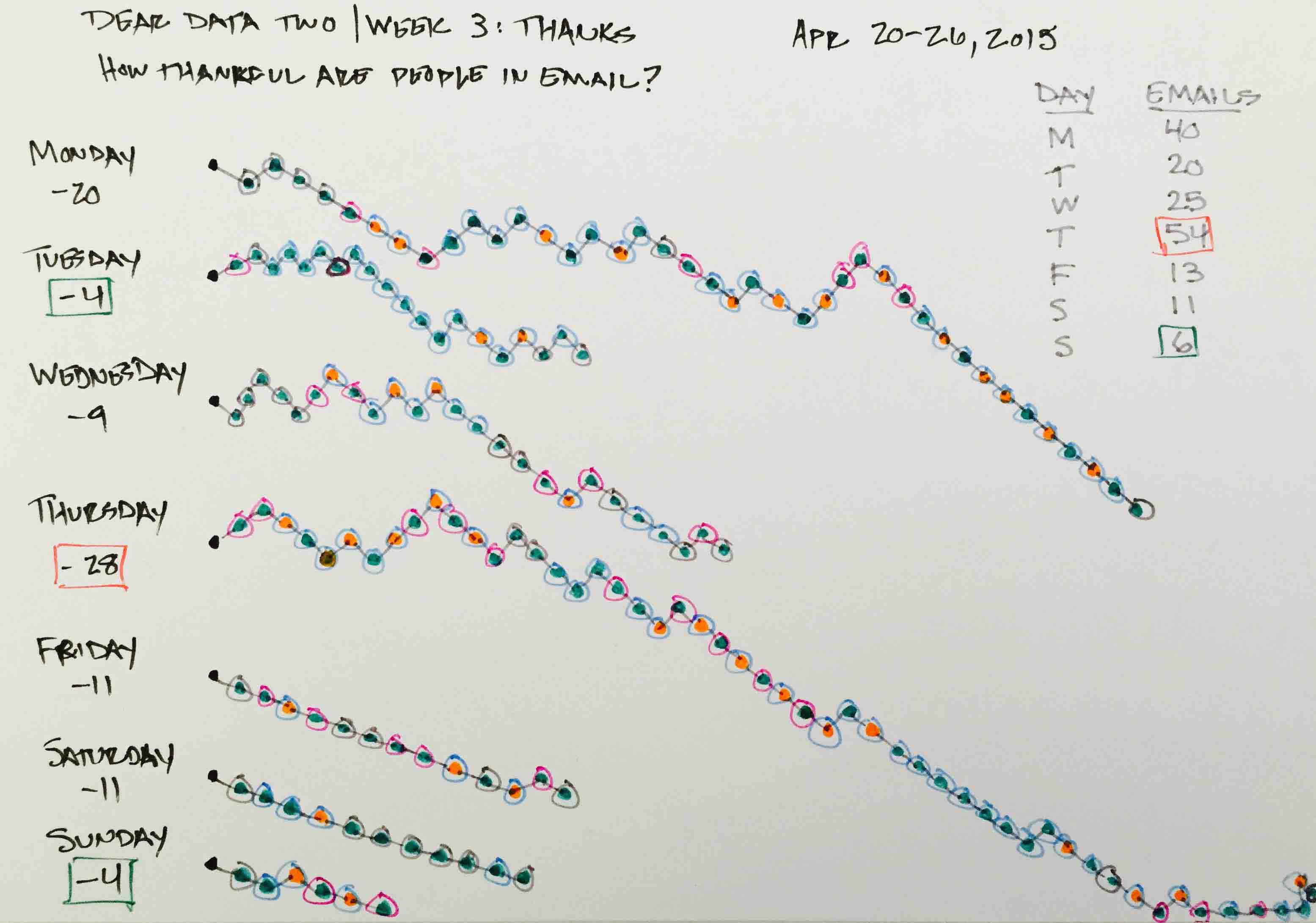
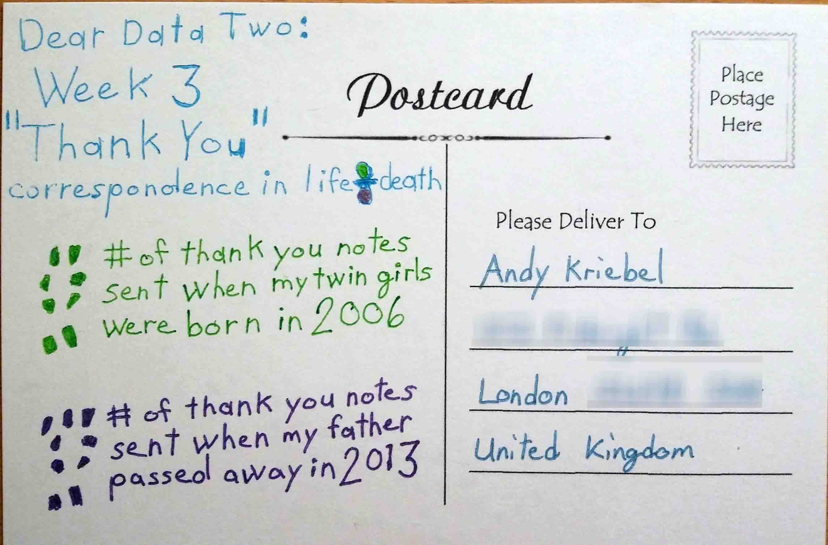
- 3 - Thank Yous
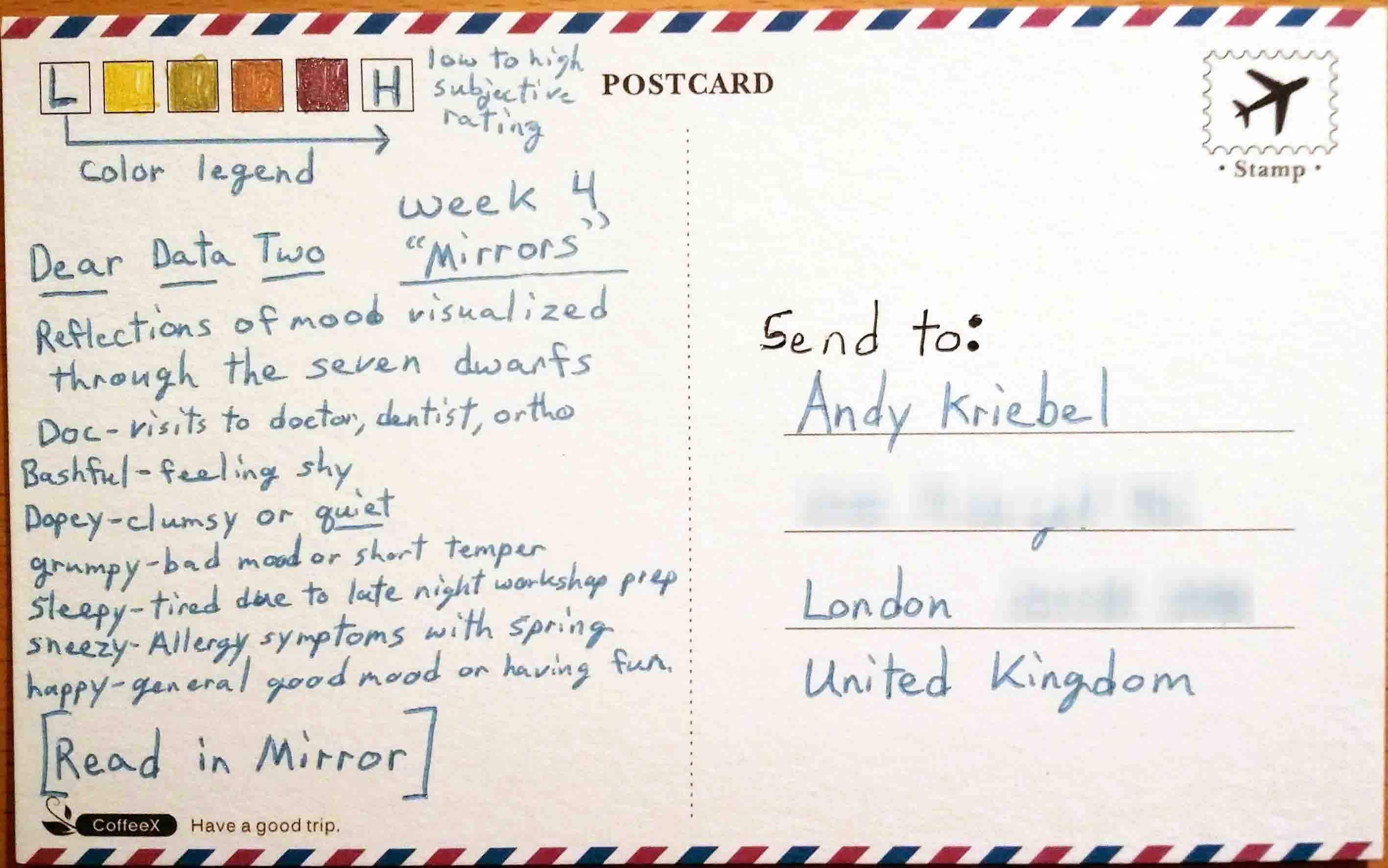
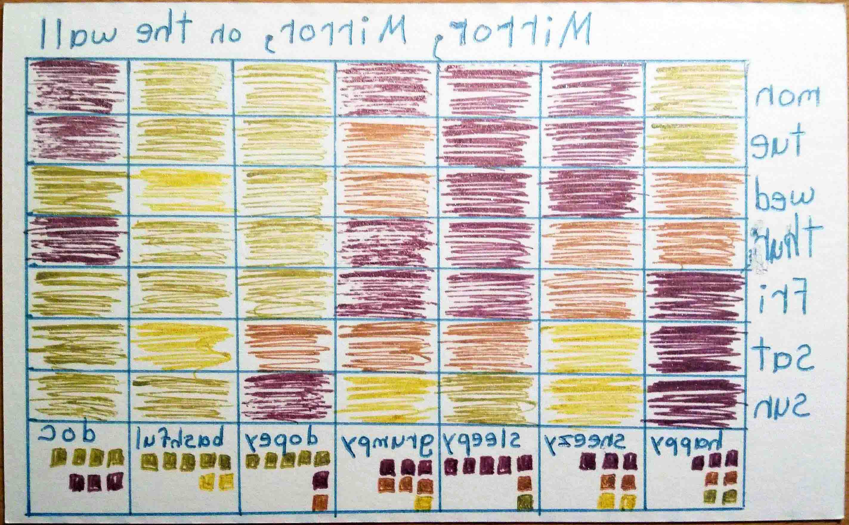
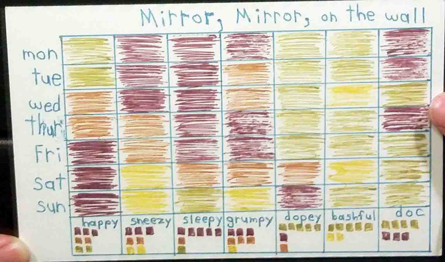
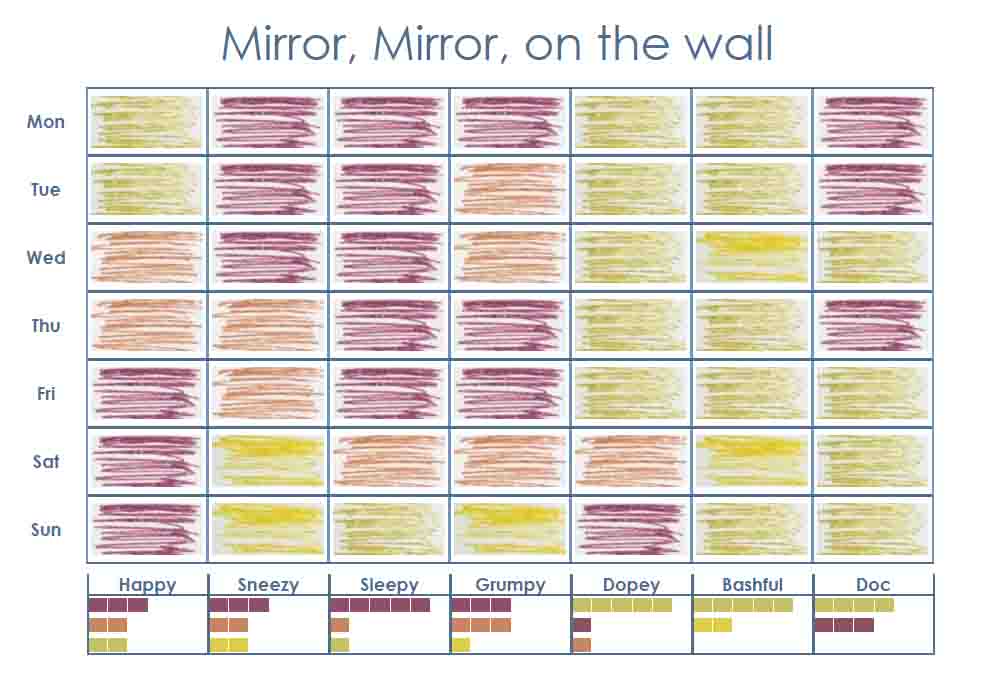
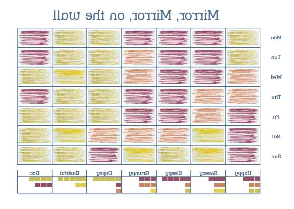
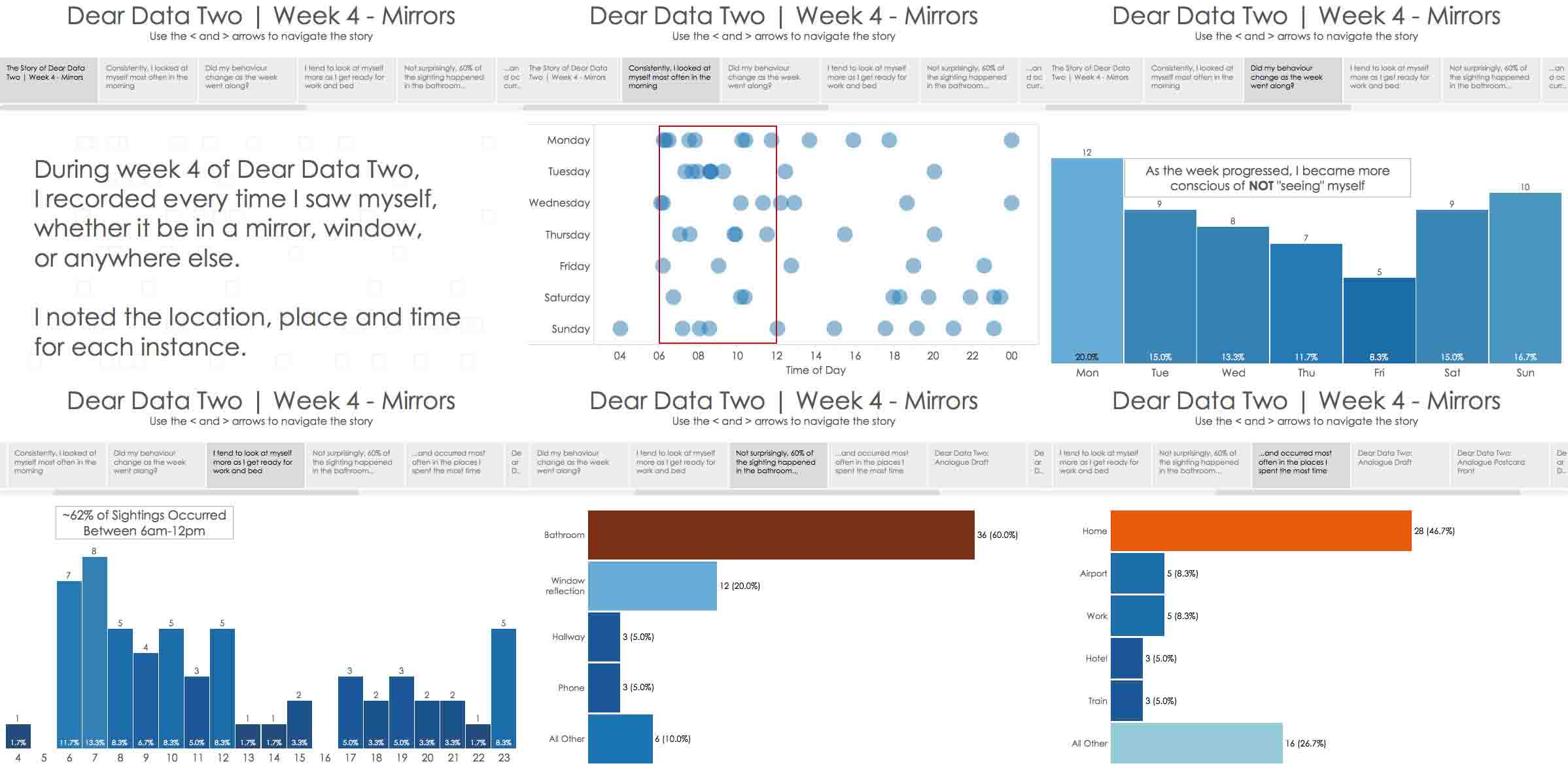
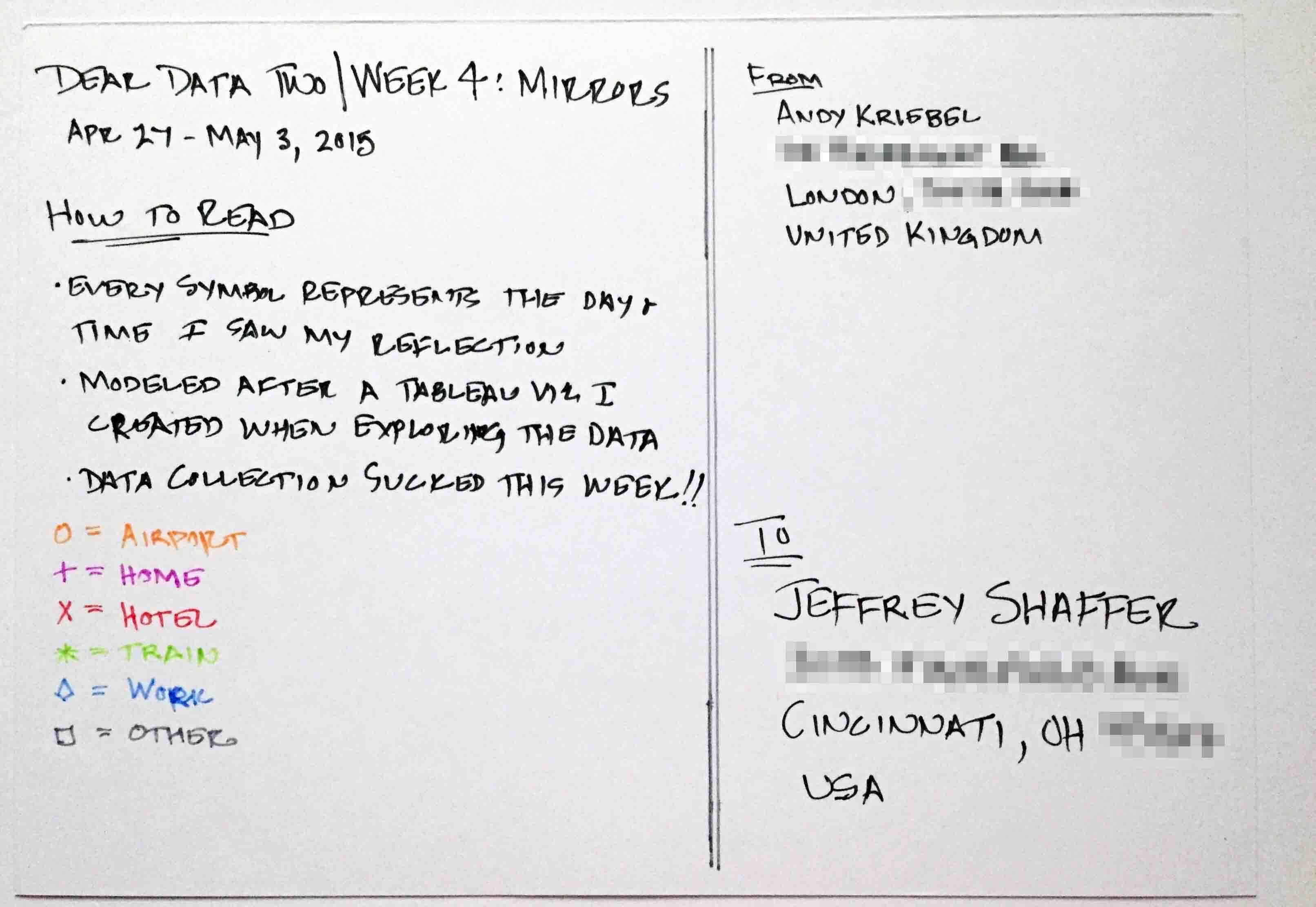
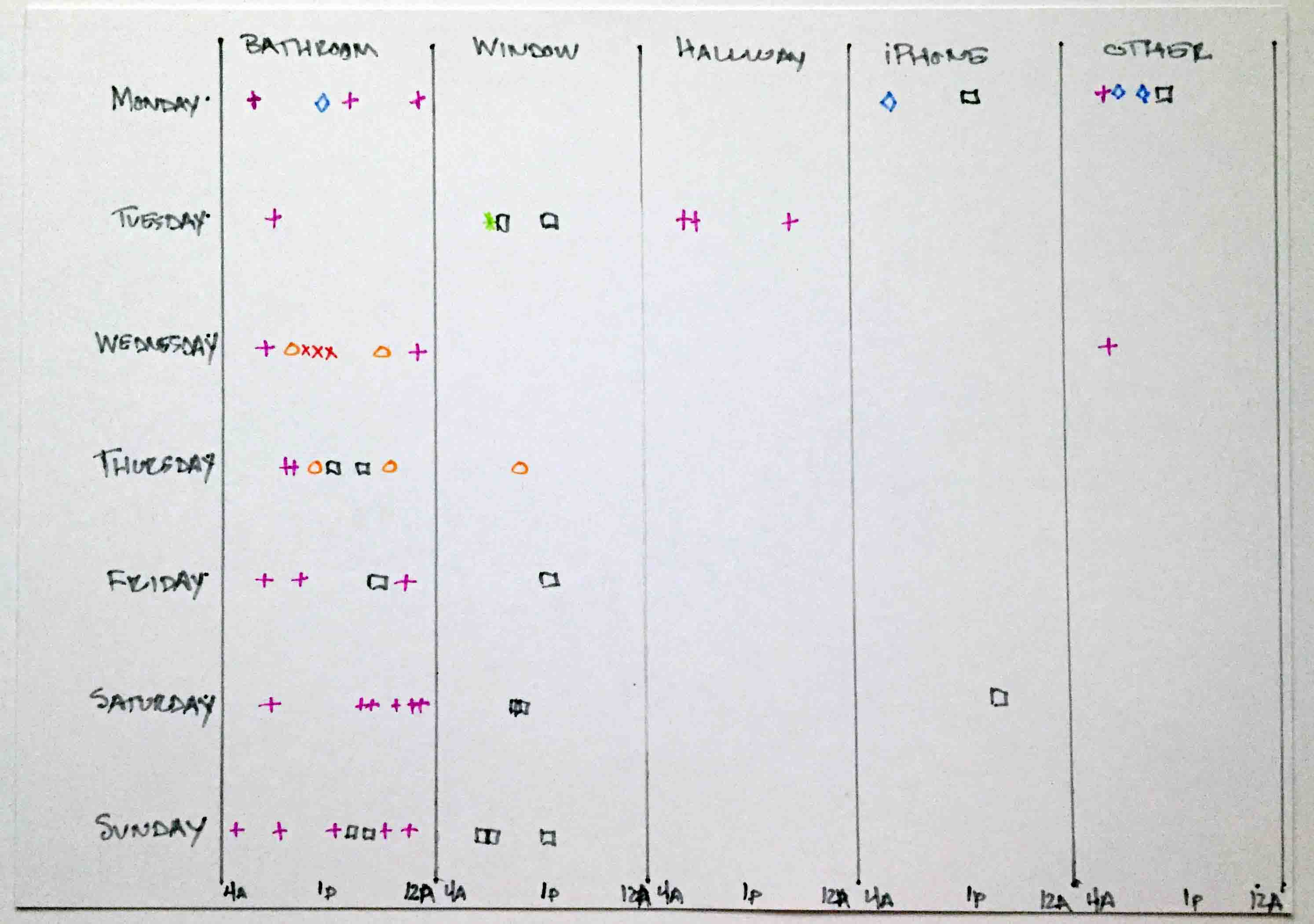
- 4 - Mirrors
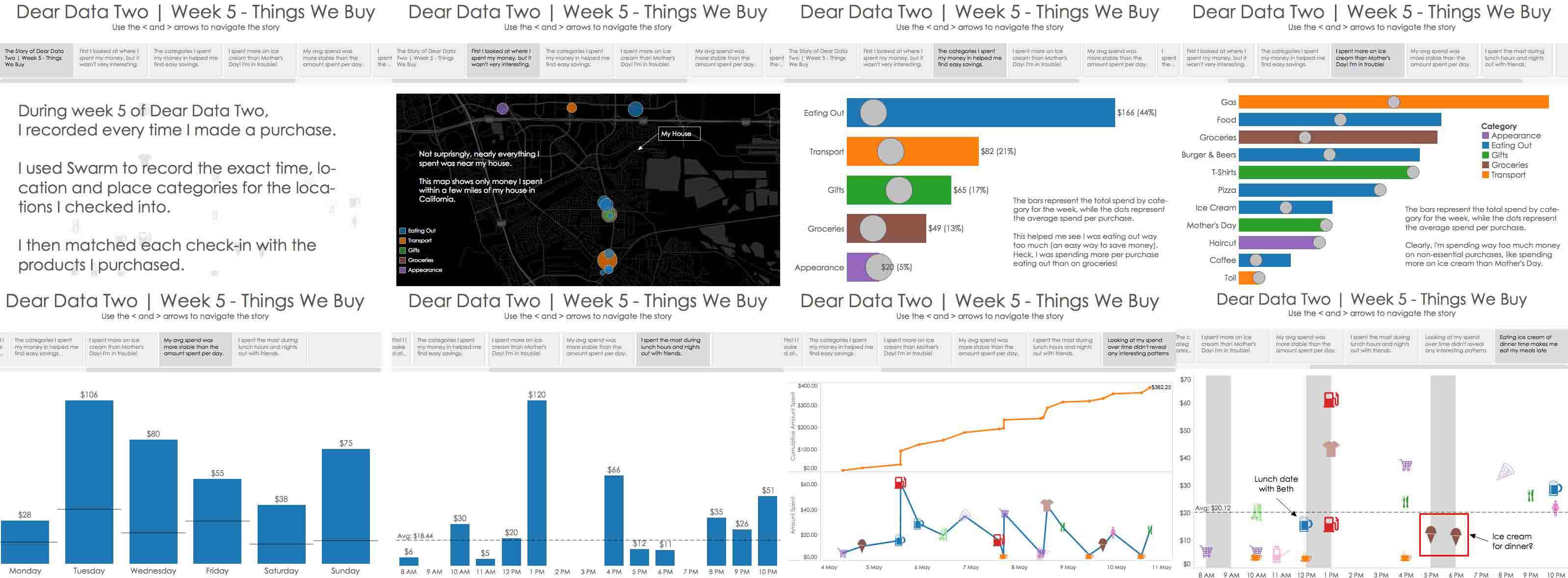
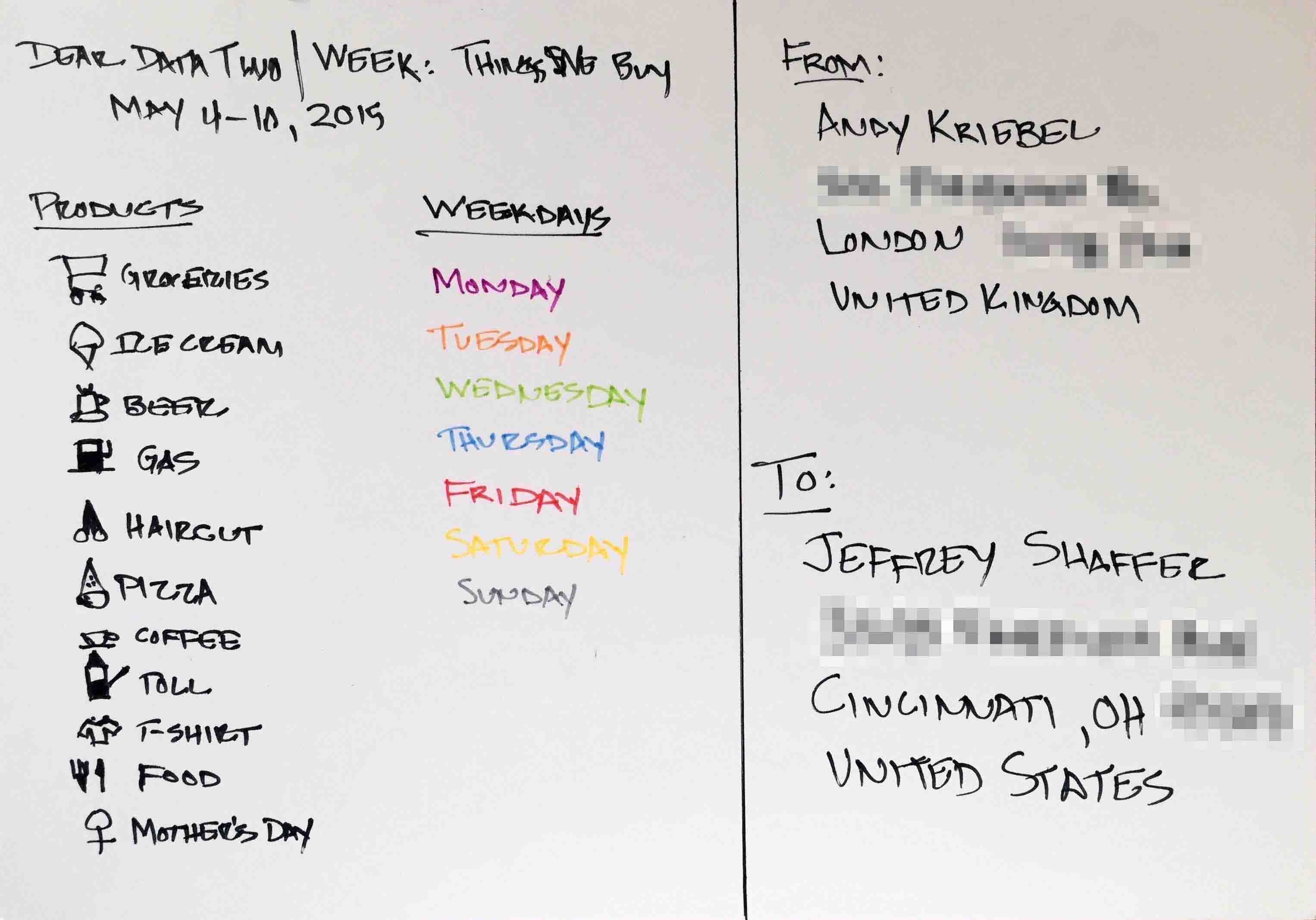
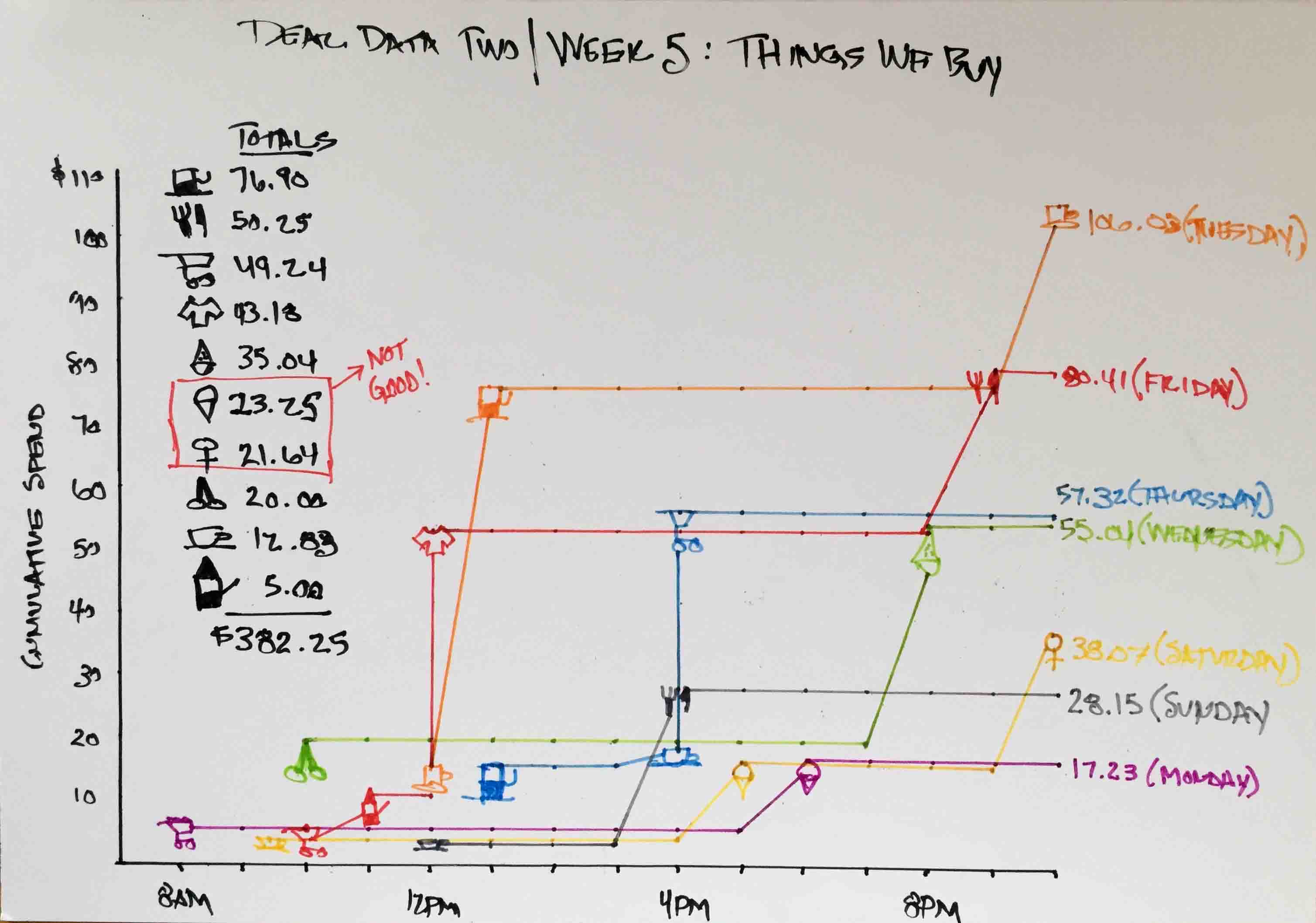
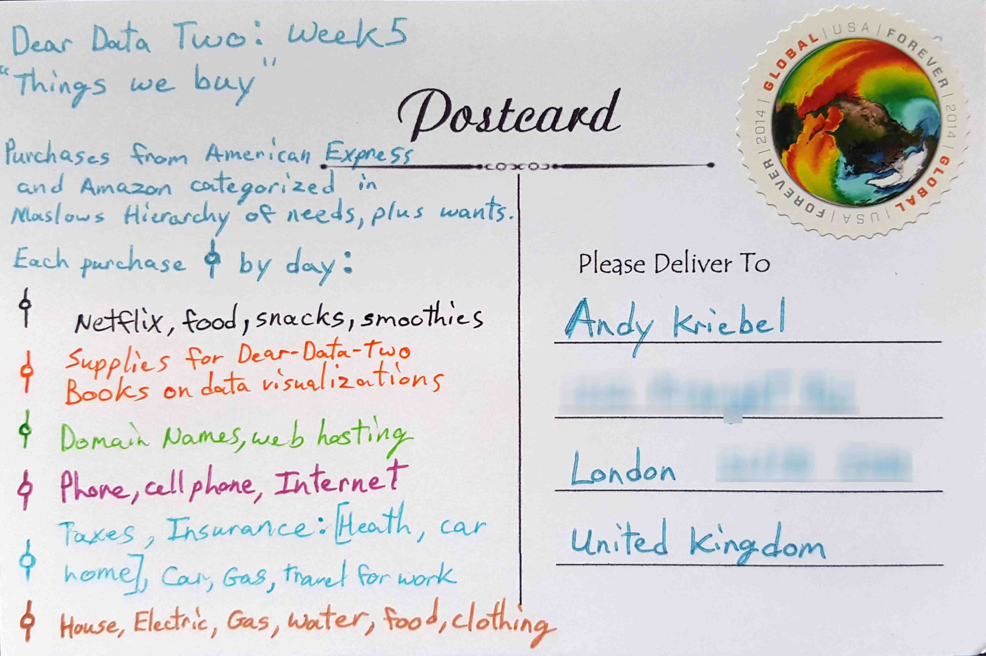
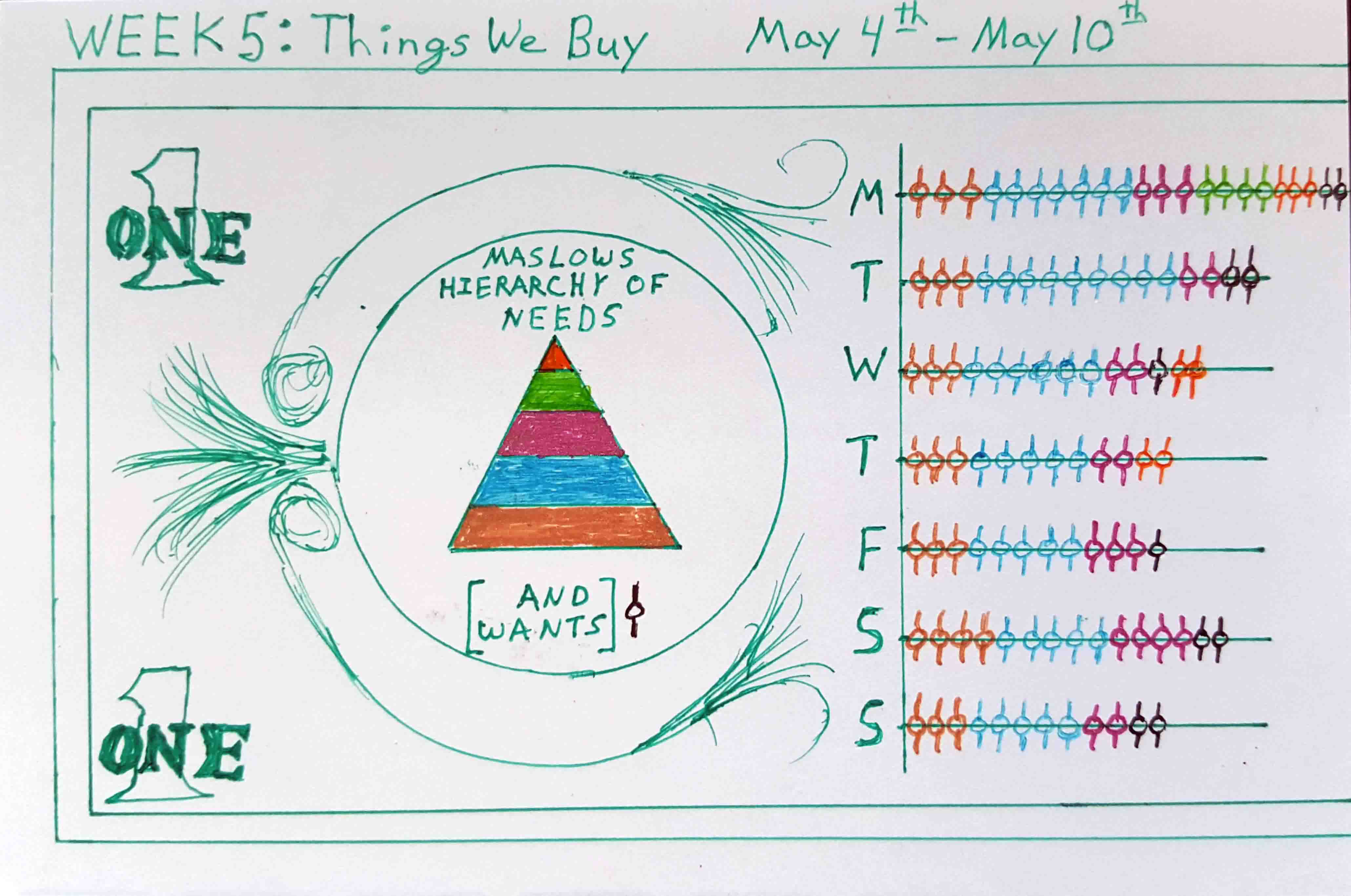
- 5 - Things We Buy
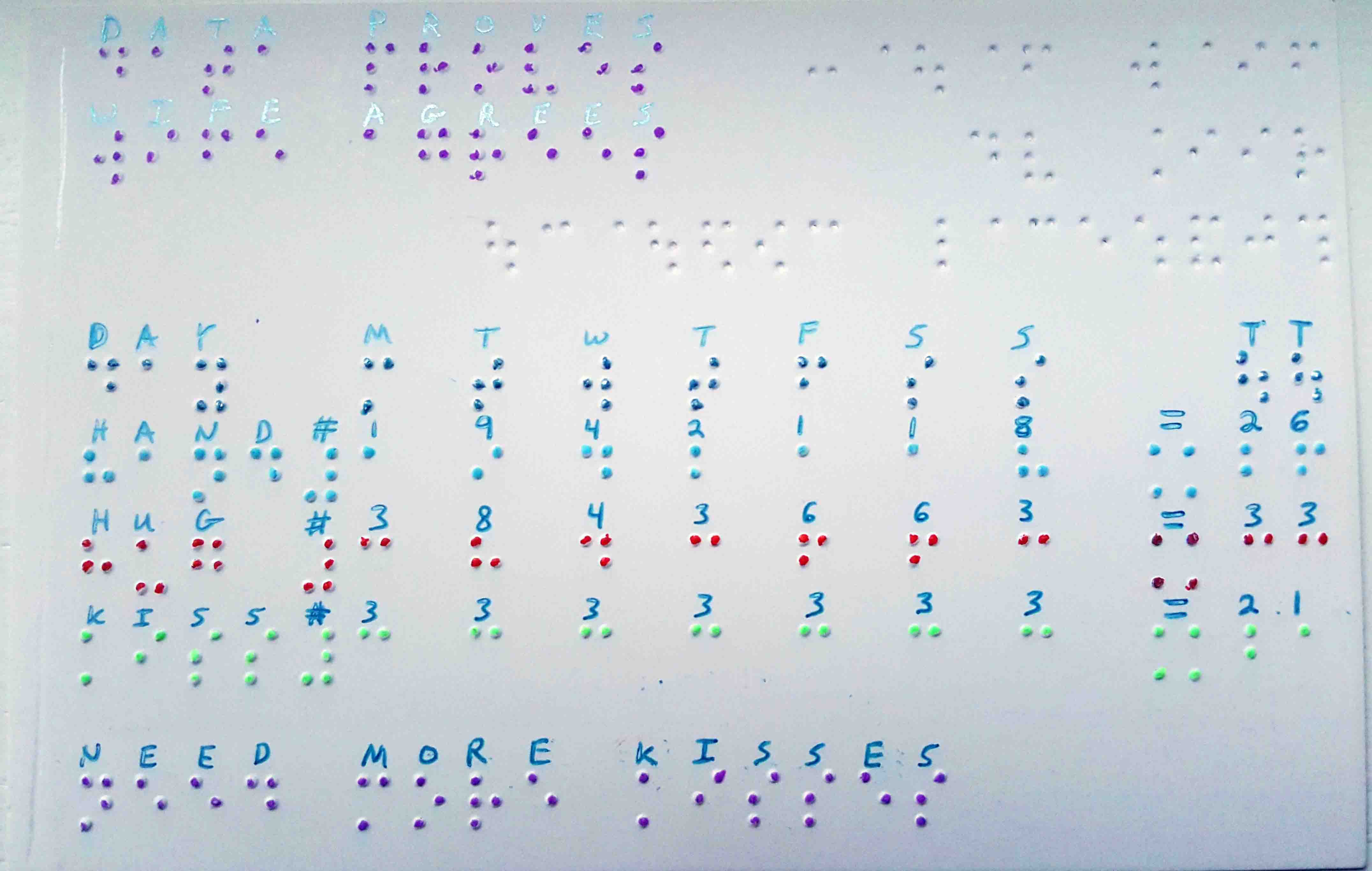
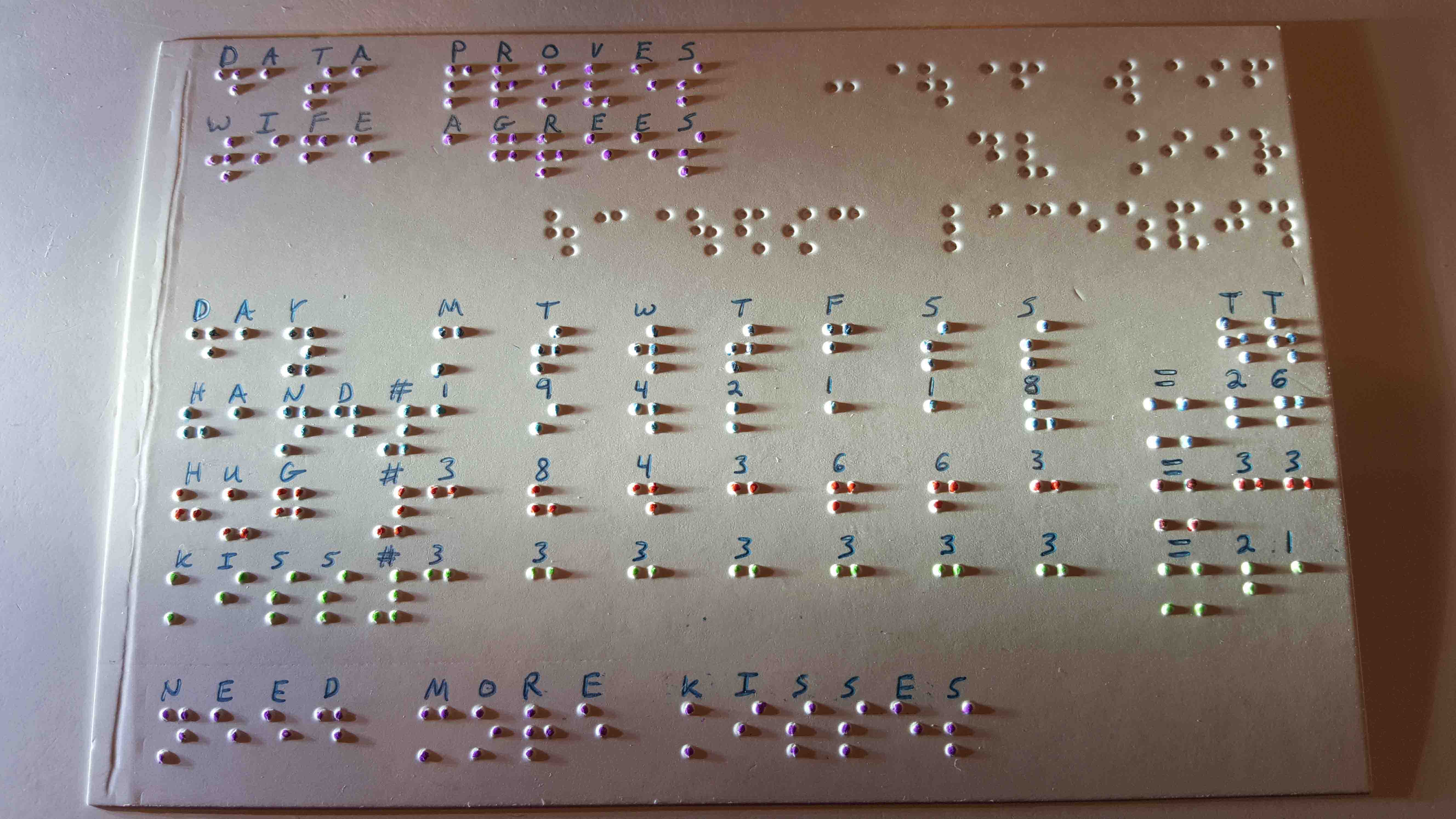
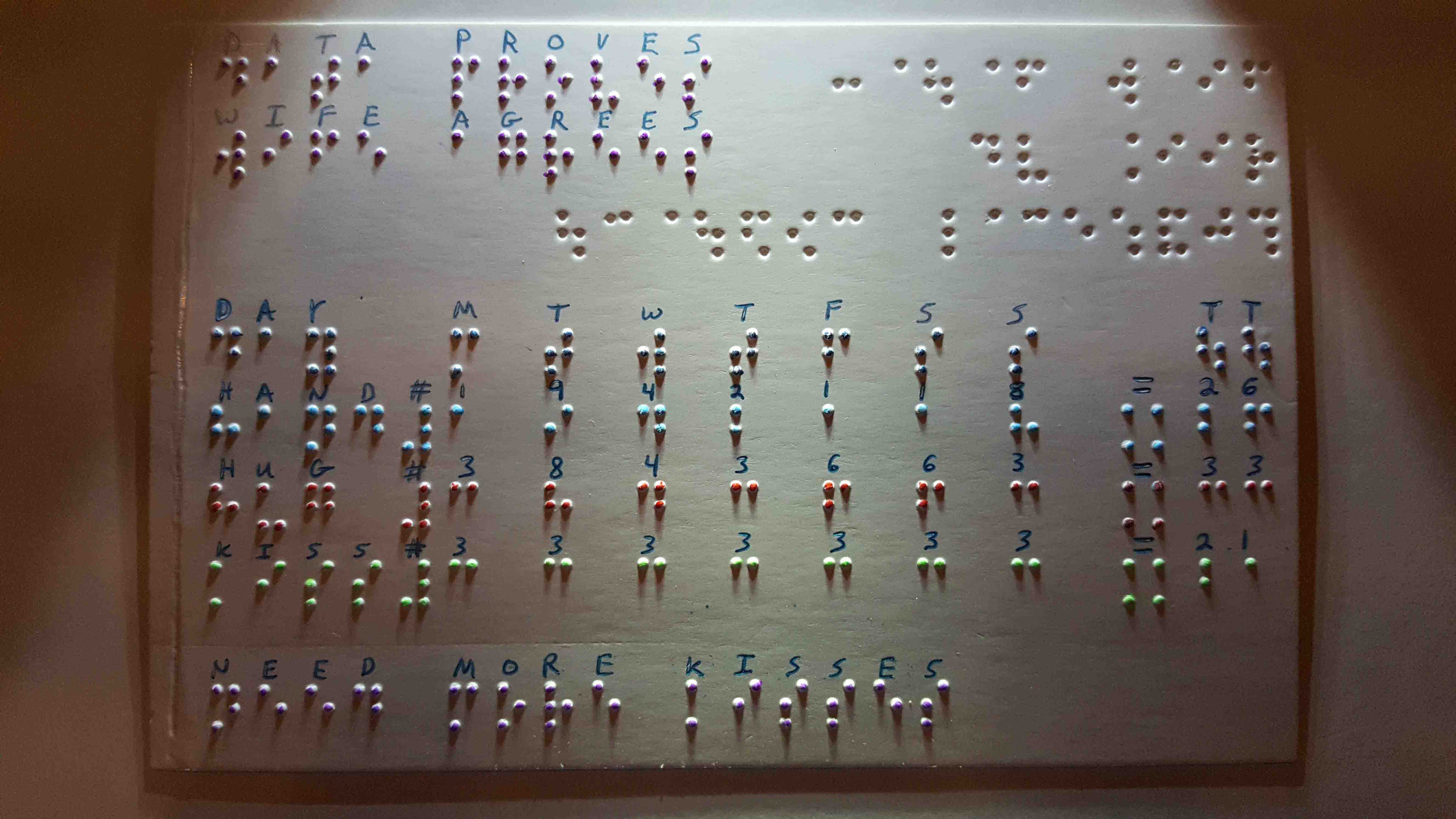
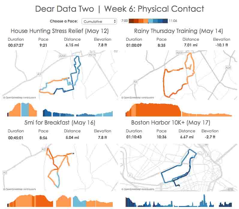
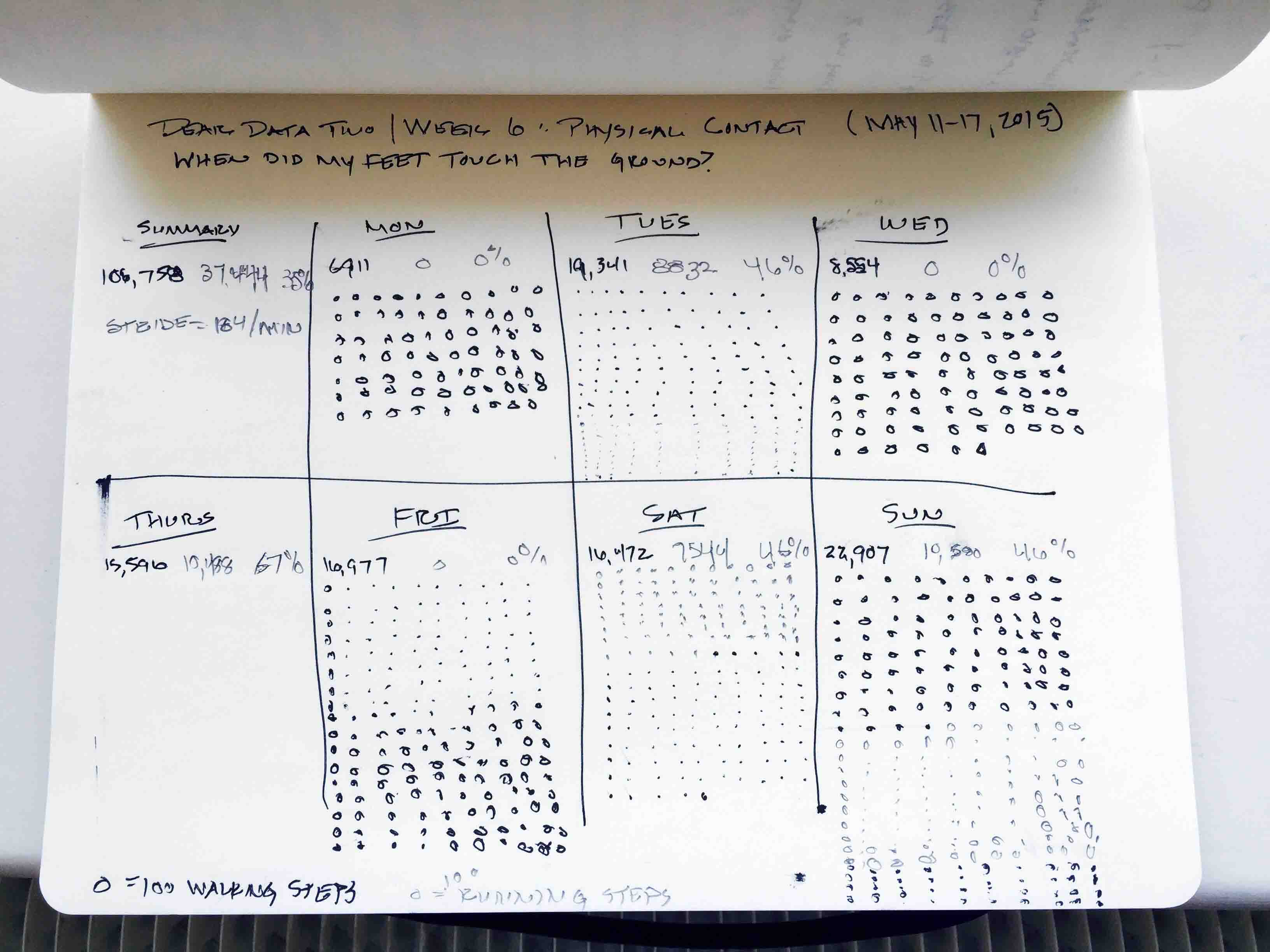
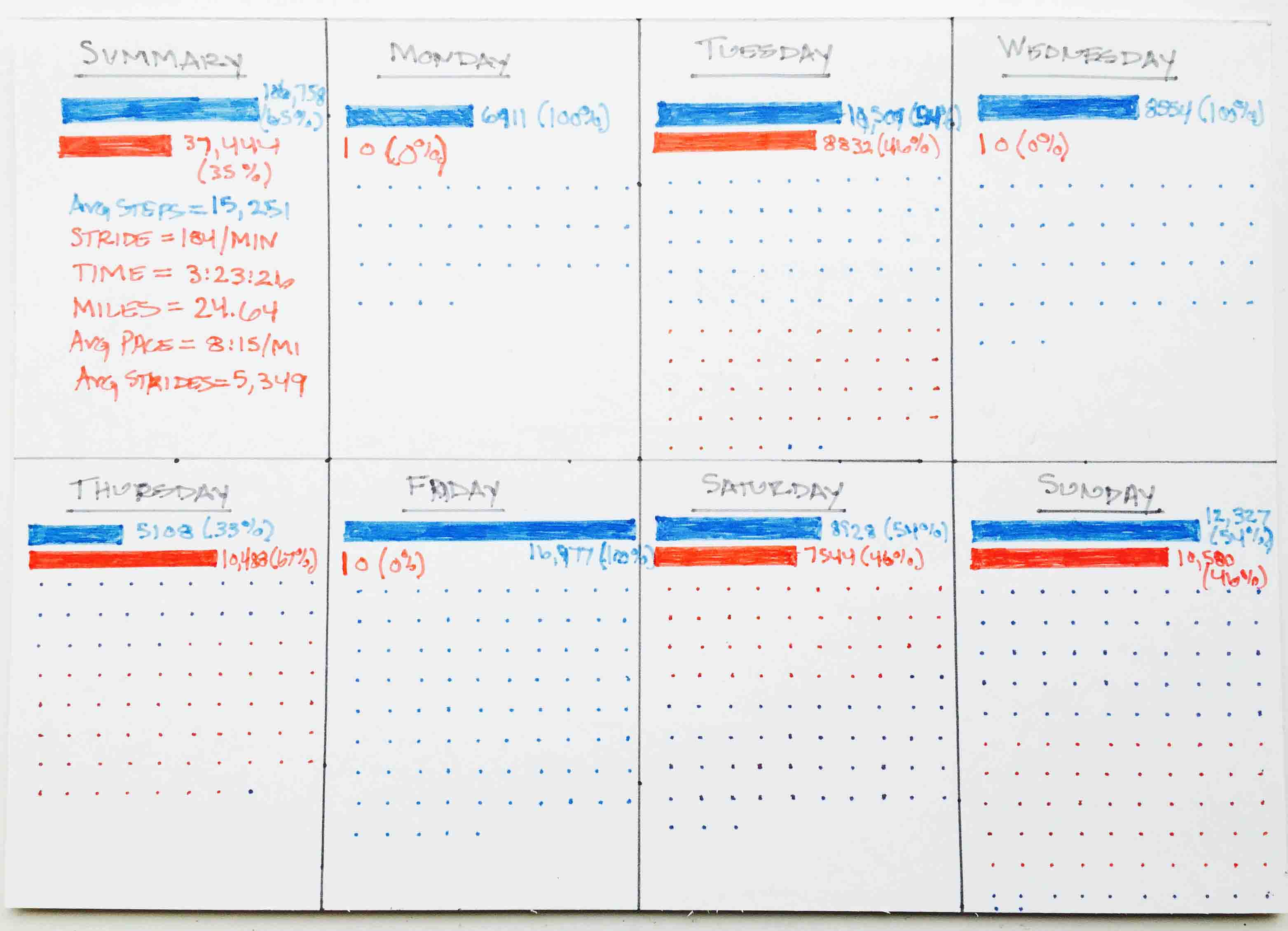
- 6 - Physical Contact
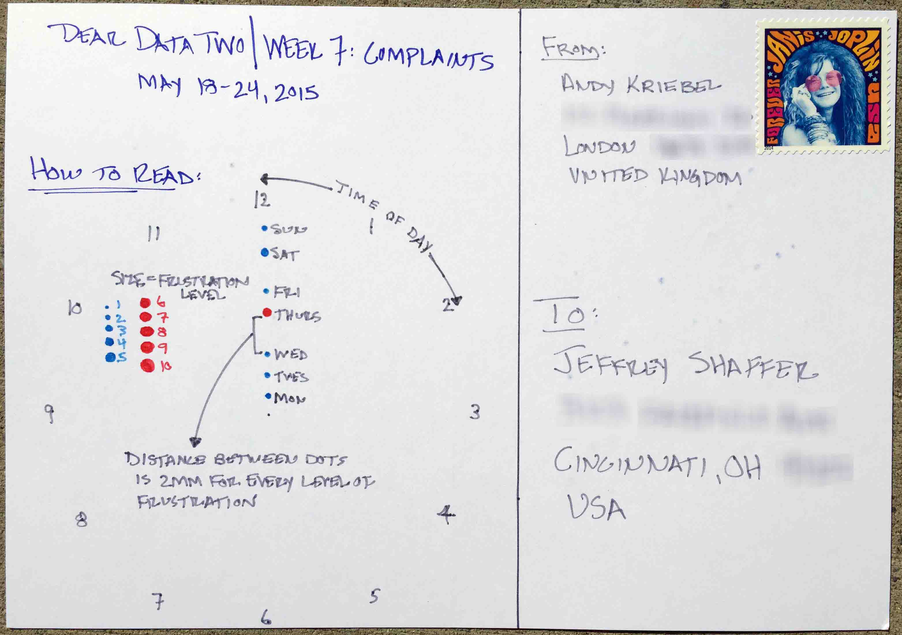
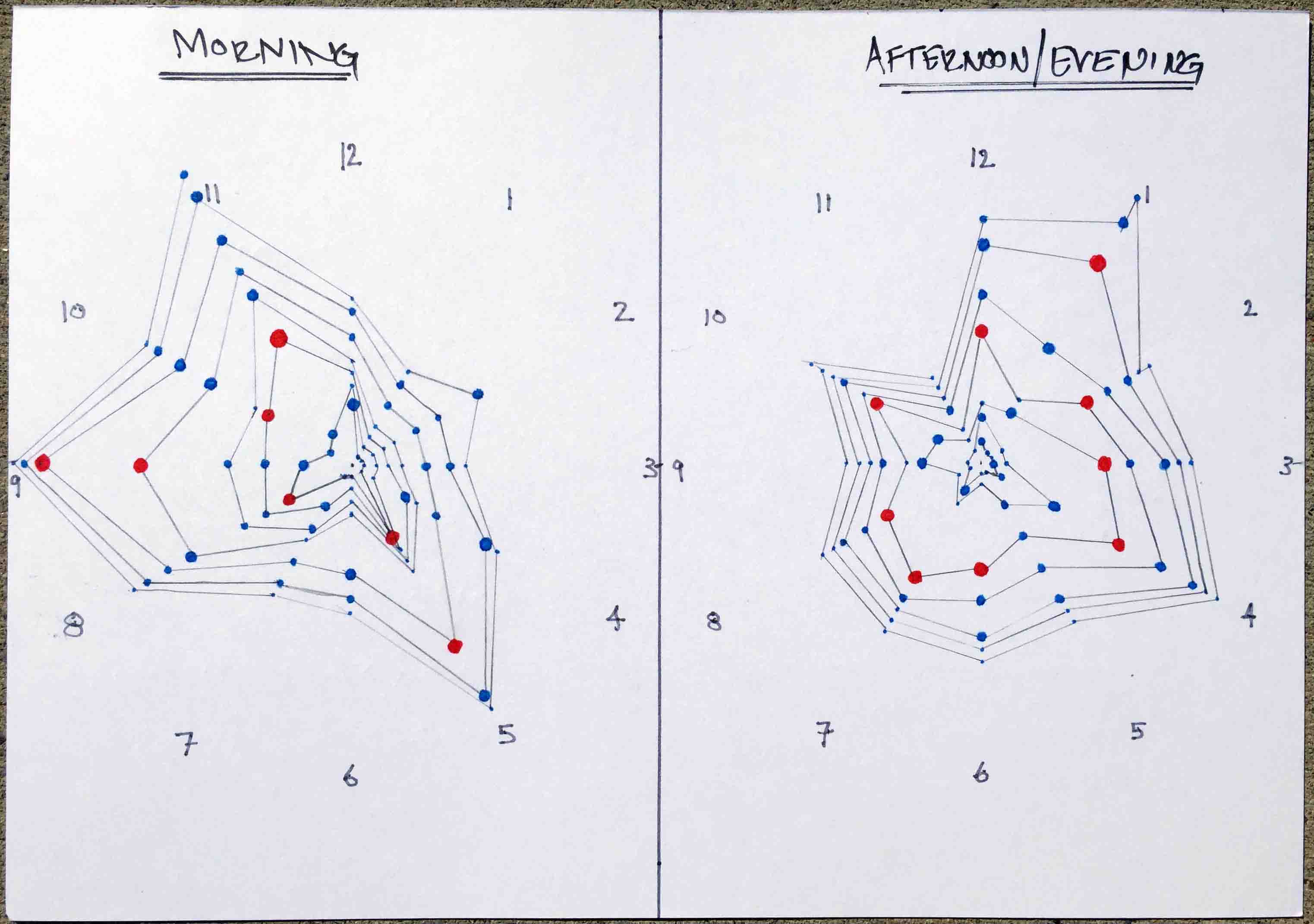
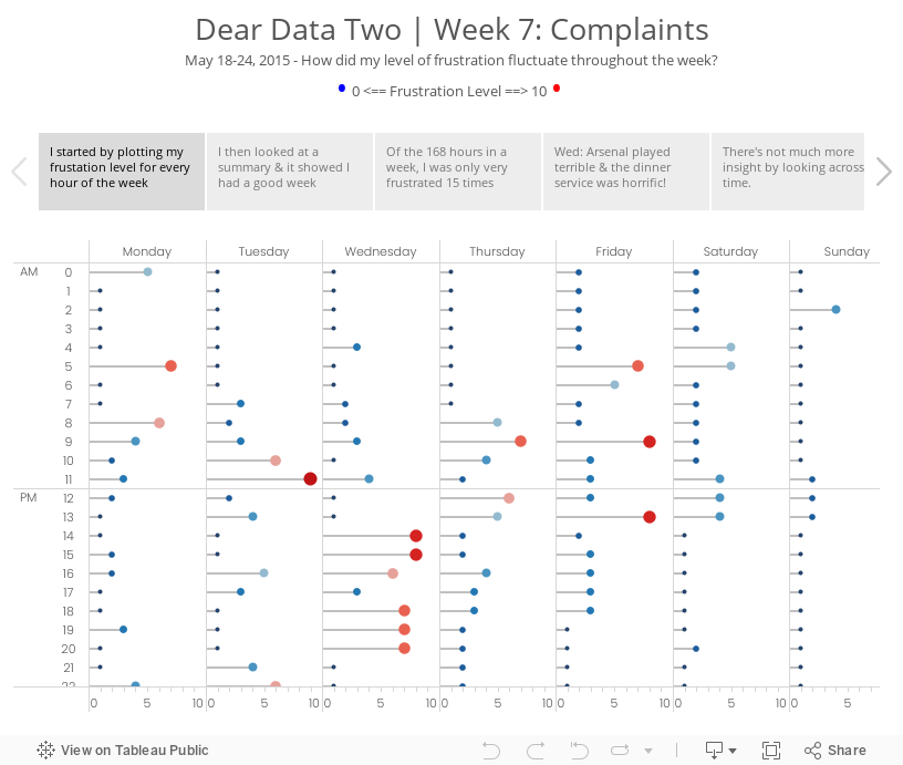
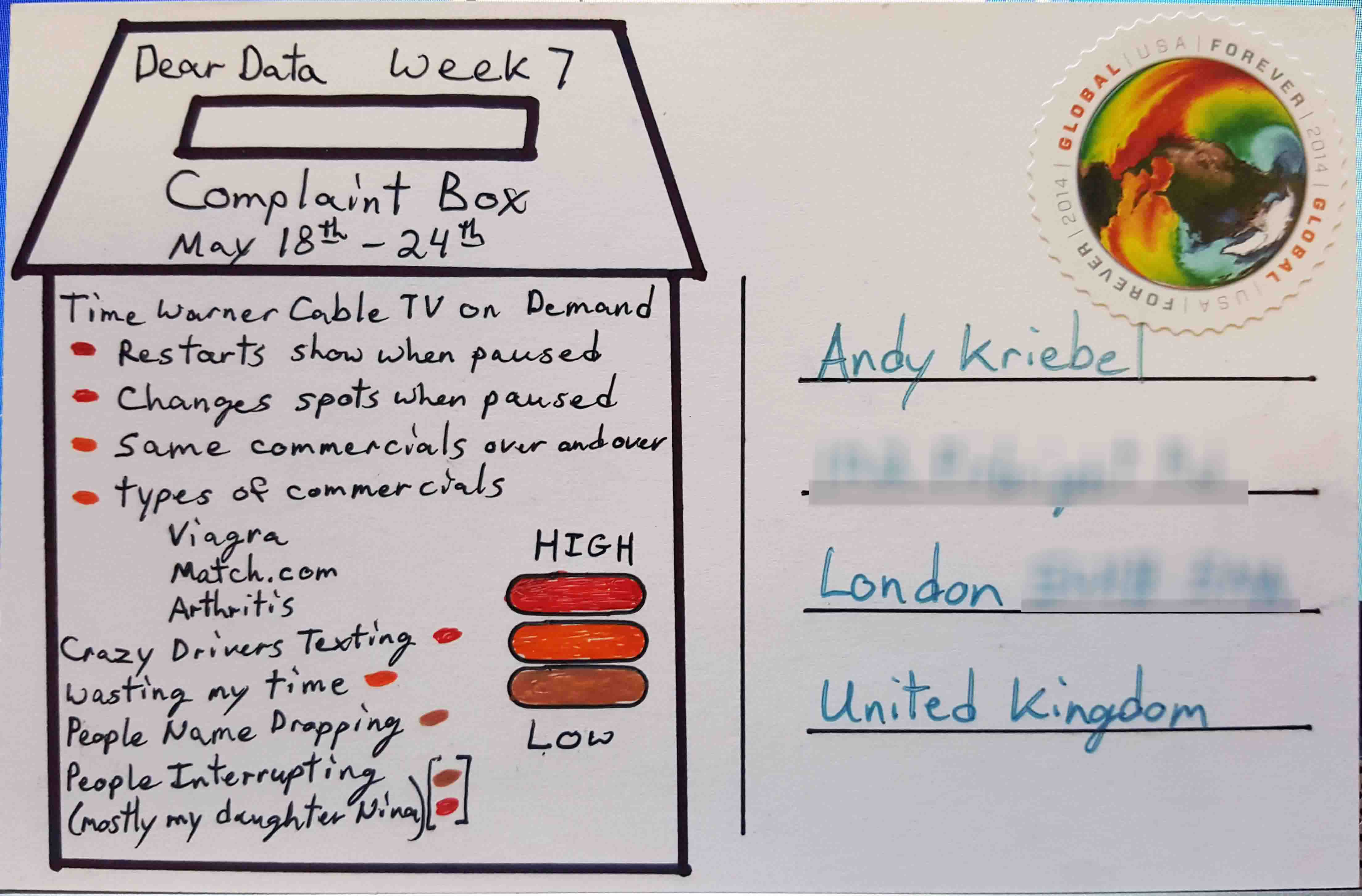
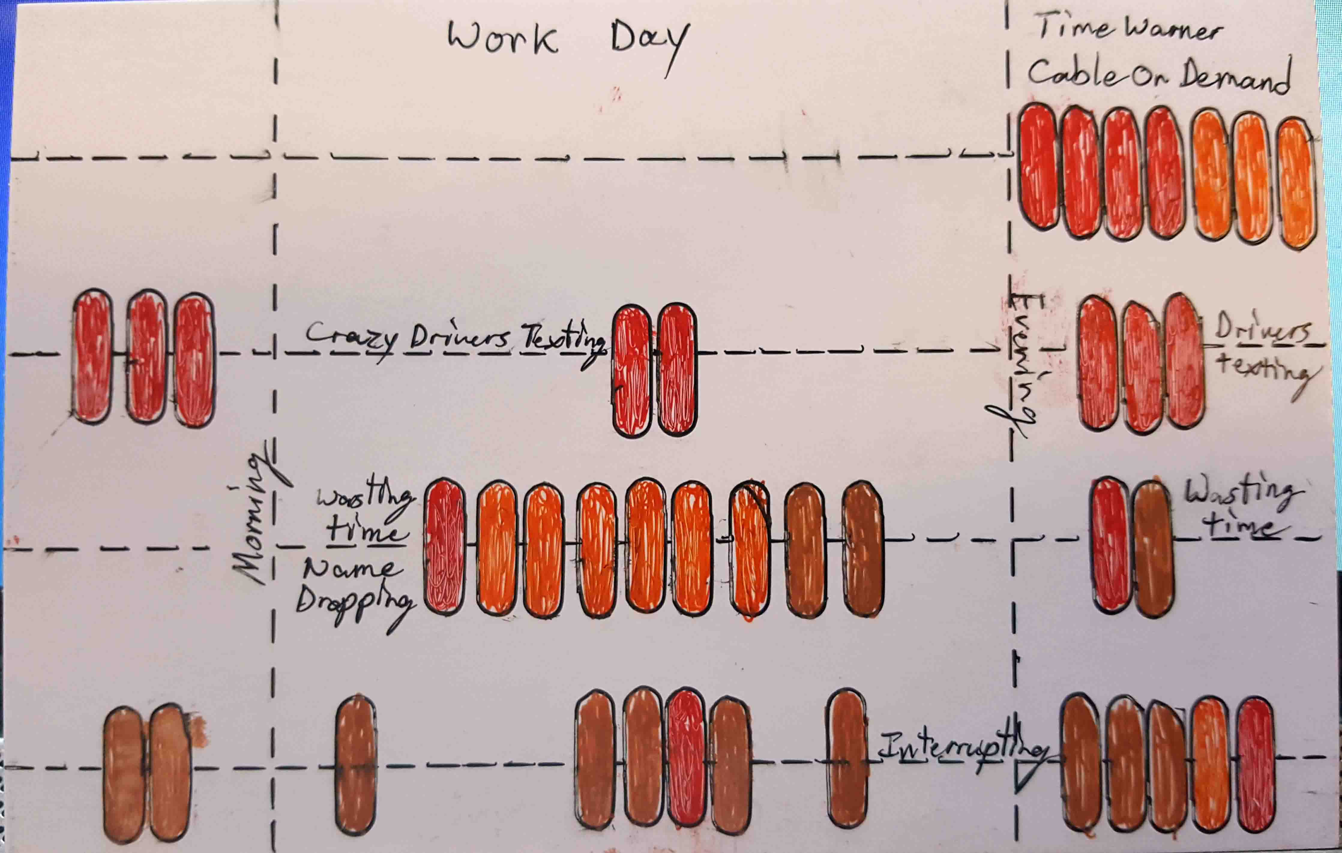
- 7 - Complaints
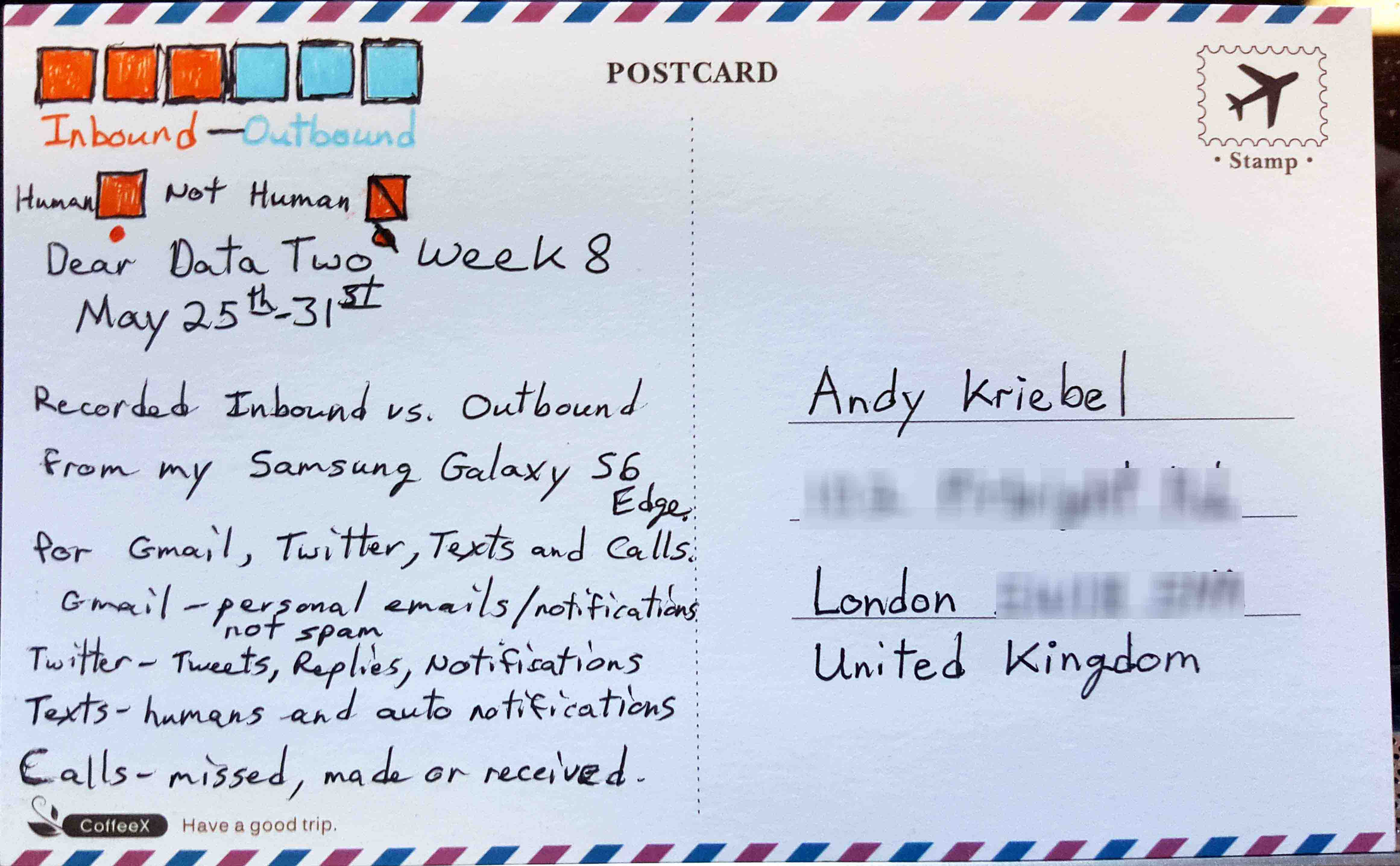
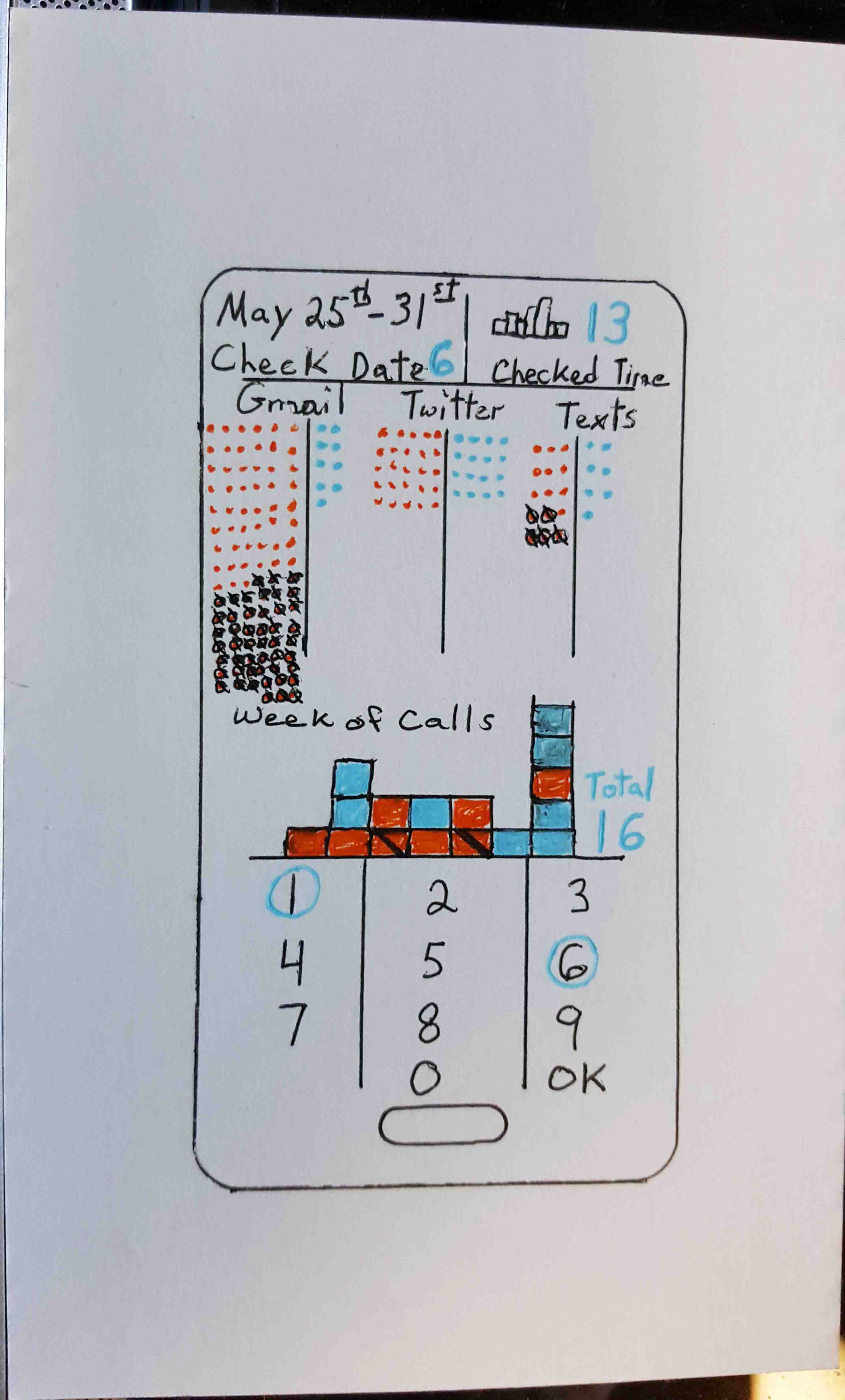
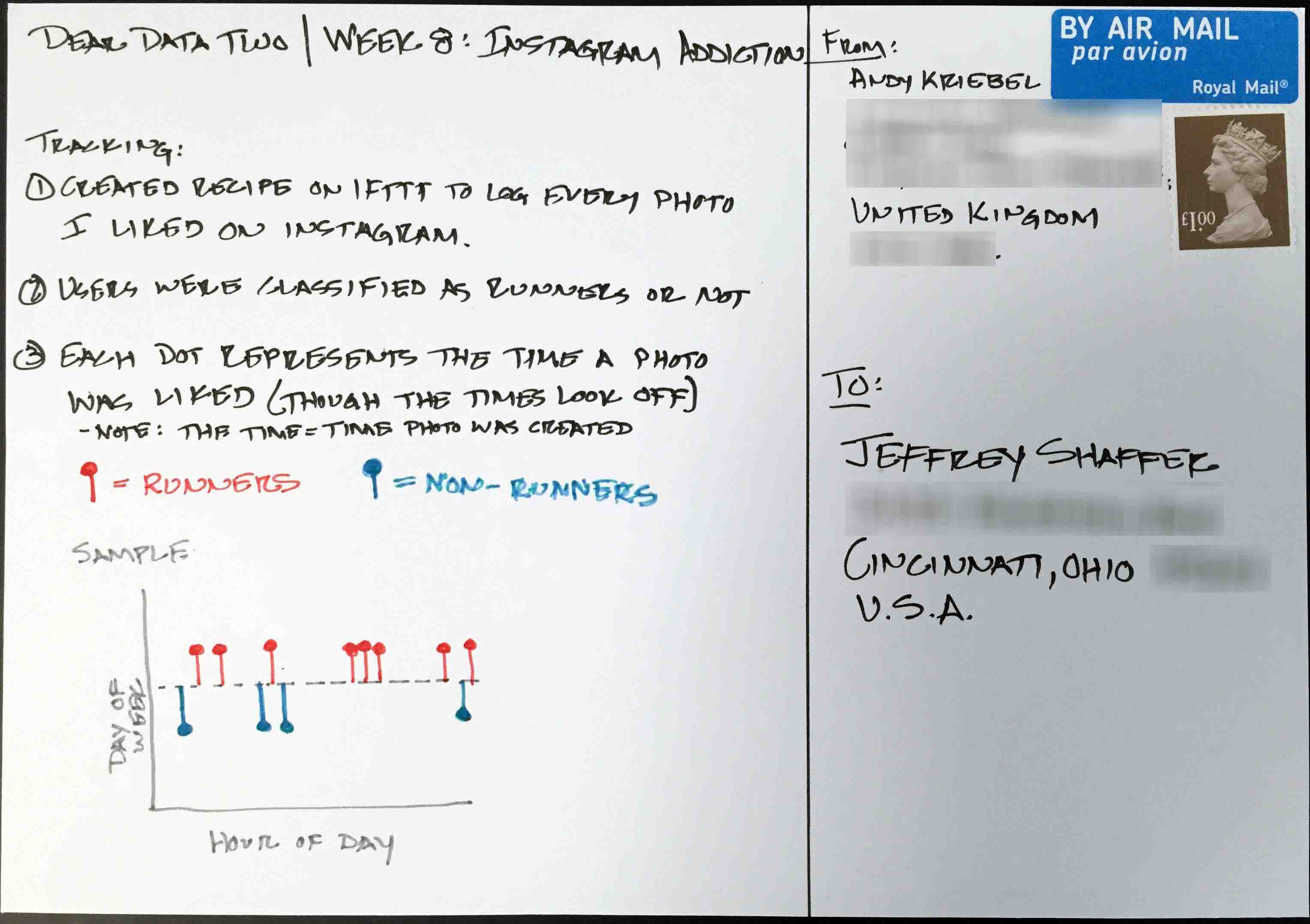
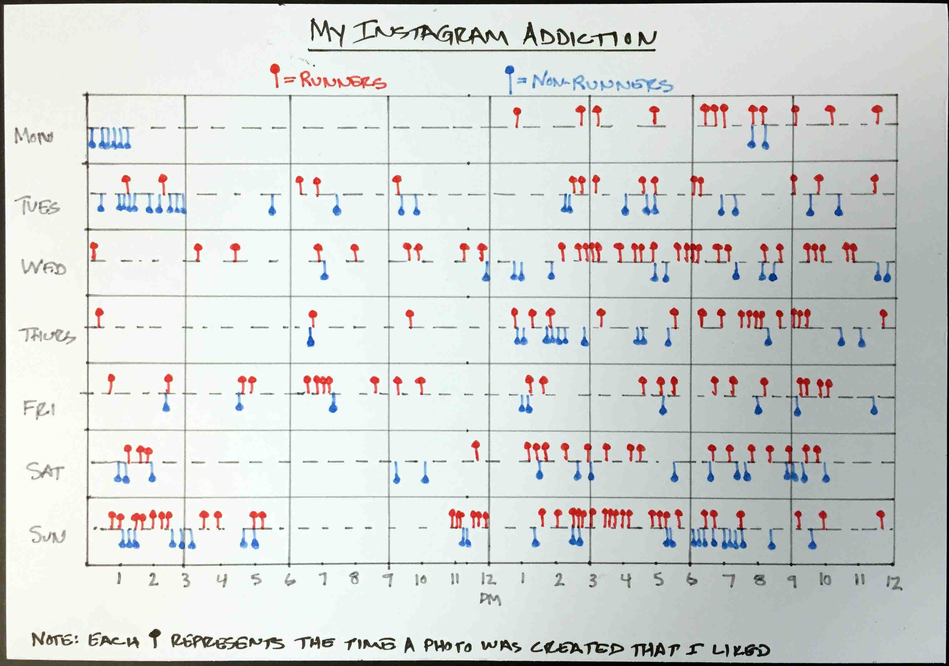
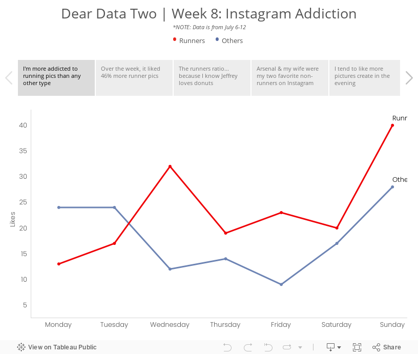
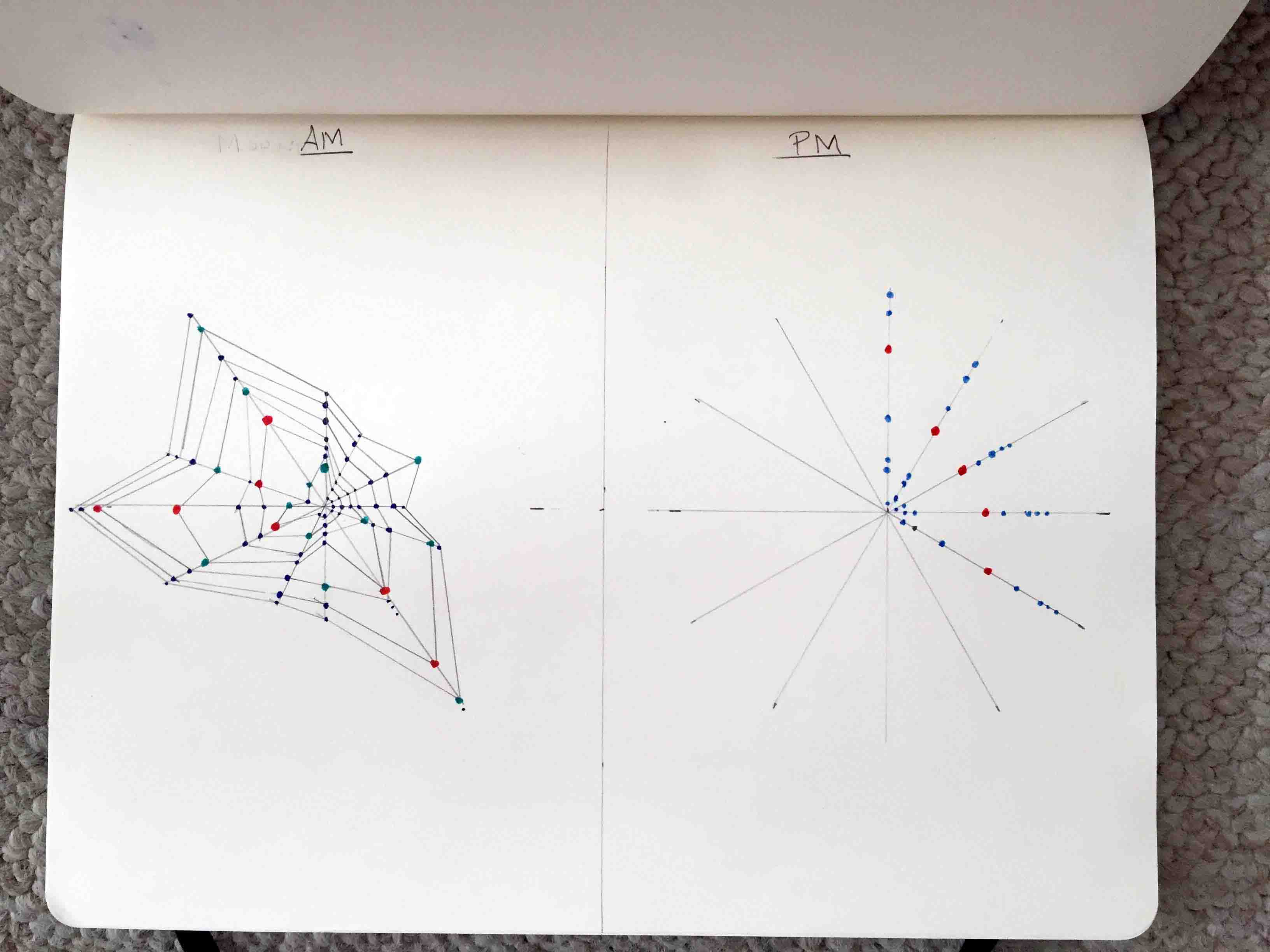
- 8 - Phone Addiction
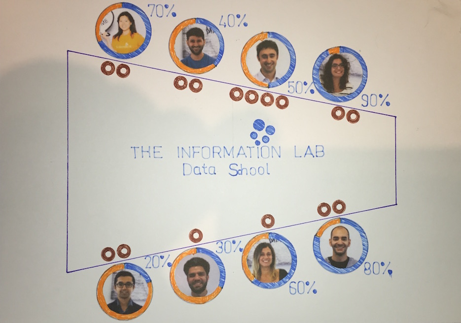
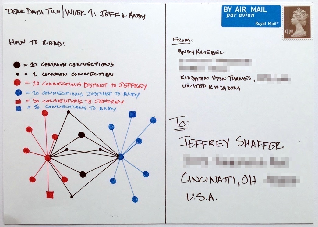
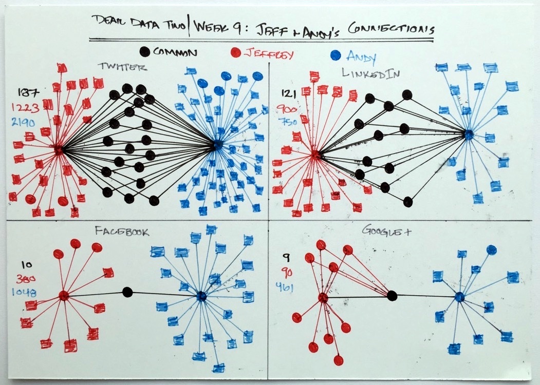
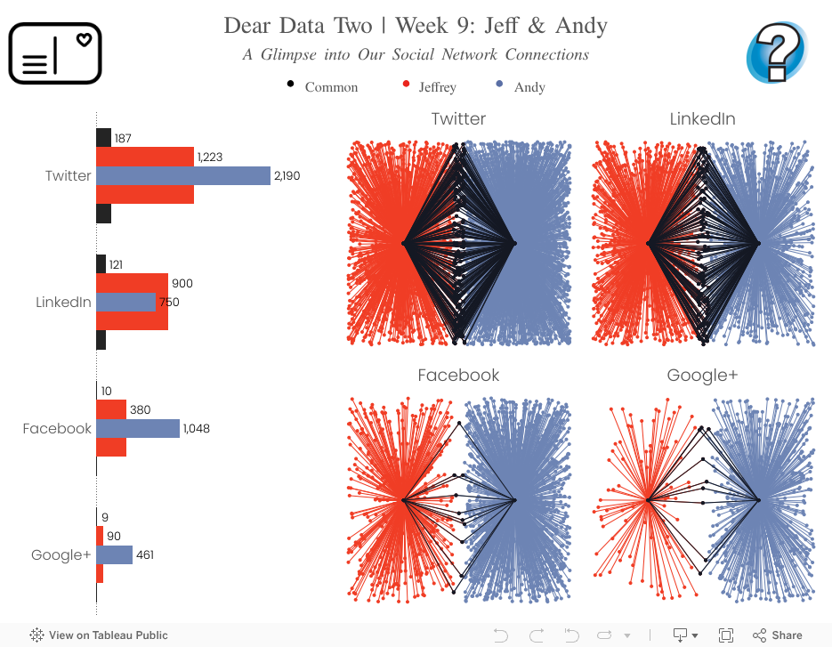
- 9 - Jeff and Andy
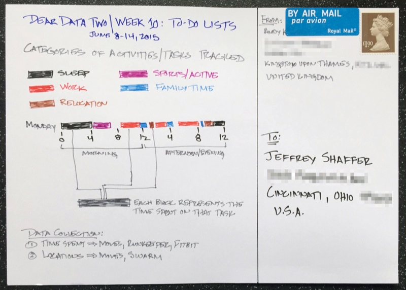
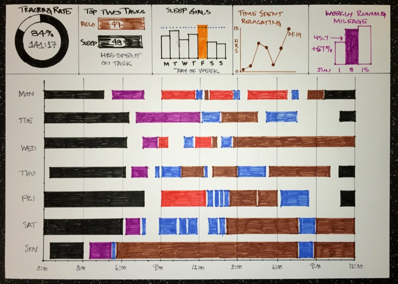
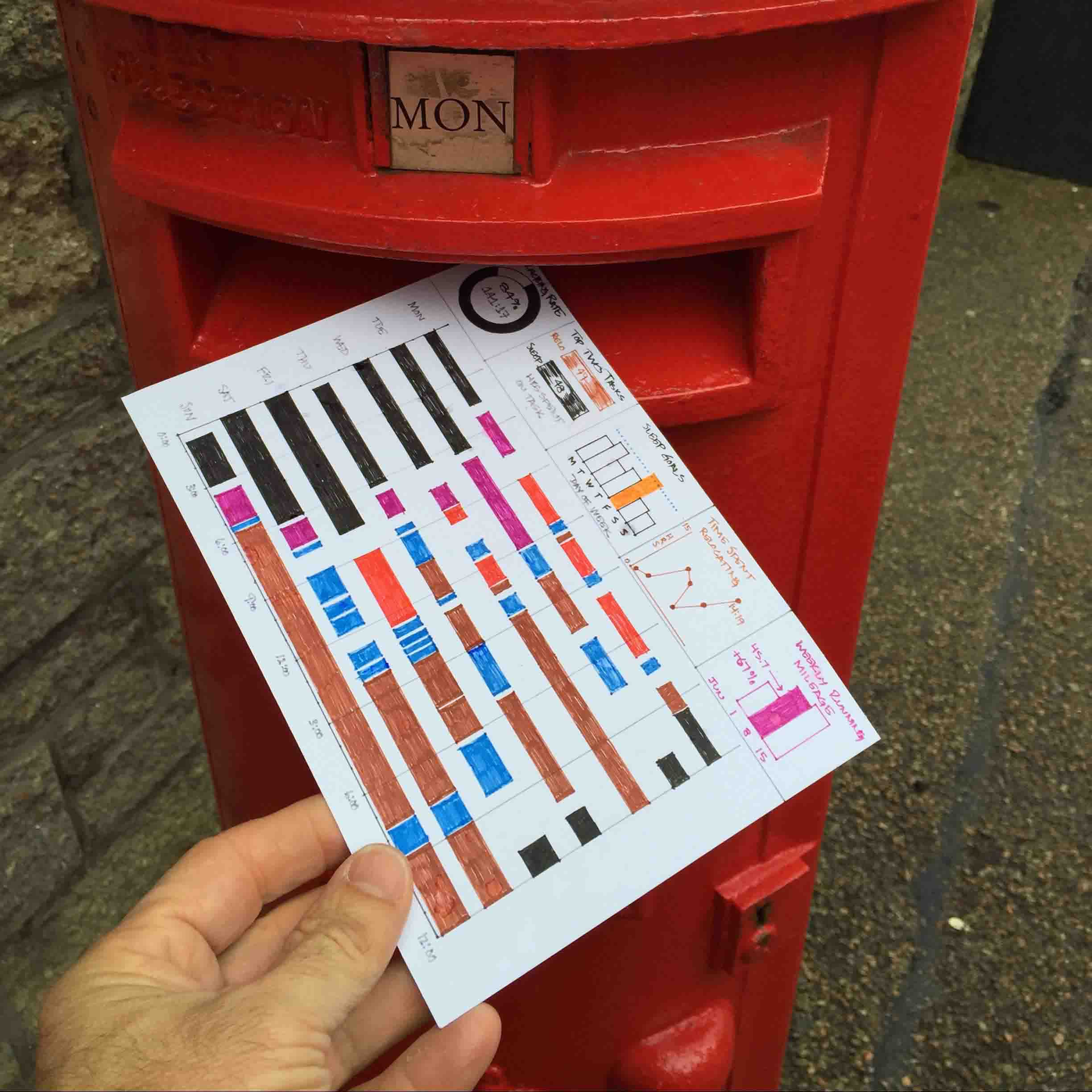
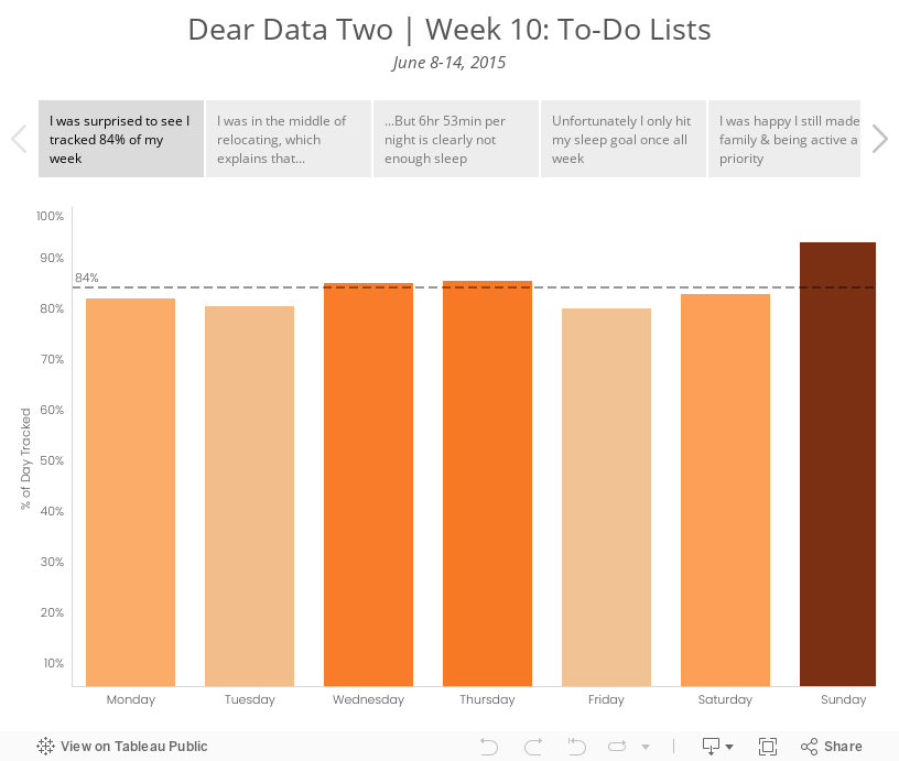
- 10 - To-Do-Lists
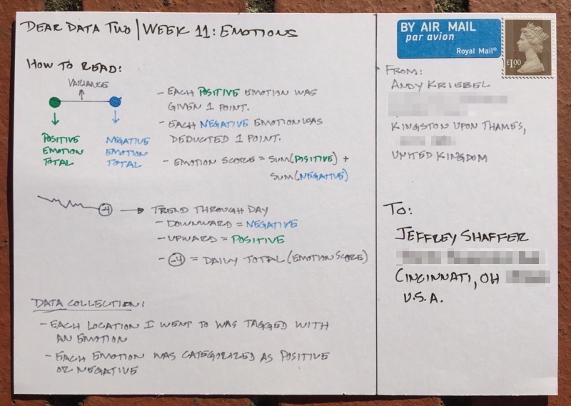
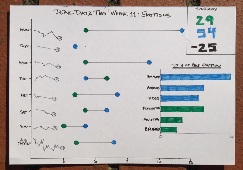
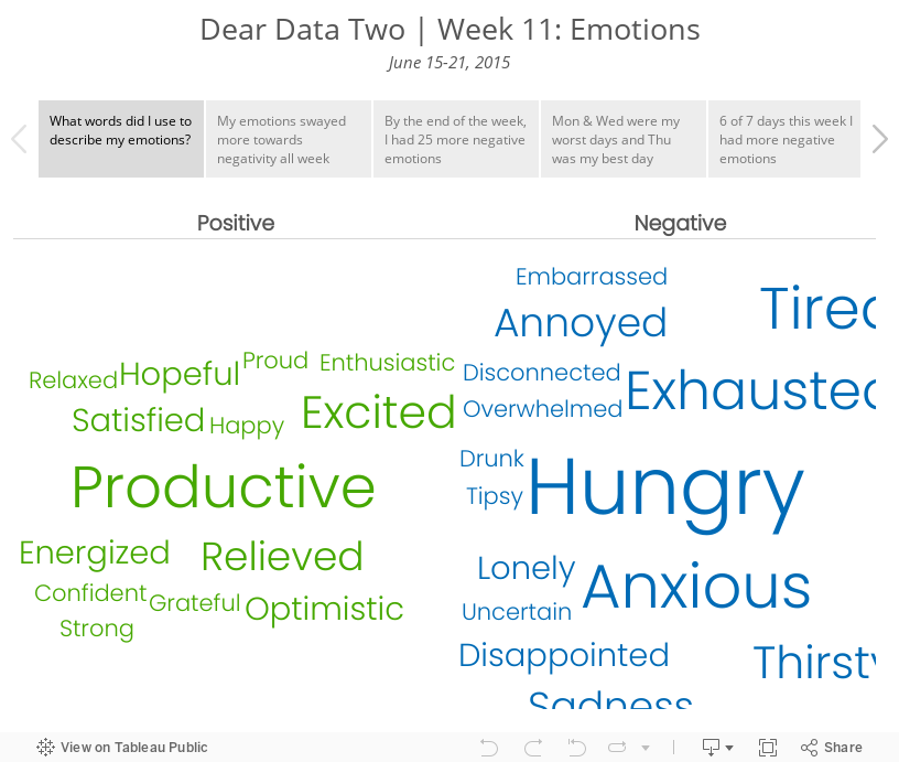
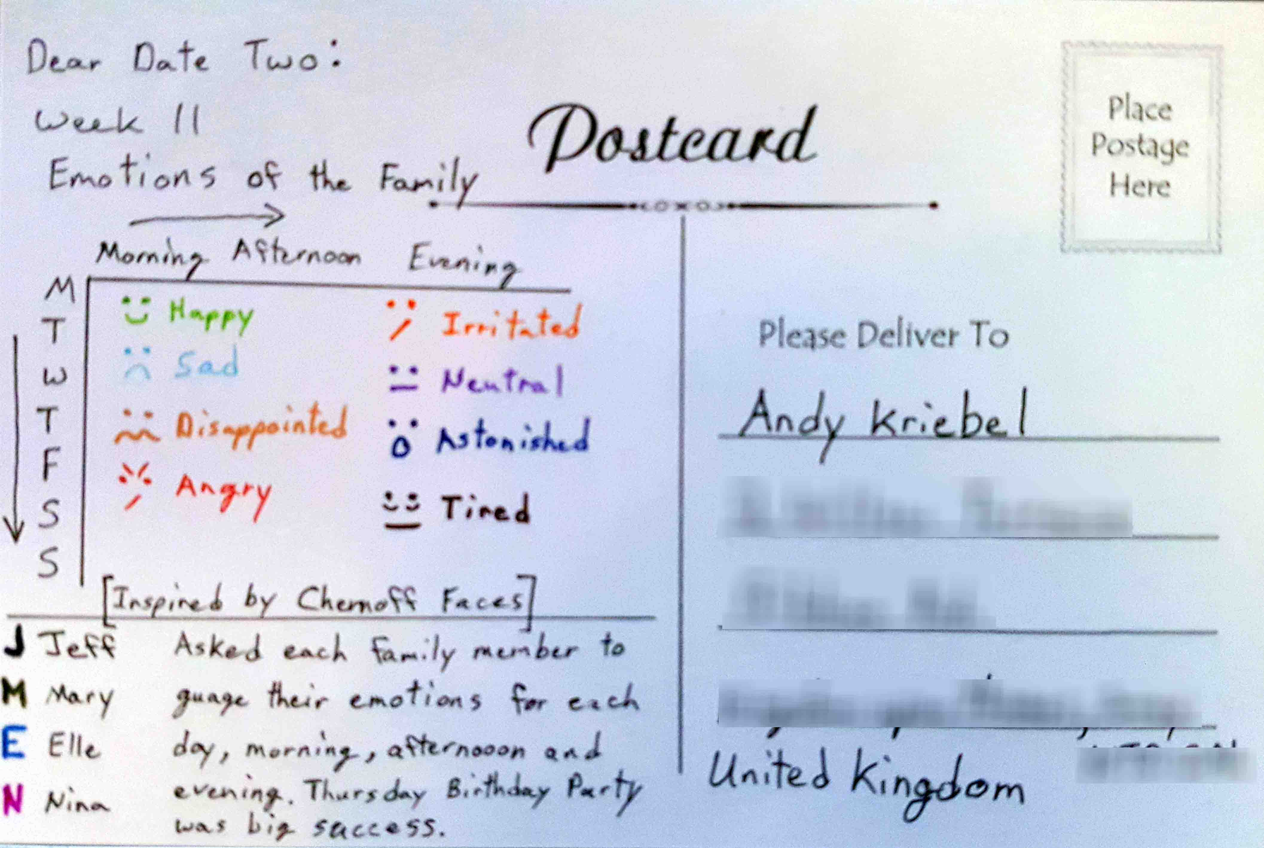
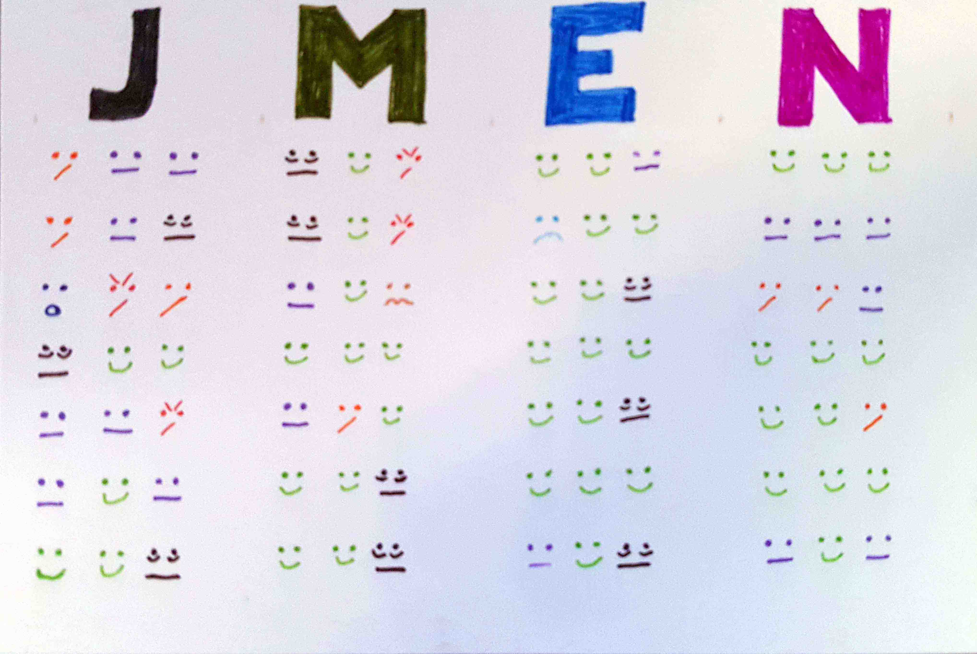
- 11 - Emotions
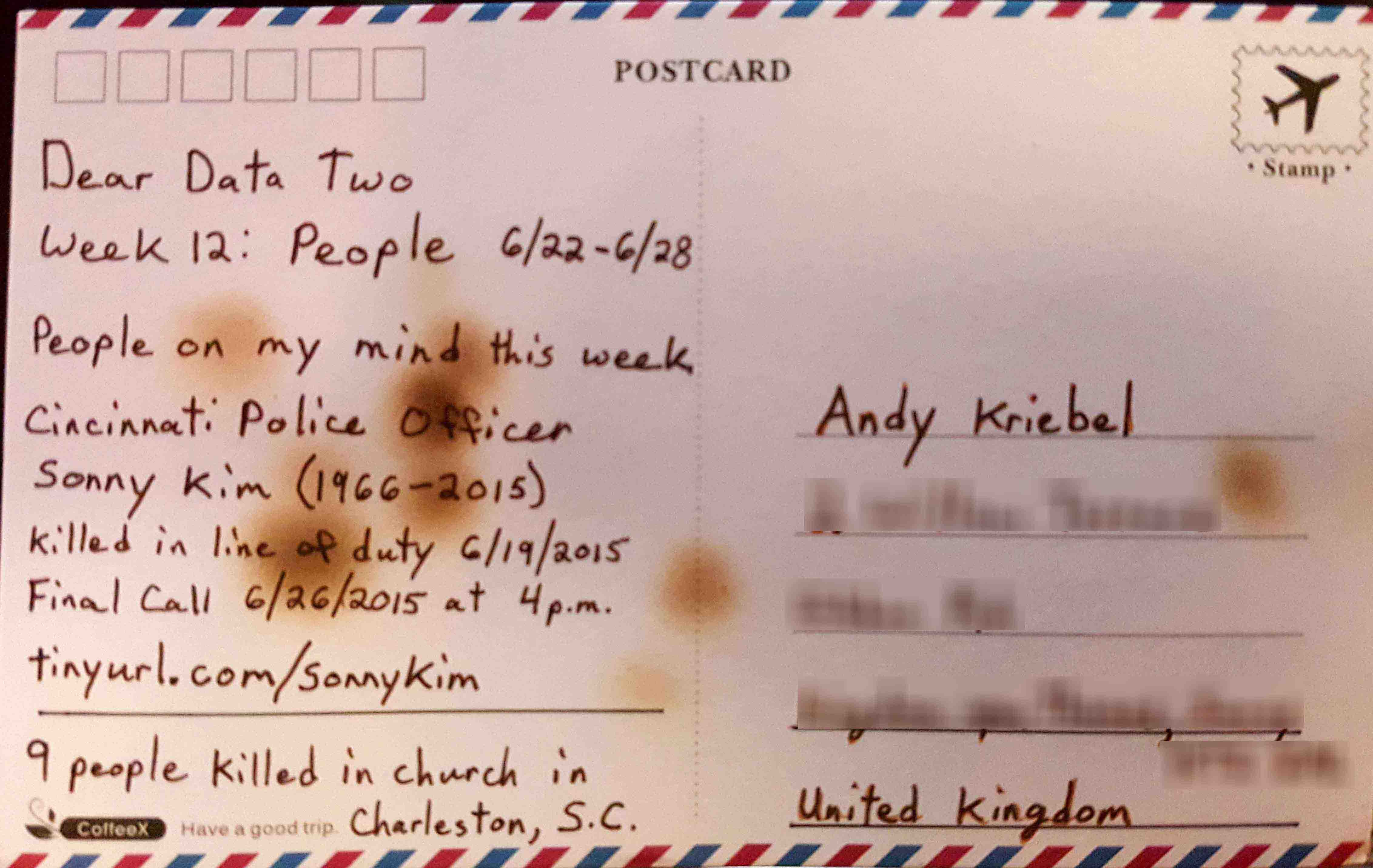
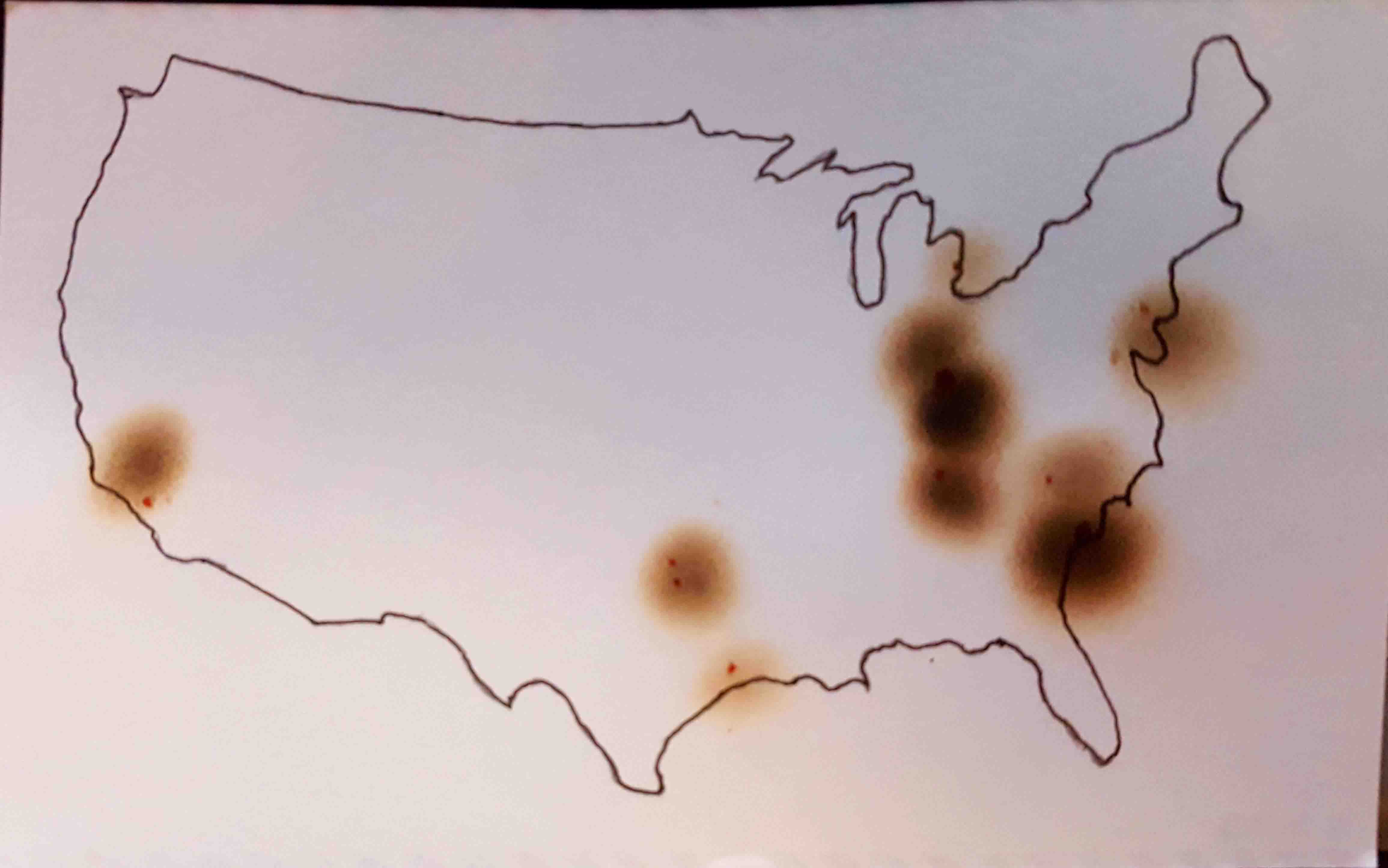
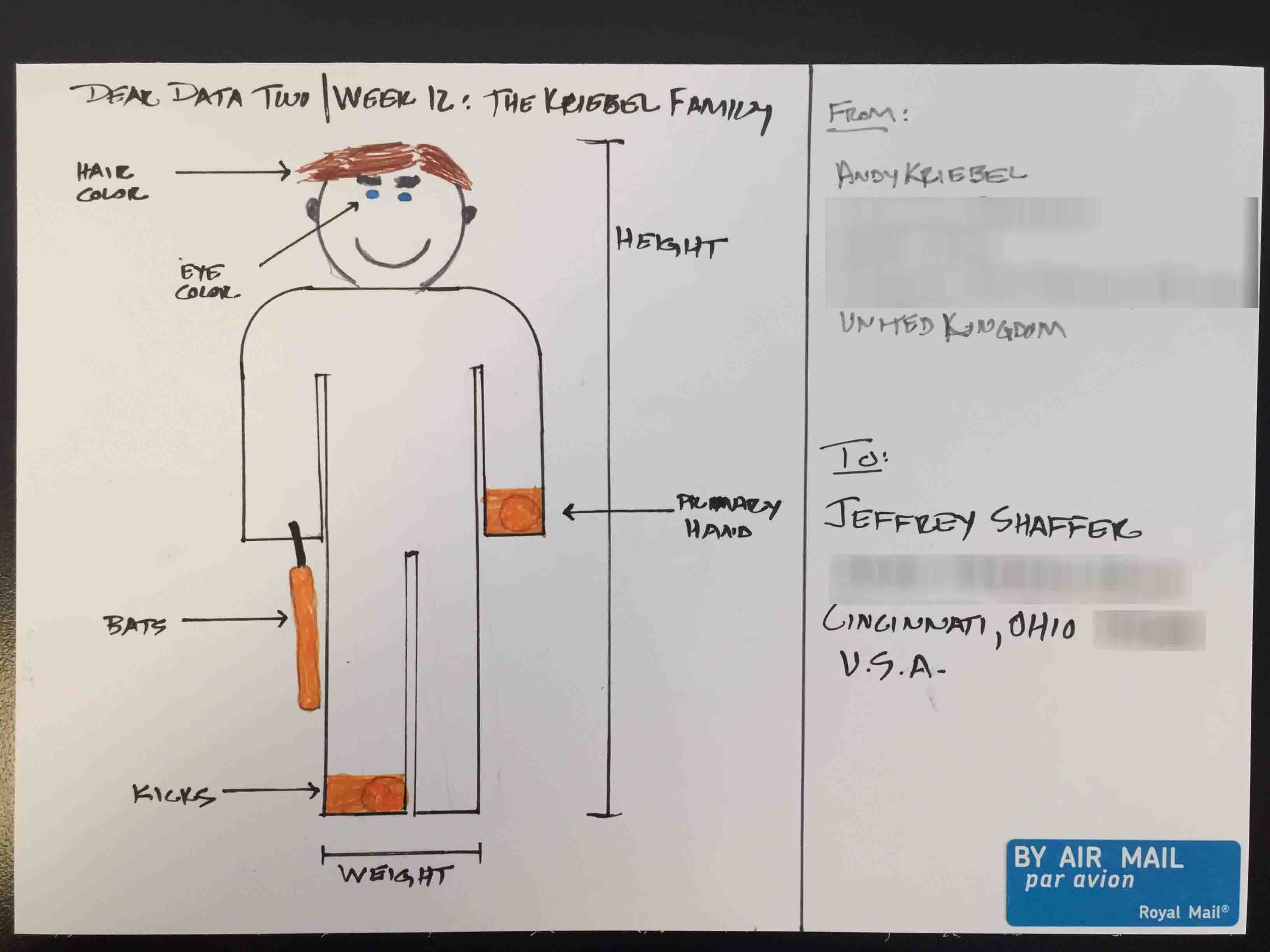
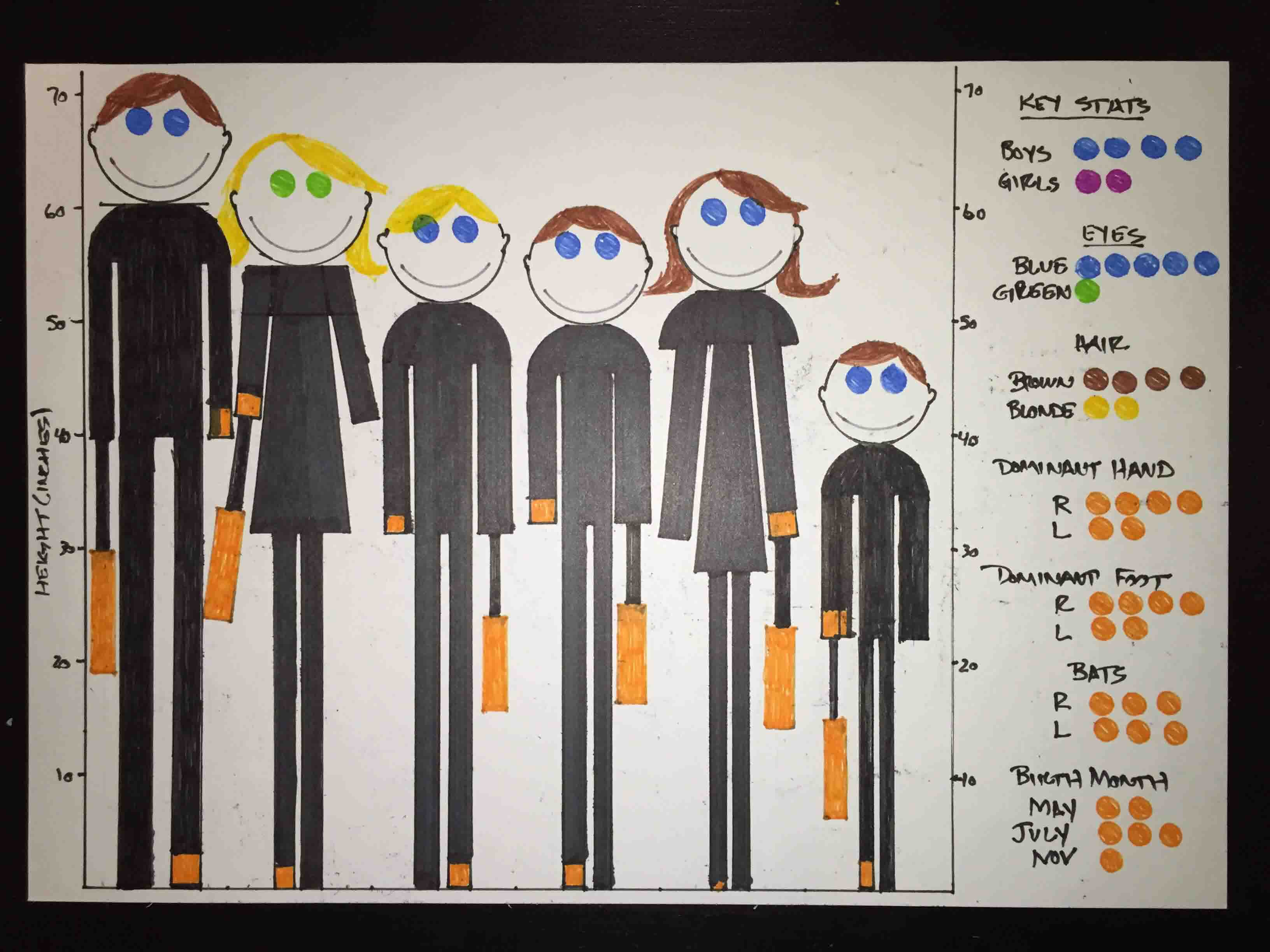
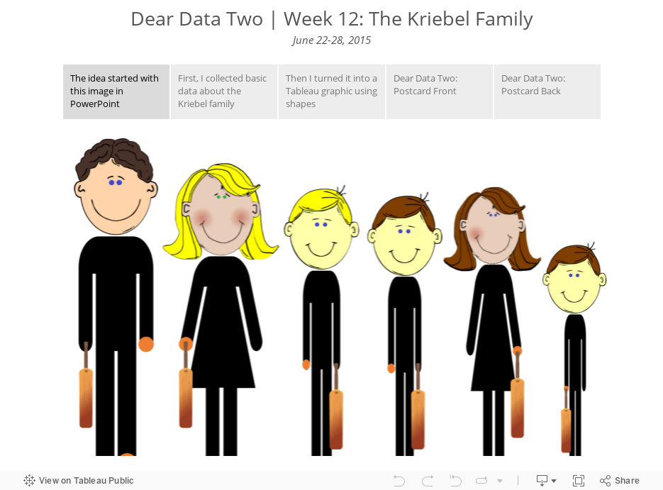
- 12 - People
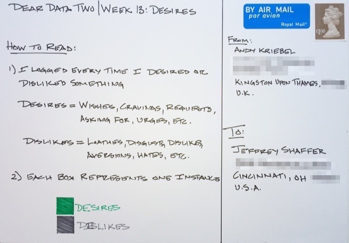
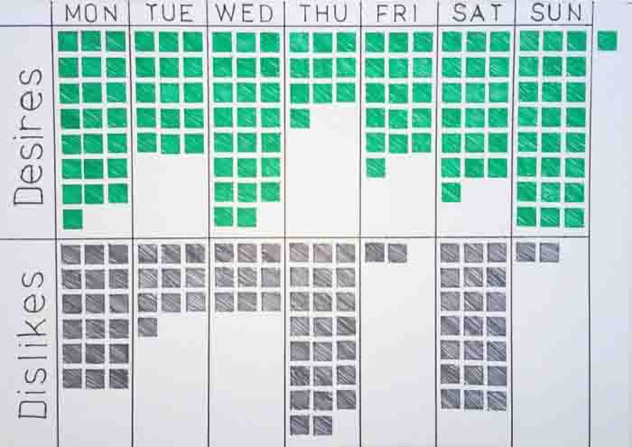
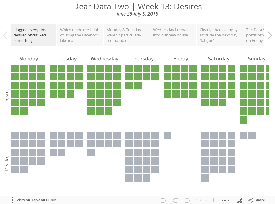
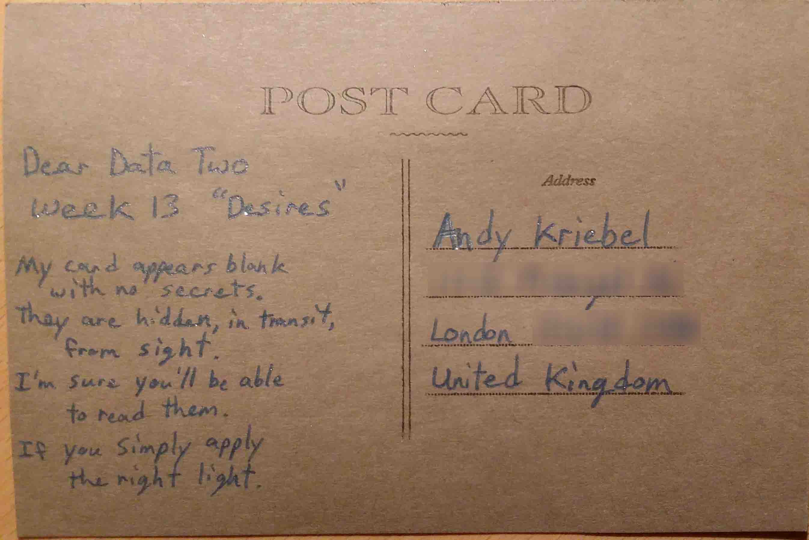
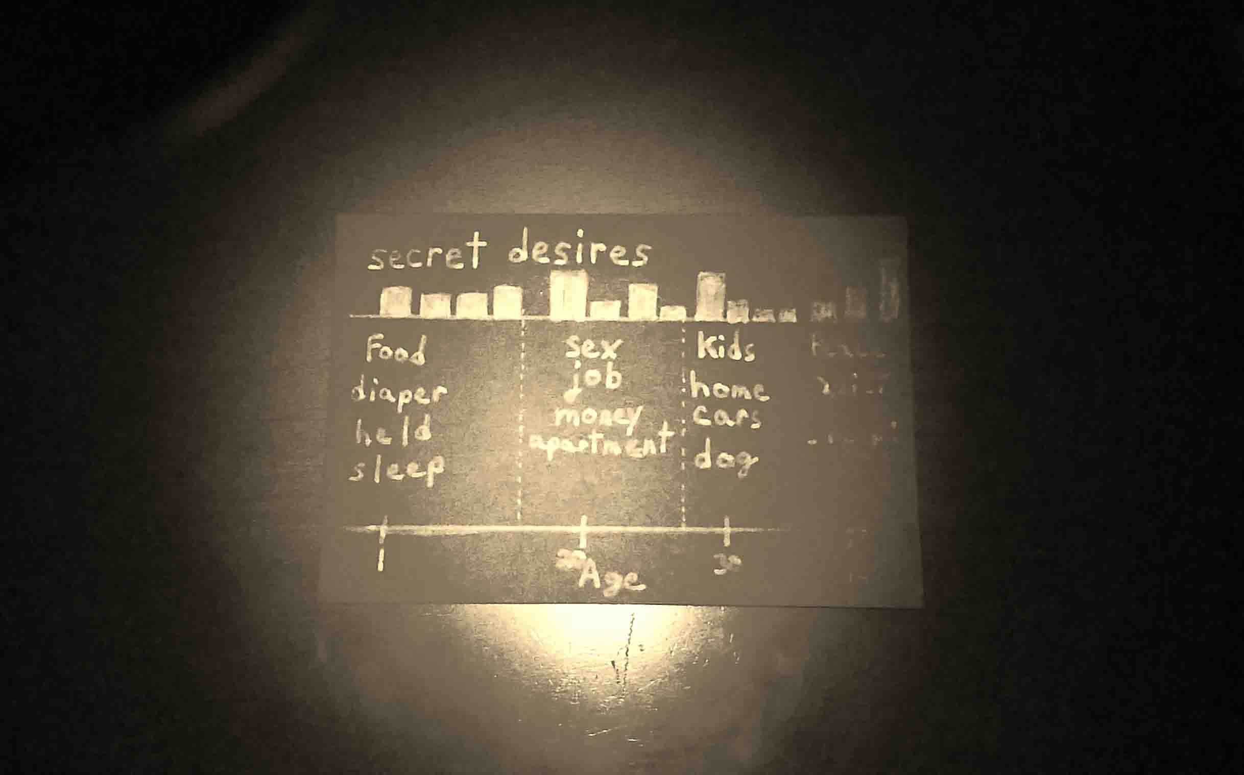
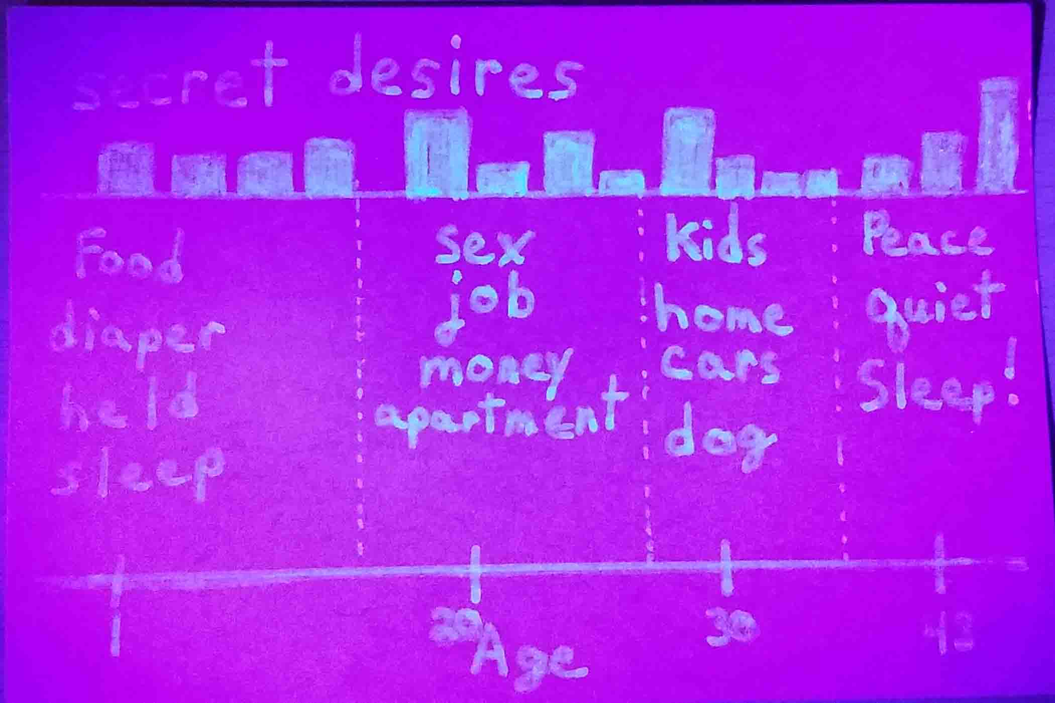
- 13 - Desires
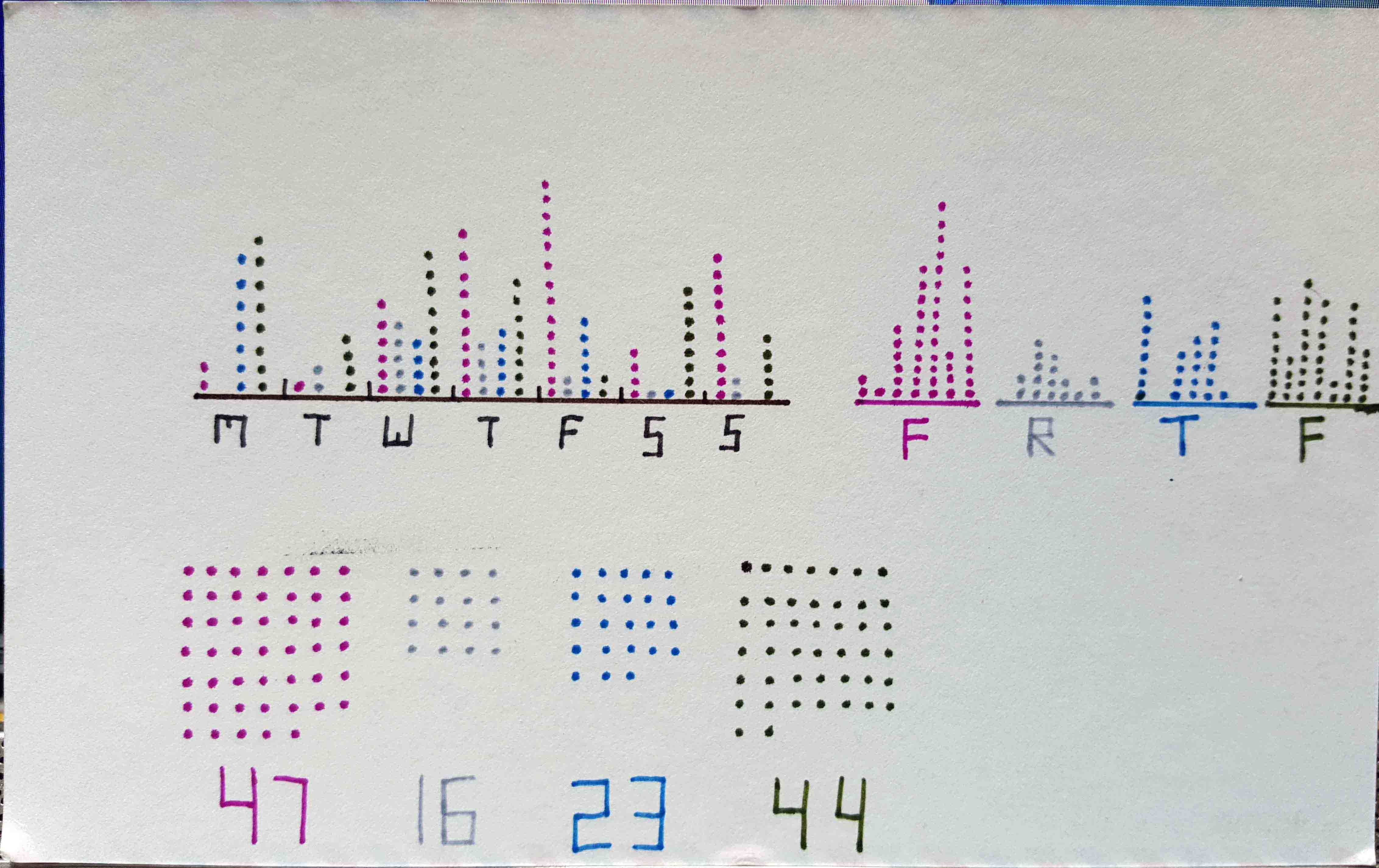
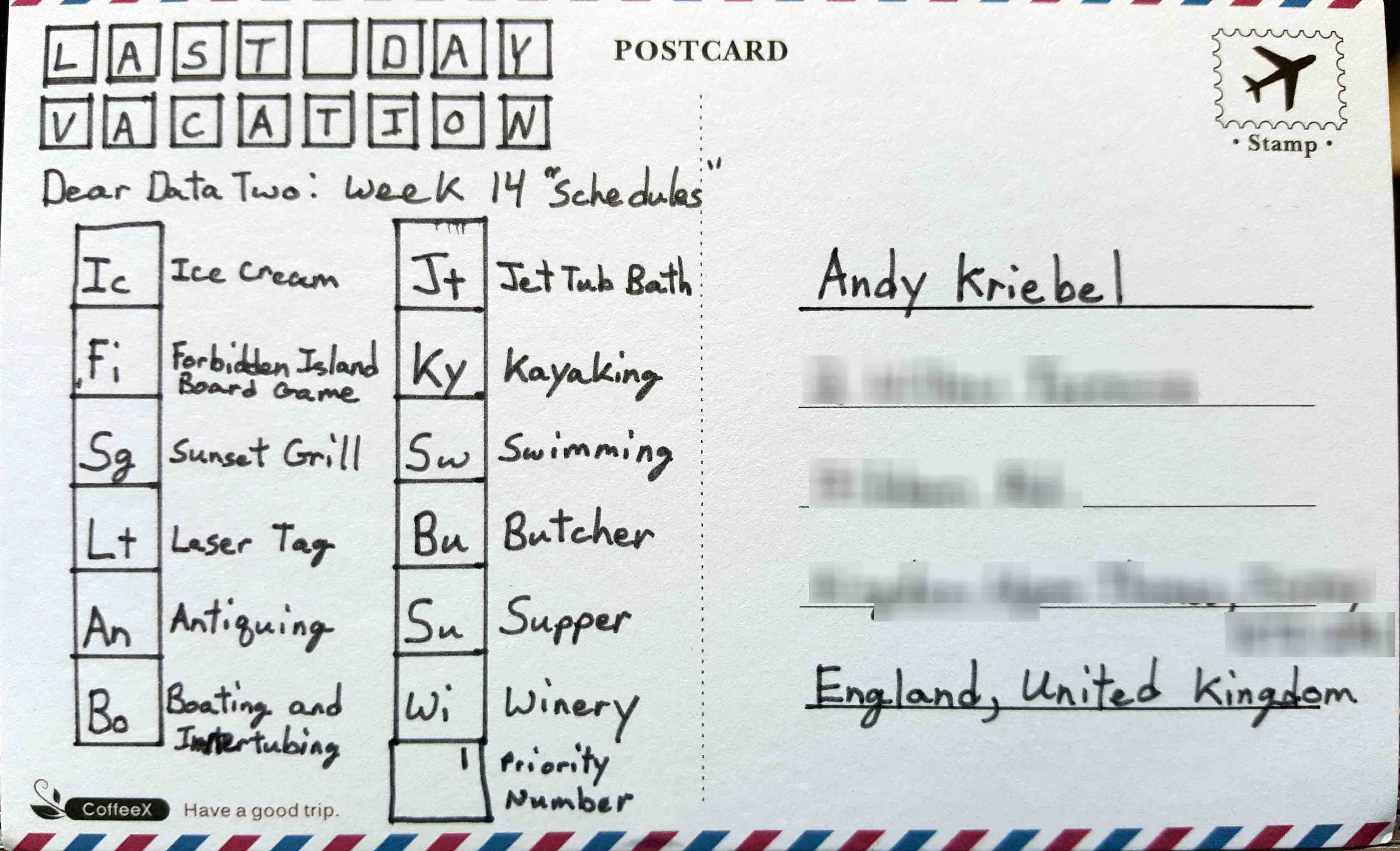
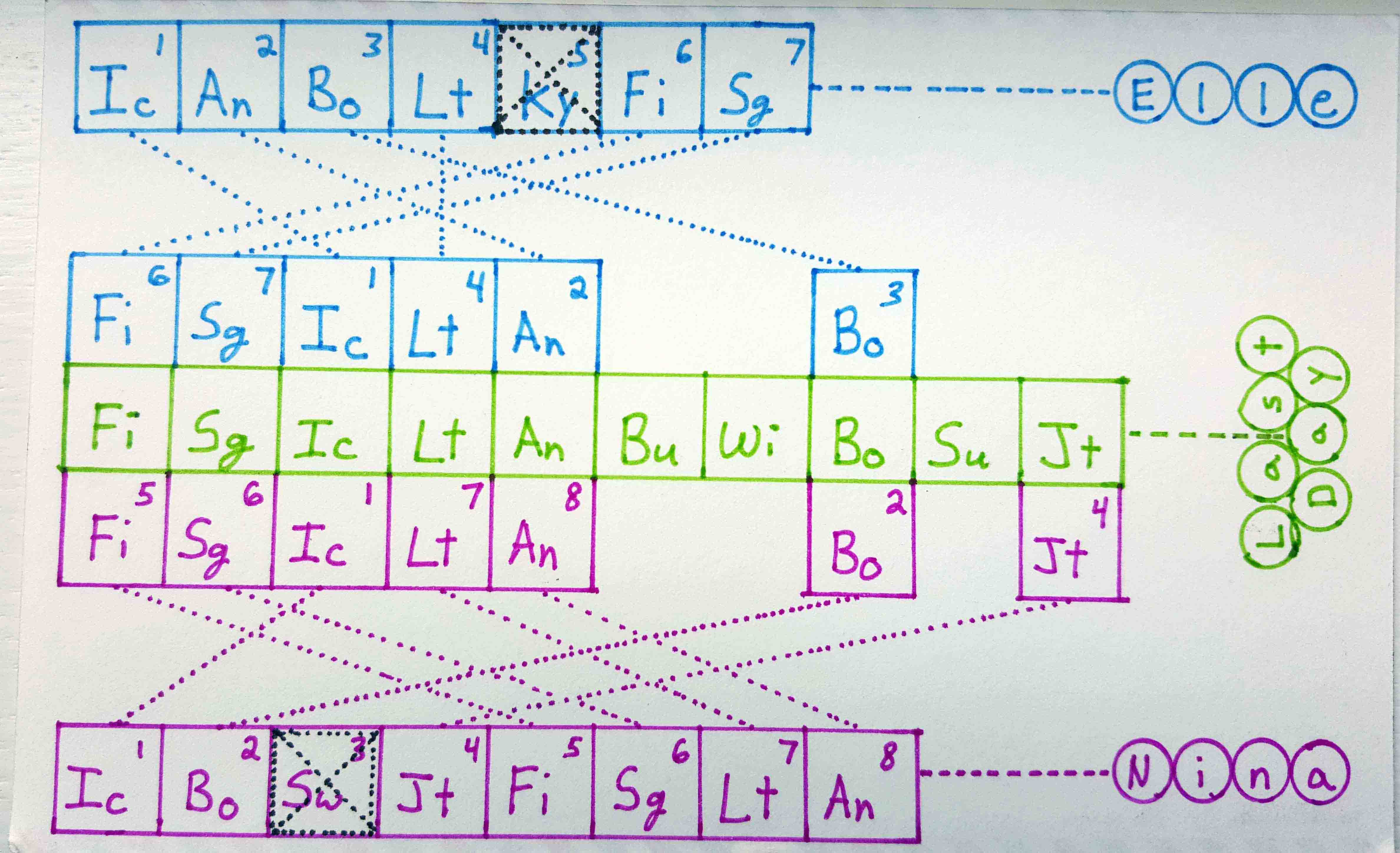
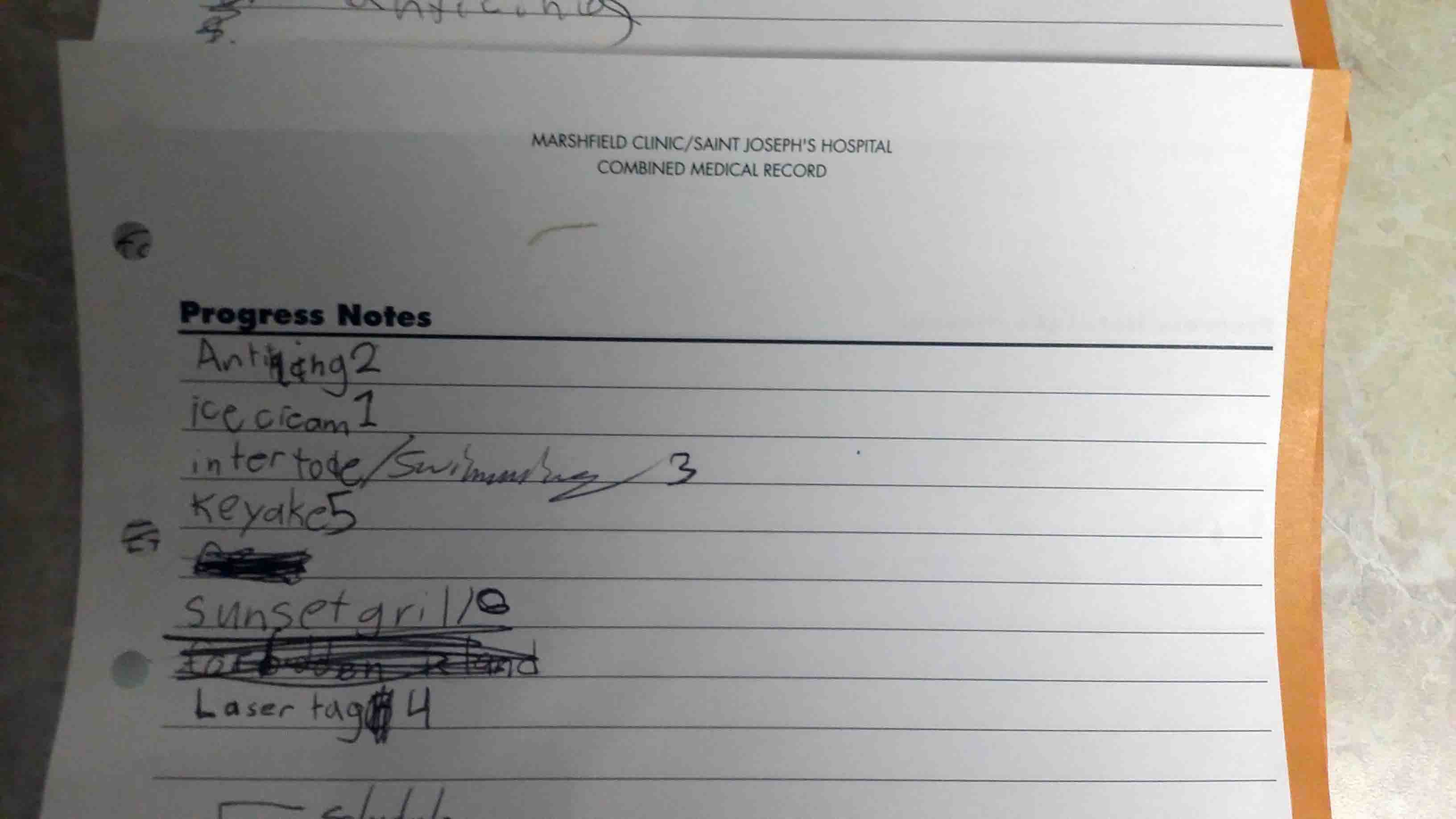
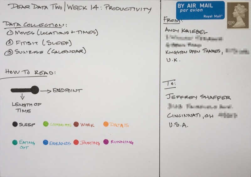
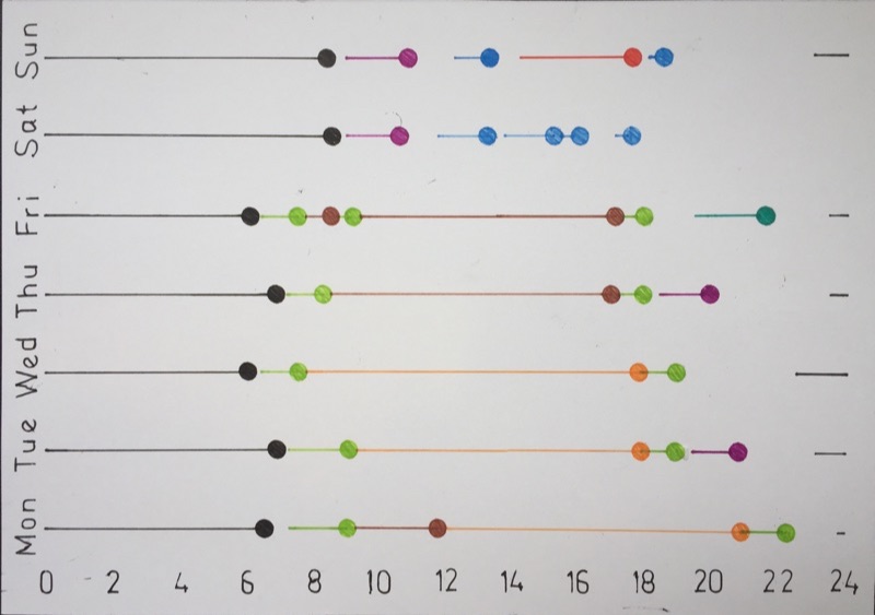
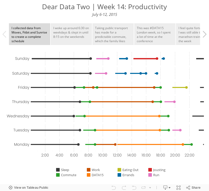
- 14 - Schedules
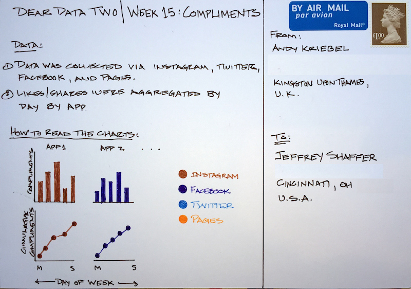
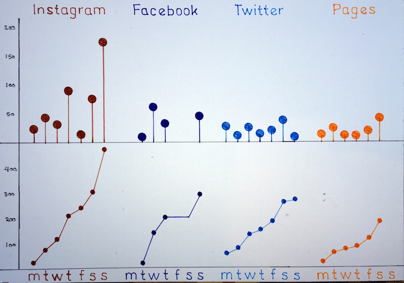
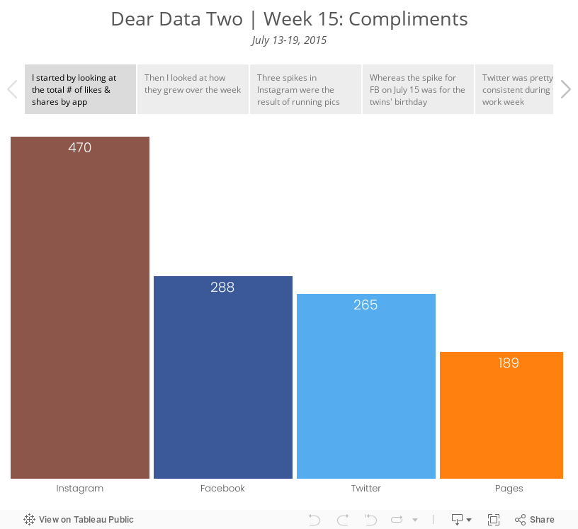
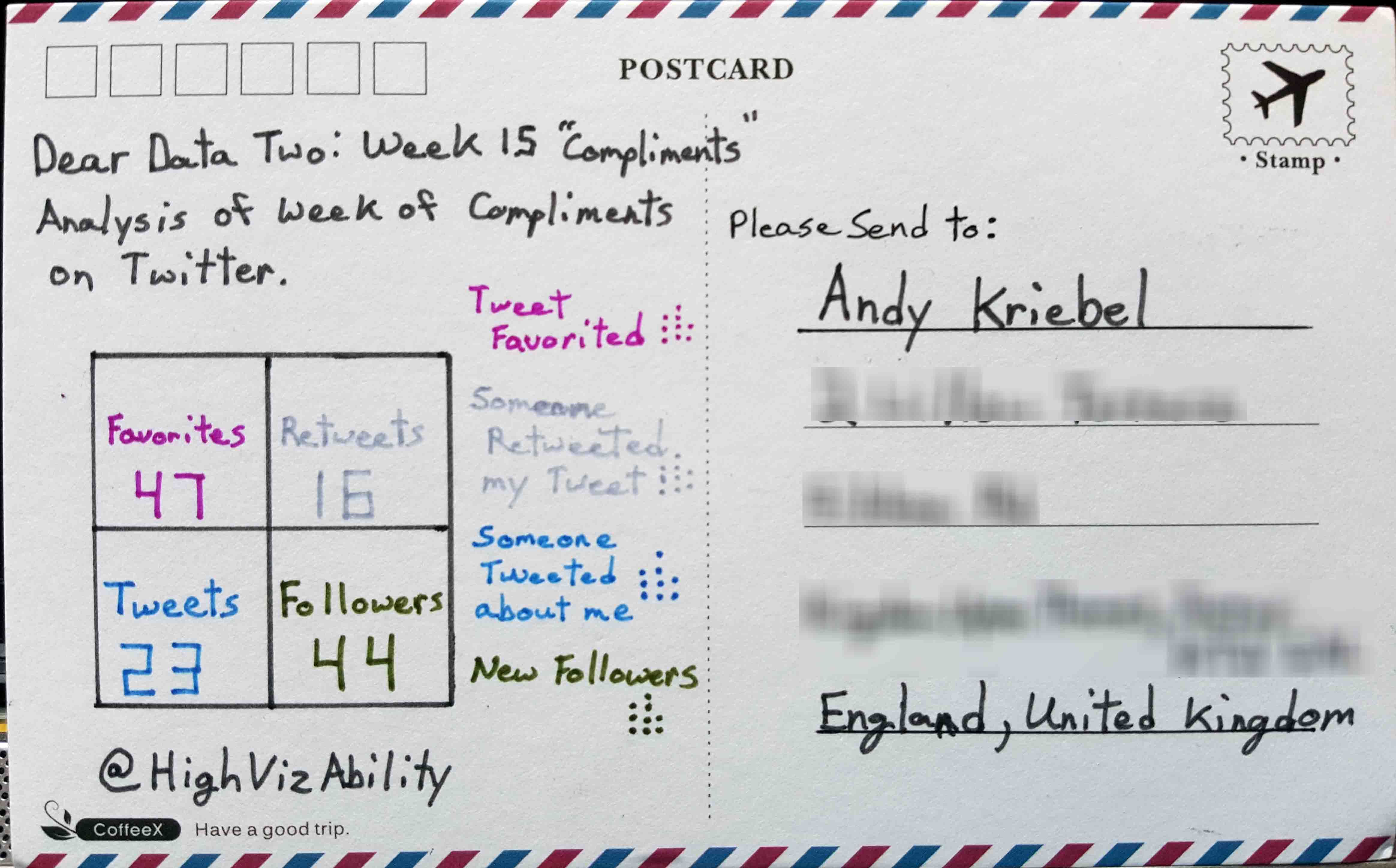
- 15 - Compliments
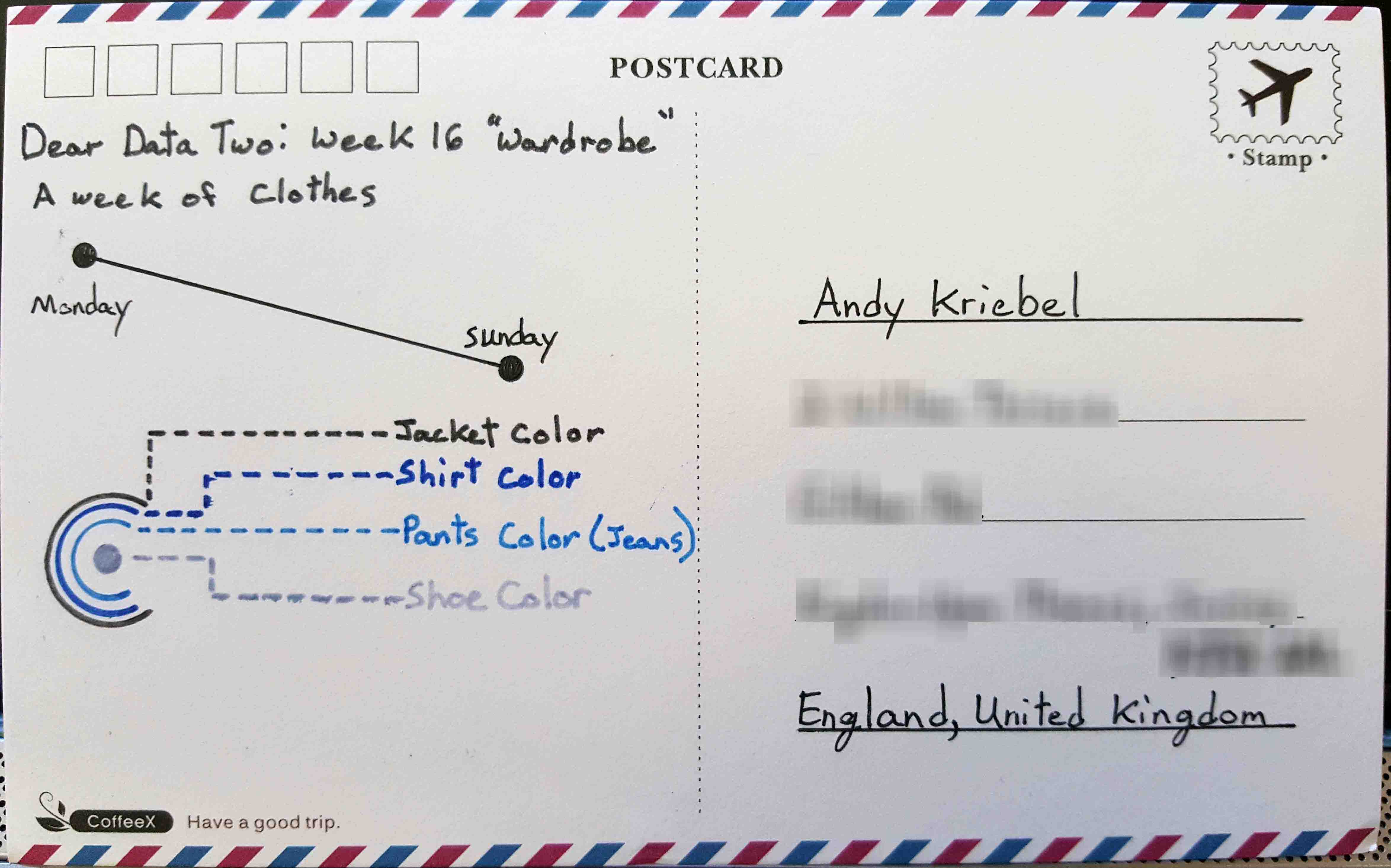
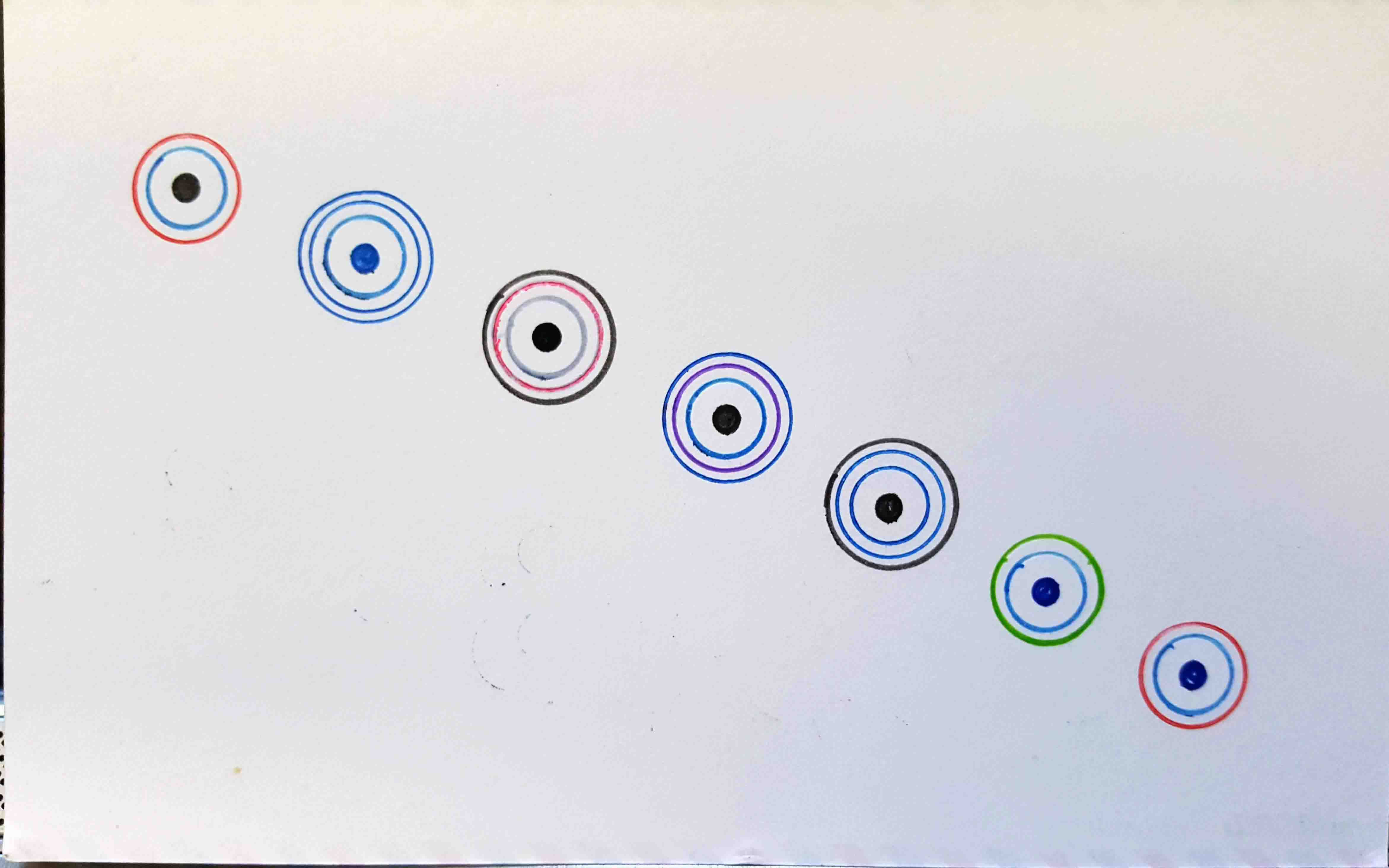
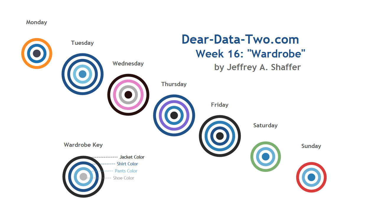
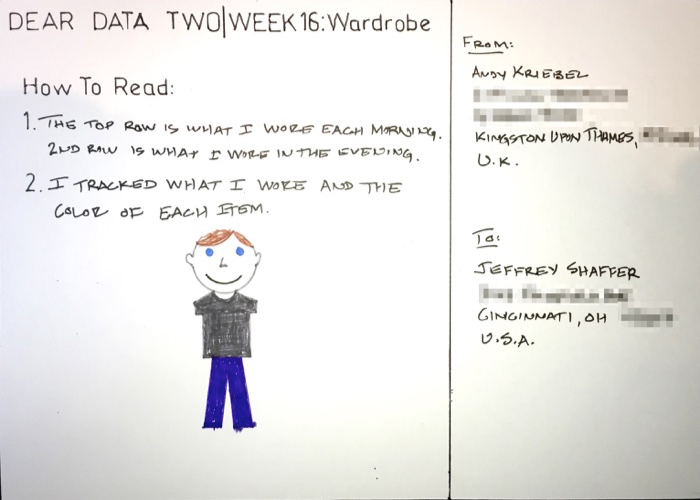
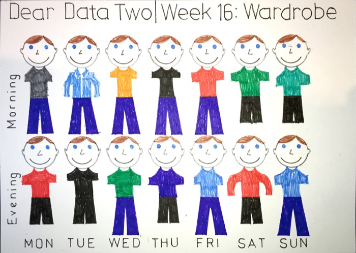
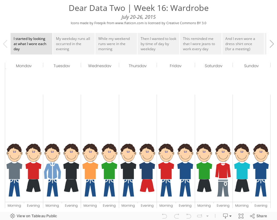
- 16 - Wardrobe
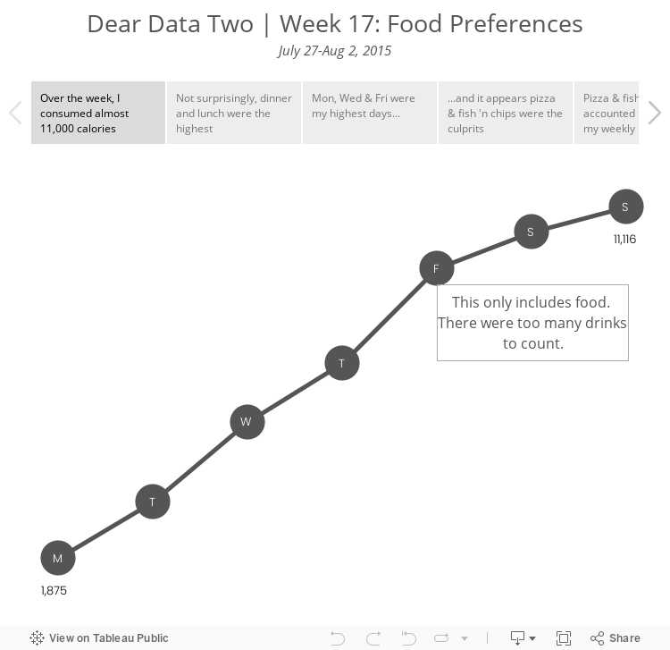
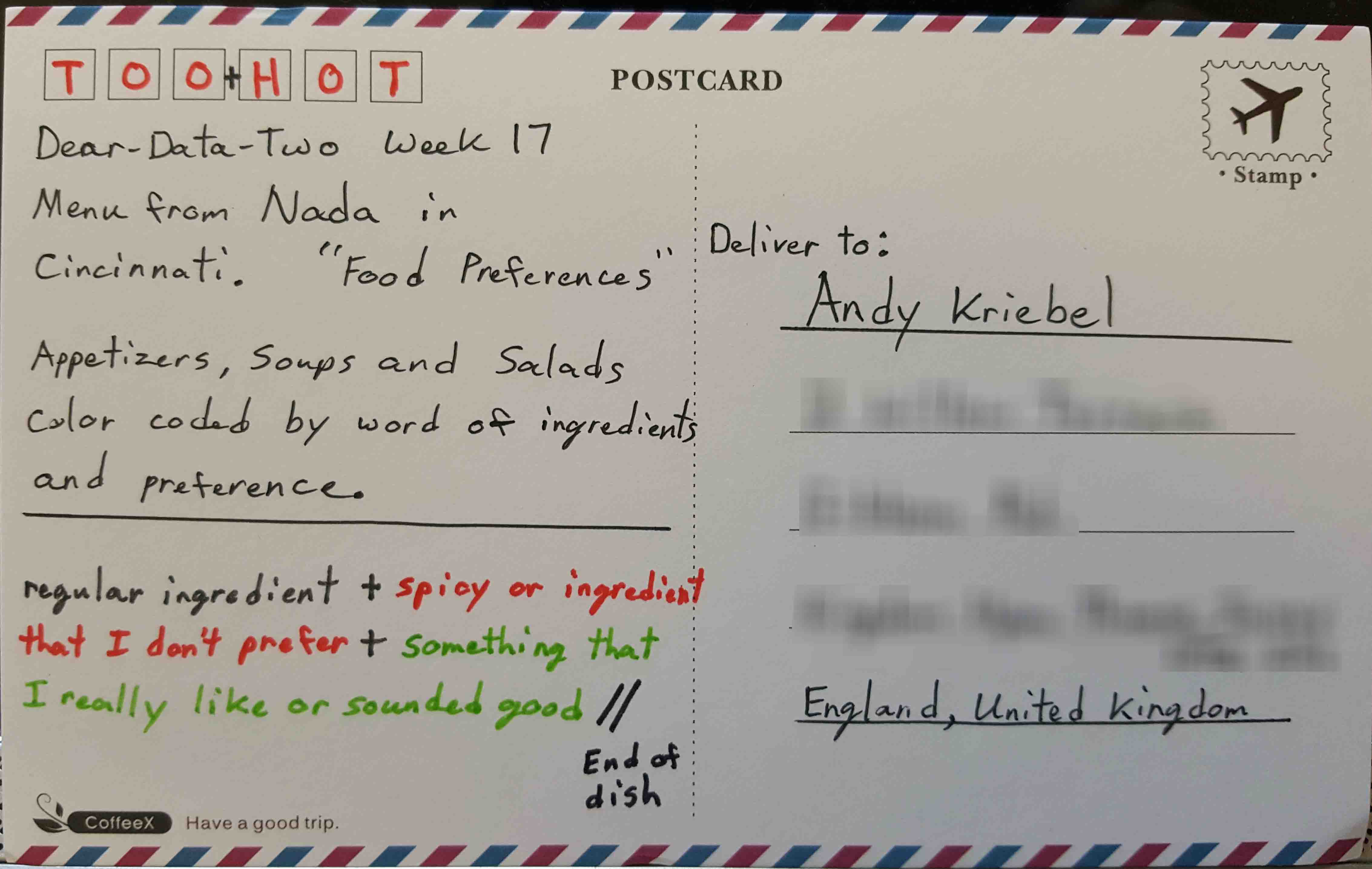
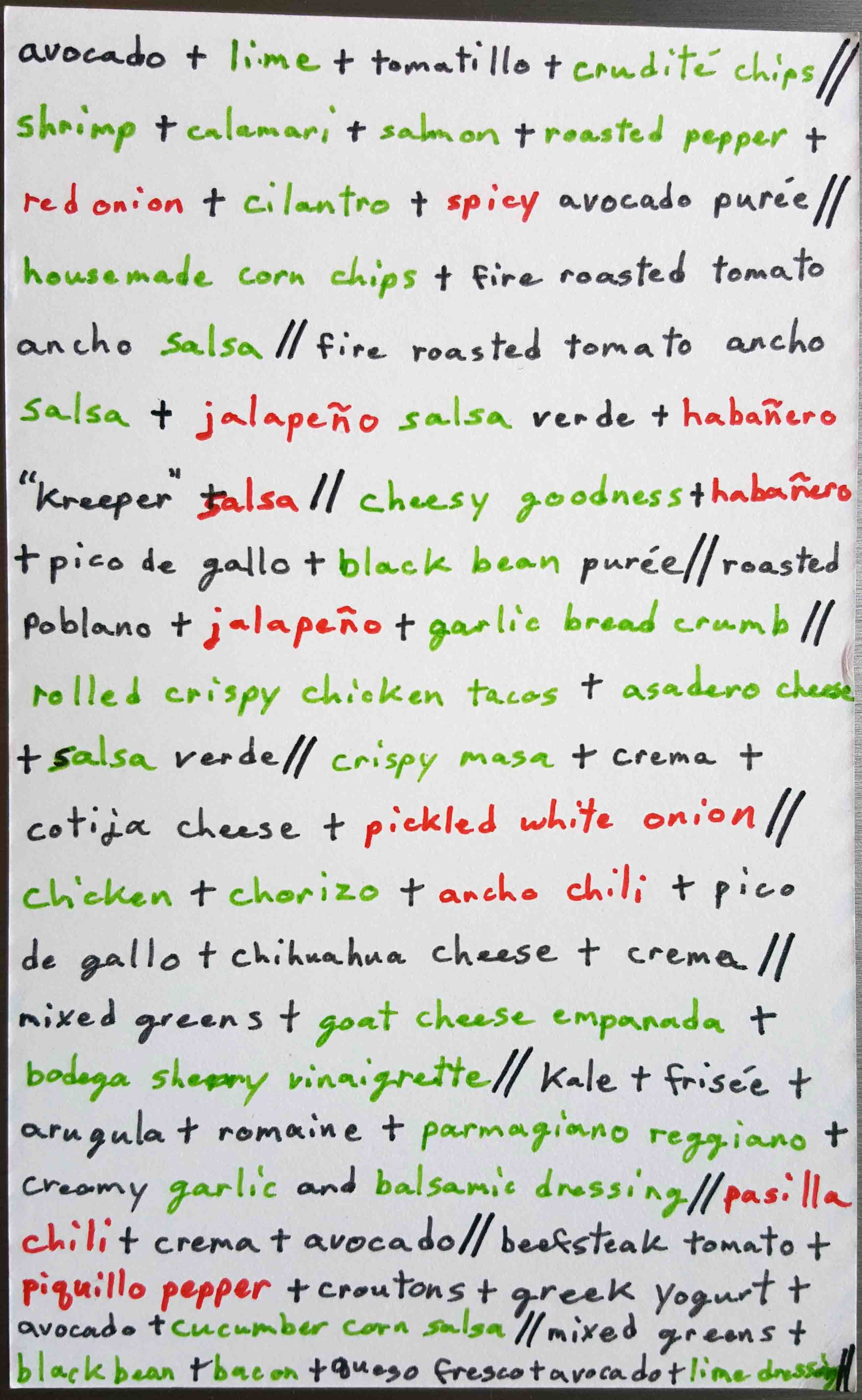
- 17 - Food Preferences
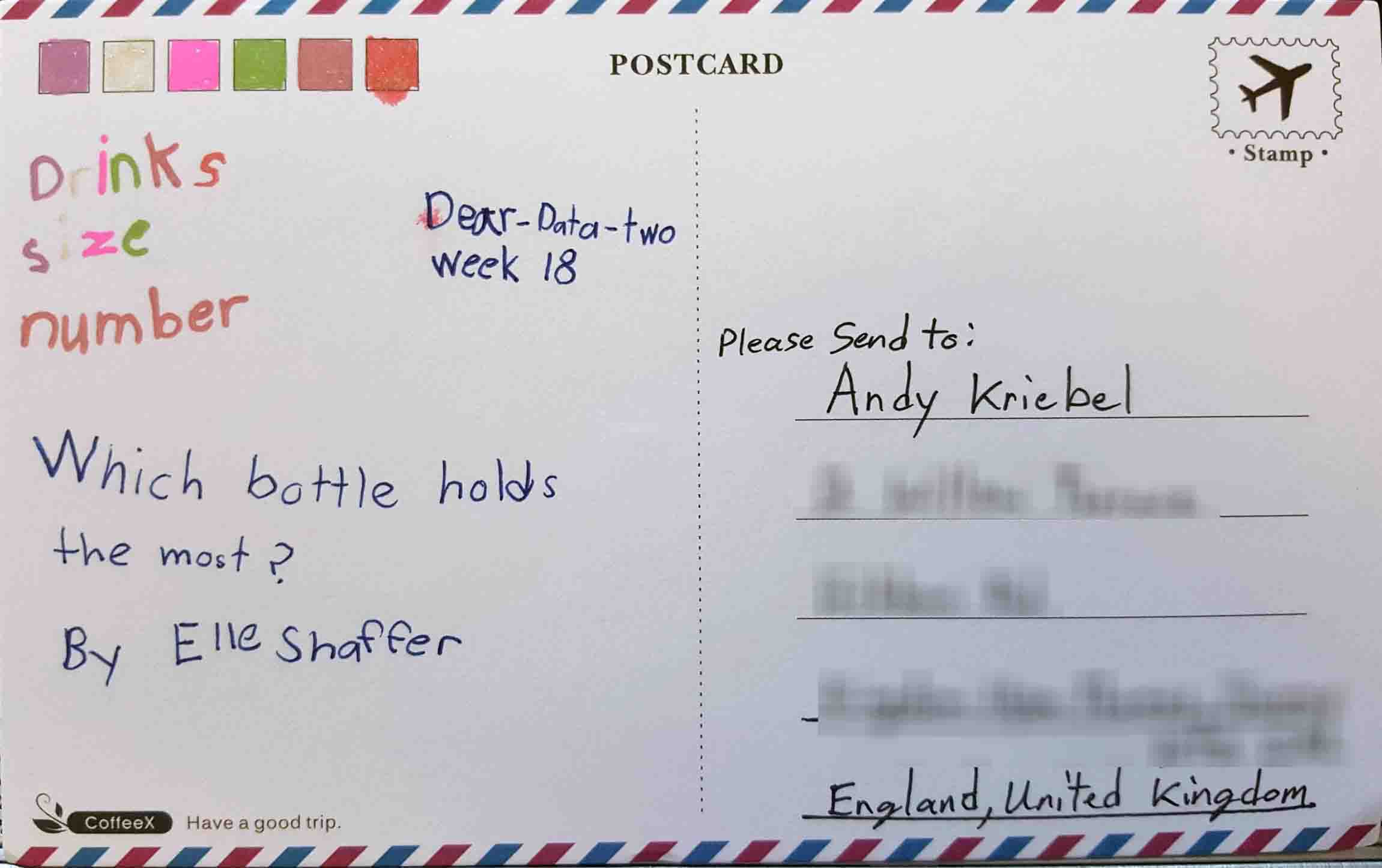
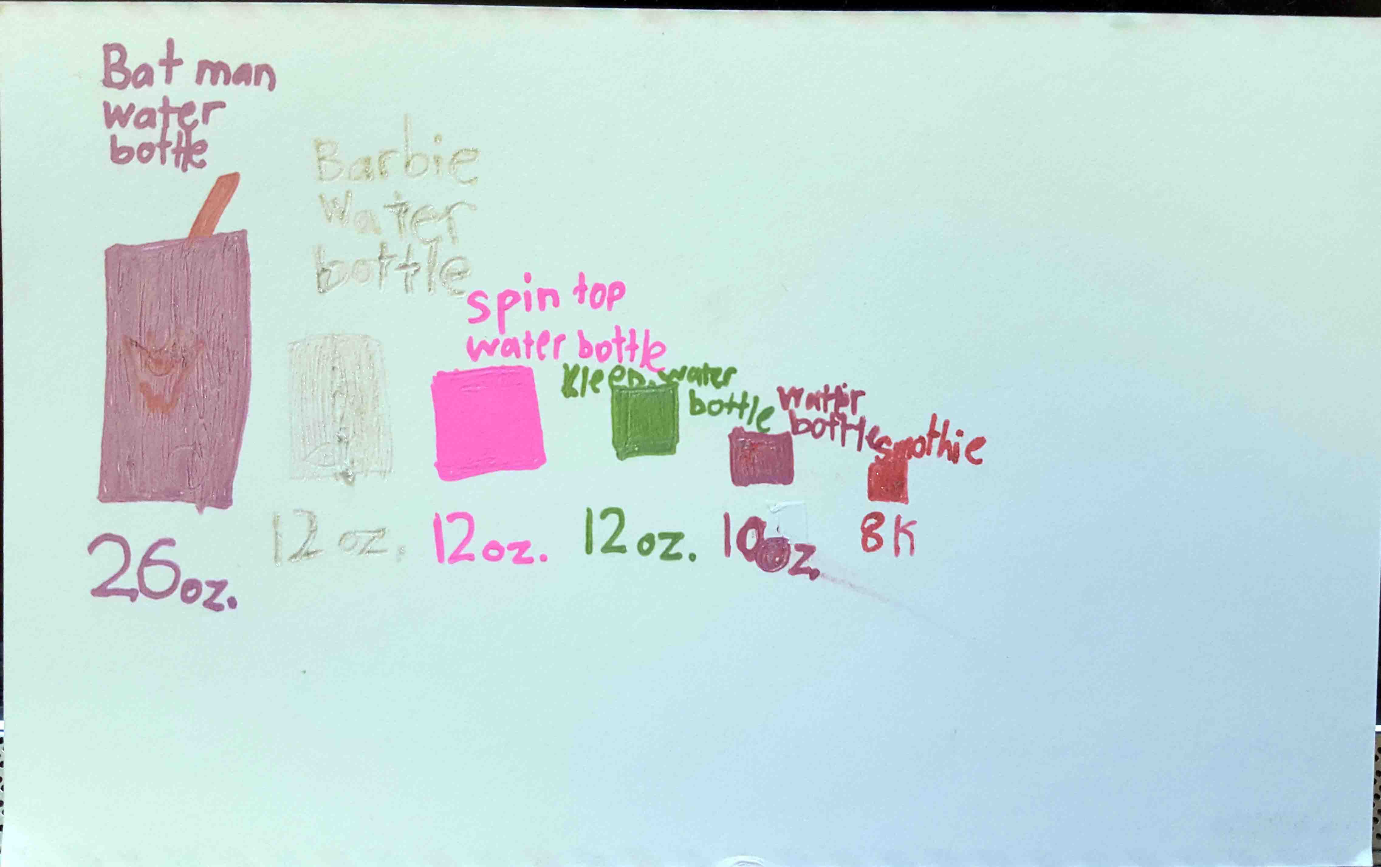
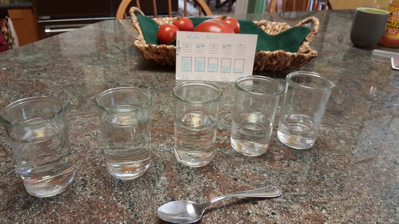
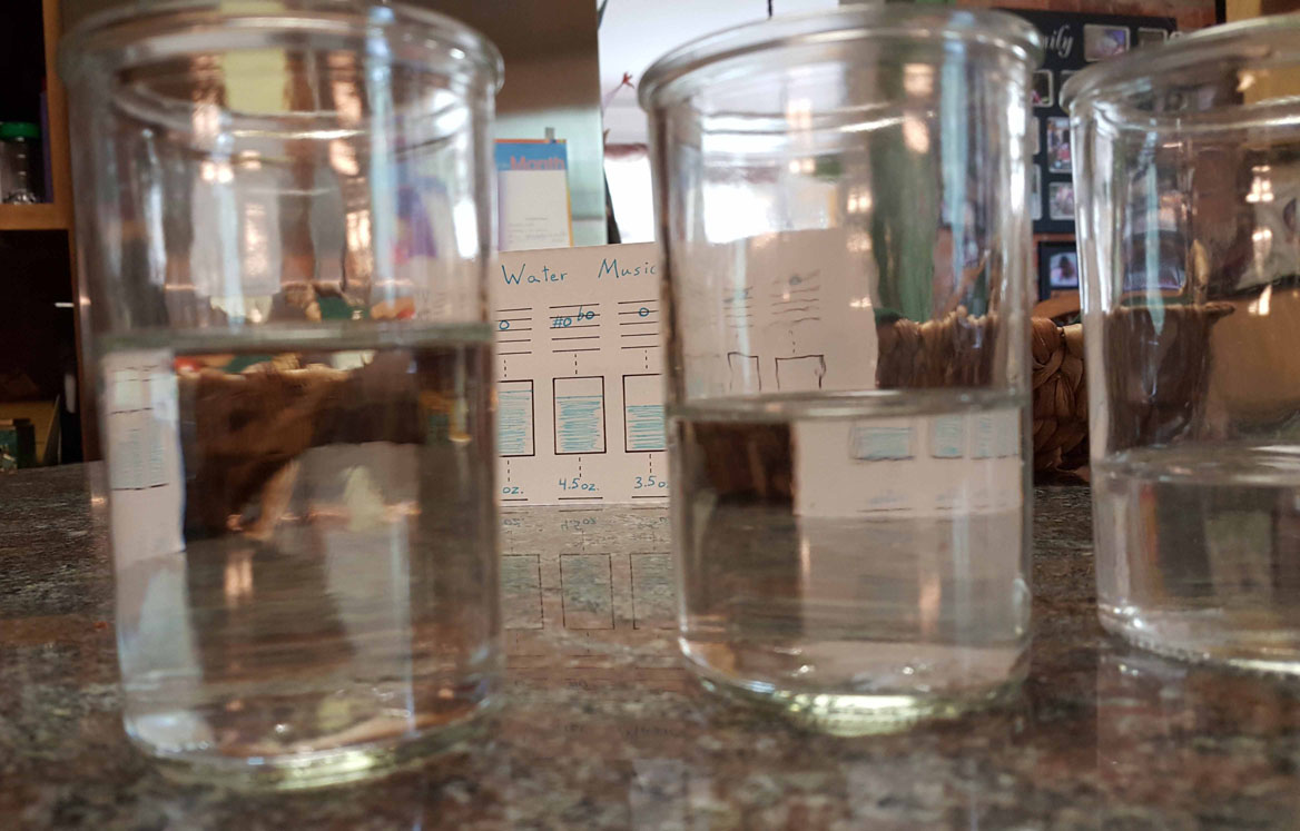
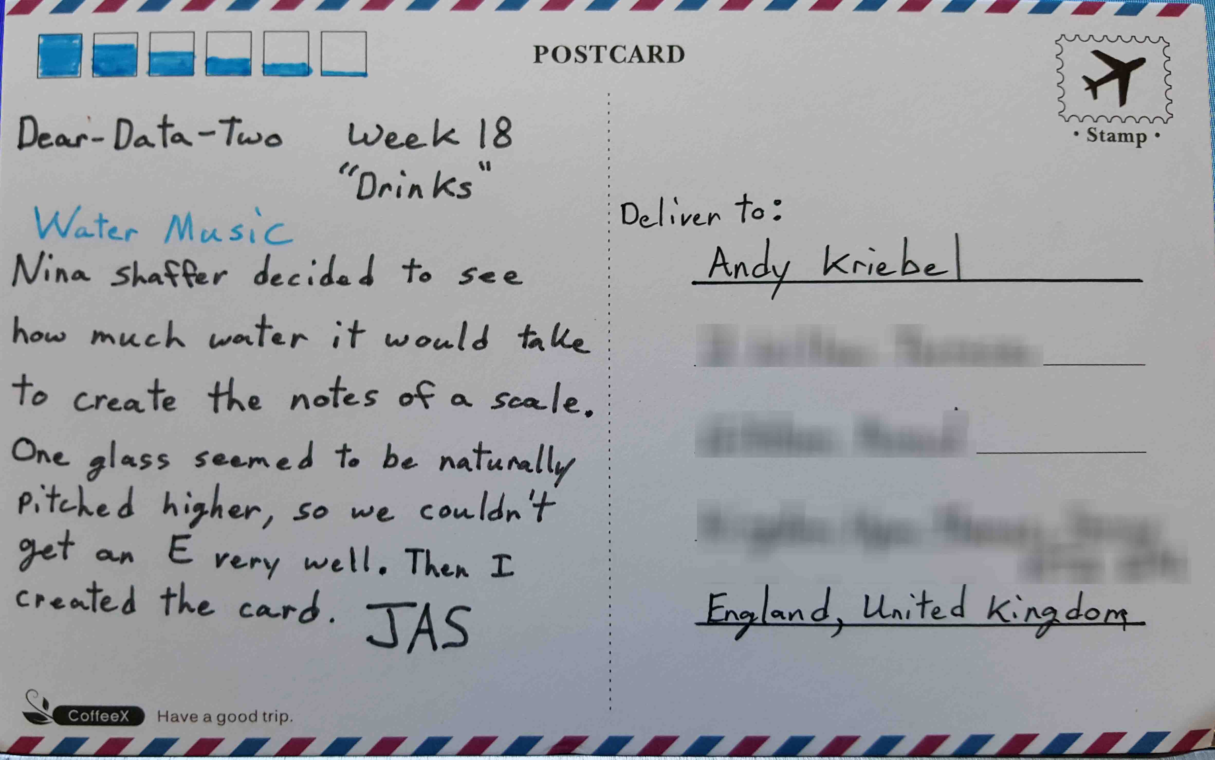
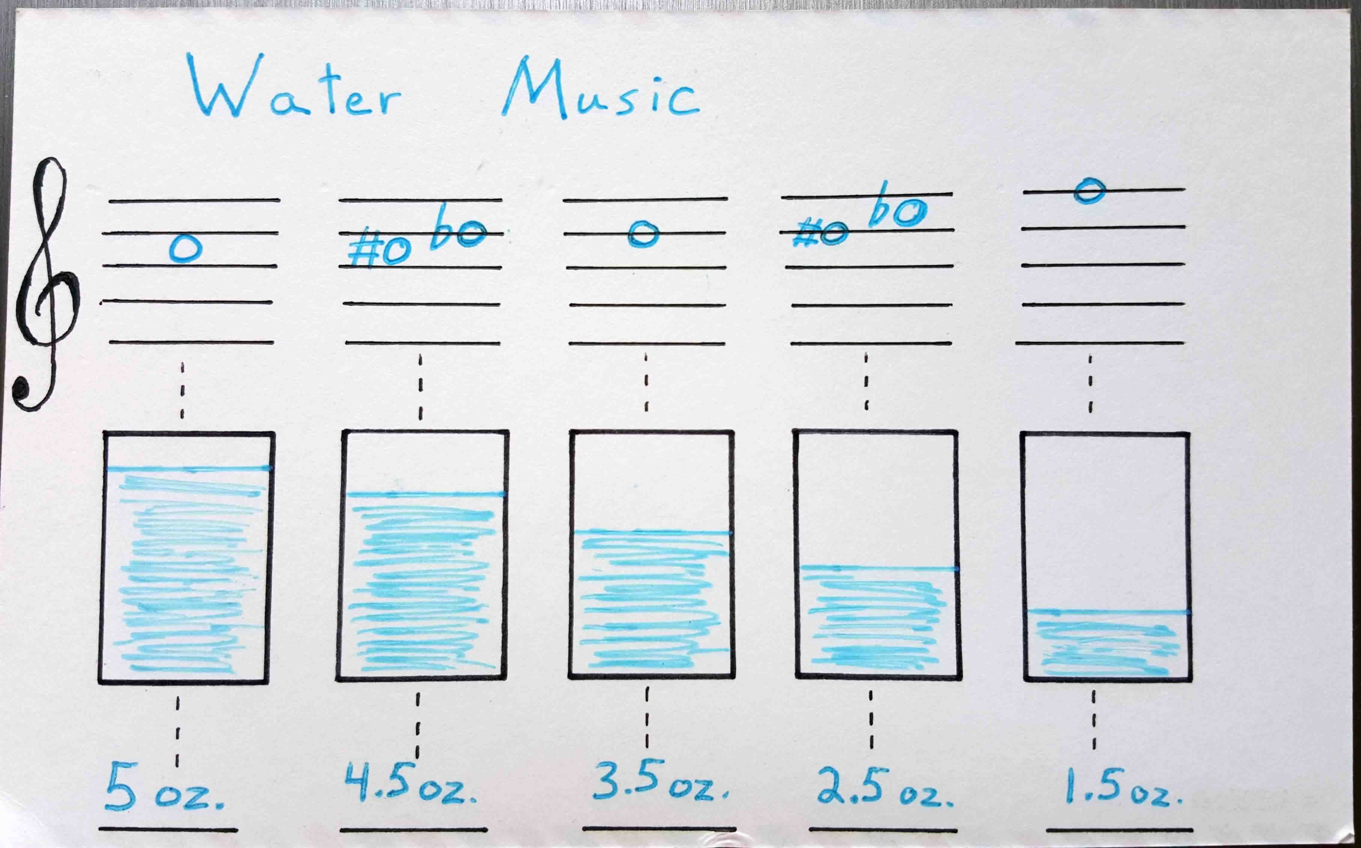
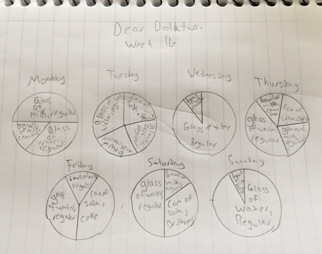
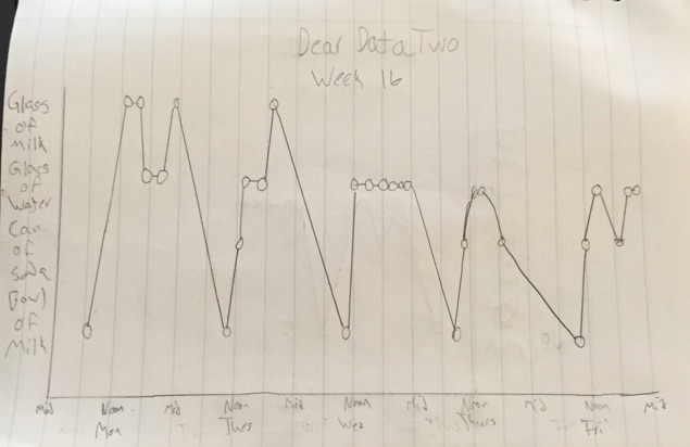
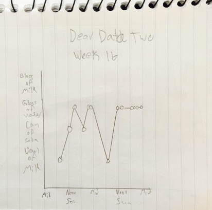
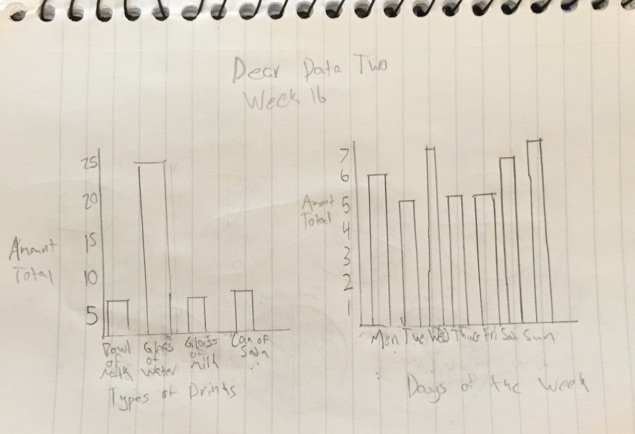
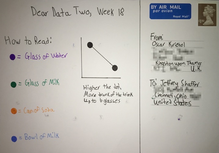
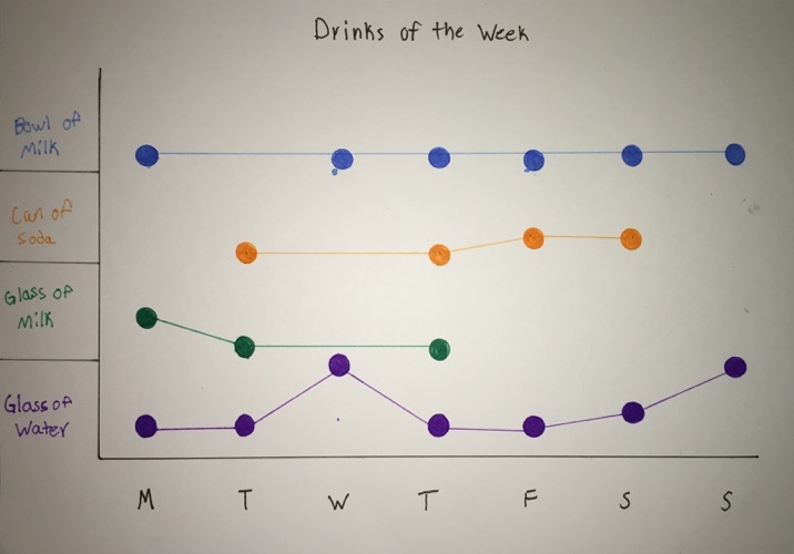
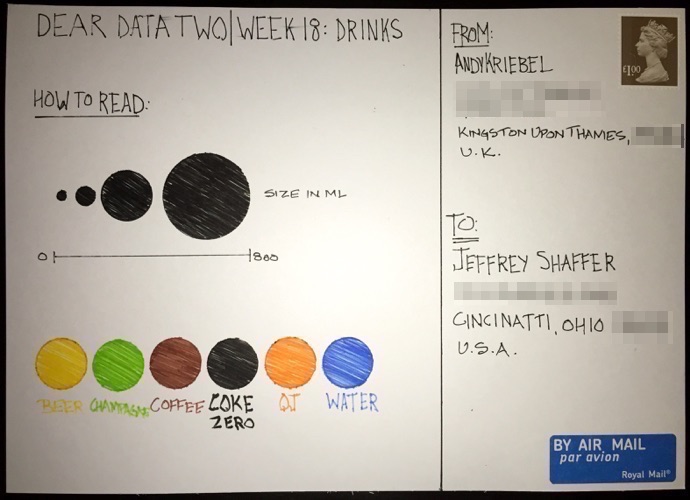
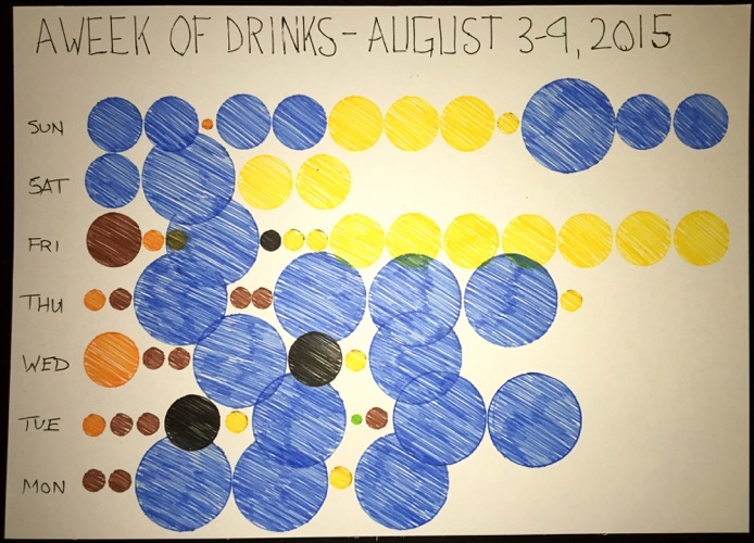
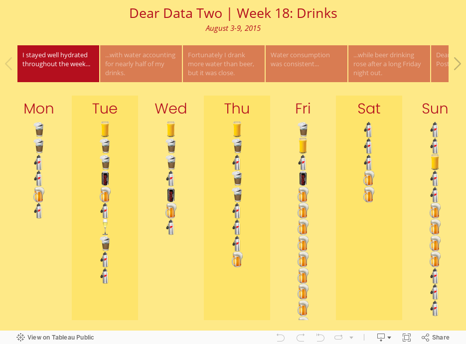
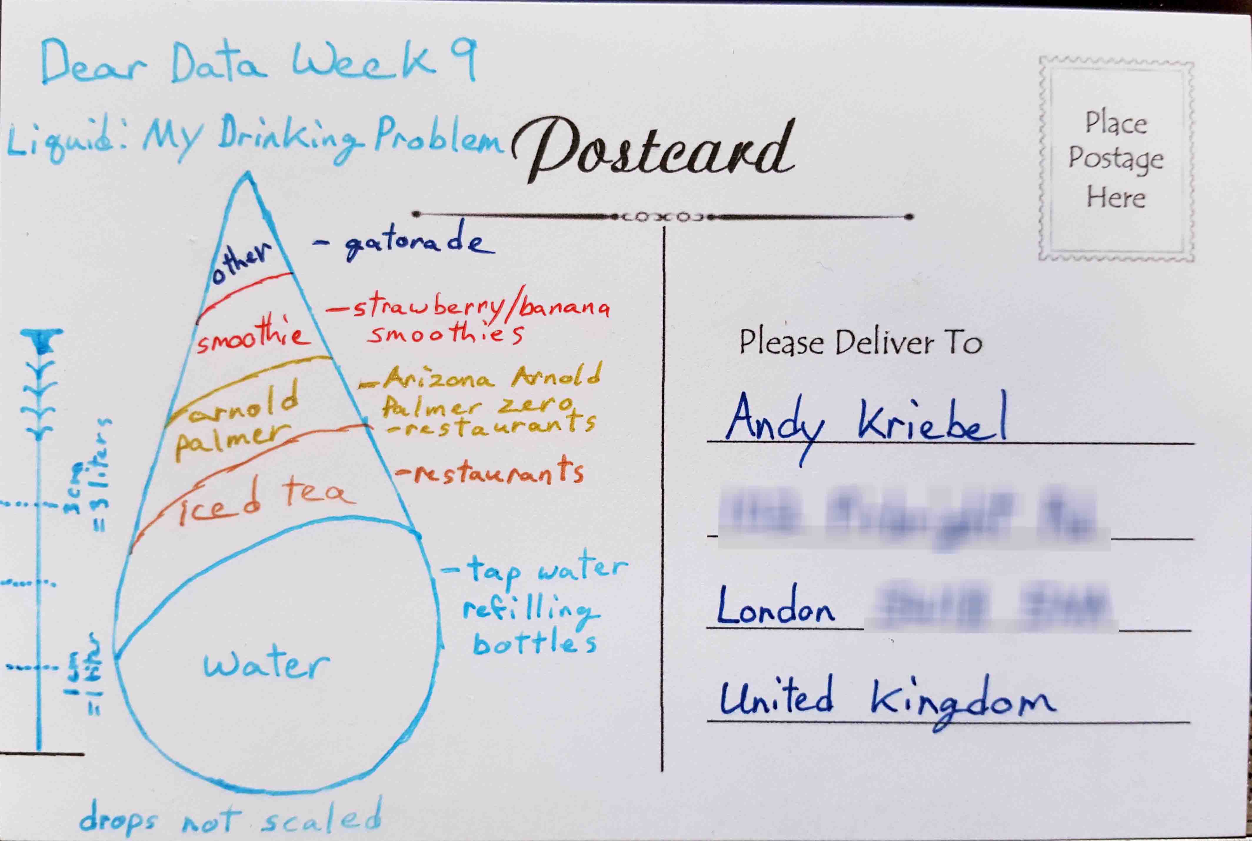
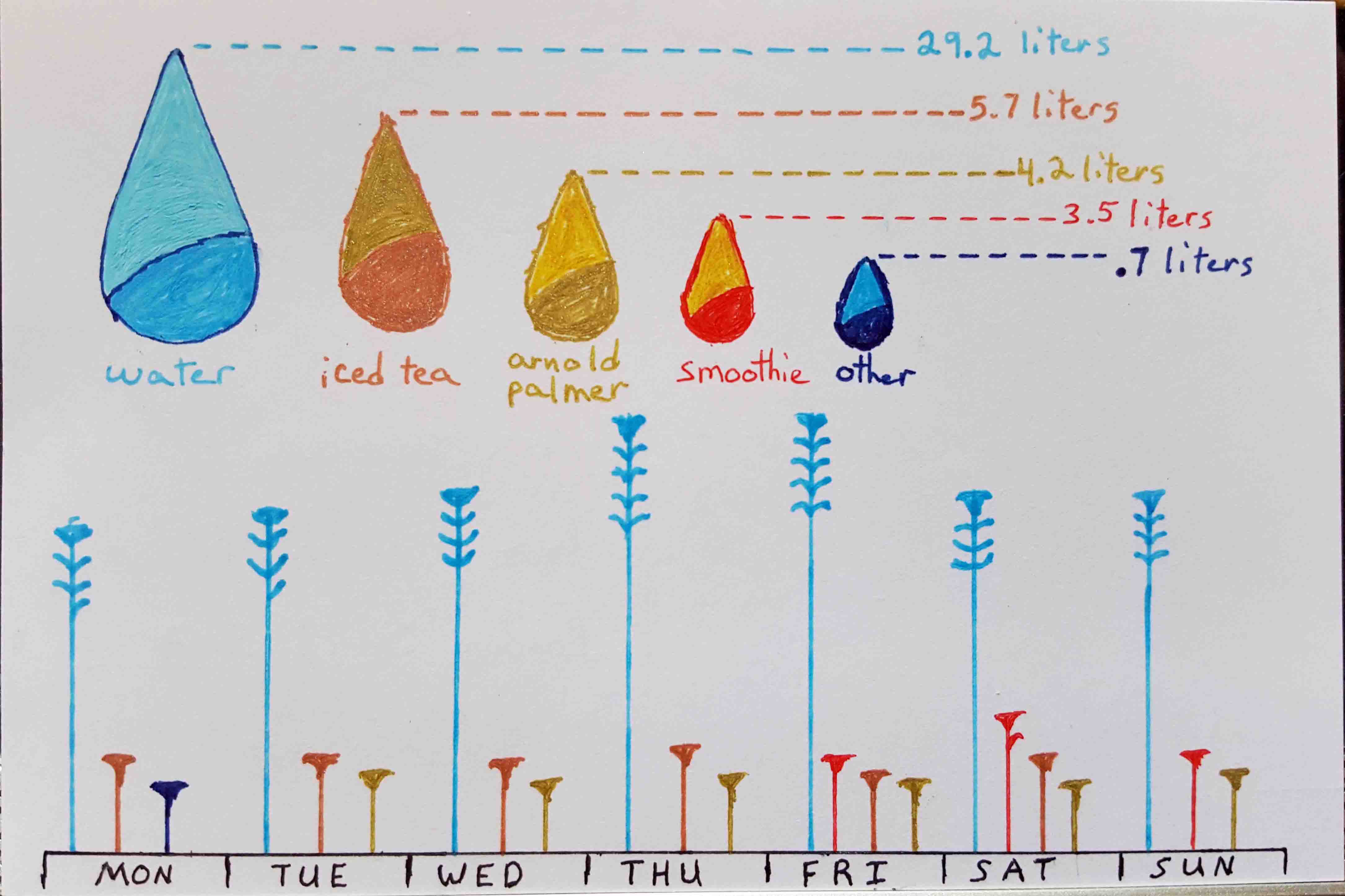
- 18 - Drinks
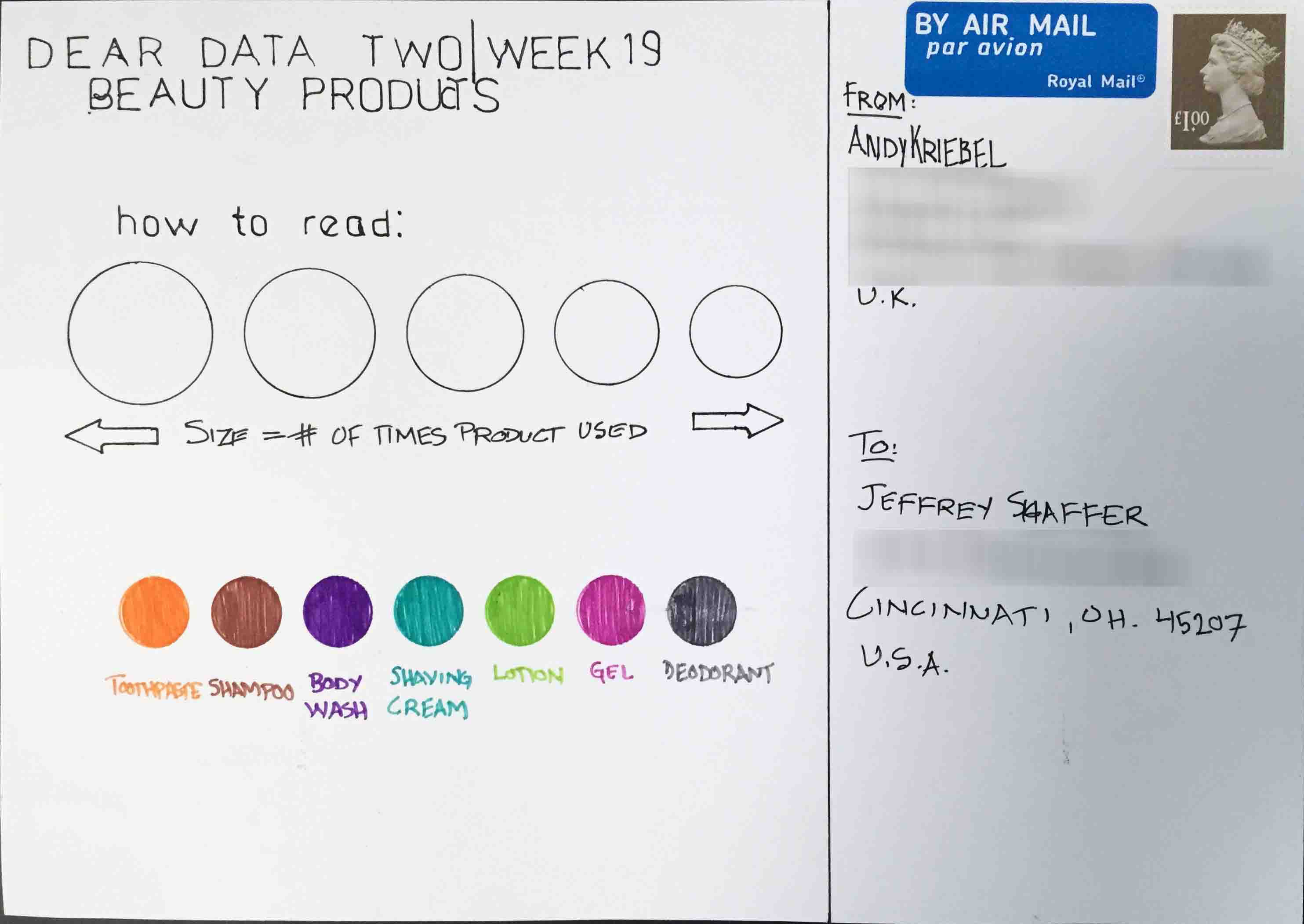
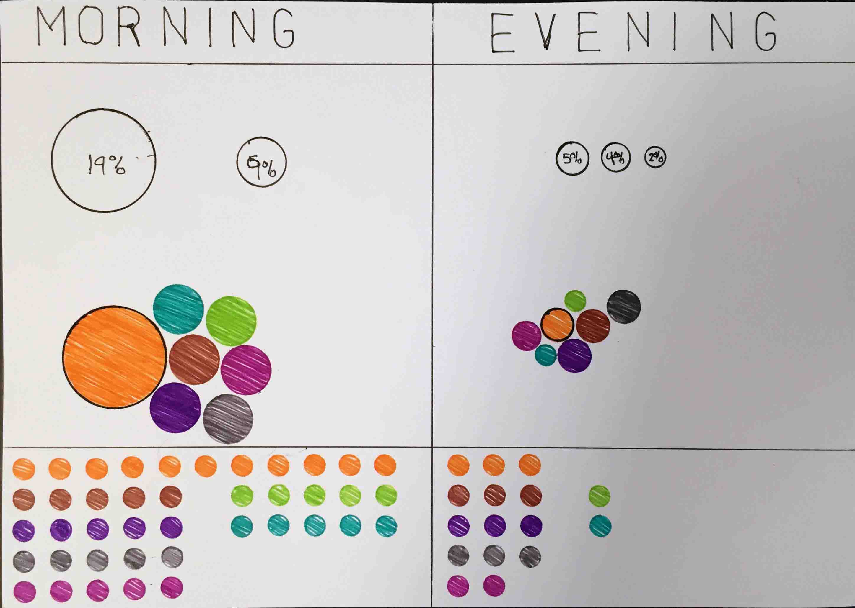
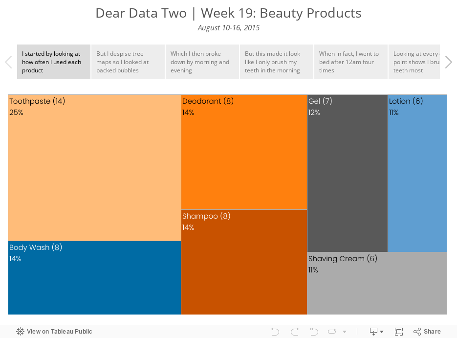
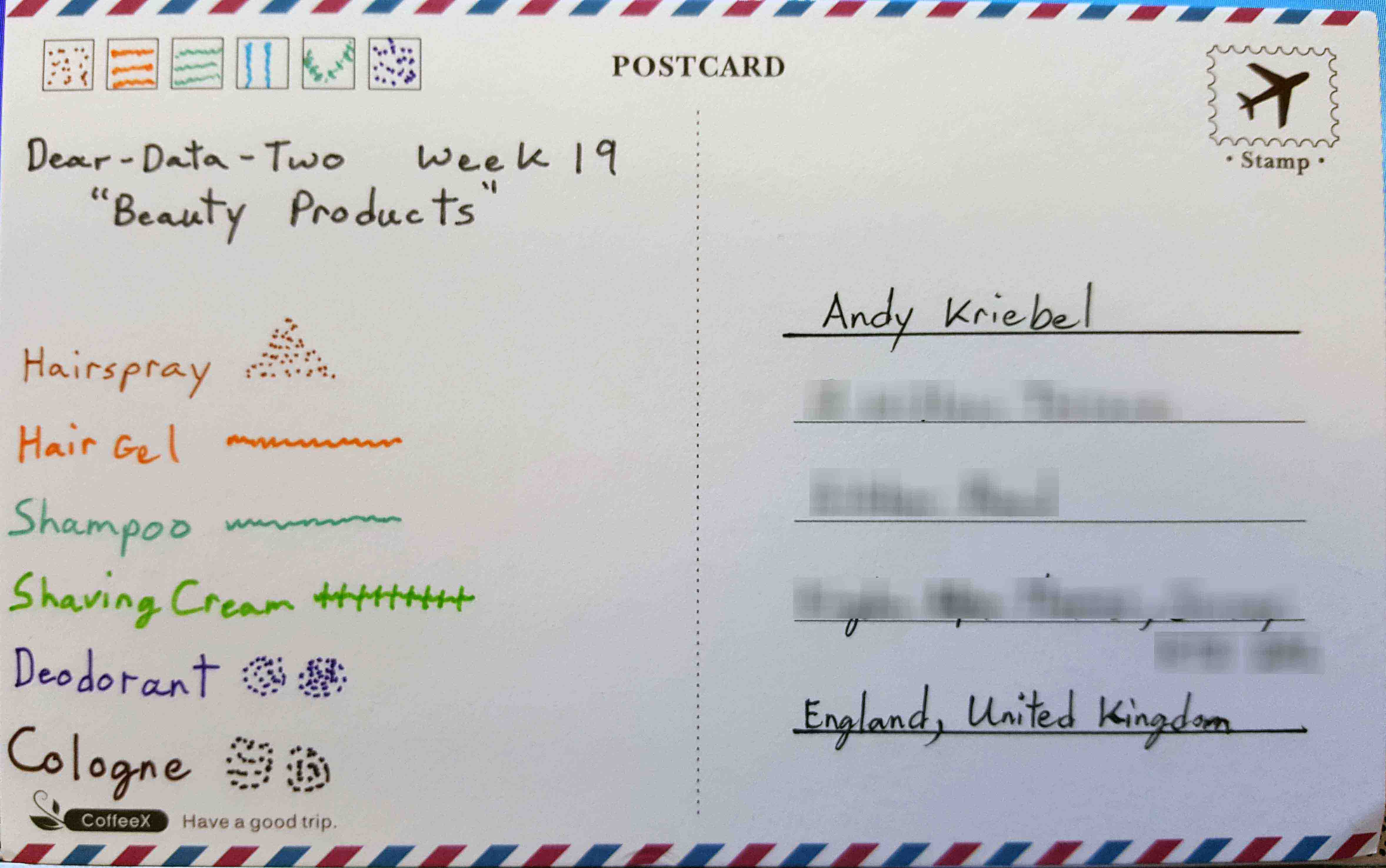
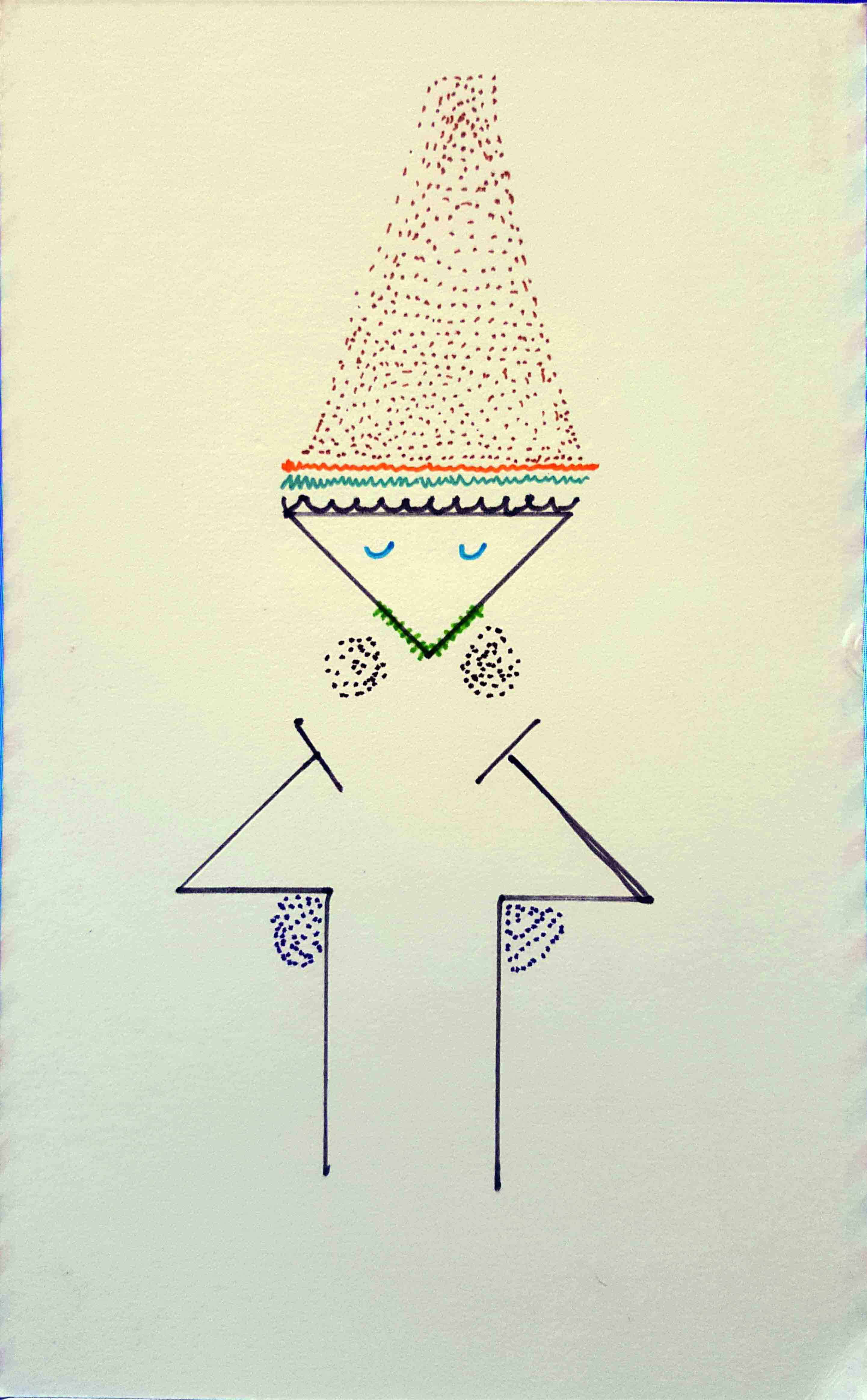
- 19 - Beauty Products
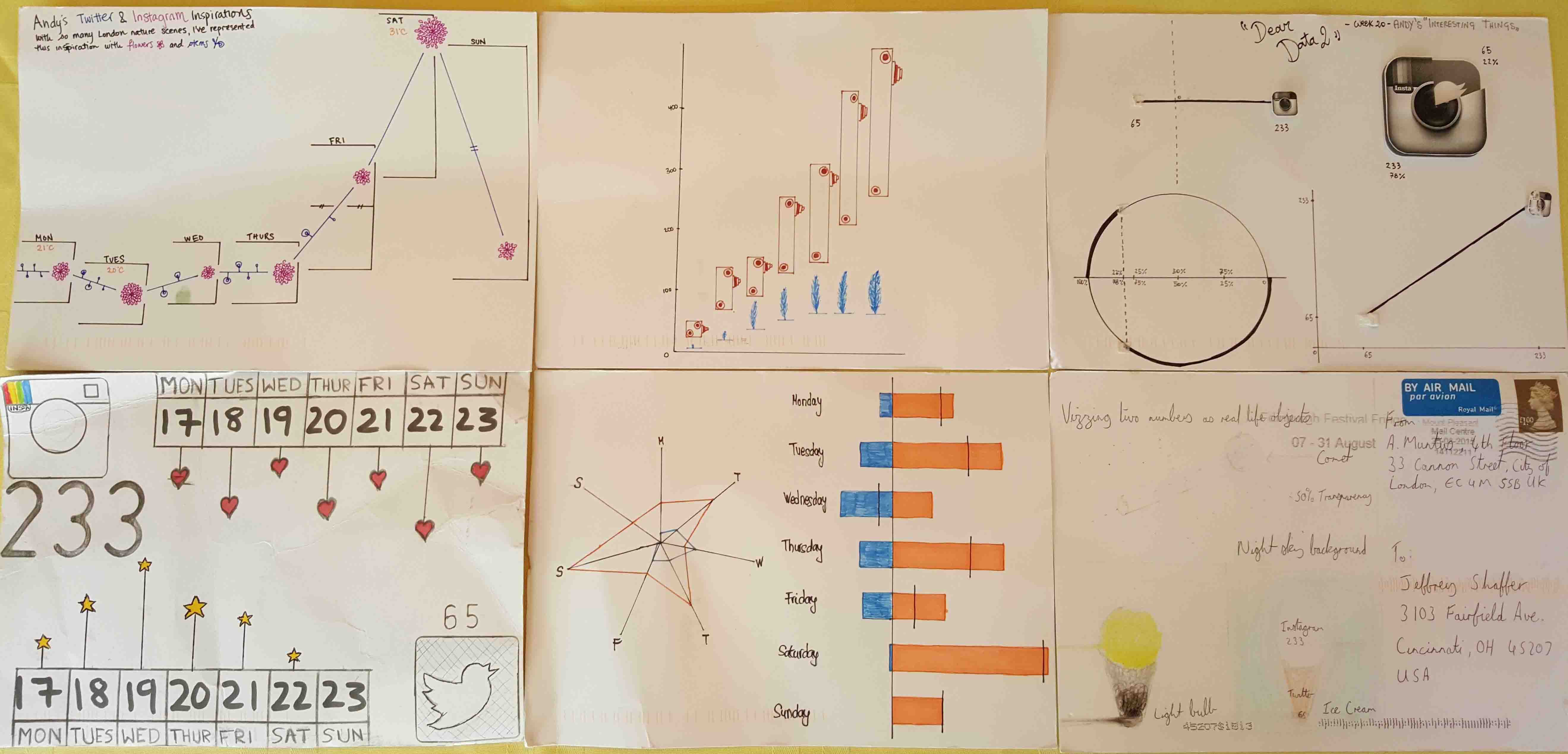
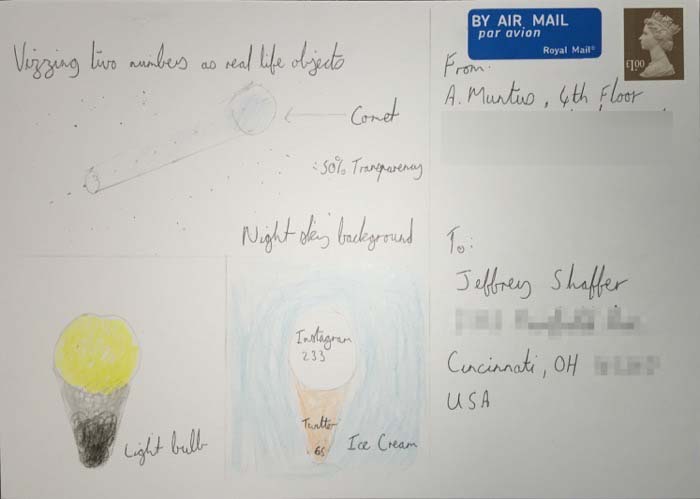
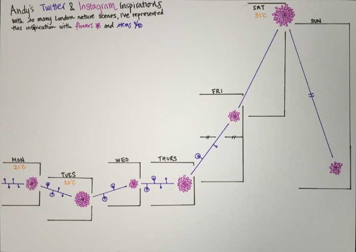
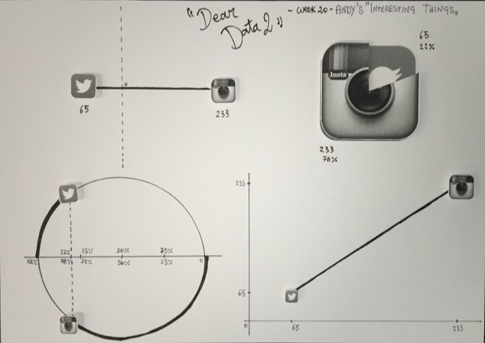
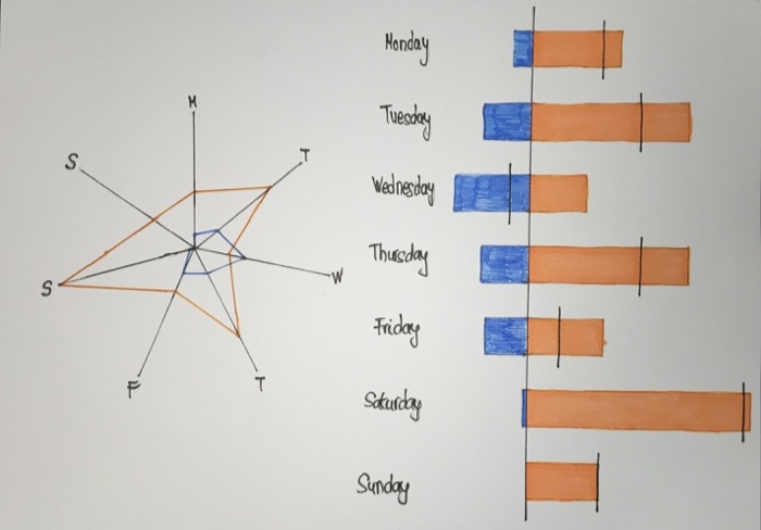
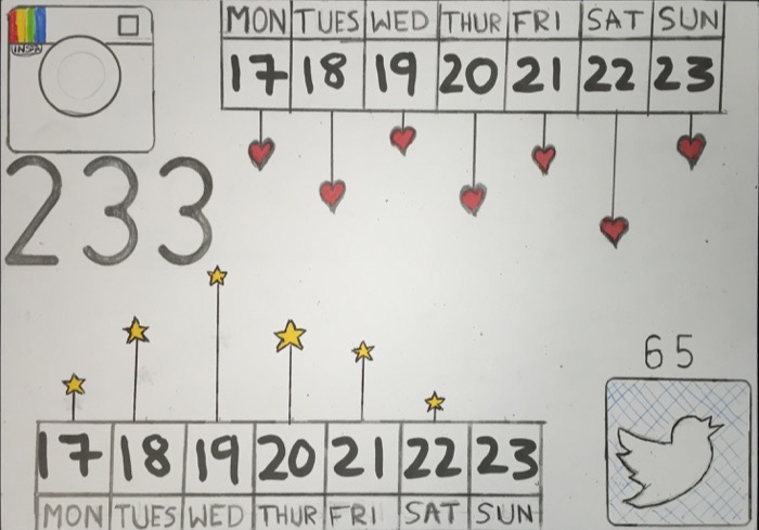
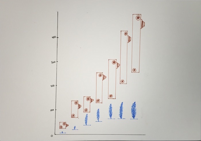
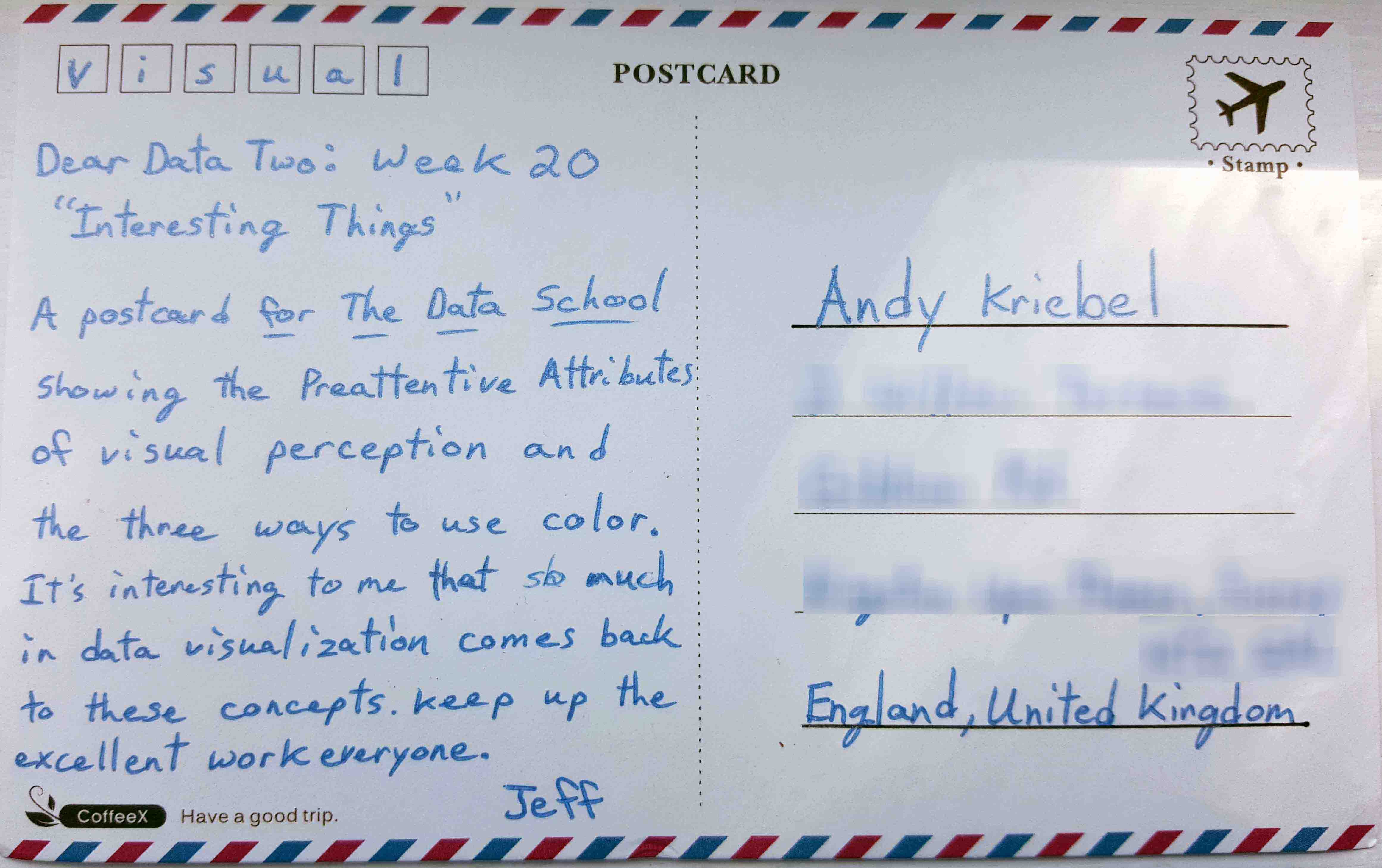
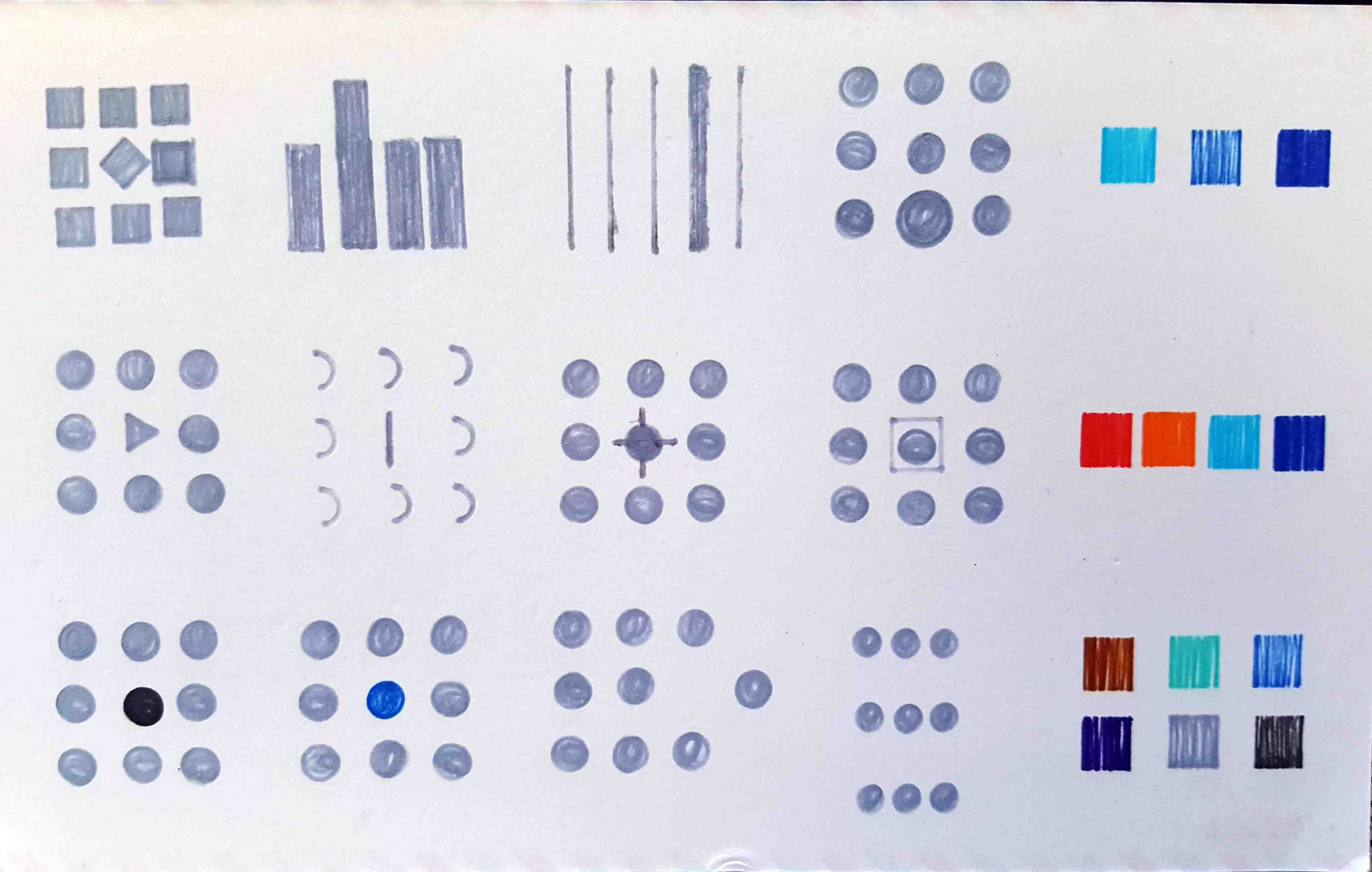
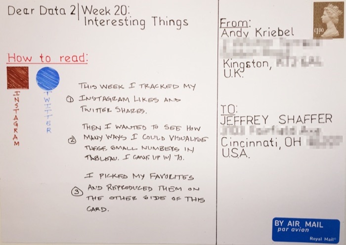
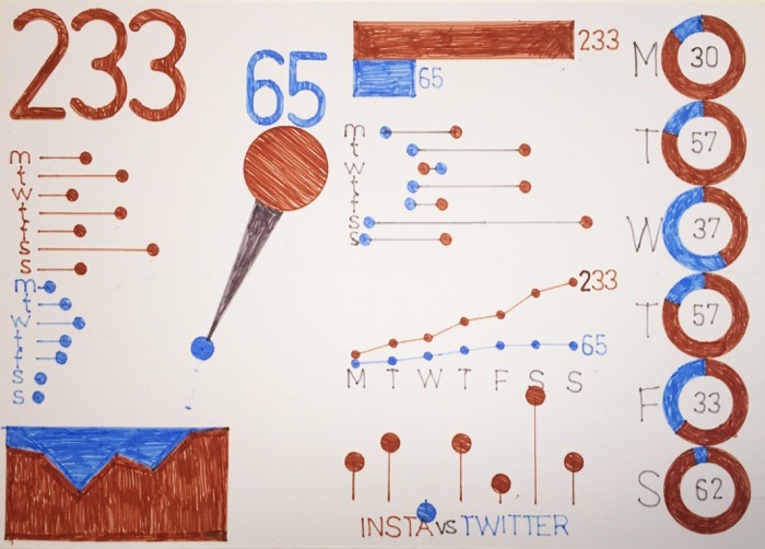
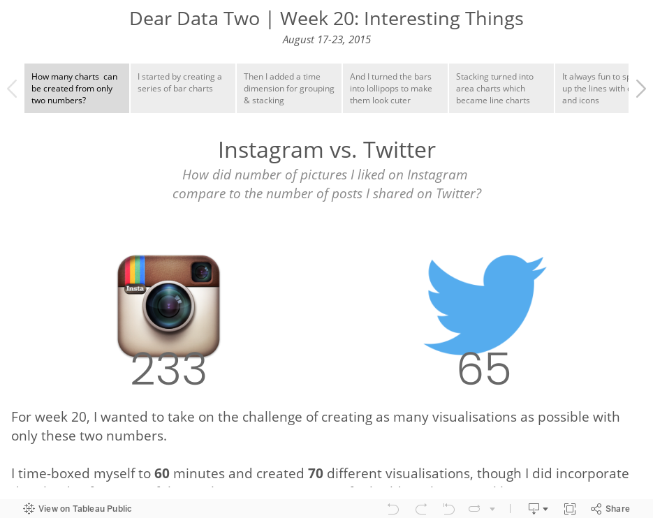
- 20 - Interesting Things
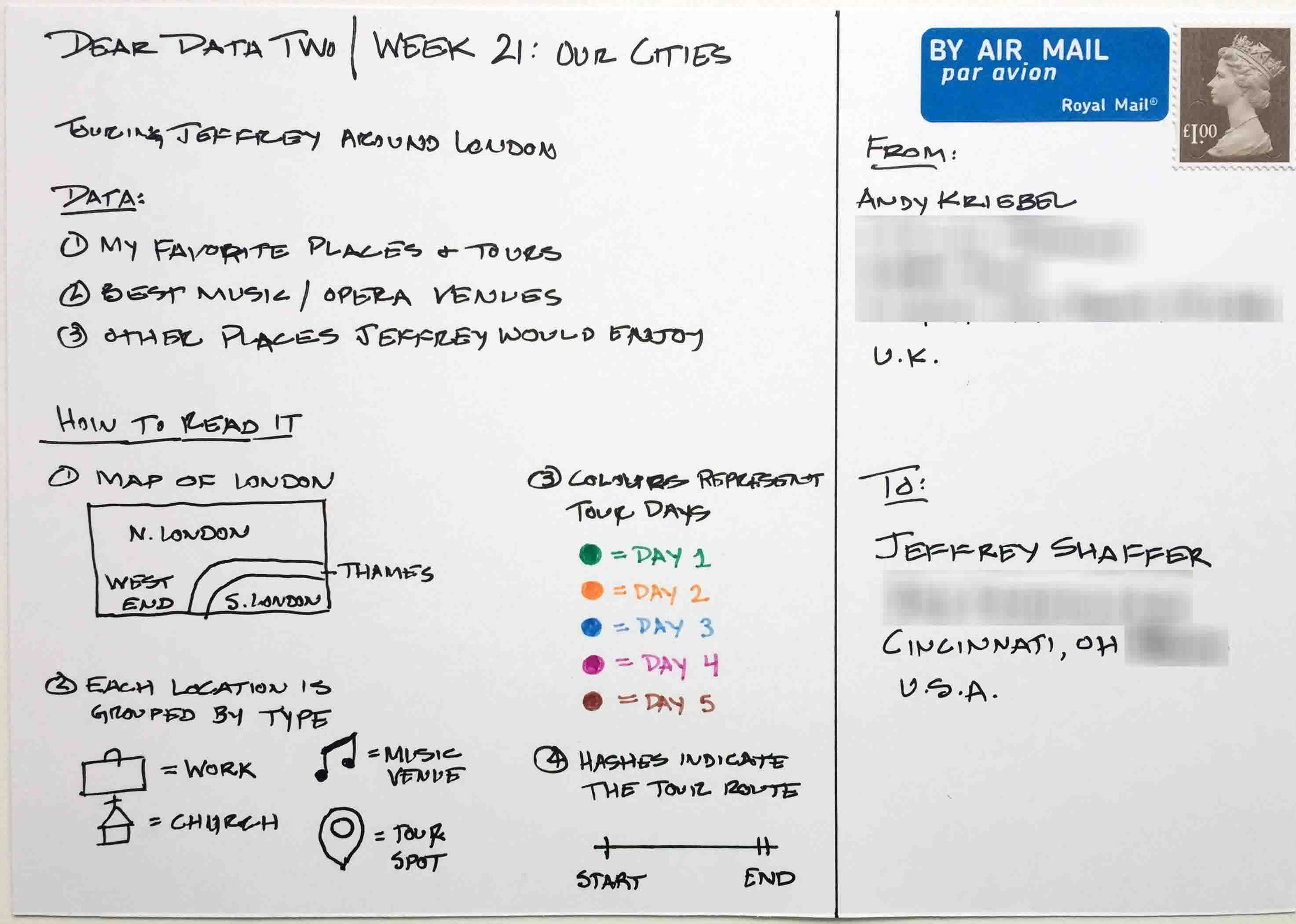
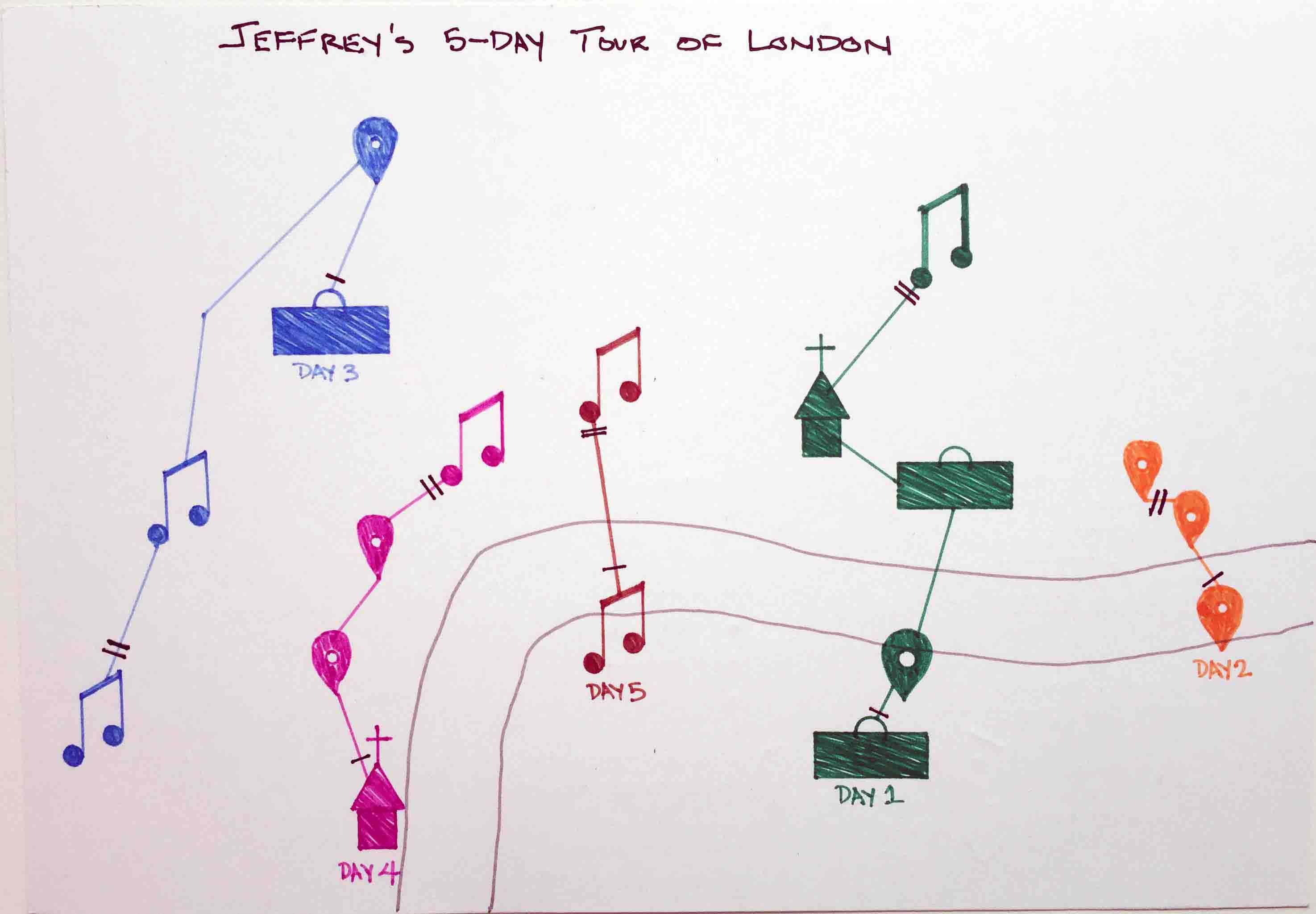
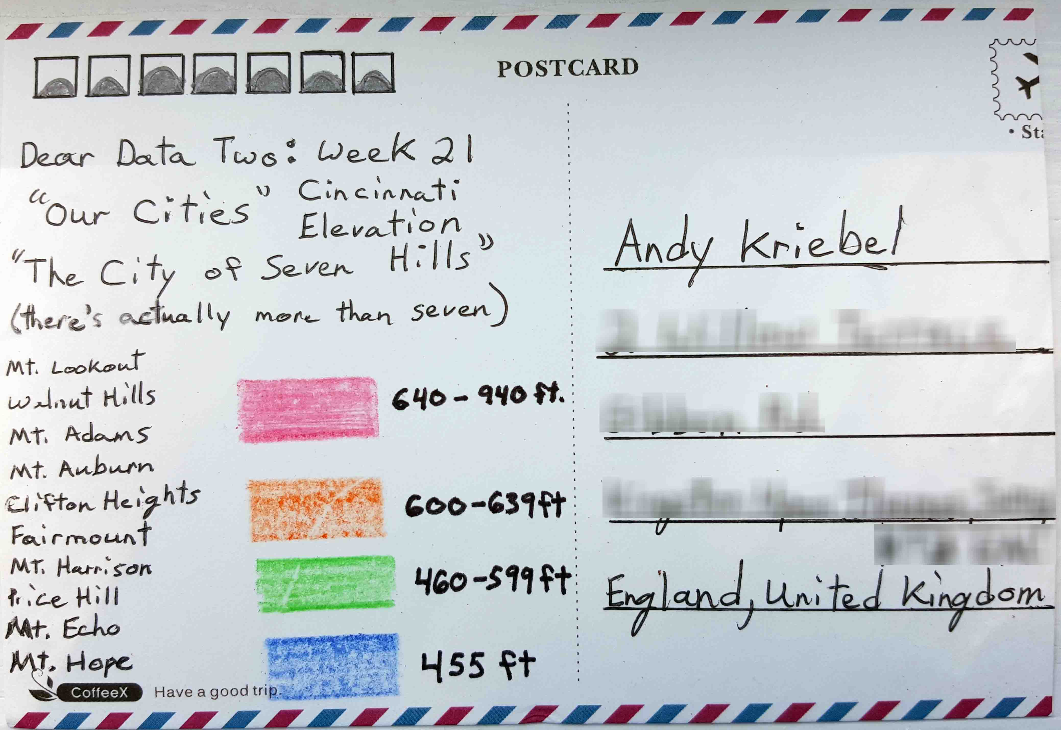
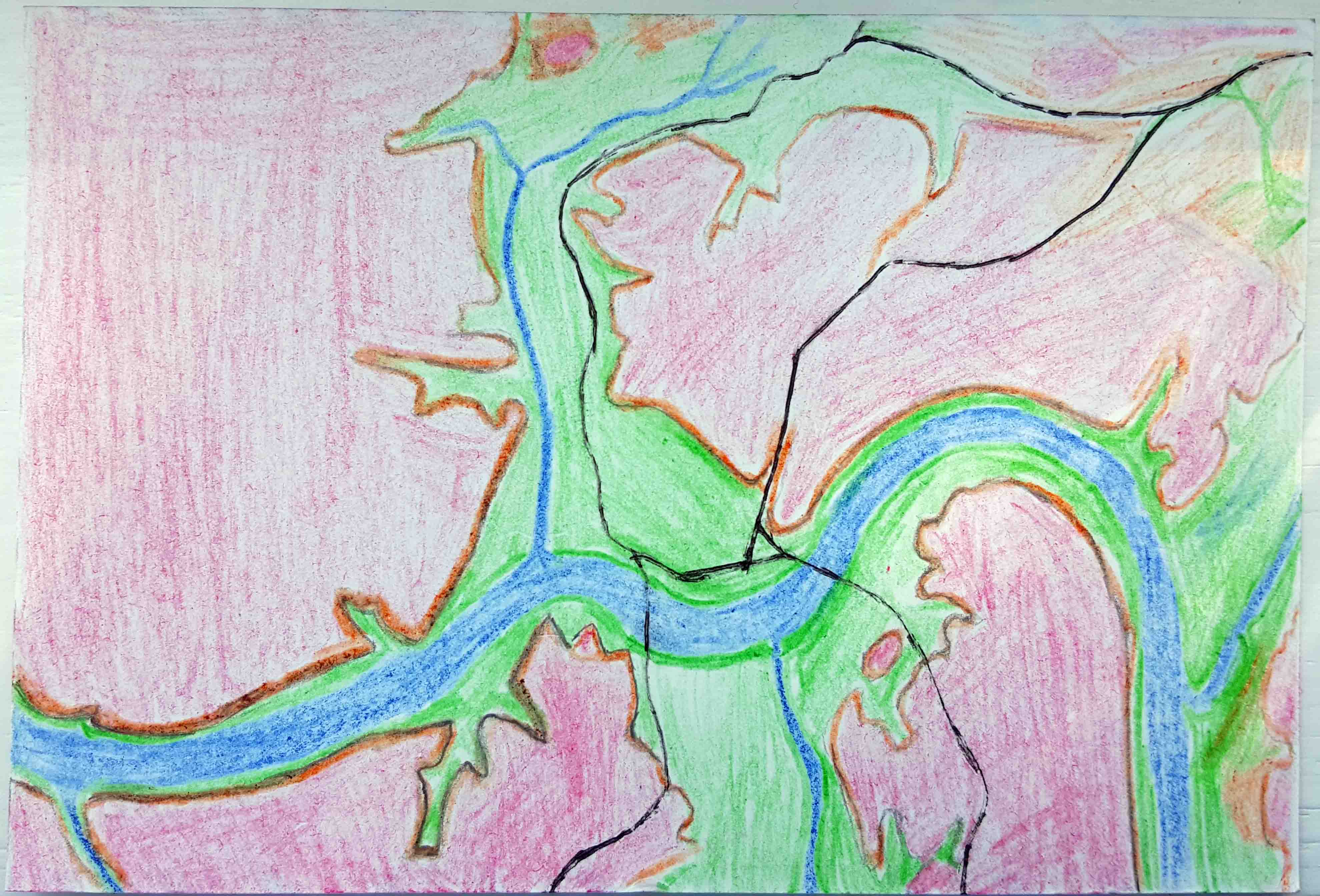
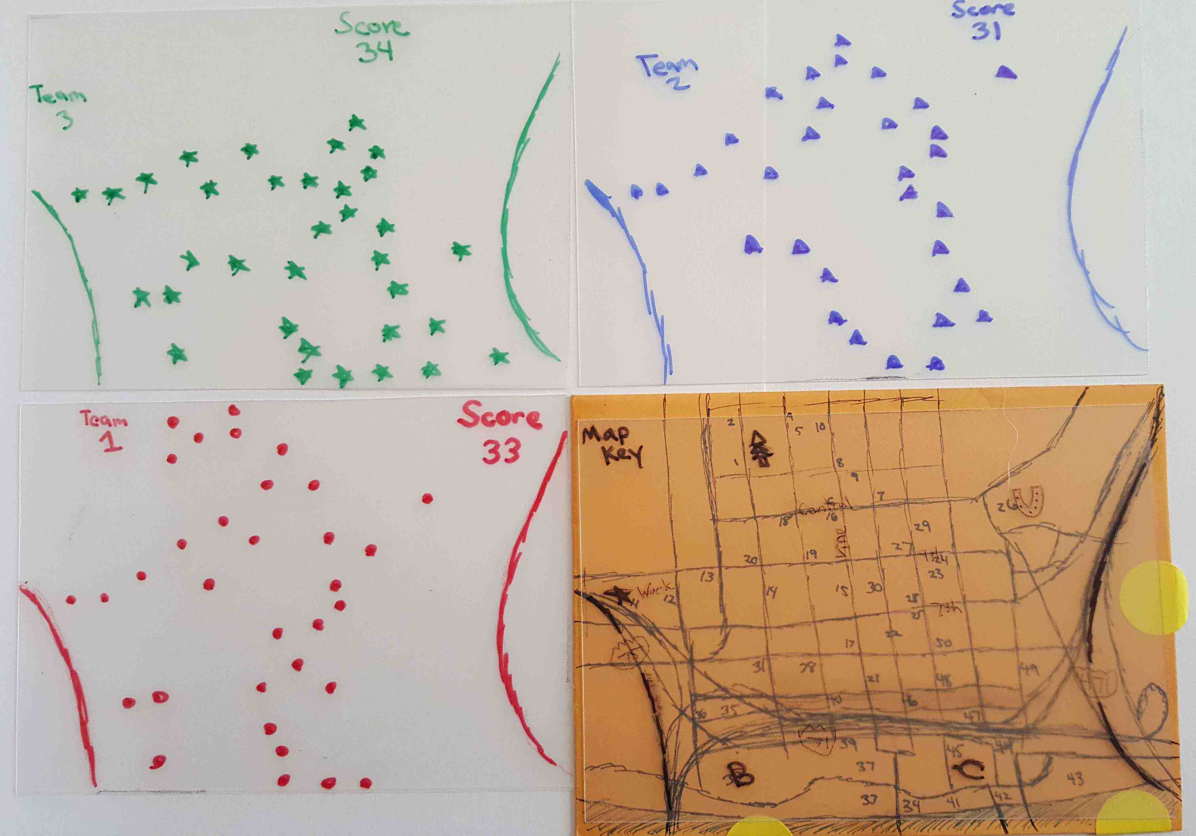
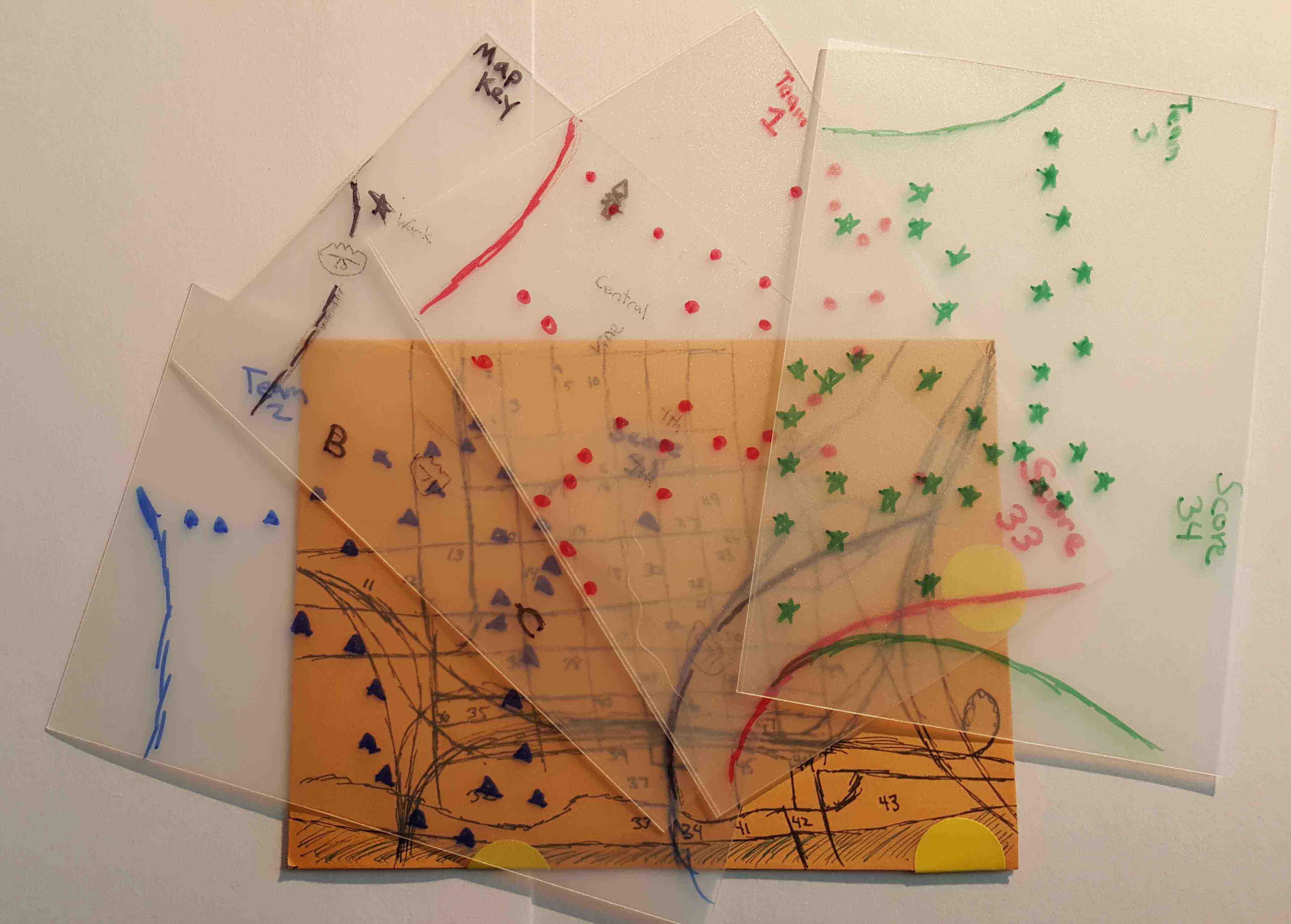
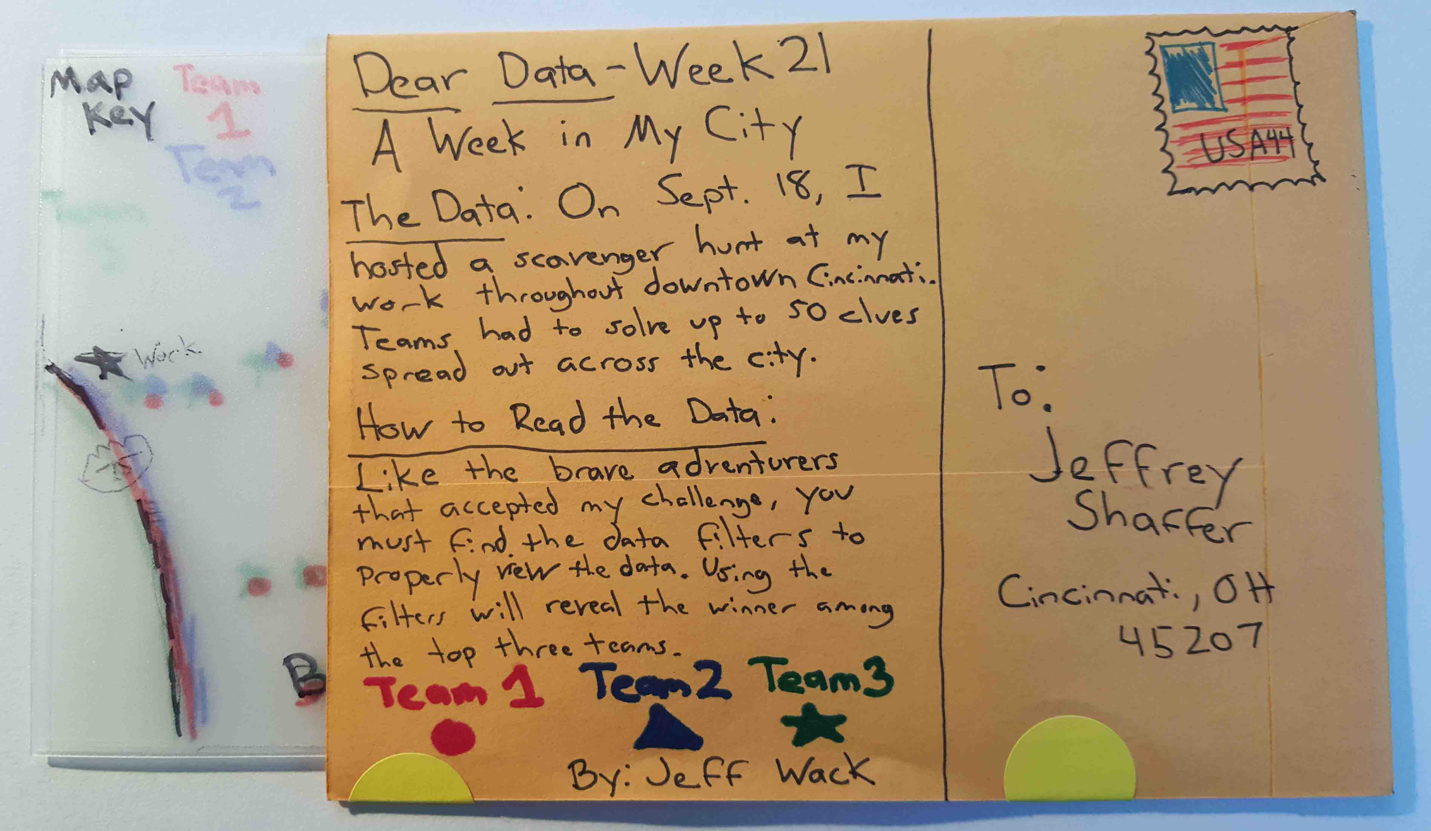
- 21 - Our Cities
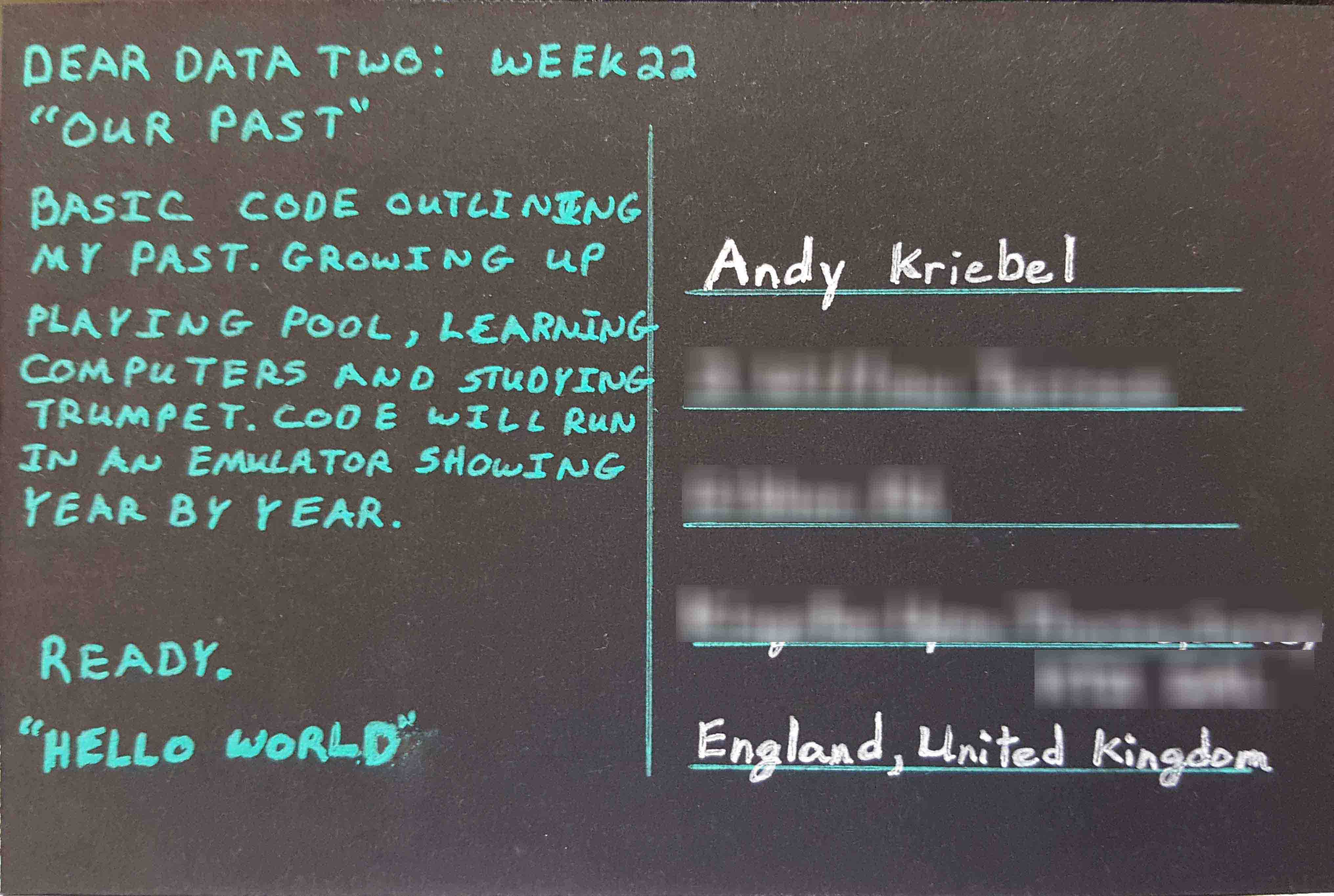
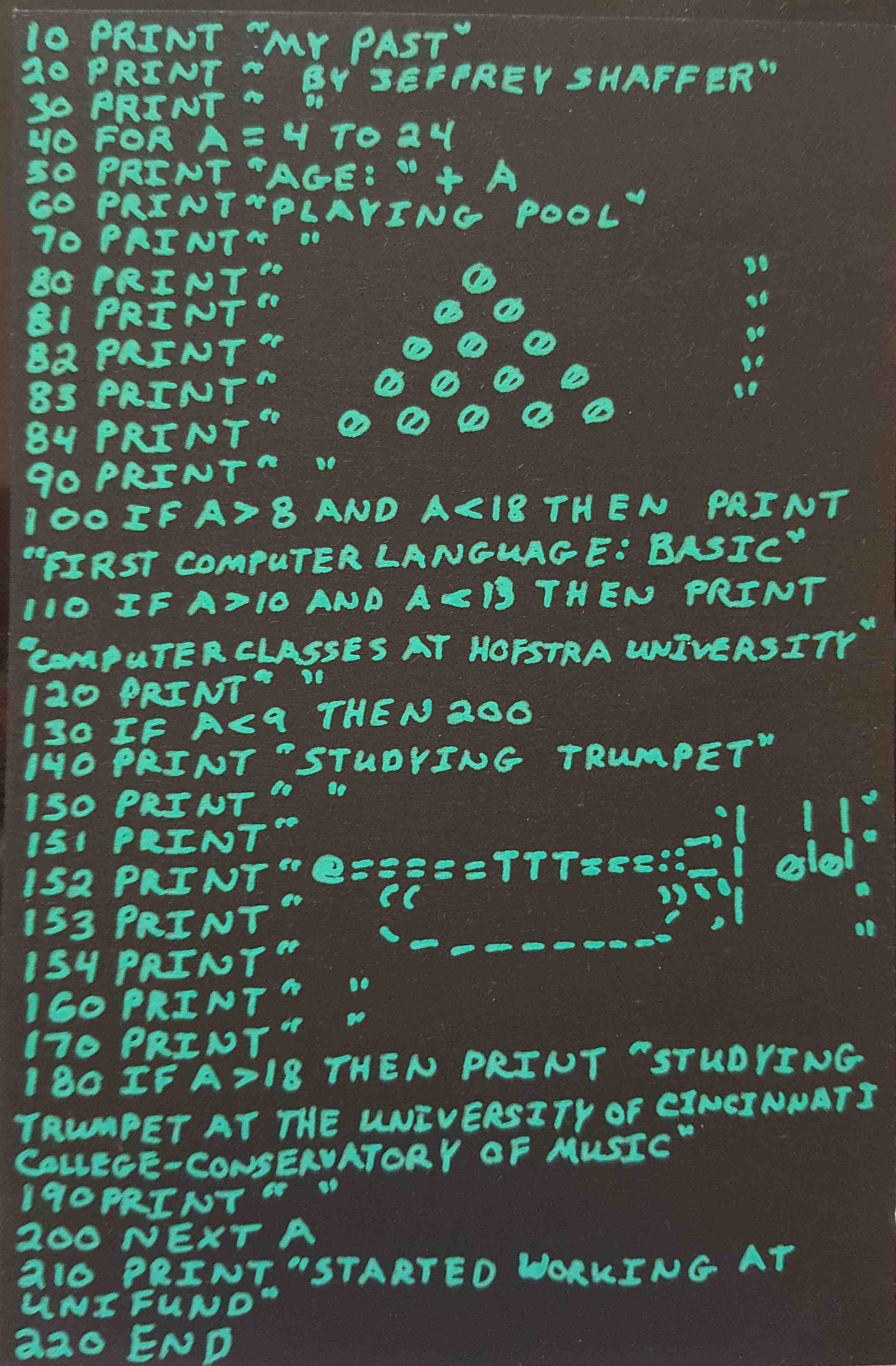
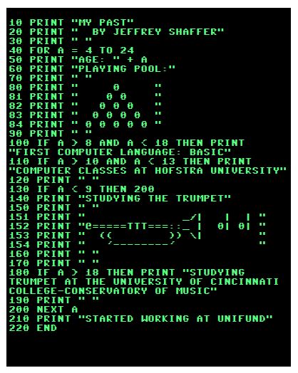
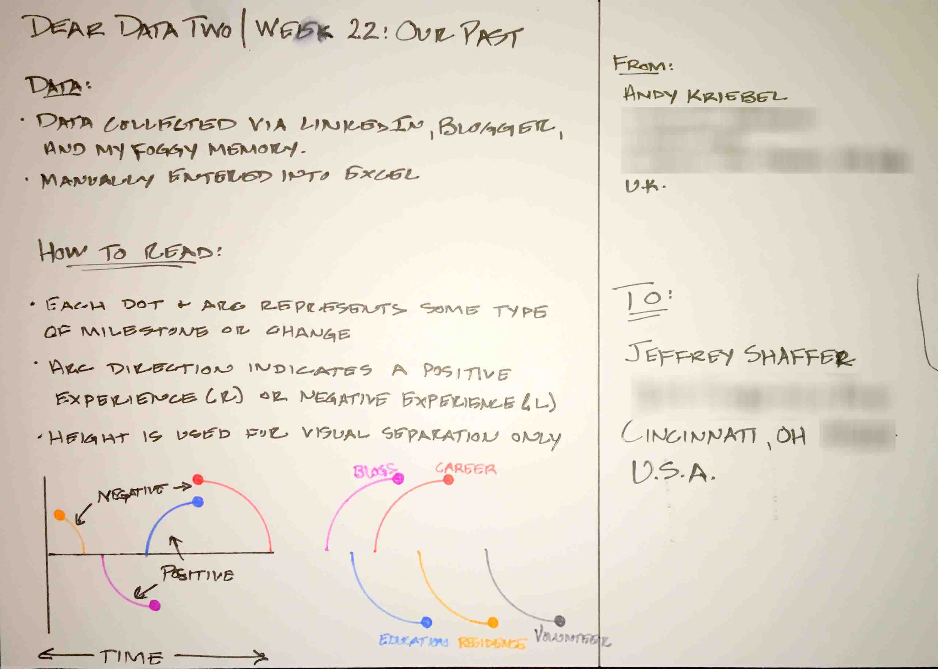
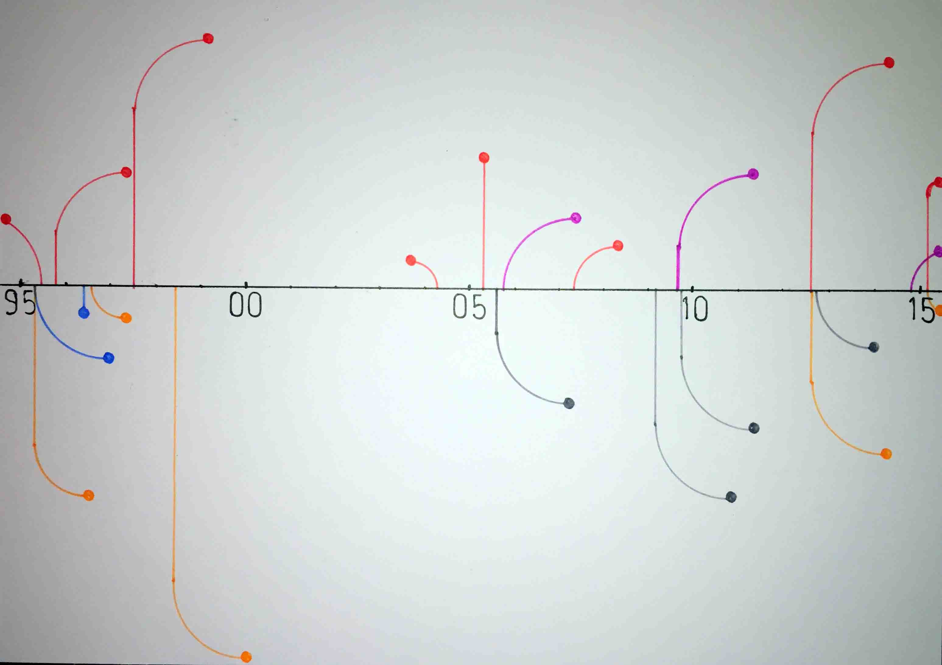
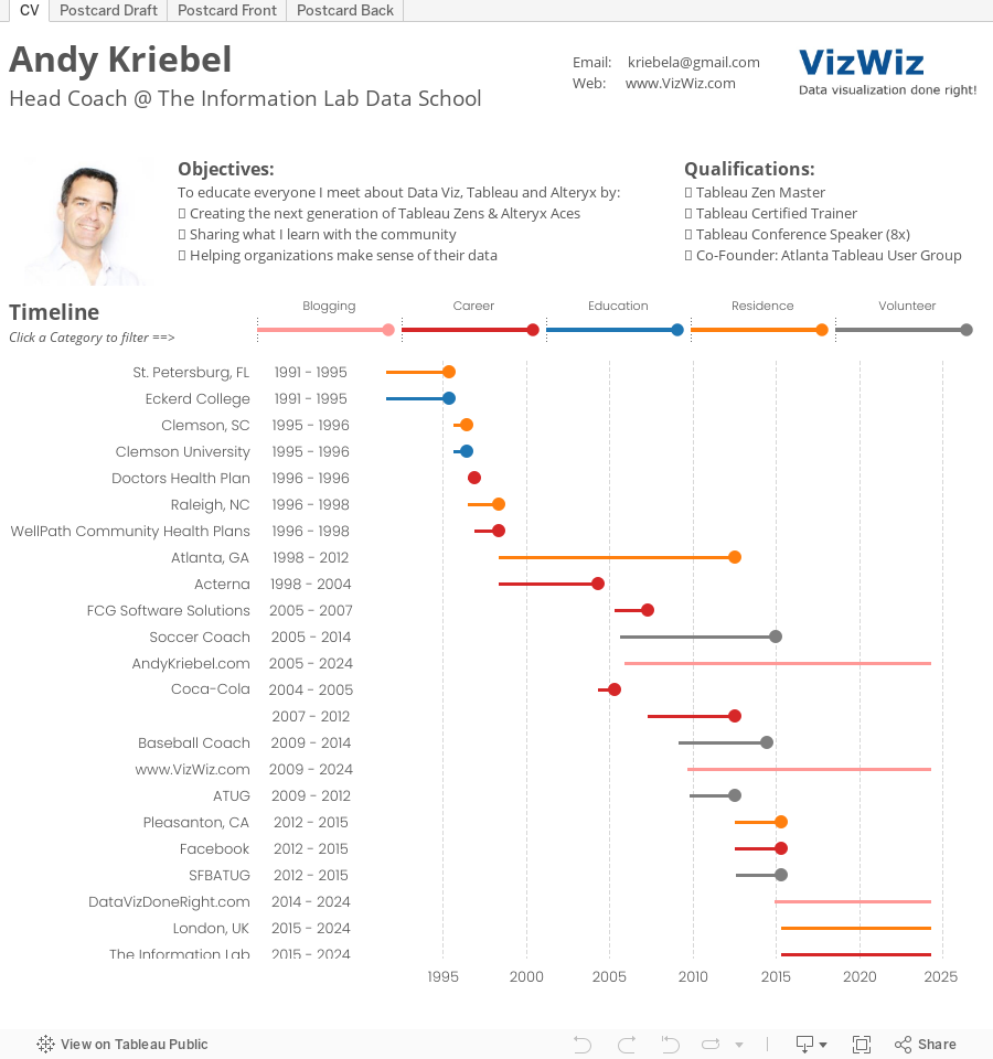
- 22 - Our Past
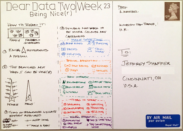
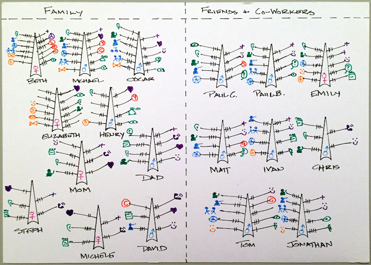
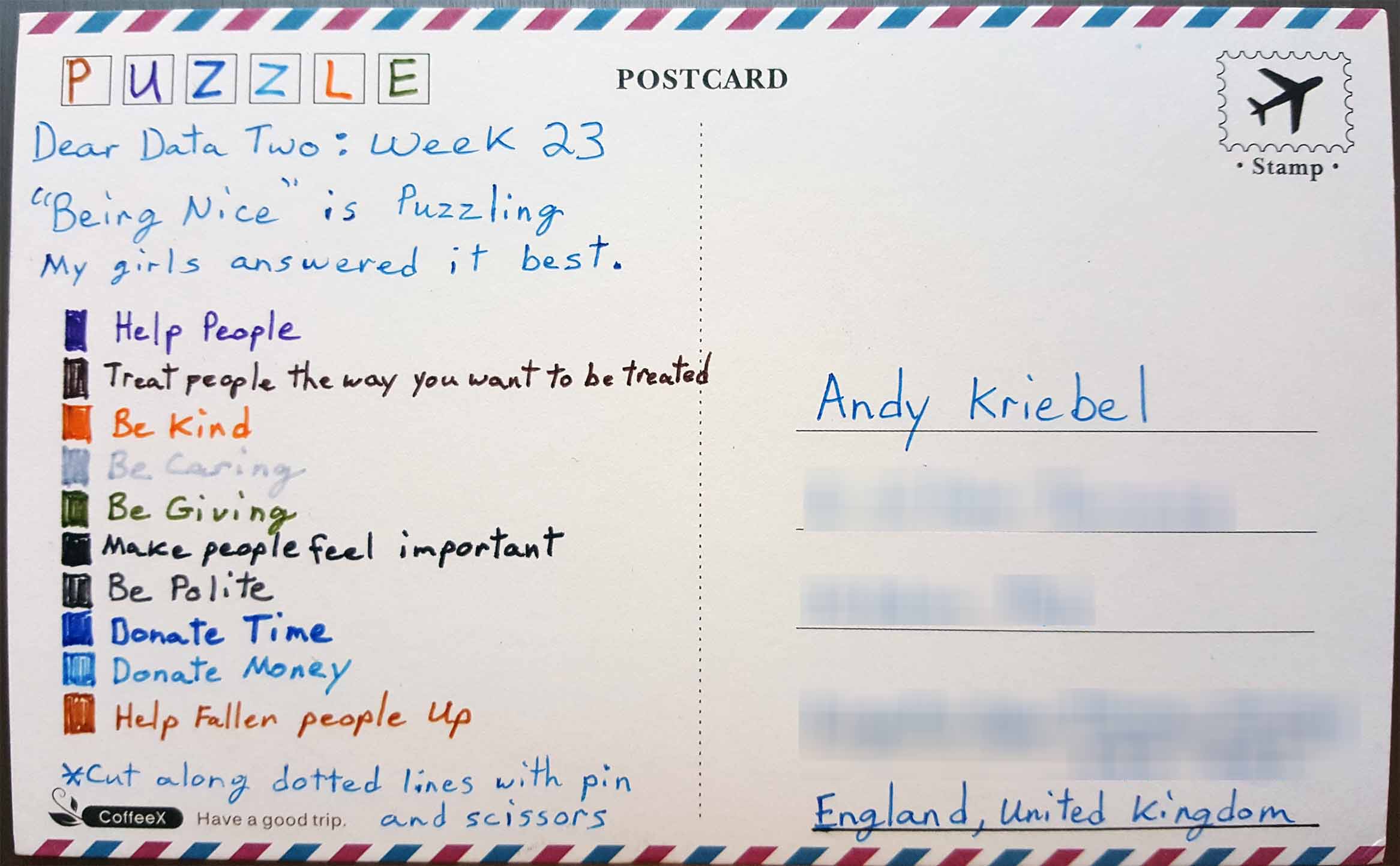
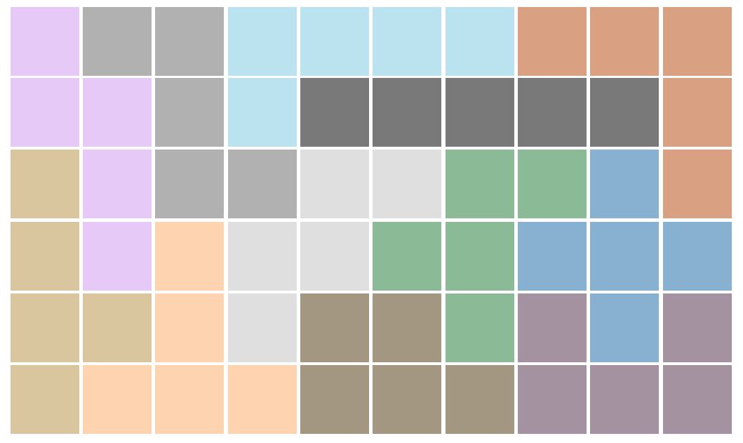
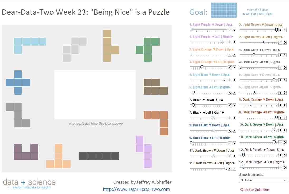
- 23 - Being Nice
- 24 - Doors/Spaces
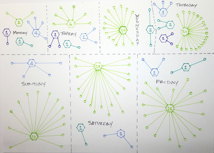
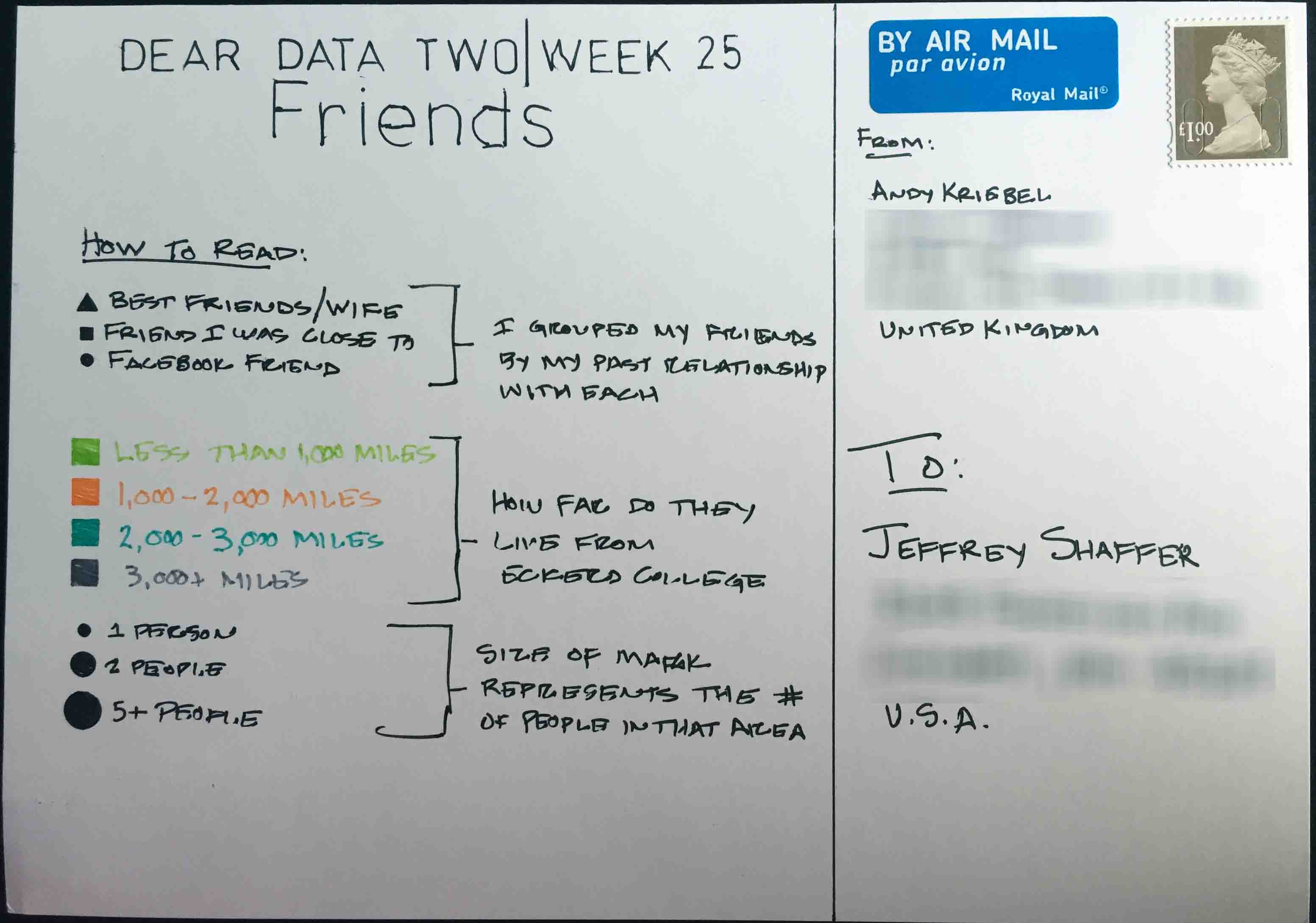
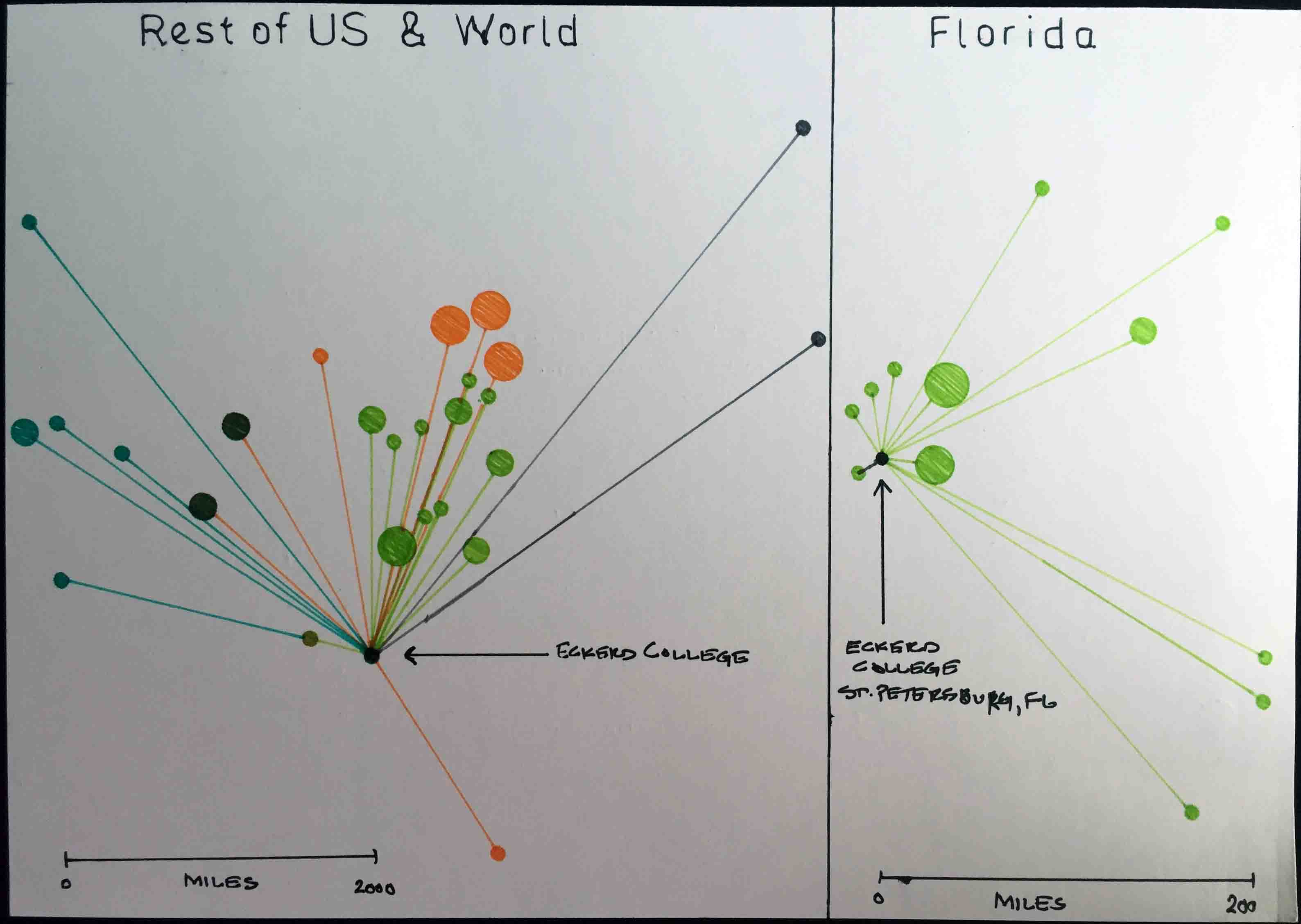
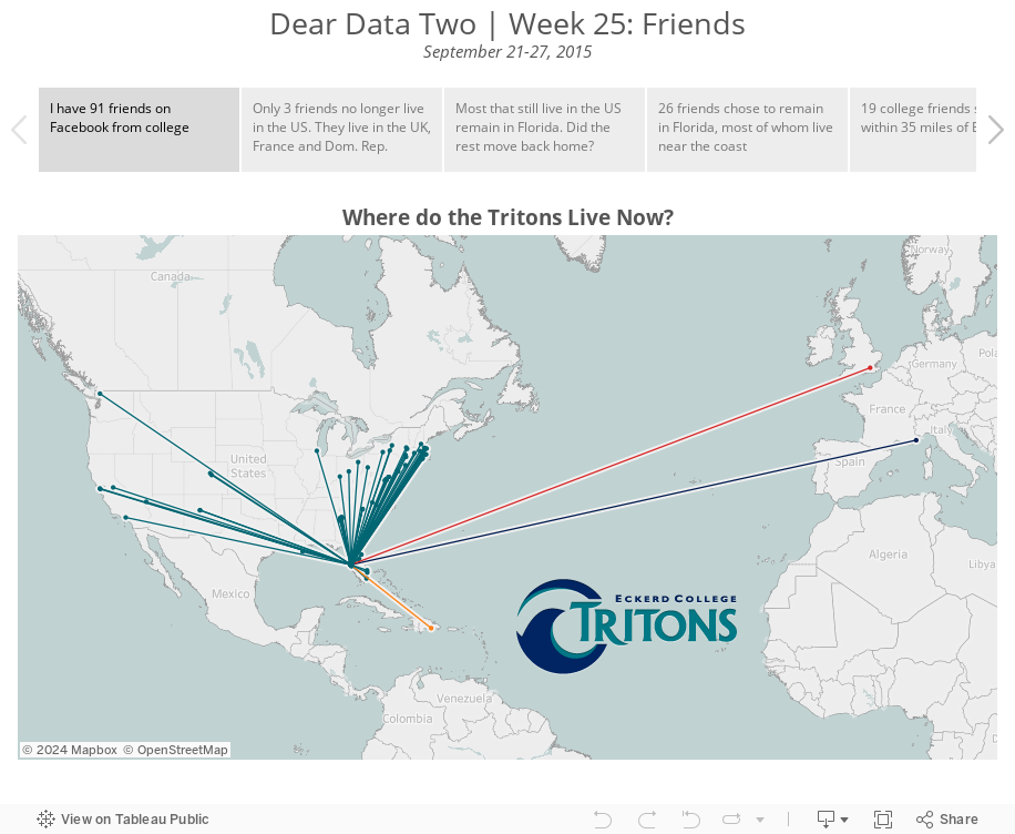
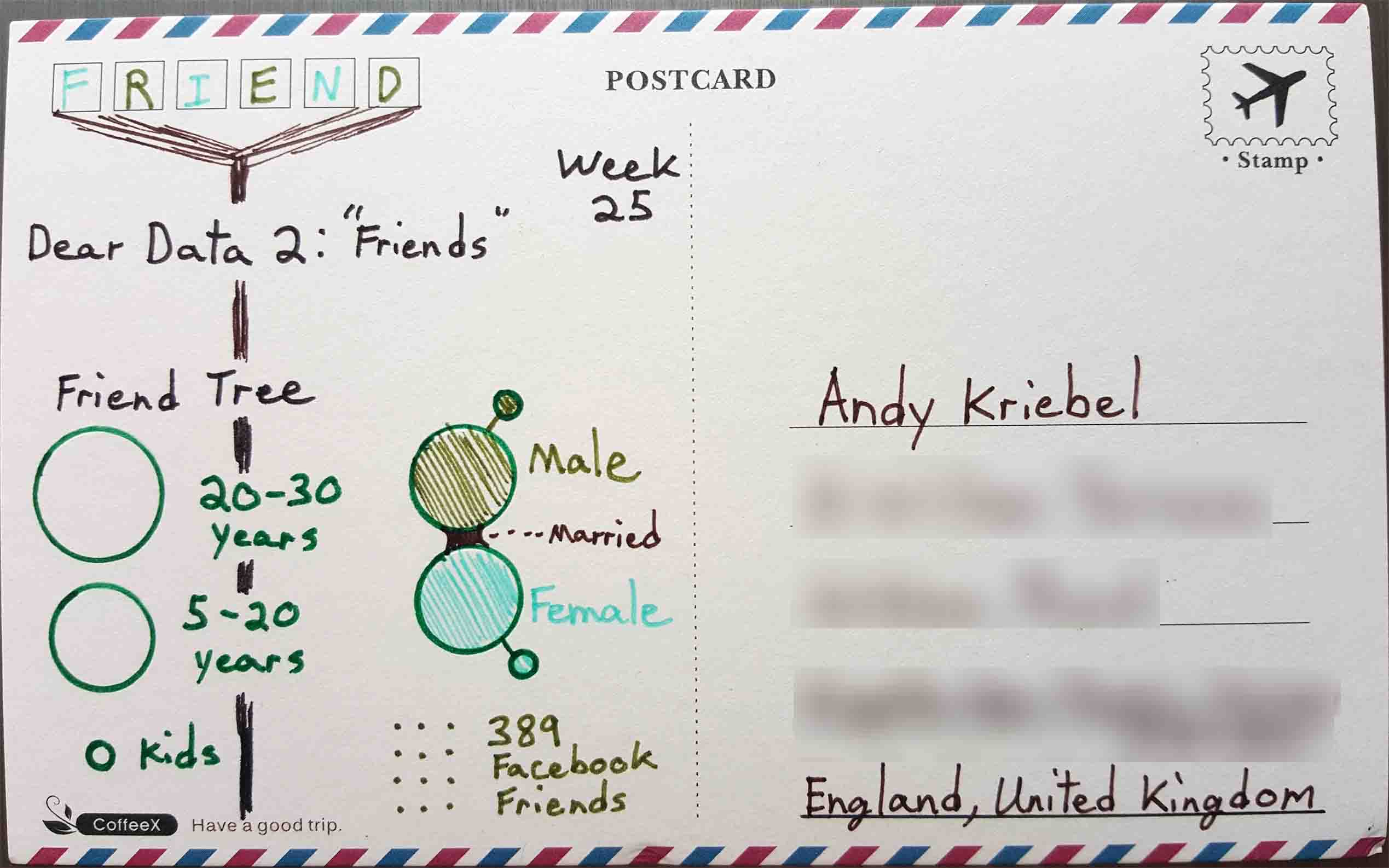
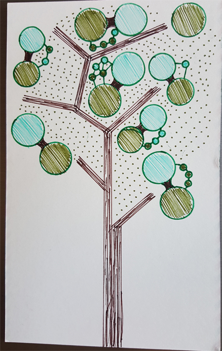
- 25 - Friends
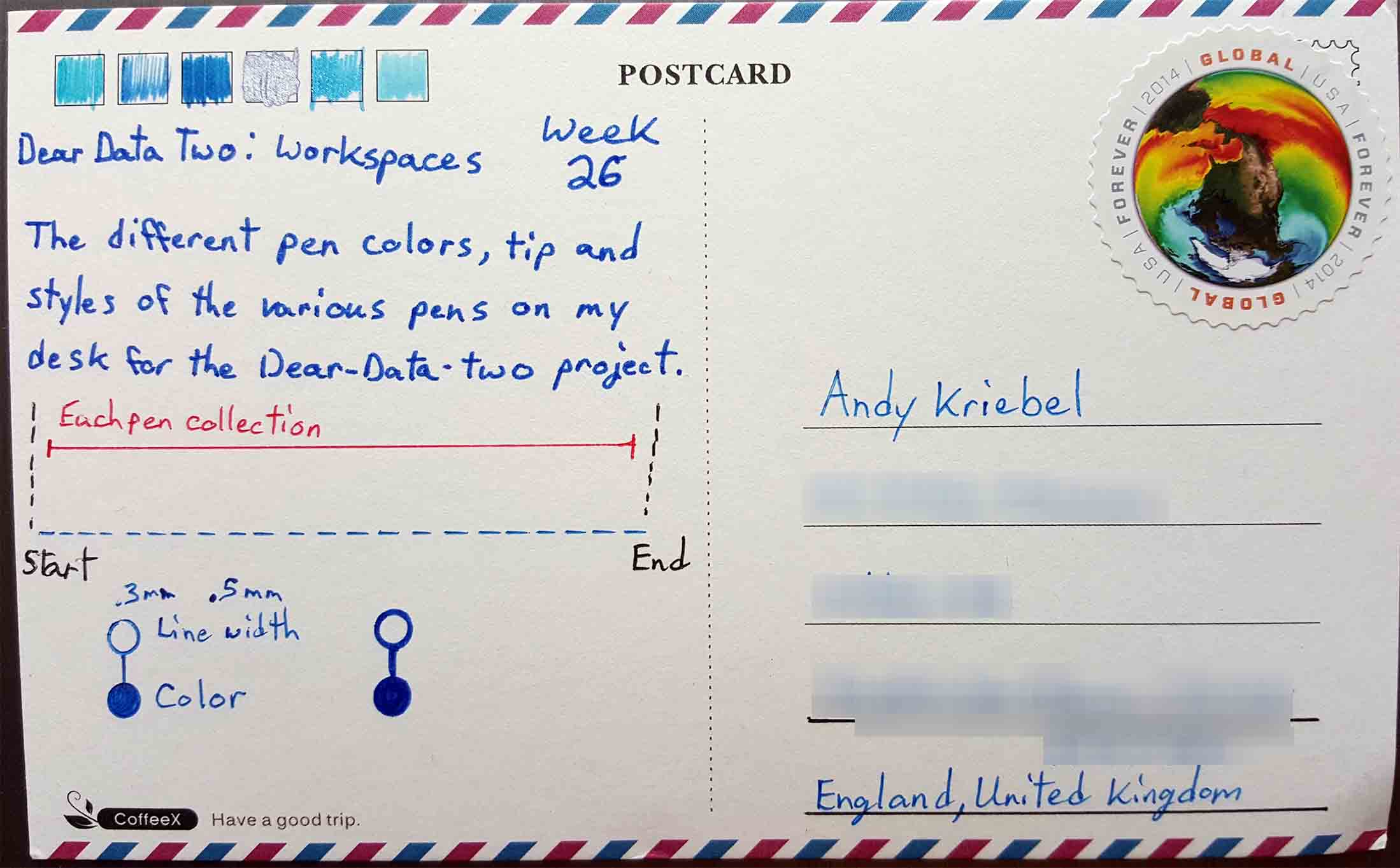
- 26 - Workspaces
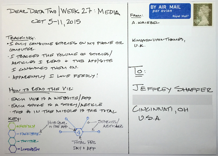
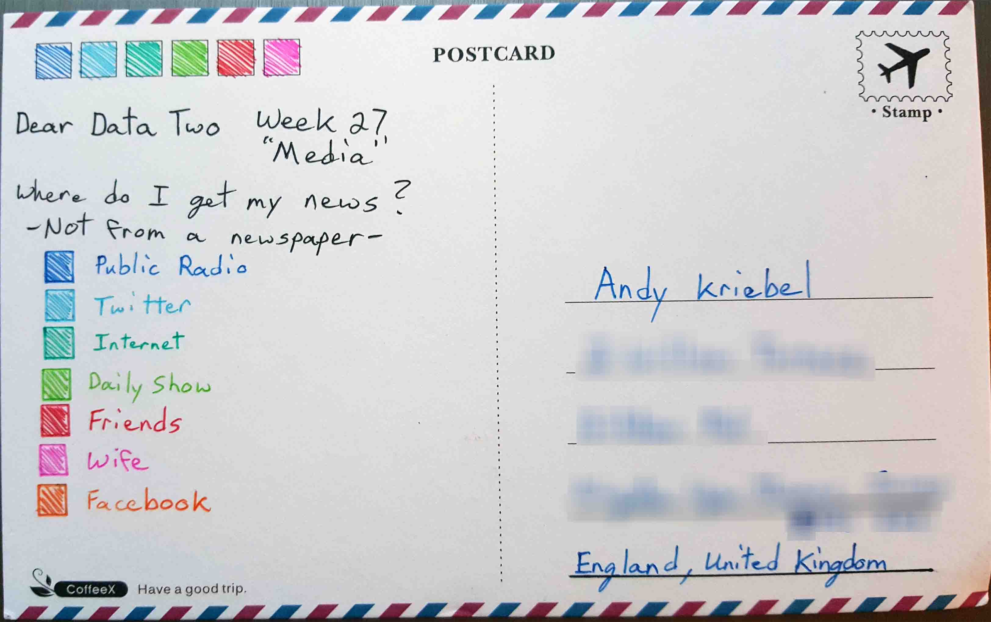
- 27 - Media
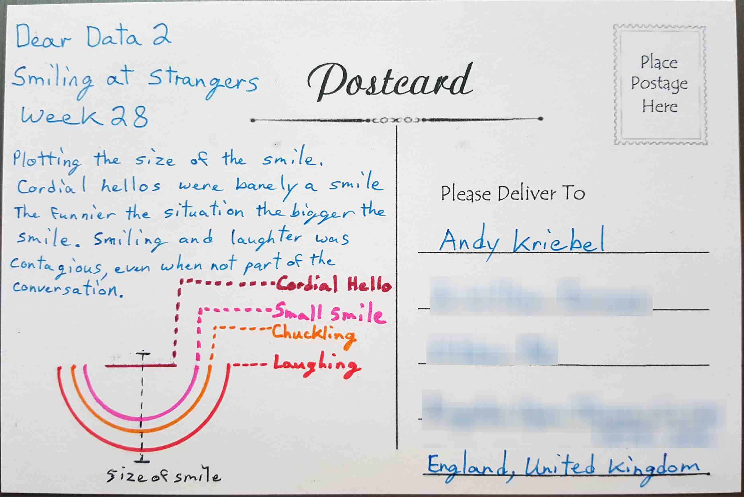
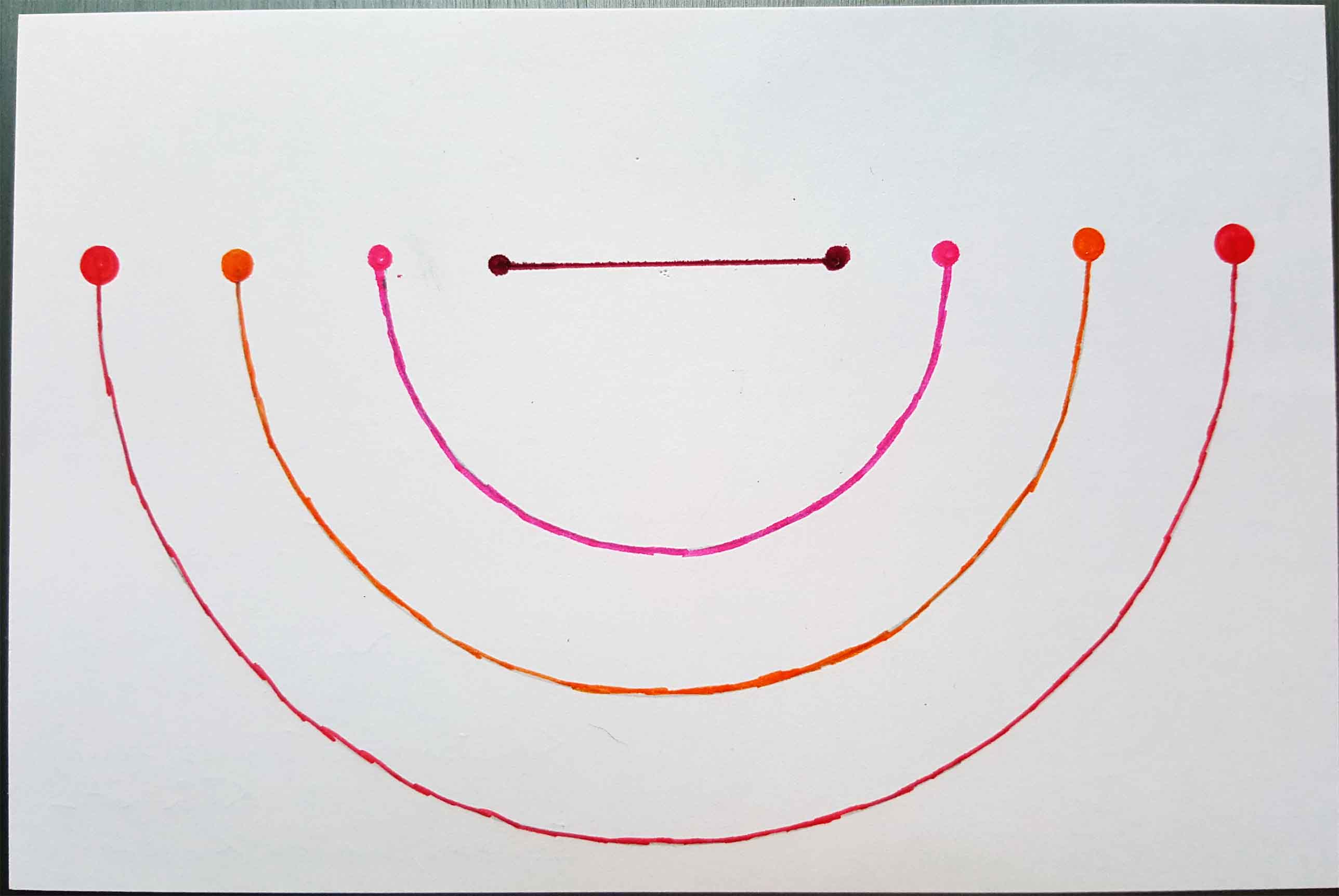
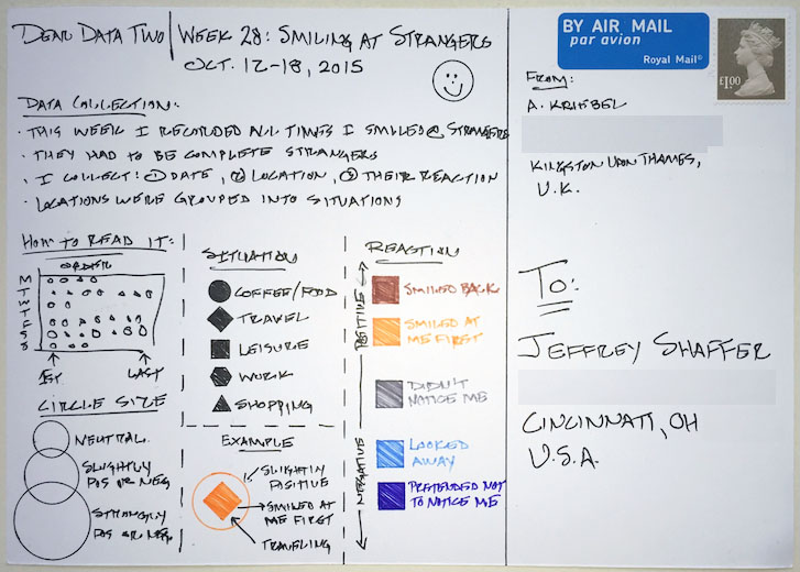
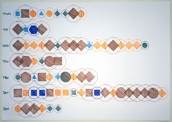
- 28 - Smiling at Strangers
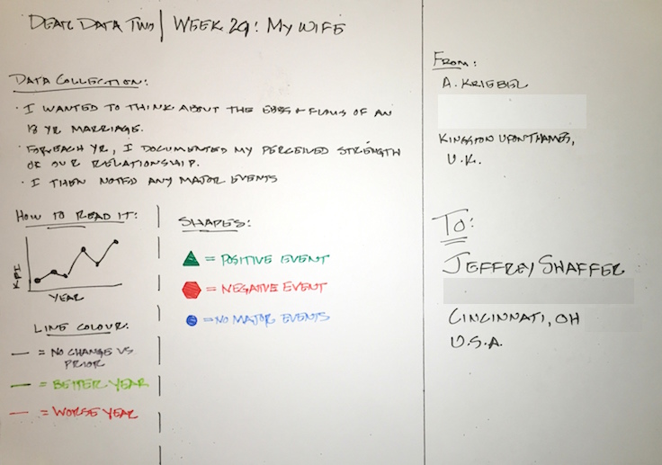
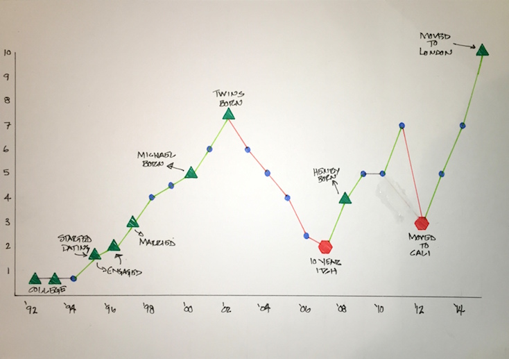
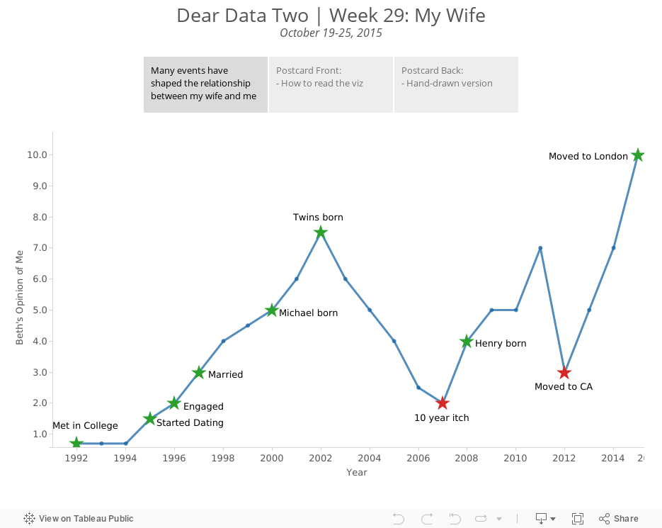
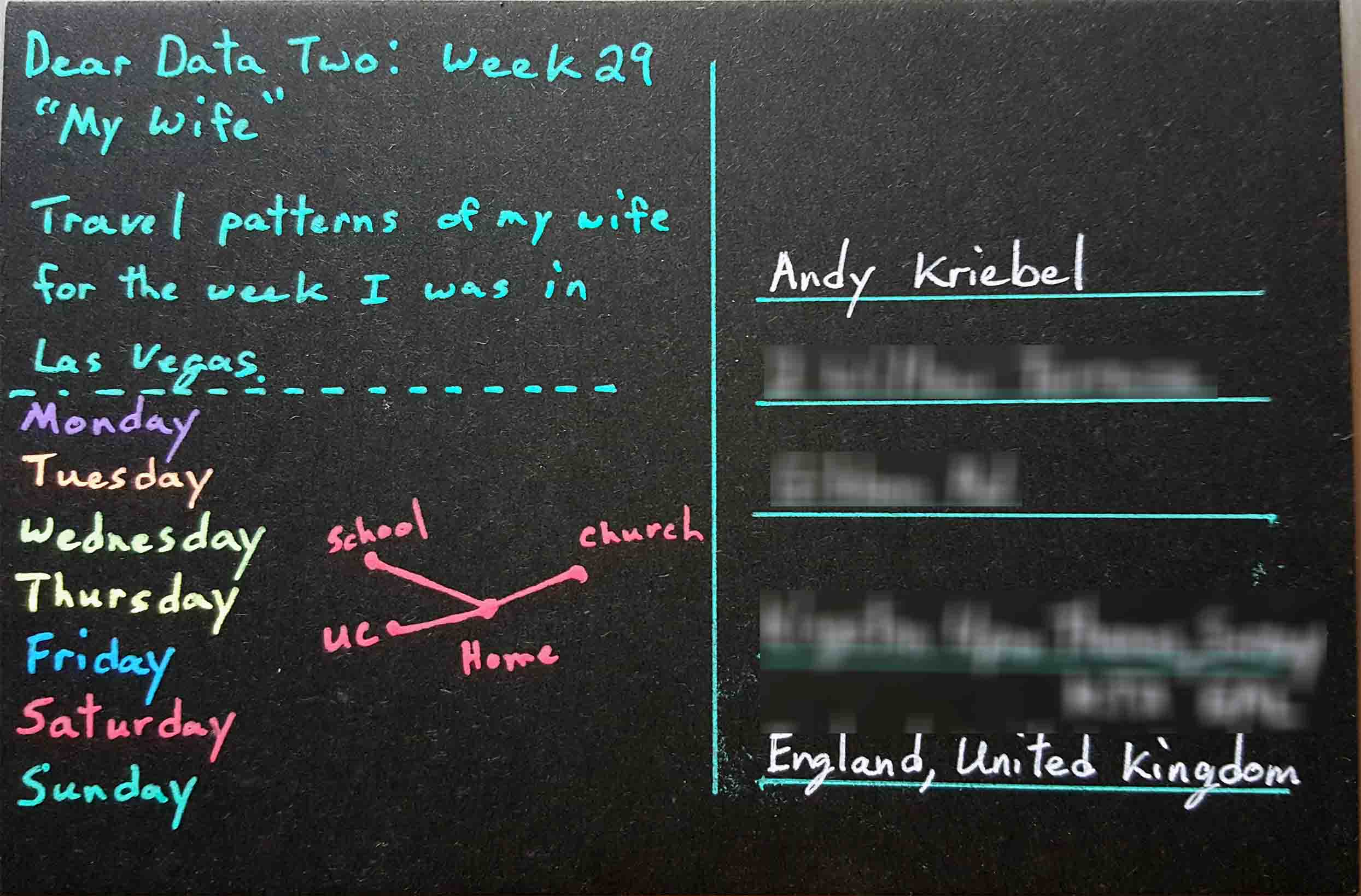
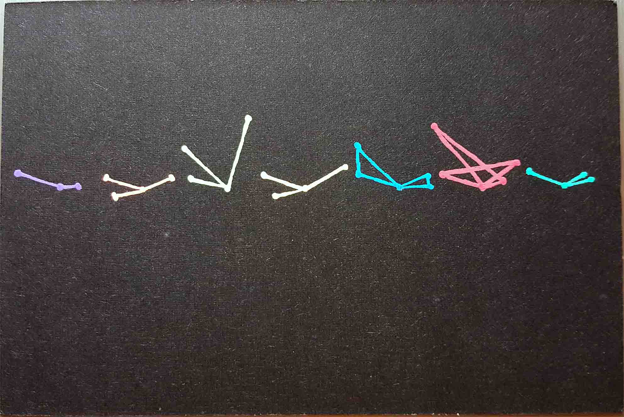
- 29 - Wives
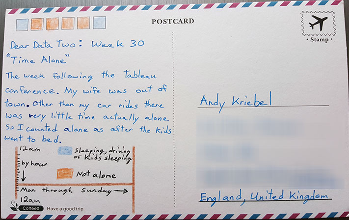
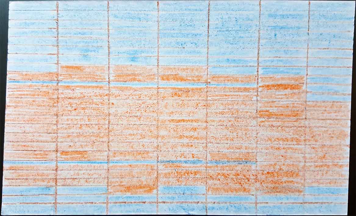
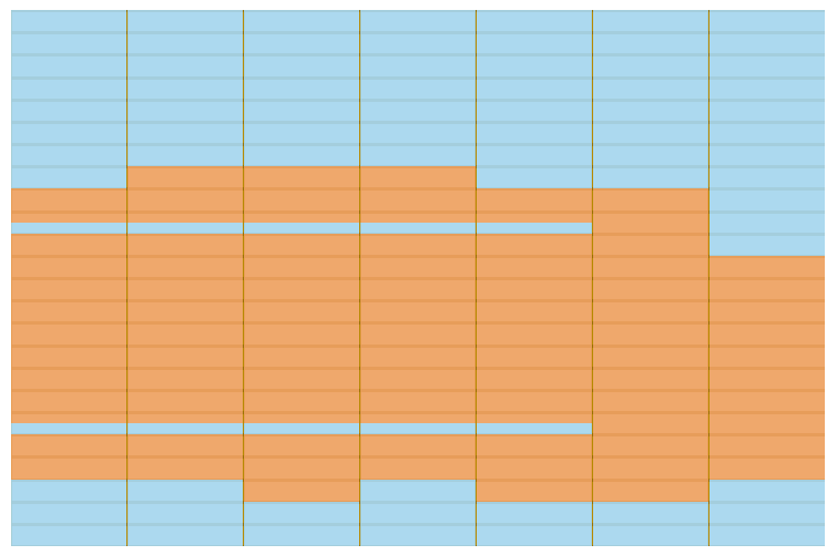
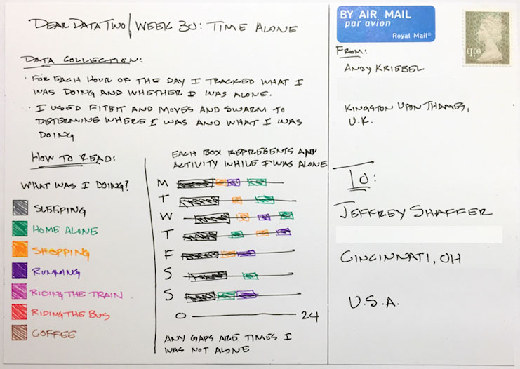
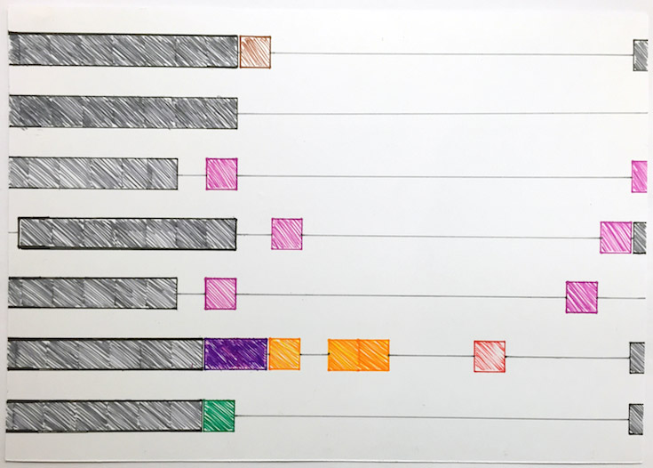
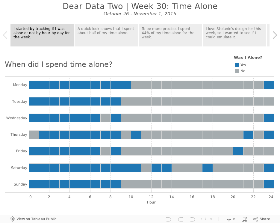
- 30 - Time Alone
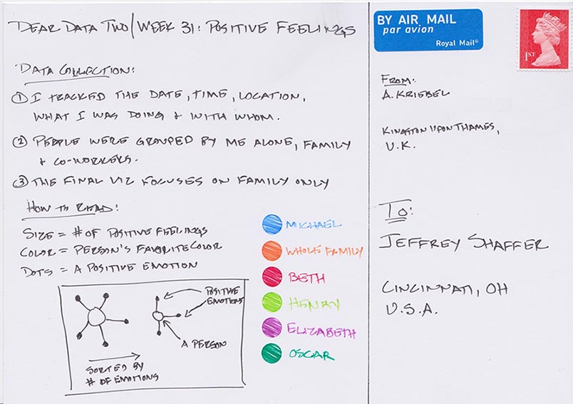
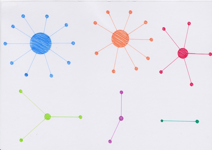
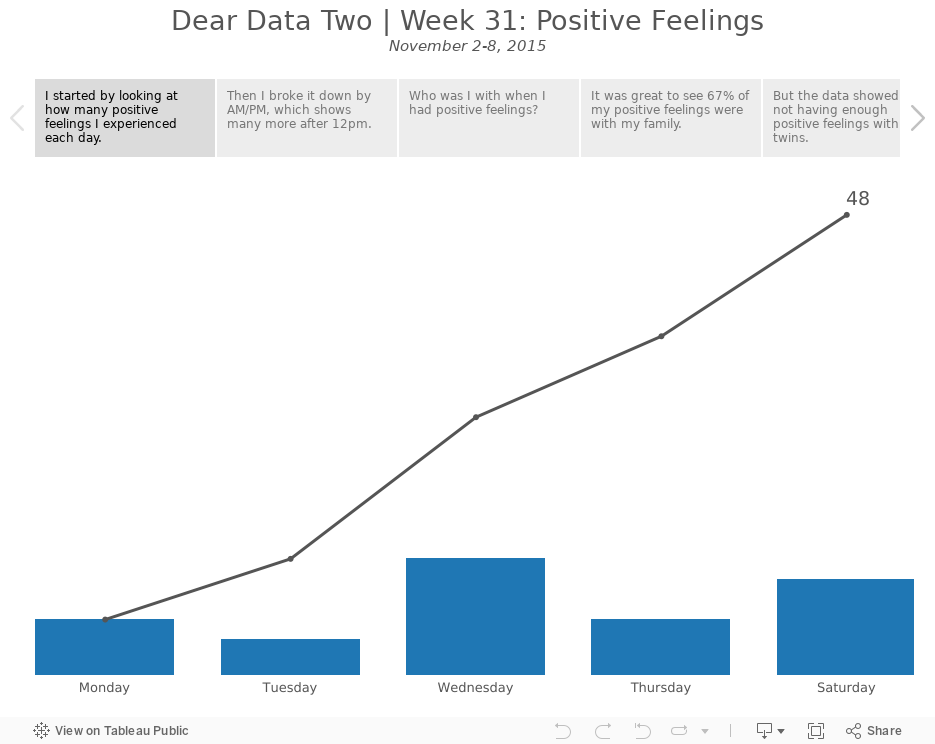
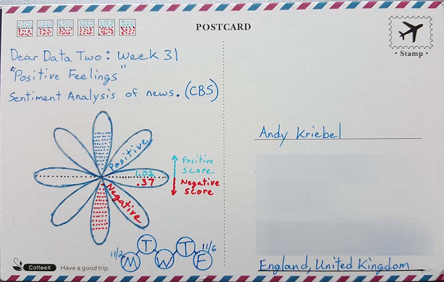
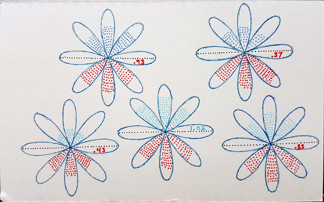
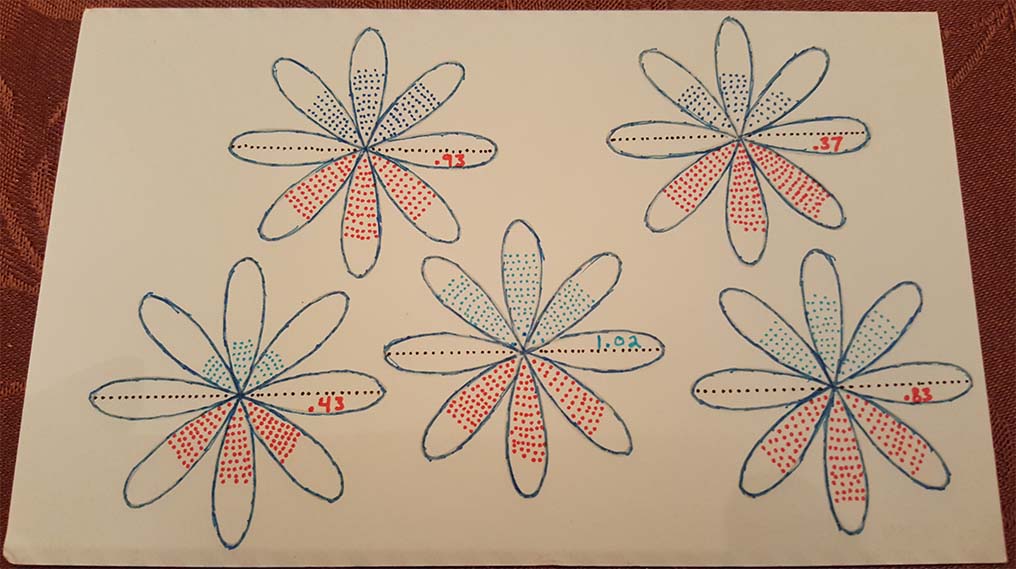
- 31 - Positive Feelings
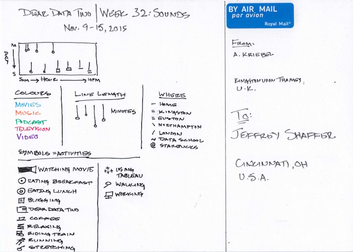
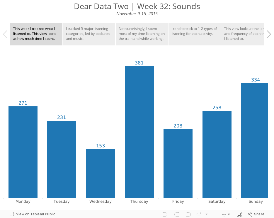
- 32 - Sounds
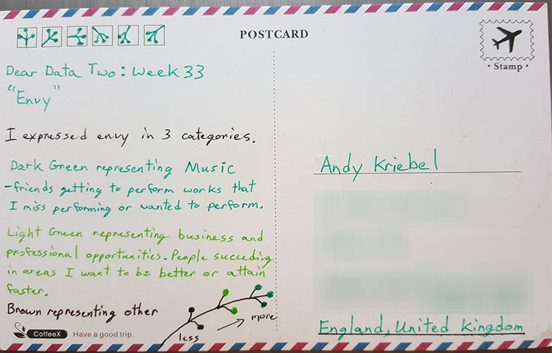
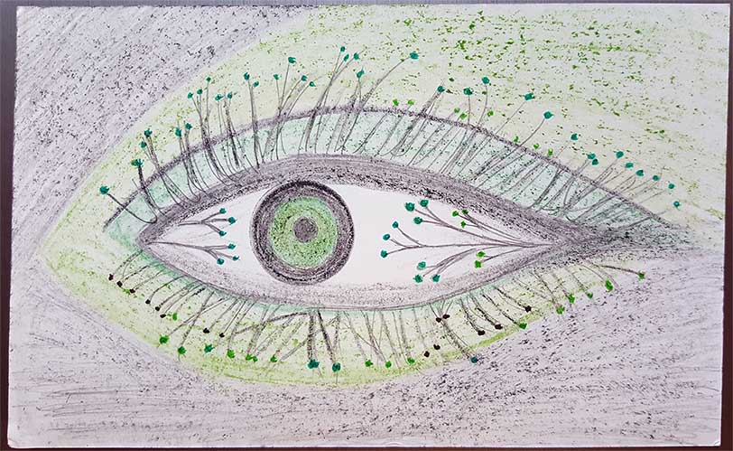
- 33 - Envy
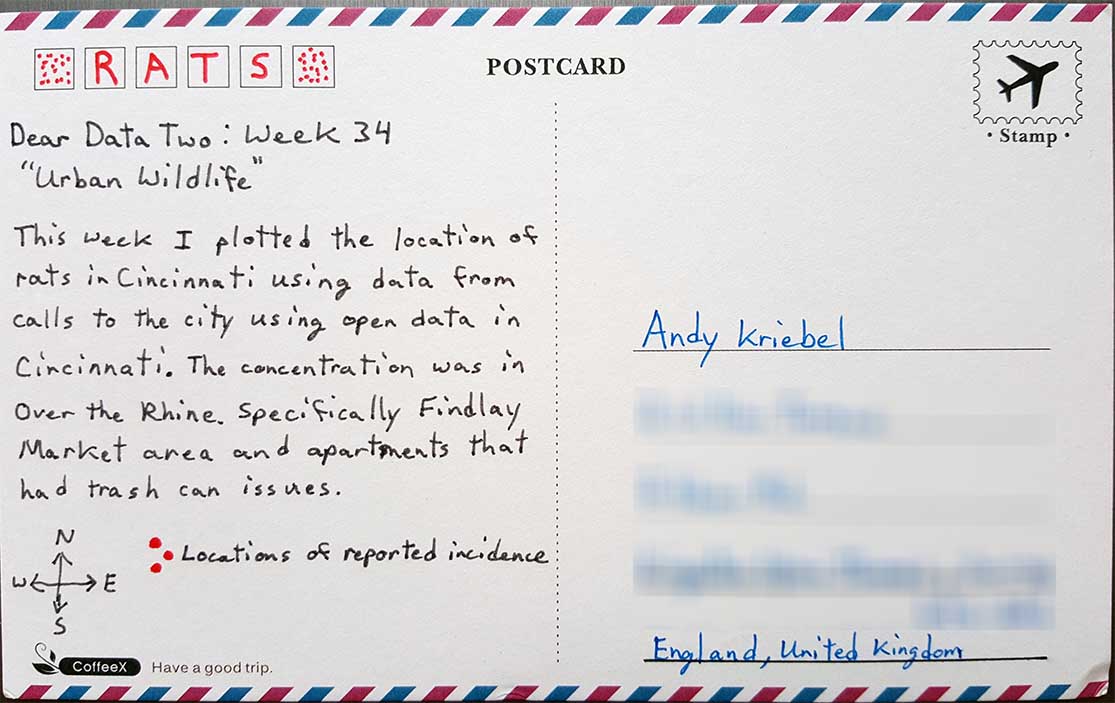
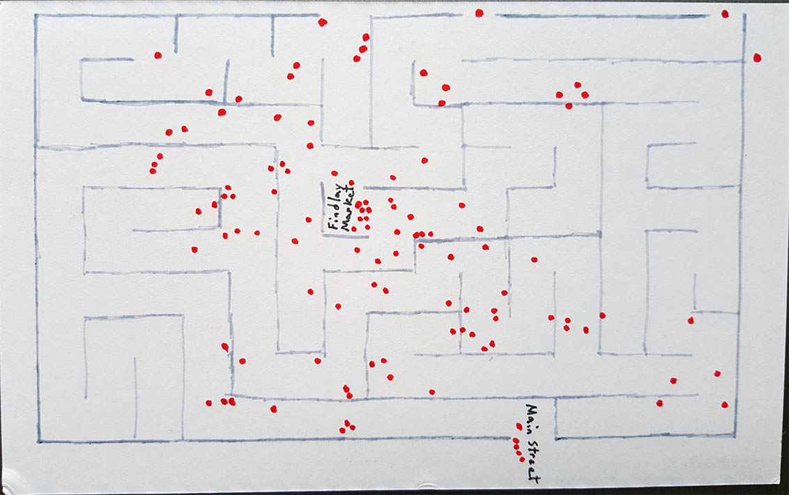
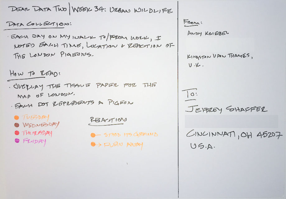
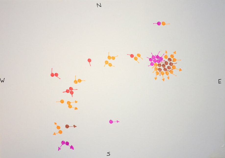
- 34 - Urban Wildlife
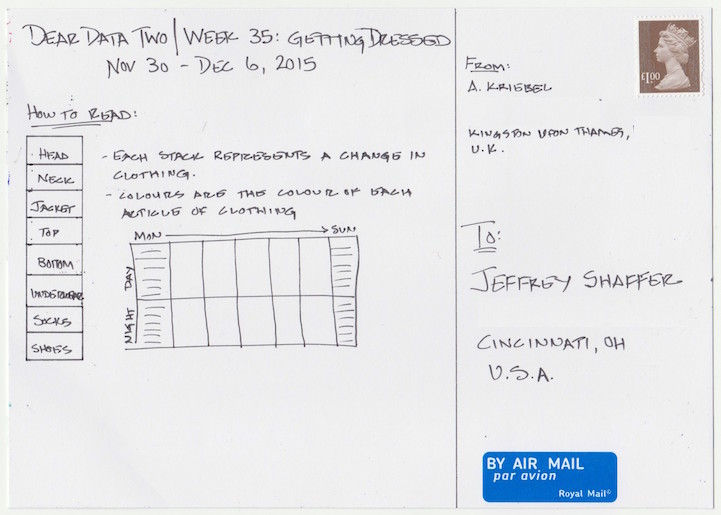
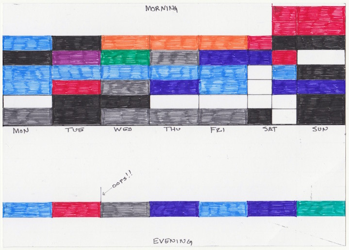
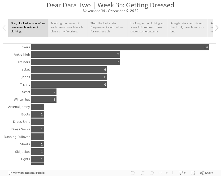
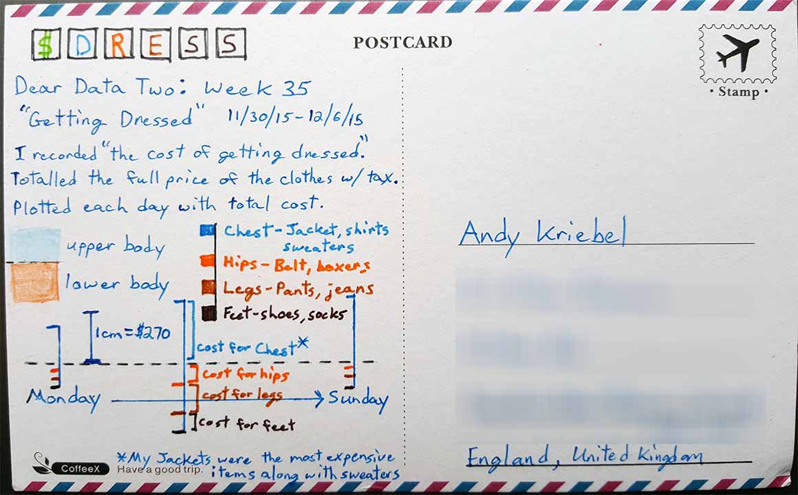
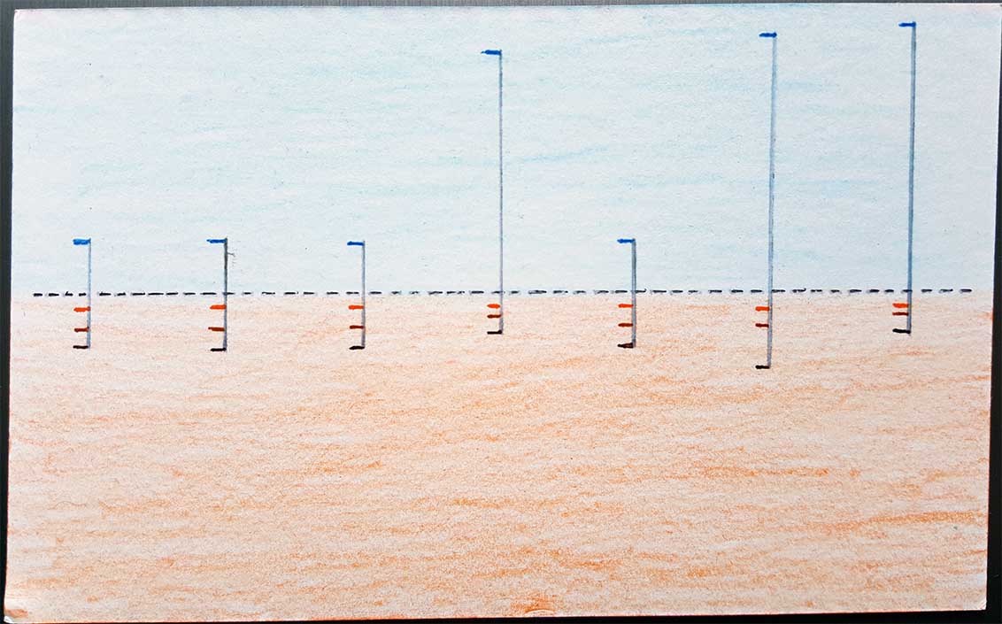
- 35 - Getting Dressed
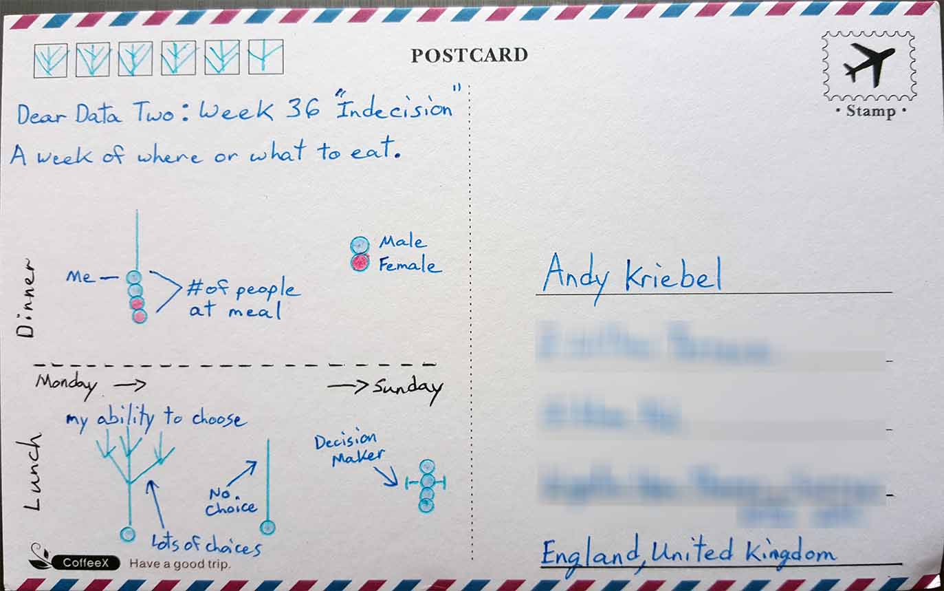
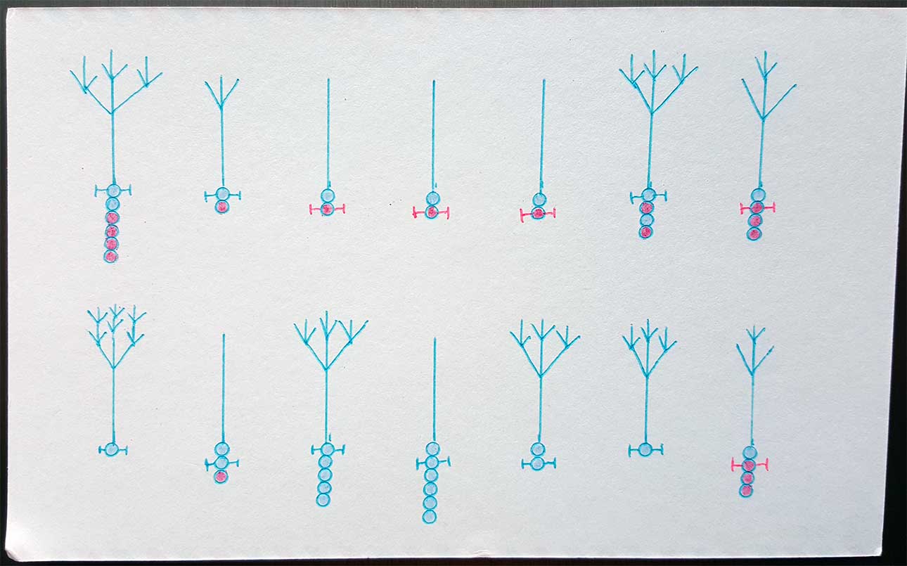
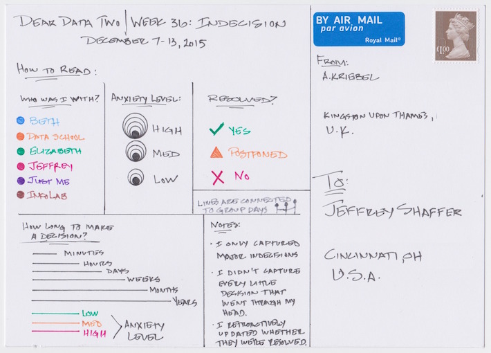
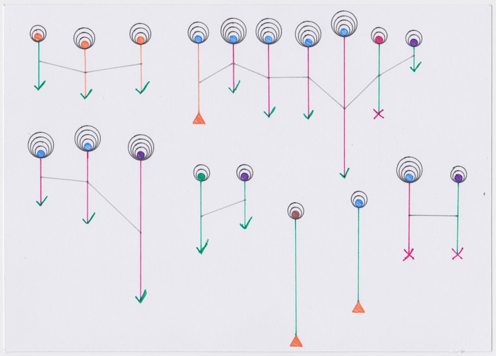
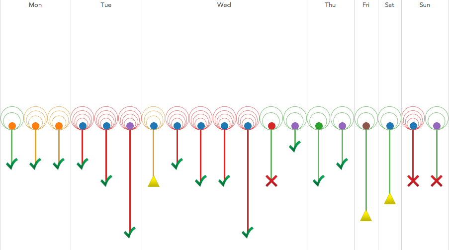
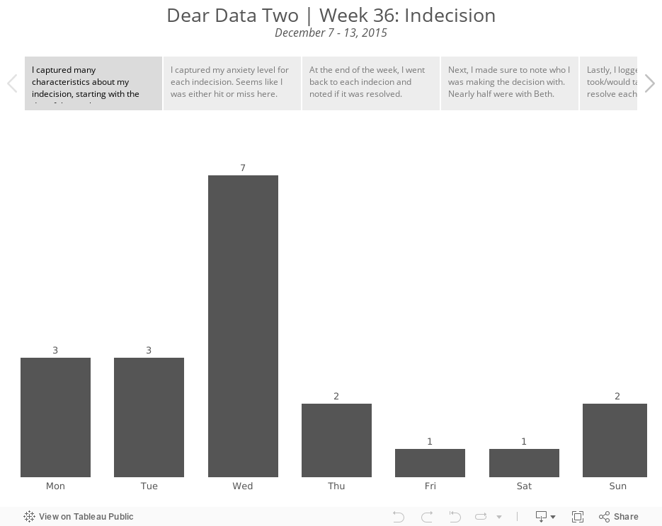
- 36 - Indecision
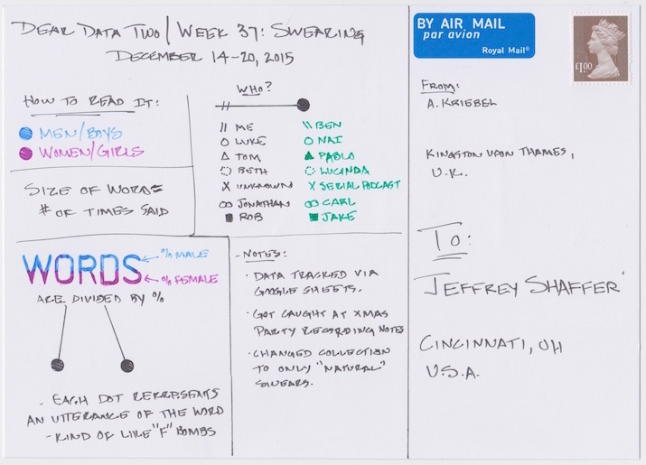
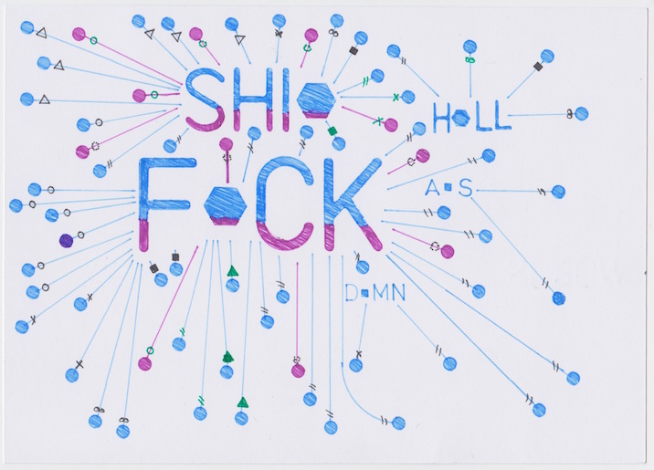
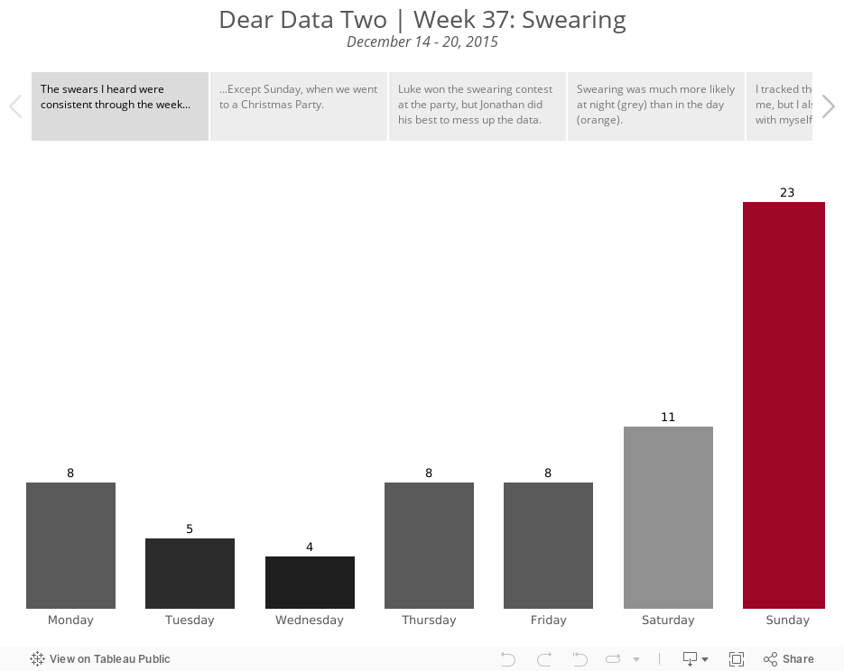
- 37 - Swearing
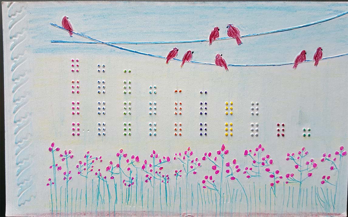
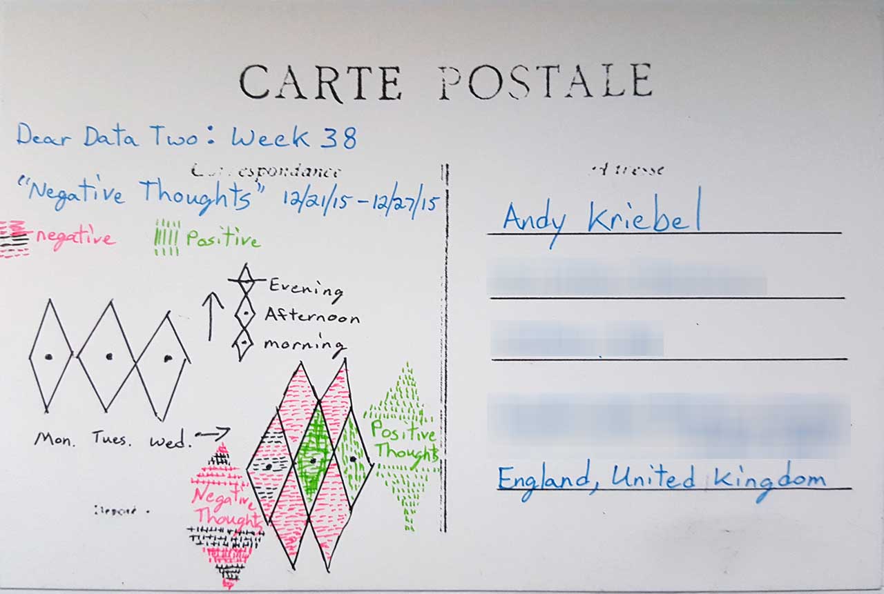
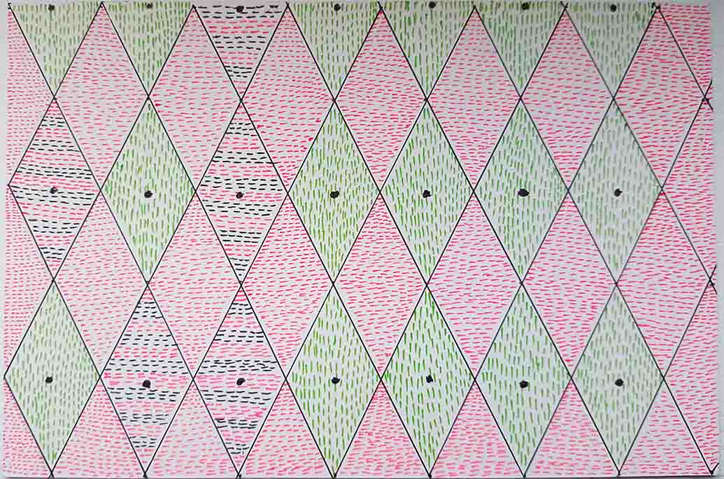
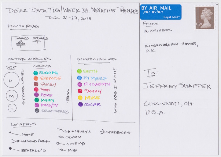
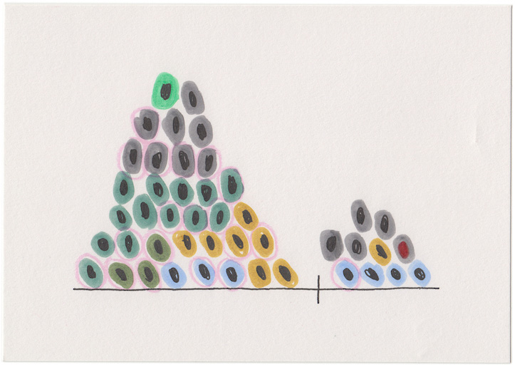
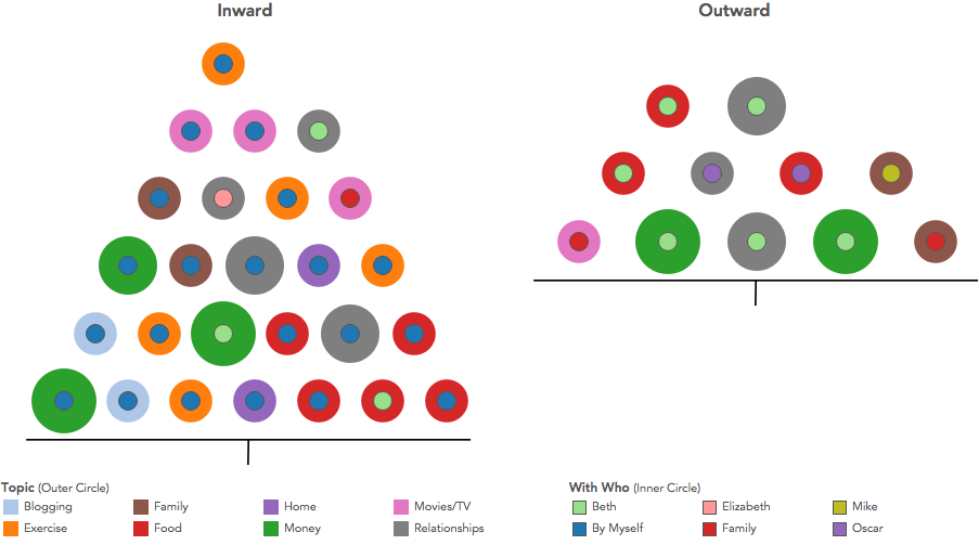
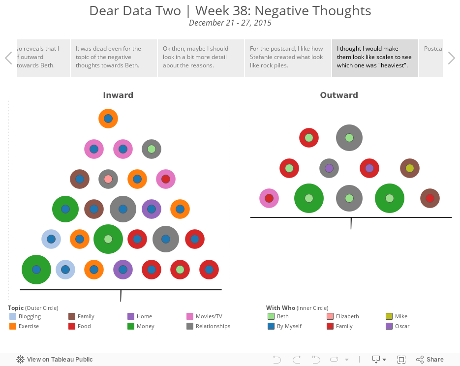
- 38 - Negative Thoughts
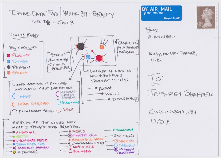
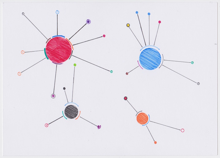
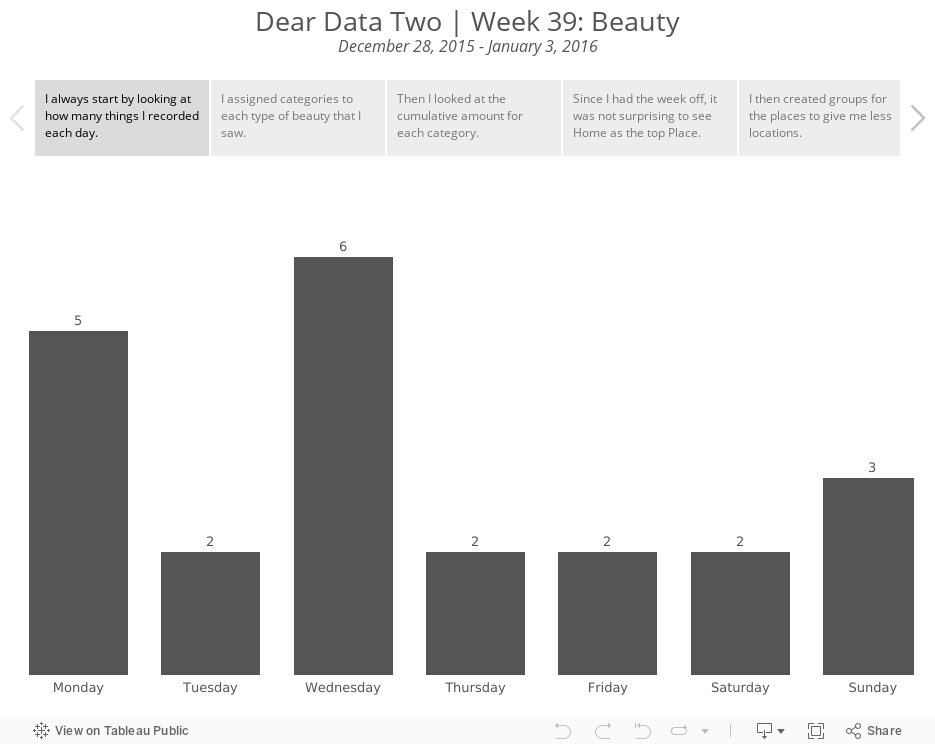
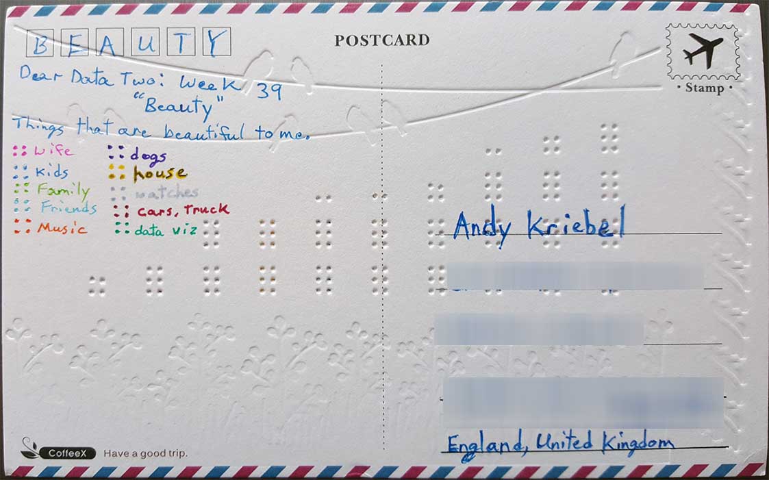
- 39 - Beauty
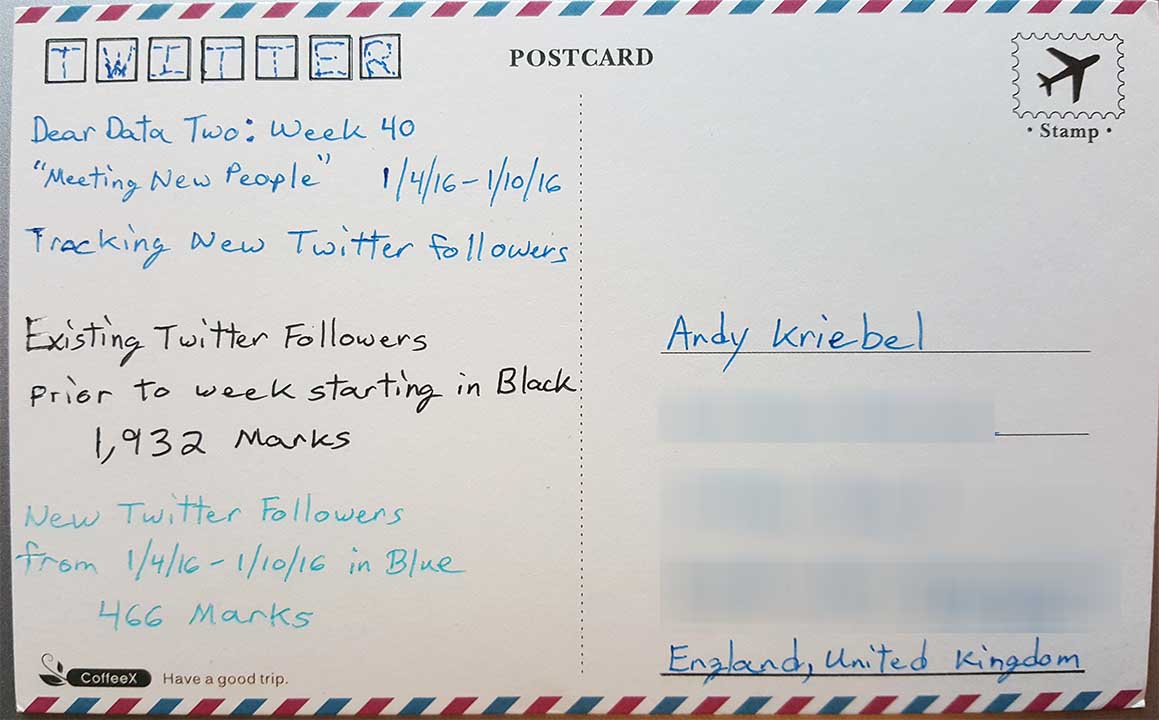
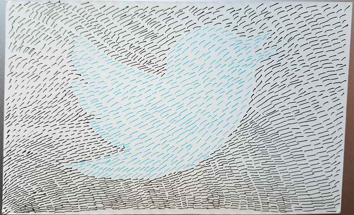
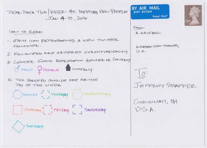
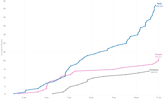
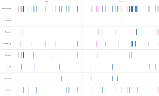
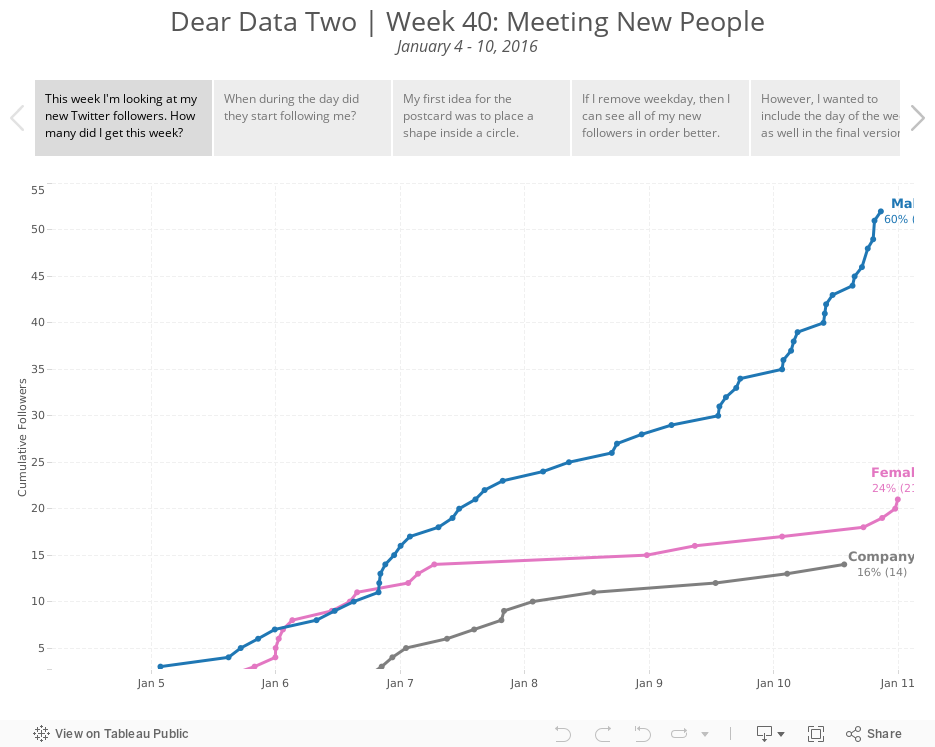
- 40 - Meeting New People
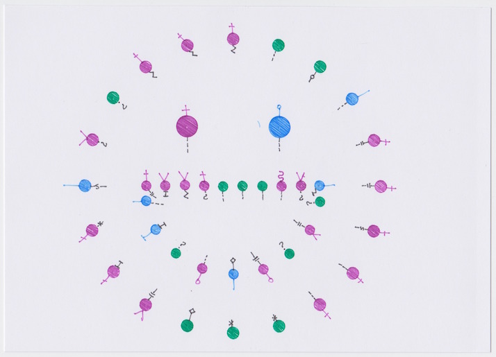
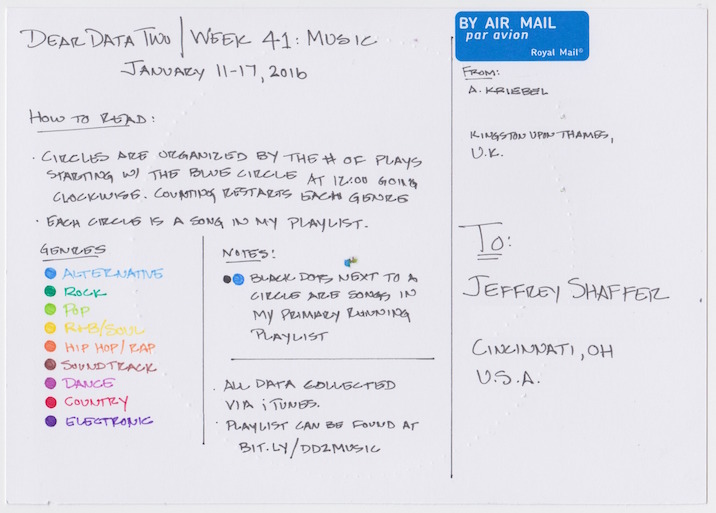
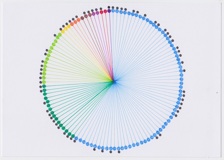
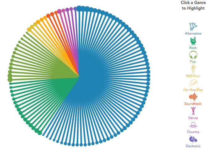
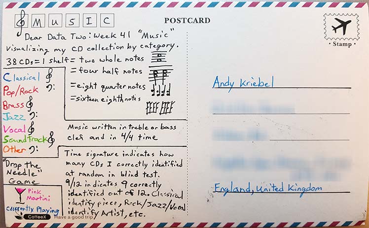
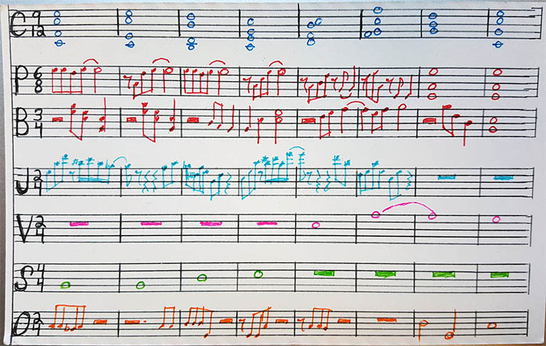
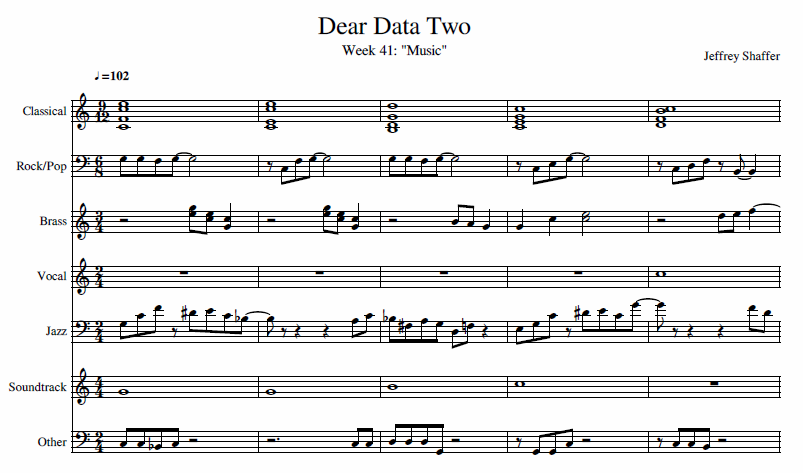
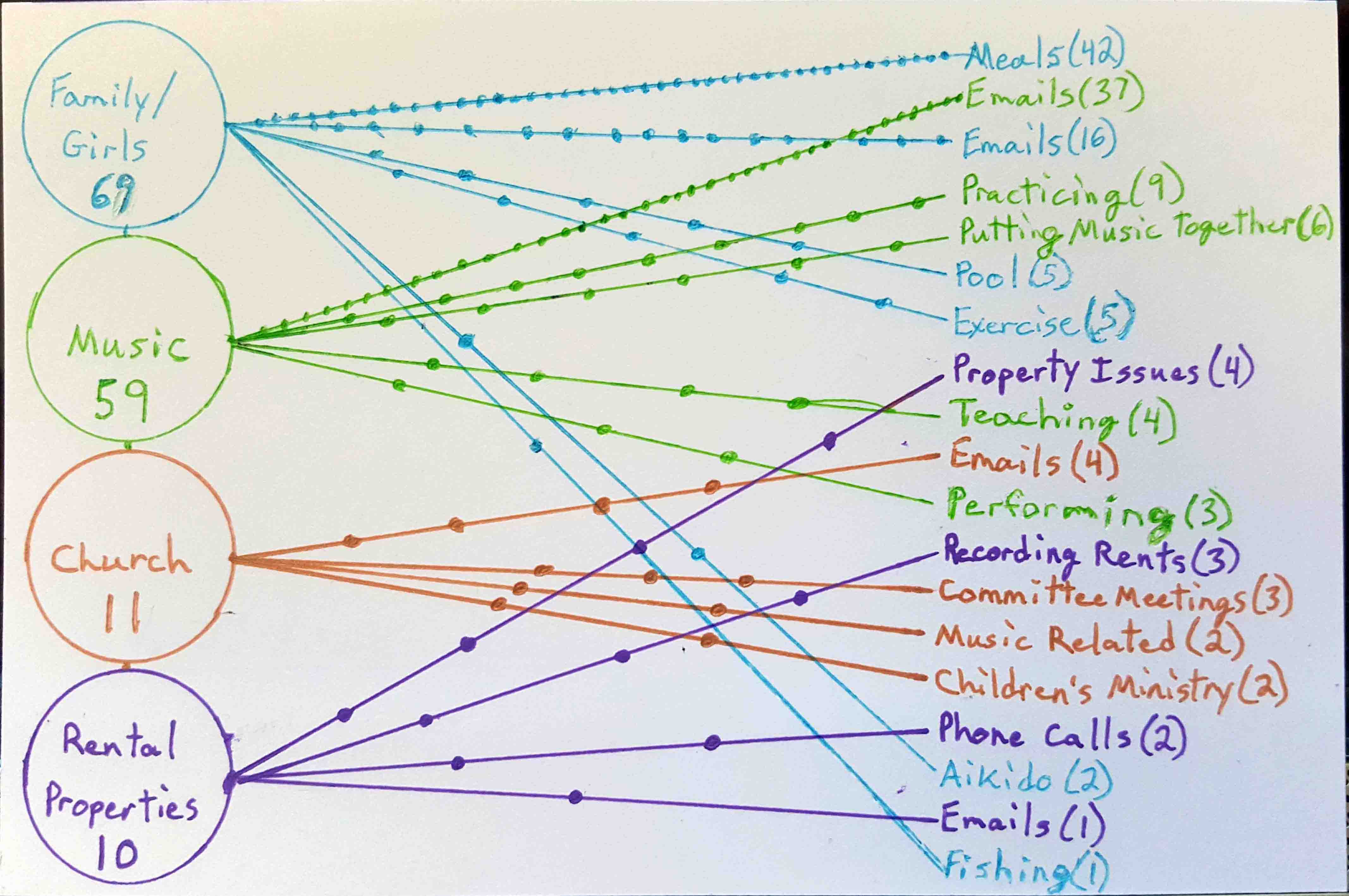
- 41 - Music
- 42 - Laughter
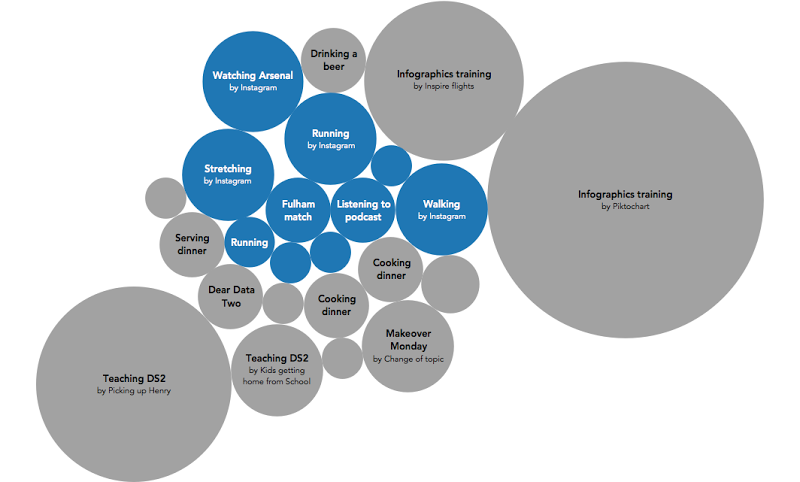
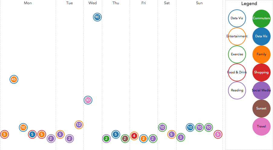
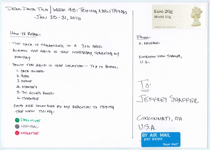
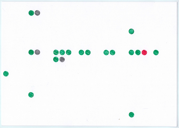
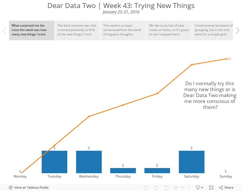
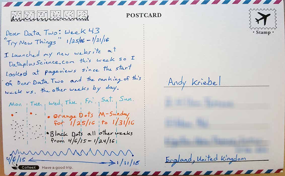
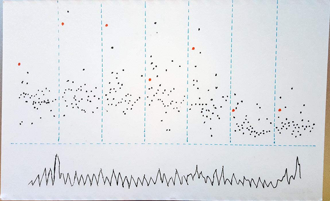
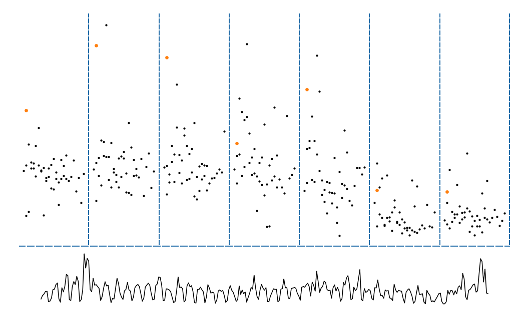
- 43 - Trying New Things
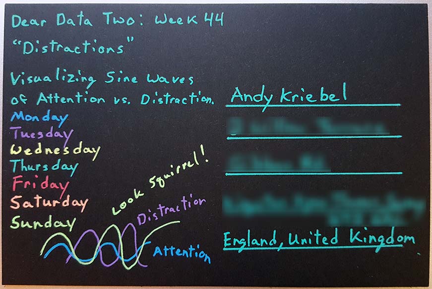
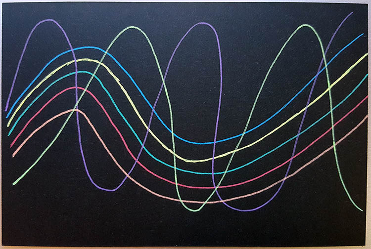
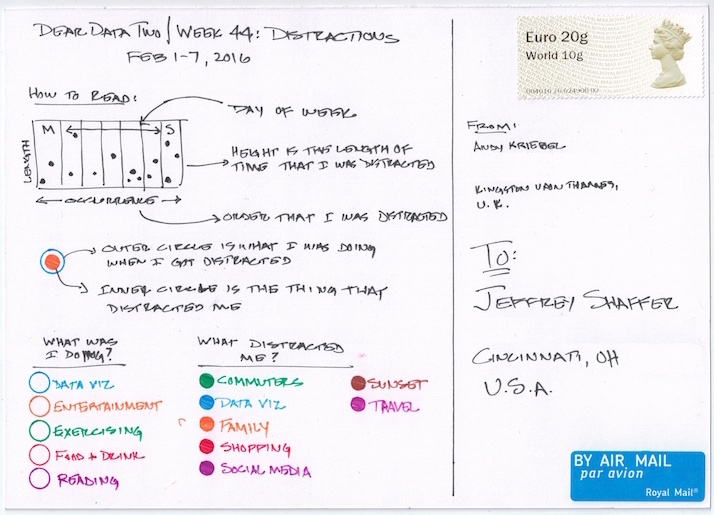
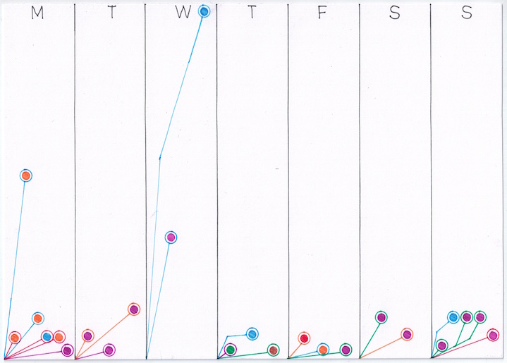
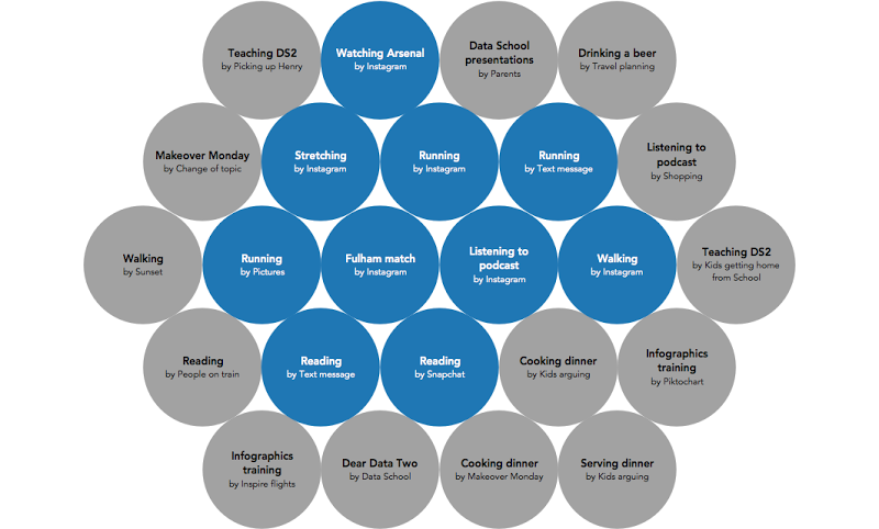
- 44 - Distractions
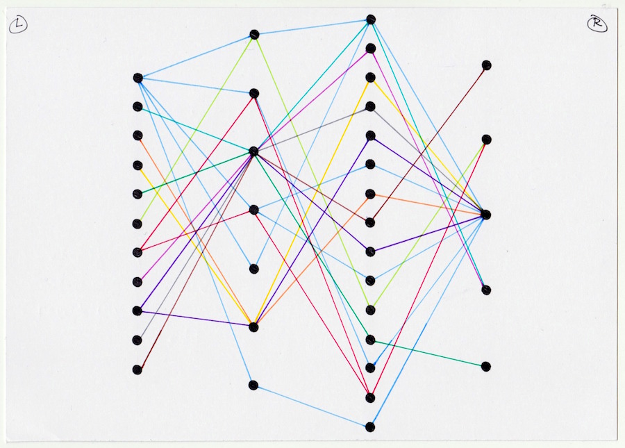
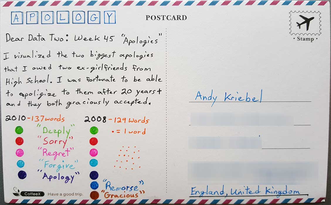
- 45 - Apologies
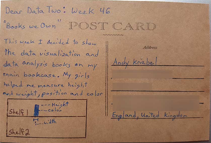
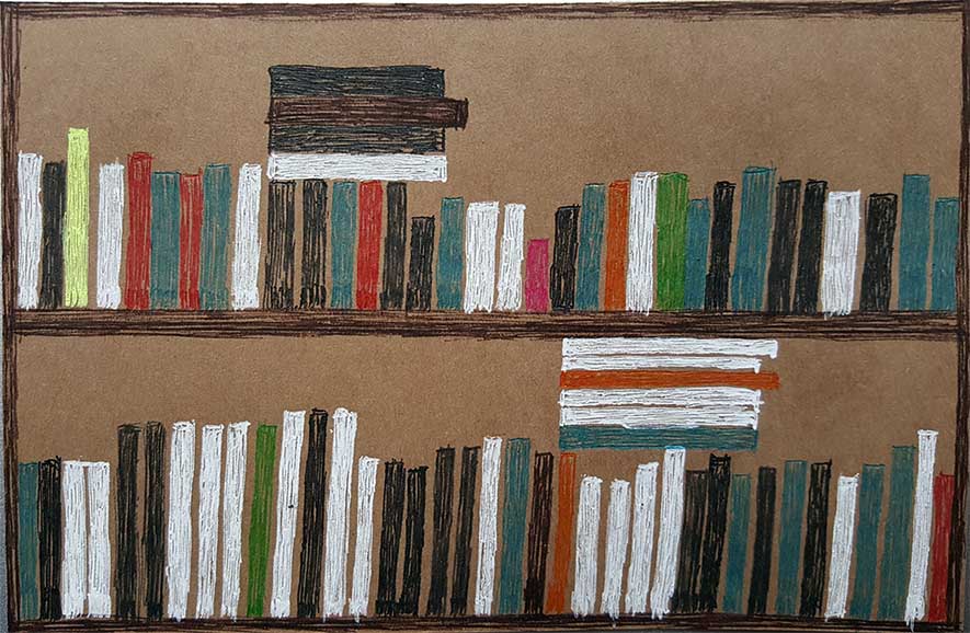
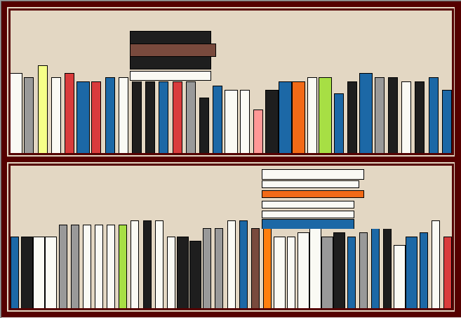
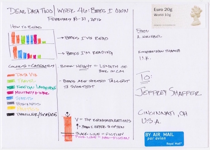
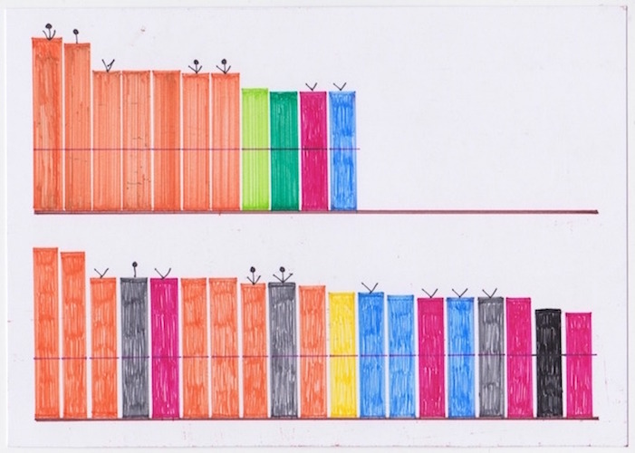
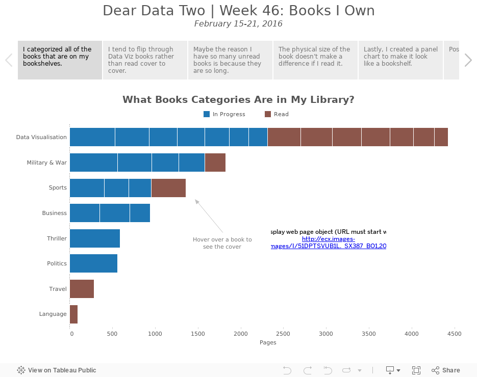
- 46 - Books We Own
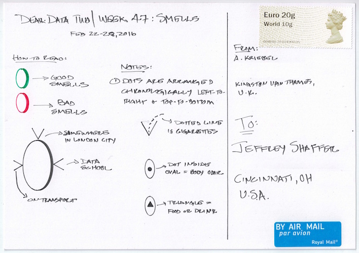
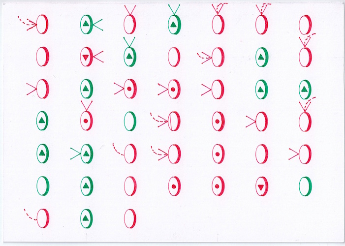
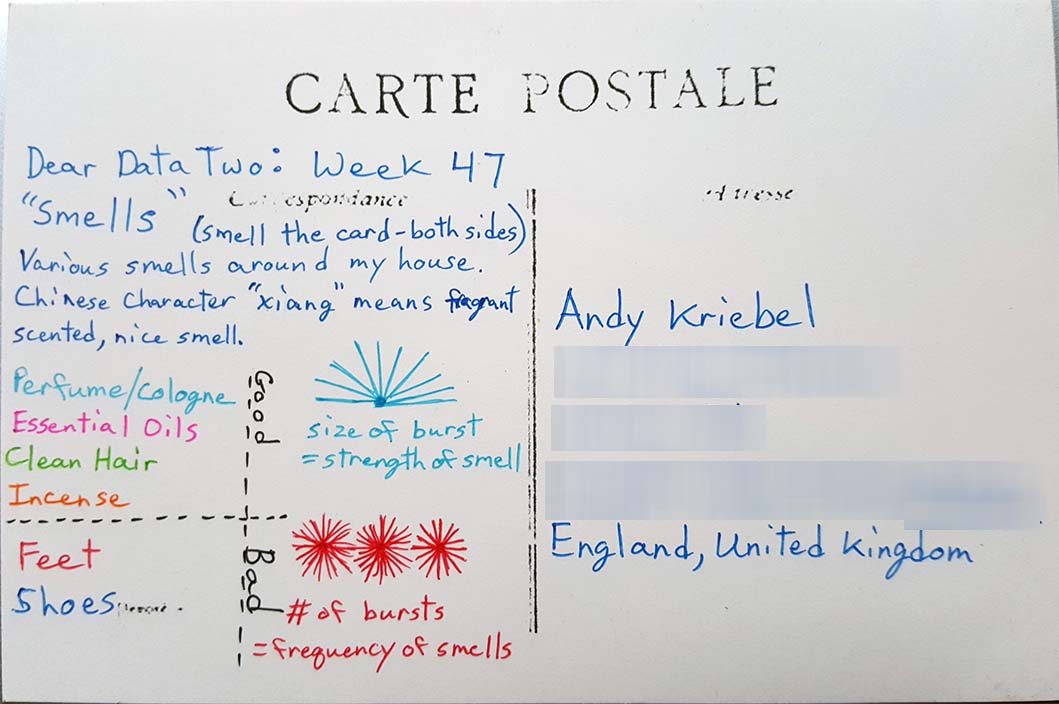
- 47 - Smells/Scent
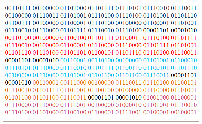
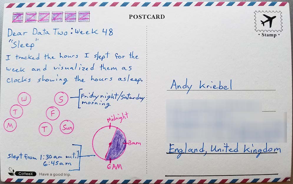
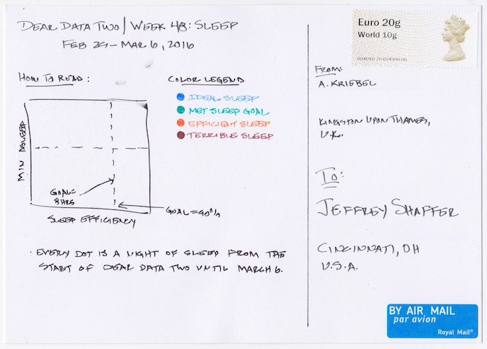
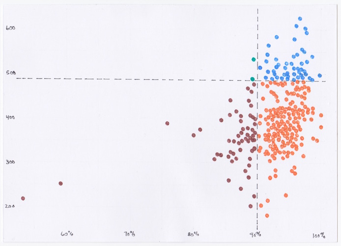
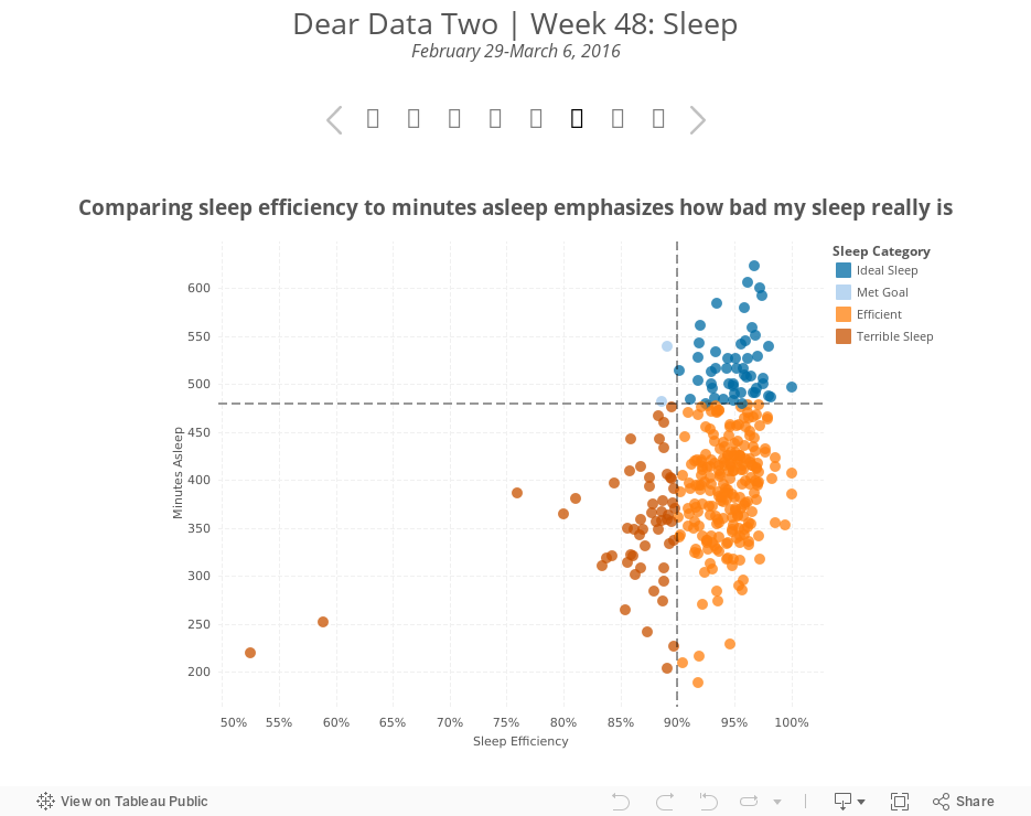
- 48 - Sleeping*
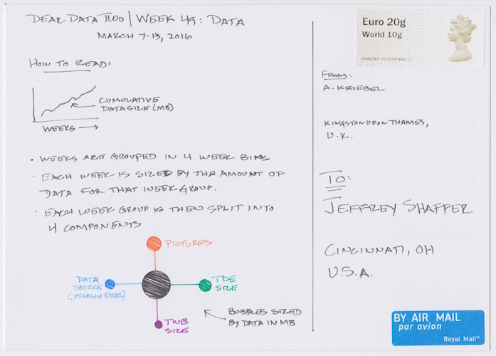
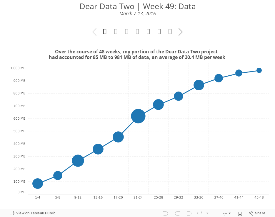
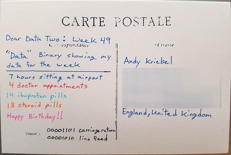
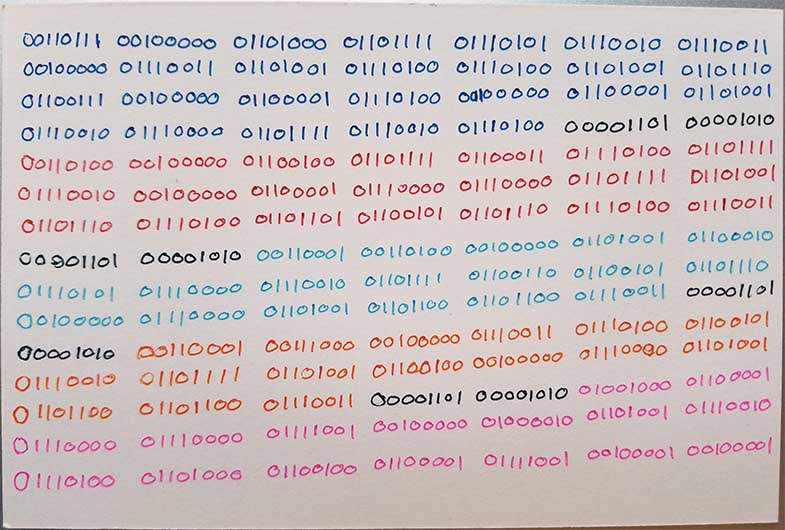
*changed from Eavesdropping - 49 - Data
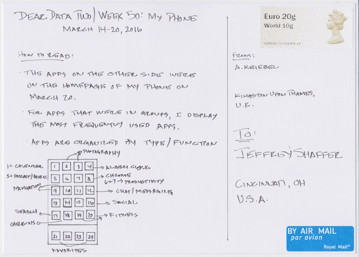
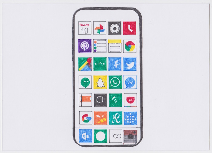
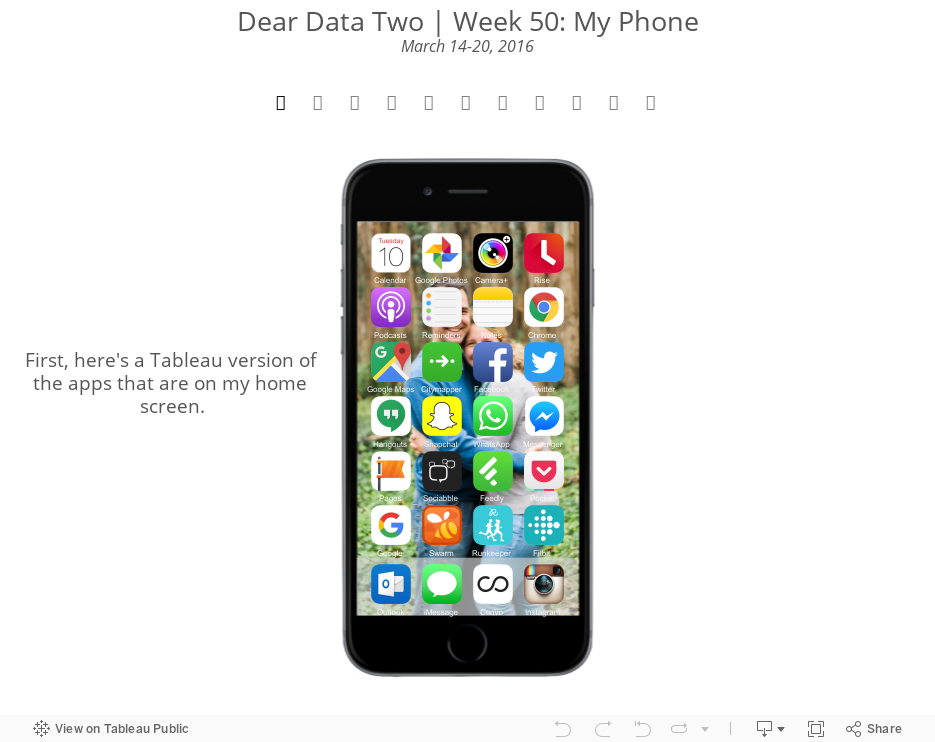
- 50 - Phone
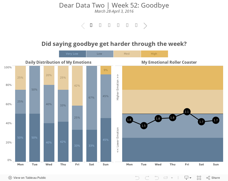
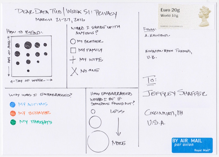
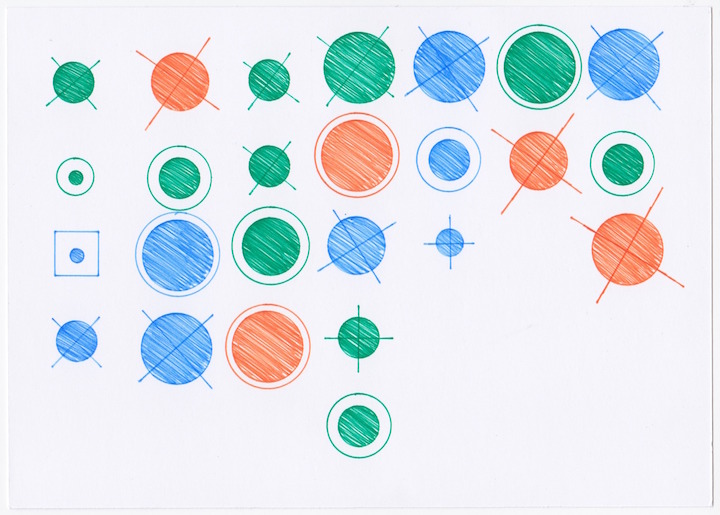
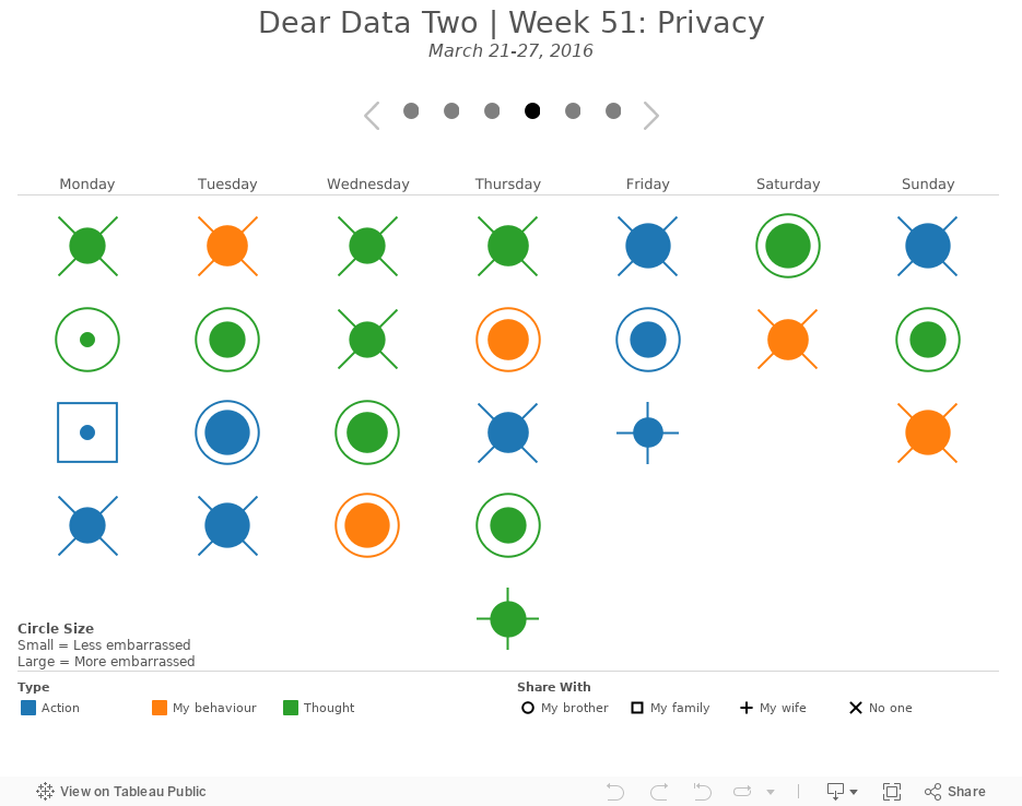
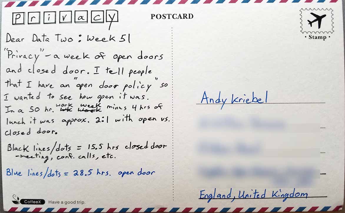
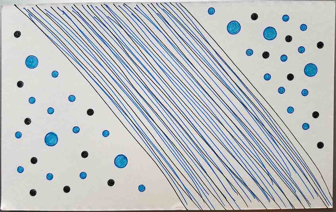
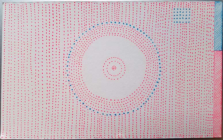
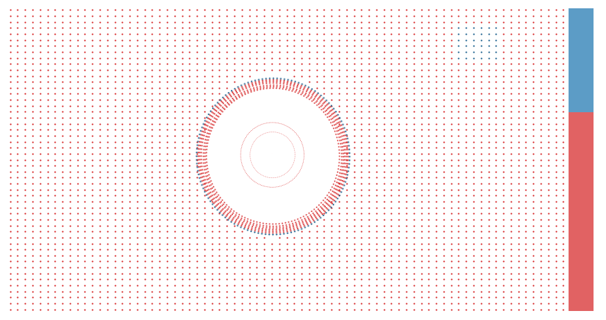
- 51 - Privacy
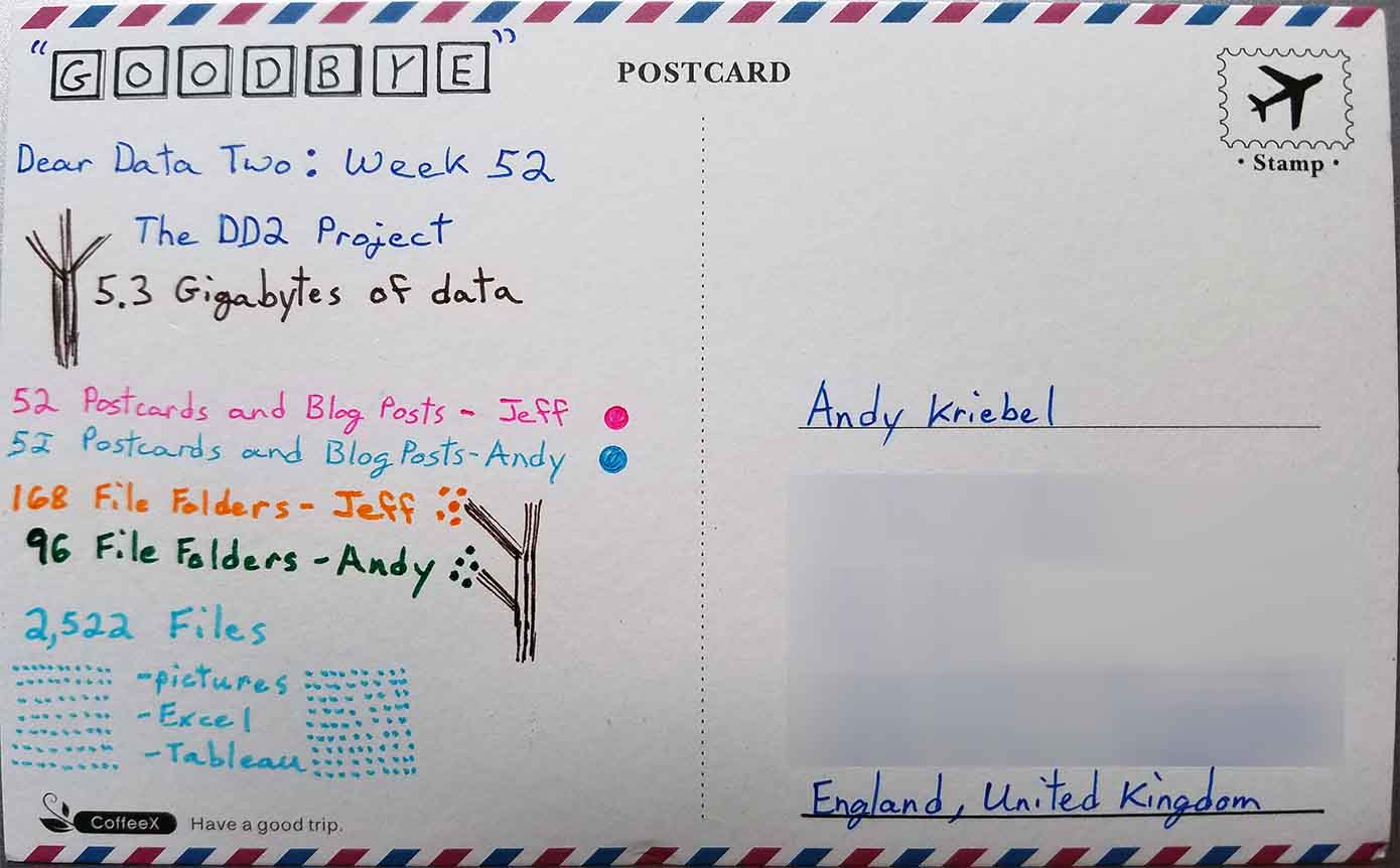
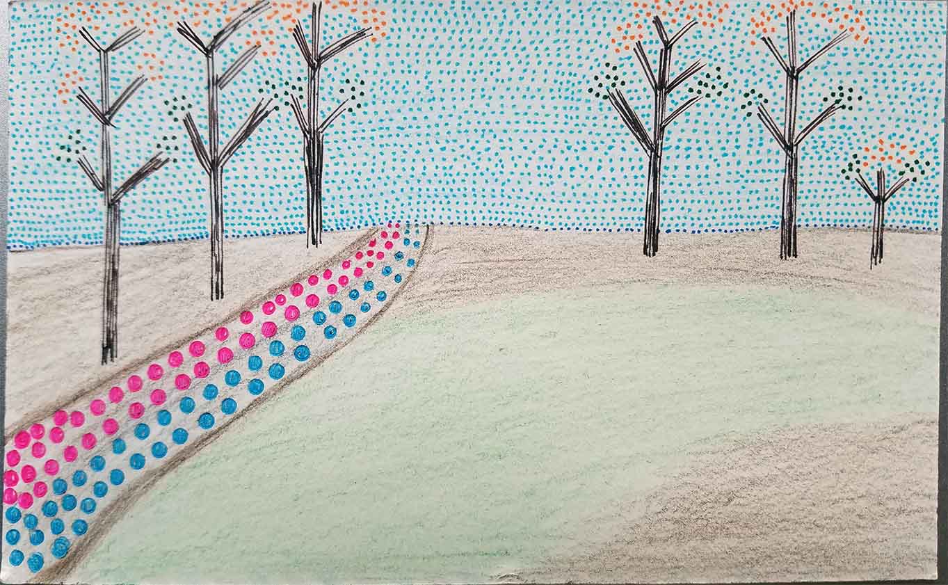
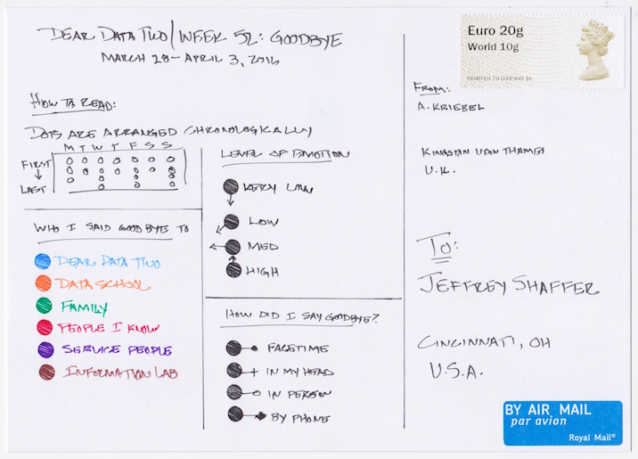
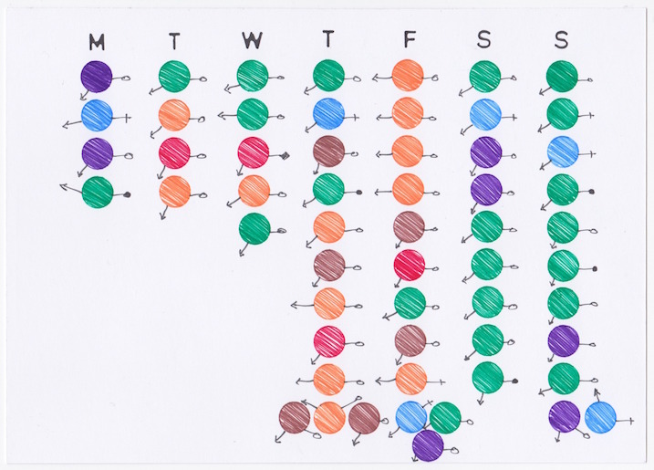
- 52 - Goodbyes